
10 Best Bow Fonts for Graphic Designers: Elevate Your Coquette Aesthetic


Some links in this post may be affiliate links. See our Affiliate Disclosure for details.
In the fast-evolving landscape of digital design, few trends have captured the collective imagination quite like the "Coquette" aesthetic. What began as a niche internet subculture has blossomed into a dominant visual movement, defined by a playful embrace of hyper-femininity, vintage charm, and a touch of Victorian romance. At the heart of this revival is a singular, iconic motif: the bow. Whether tied in silk or rendered in pixels, ribbons have moved beyond mere accessories to become the defining hallmark of 2026’s visual language.
This surge in popularity has paved the way for bow-integrated typography to take center stage in modern branding. No longer relegated to niche craft projects, these fonts serve as a powerful tool for brands aiming to establish an immediate sense of "soft luxury" and approachability. By weaving ribbon-like flourishes directly into letterforms, designers can communicate elegance and personality without saying a word. In a marketplace saturated with sterile minimalism, bow fonts offer a refreshing return to ornamentation, allowing brands to stand out with a signature style that feels both timelessly classic and undeniably current.
The Rise of Bow Typography in 2026
At its core, a bow font is defined by the seamless integration of ribbon motifs into the structural DNA of the letterforms. It isn’t just about placing a clip-art bow next to a word; it’s about how the "ribbon" interacts with the typography to create a cohesive, fluid design.
Here are the three primary elements that define the anatomy of these fonts:
1. Decorative Swashes & Extensions
The most common trait is the use of exaggerated swashes—the decorative strokes that extend from the entry or exit points of a character (like the "tail" of a lowercase y or the "arm" of a capital K). In bow fonts, these strokes are often styled to mimic the silky, flowing movement of a ribbon, ending in a delicate loop or a knotted bow.
2. Ligature-Based Bows
High-quality bow fonts often utilize ligatures, which are special characters that join two or more letters together. Designers use these to create "functional" bows—where the connection between two letters (like st or oo) forms a decorative knot. This ensures the bow looks intentional and maintains the rhythm of the word rather than looking like an afterthought.
3. Integrated Ornaments (The "Knot" Points)
In more maximalist styles, the bow acts as the junction point or the "knot" of the letter. For example, the crossbar of a capital A or lowercase t might be replaced entirely by a tied ribbon. These decorative ornaments are built directly into the font's glyph palette, allowing the typography to feel three-dimensional and tactile.
By mastering these anatomical features, bow fonts provide a sense of "motion" in a static medium, effectively making the text feel as though it were hand-wrapped.
10 Best Bow Fonts for the Coquette Aesthetic
finding a balance between whimsical charm and professional polish can be a challenge, especially when looking for typography that feels both trend-forward and timeless. To help you navigate the "Coquette" landscape, we have handpicked a diverse collection of fonts that embody the ribbon-and-bow spirit.
This curated selection ranges from delicate, hairline serifs that whisper elegance to playful, hand-drawn scripts that shout personality. Whether you are looking for a free-for-commercial-use gem for a passion project or a premium powerhouse for a high-end brand identity, these 10 fonts represent the very best of 2026’s typographic trends.
Here are the top picks to help you wrap your next design in style.
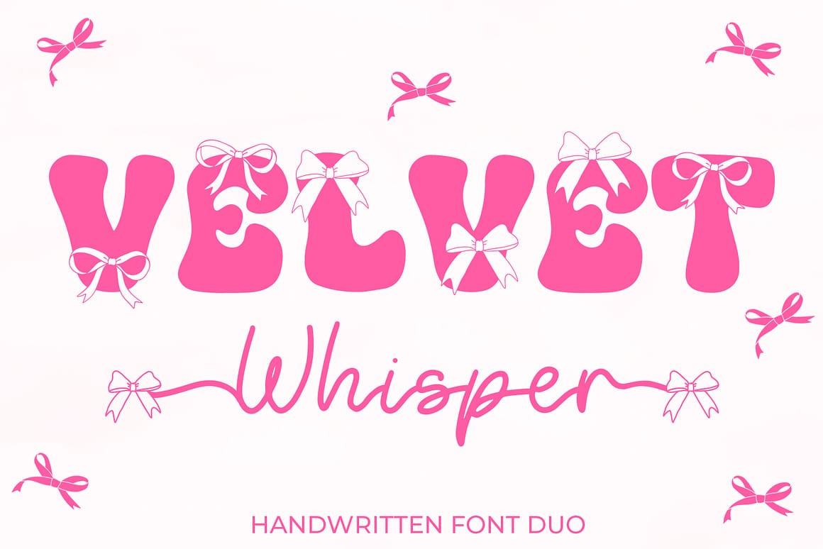
The "Vibe": Retro Coquette & Whimsical Elegance
Best Used For: Branding for boutique retail, trendy apparel (Spreadshop/Zazzle), romantic wedding invitations, and social media quotes.
Key Characteristic: A versatile font duo featuring bubble-style retro uppercase letters topped with dainty bows and a monoline script with flowing, bow-accented swashes.
License Info: Premium (Includes Commercial License)
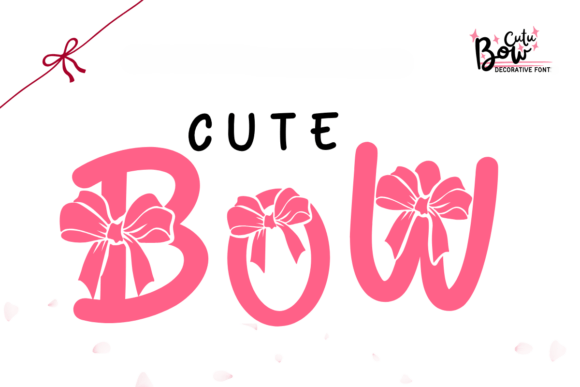
The "Vibe": Playful, Sweet, & Whimsical
Best Used For: Girly branding, holiday crafts, party decor, sticker design, and personalized children's apparel.
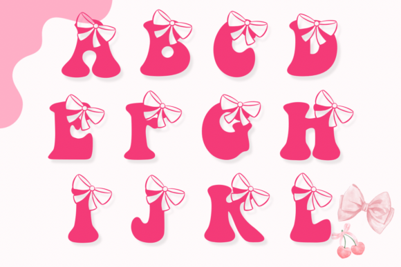
Key Characteristic: Bold, rounded letterforms featuring integrated bow ornaments on select characters, offering a cheerful and "cutesy" aesthetic.
License Info: Premium (Includes Commercial License)
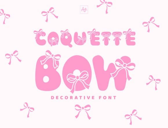
The "Vibe": Audacious, Bubbly, & Youthful
Best Used For: Headline posters, children’s book covers, party invitations, and any design requiring a bold, "girly" statement.
Key Characteristic: A chunky, display-style font with rounded letterforms and integrated bow motifs that prioritize readability and impact.
License Info: Premium (Includes Commercial License)
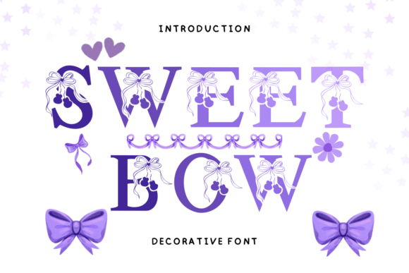
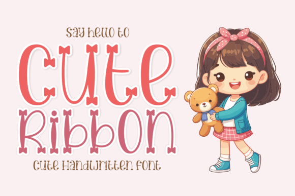
The "Vibe": Whimsical, Romantic, & Soft Aesthetic
Best Used For: Personal diary entries, greeting cards, stationary, social media posts, and custom merchandise like mugs or stylish shirts
Key Characteristic: An inherently ornamental serif typeface featuring delicate bow and heart embellishments integrated into the letterforms
License Info: Premium (Includes Commercial License)
The "Vibe": Retro Y2K & Funky Femininity
Best Used For: Fashion branding, girly logos, trendy sticker designs, and whimsical craft projects.
Key Characteristic: Combines playful, bubbly letterforms with retro-inspired shapes and adorable bow elements for a nostalgic, high-energy look.
License Info: Premium (Includes Commercial License)
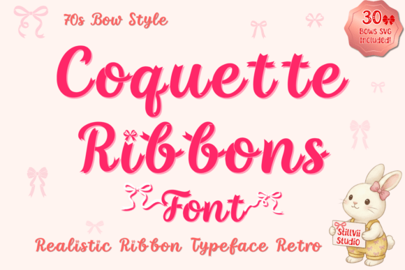
The "Vibe": Realistic Satin Luxury & "Old Money" Coquette
Best Used For: High-end wedding invitations, boutique branding, social media graphics, and premium apparel designs.
Key Characteristic: Features ultra-realistic fabric textures with intricate folds and a layering effect that creates a 3D, weaving appearance.
License Info: Premium (Includes Commercial License)
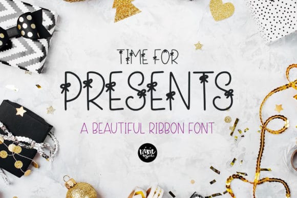
The "Vibe": Festive, Adorable, & Hand-lettered
Best Used For: Holiday cards, birthday invitations, gift tags, and cute seasonal branding.
Key Characteristic: A unique, skinny handwritten font featuring delicate integrated bow-tie motifs on the characters.
License Info: Free for commercial use
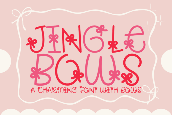
The "Vibe": Festive Coquette & Holiday Cheer
Best Used For: Christmas cards, seasonal marketing, holiday-themed apparel (DTF/Sublimation), and winter event signage.
Key Characteristic: A playful decorative font where bold, rounded letterforms are paired with classic holiday bows, perfectly capturing the seasonal coquette trend.
License Info: Premium (Includes Commercial License)
The "Vibe": Personal, Handcrafted, & Childlike
Best Used For: DIY scrapbooking, children’s book titles, feminine stationery, and personalized gift tags.
Key Characteristic: A lighthearted, handwritten script featuring charming, hand-drawn bows on select characters to create a whimsical, sweet aesthetic.
License Info: Premium (Exclusive to Creative Fabrica)
The "Vibe": Joyful, Playful, & Quirky
Best Used For: Creative headlines, friendly brand identities, personalized art projects, and social media content that needs a standout, handcrafted touch.
Key Characteristic: A friendly, round display font with a quirky, hand-lettered style that balances modern simplicity with a cheerful, artistic character.
License Info: Premium (Includes Commercial License)
The "Vibe": Playful Romance & Valentine Aesthetic
Best Used For: Personal journals, romantic greeting cards, social media graphics, and decorative stickers.
Key Characteristic: A charming handwritten display font that integrates ribbon-style decorations into the uppercase letterforms for a sweet, festive touch.
License Info: Premium (Includes Commercial License)
Expert Tips for Styling Bow & Ribbon Fonts
Integrating highly decorative typography into your designs requires a strategic eye to ensure the "Coquette" aesthetic enhances your message rather than obscuring it. Here is how to master the balance:
1. Balancing Ornamentation with Legibility
When working with fonts like Coquette Ribbon or Groovy Cute Bow, the decorative elements can quickly become overwhelming.
Size Matters: Use these fonts primarily for headers or single-word focal points. Decorative details (like ribbon slits or bow flourishes) tend to "muddy" at small sizes. Keep them large to let the textures shine.
Generous Letter Spacing: If the bows or ribbons overlap too much, increase the tracking (letter spacing). This gives the ornamentation "room to breathe" and helps the eye distinguish individual characters.
Limit Word Count: The more "heavy" the ornamentation, the shorter the text should be. A three-word headline in a bow font is a statement; a full paragraph is a visual headache.
Contrast with Color: Use high-contrast colors between the font and the background. If the font has intricate folds and shadows, a clean, solid background will prevent the design from looking cluttered.
2. Pairing Recommendations
The key to a professional layout is contrast. Since bow fonts are "loud" and artistic, your secondary font needs to be "quiet" and functional.
The "Clean Sans-Serif" Rule: Pair your decorative bow fonts with a minimalist, geometric sans-serif (like Montserrat, Lato, or Helvetica). This creates a clear visual hierarchy, allowing the bow font to be the "star" while the body text remains perfectly readable.
Weight Variance: If your bow font is bold and bubbly (like Jingle Bows), pair it with a light or thin weight sans-serif. This creates a sophisticated balance between "cute" and "professional."
Avoid Font Conflict: Never pair two decorative fonts together. If you use a ribbon script for the headline, avoid using a handwritten or brush script for the subheader. Stick to a neutral, clean body font to maintain the "Old Money" or "High-End" aesthetic often associated with the coquette trend.
When using realistic textured fonts for printing, always check your manufacturer's specifications. High-detail fonts work best with Sublimation or DTF printing, whereas standard vinyl cutting may struggle with the tiny "ribbon slit" details.
Conclusion
As we navigate the 2026 design season, the resurgence of maximalism and hyper-feminine aesthetics has made bow-themed typography more than just a passing trend—it's a versatile essential. Whether you are leaning into the high-end "Old Money" look with realistic textures or capturing the playful energy of Y2K retro-revival, these fonts offer a unique way to inject personality and "vibe" into your portfolio.
Adding these bow-themed resources to your library ensures you’re prepared for the growing demand for "Coquette-core" branding, personalized stationery, and social media content that feels both handcrafted and high-fashion. In a digital world, these tactile, ribbon-inspired details provide the warmth and whimsy that audiences are currently craving.
What is your favorite way to incorporate ribbons into your designs? Are you using them for high-end wedding suites, or do you prefer the bubbly, retro sticker look? Share your latest projects with us in the comments below!
Frequently Asked Questions (FAQs)
Yes, most fonts on platforms like Creative Fabrica include a commercial license. However, always double-check the specific license agreement provided with your download. If you are using these for large-scale production (like mass-market retail apparel), ensure your license covers those specific commercial use cases.
Absolutely! If you have a Creative Fabrica subscription, you can download the OTF or TTF file and upload it directly into Canva’s Font Manager (available with Canva Pro). This allows you to use your decorative ribbon fonts across all your social media graphics and digital planners.
For vinyl cutting, the OTF (OpenType Font) format is generally preferred as it often includes extra features like ligatures and alternates. However, both OTF and TTF work well. Note: Because bow fonts have intricate details and small "slits," they can be tricky to weed. We recommend using the "Print-then-Cut" feature for stickers or scaling them to at least 3 inches for clean cuts.
The "Coquette" aesthetic is a trend characterized by ultra-femininity, soft color palettes (pinks, creams, and pastels), and the heavy use of bows and ribbons. In typography, it manifests as script or display fonts that feel delicate, romantic, and whimsical.
The best way to balance a decorative "bow" font is to pair it with a very clean, neutral sans-serif body font (like Montserrat or Open Sans). Use the bow font only for headlines or short, impactful phrases, and keep your body text simple to ensure your message remains readable.
Disclaimer:
This article is for informational purposes only. Some links may be affiliate links, meaning Advise Graphics may earn a commission at no extra cost to you. We do not guarantee results, and readers should do their own research before making any decisions.
Tags
Subscribe
Join the Advise Graphics community and get exclusive design resources, tips, and updates delivered straight to your inbox.


Ads


Copyright
© 2025 Advise Graphics. All rights reserved.
Cop© 2025 Advise Graphics. All rights reserved.