
35 Best Cursive Tattoo Fonts for Graphic Designs


Some links in this post may be affiliate links. See our Affiliate Disclosure for details.
A tattoo studio's typography does more work than most owners realize. It's the wordmark on the storefront window, the header on the booking site, the sticker on a merch drop, the highlight-cover font on Instagram. Cursive script carries the same associations tattoo art itself does — craftsmanship, permanence, personality — which makes it one of the most natural typography choices for the industry's branding, not just the ink.
This list is built for that purpose: choosing and applying cursive fonts across logos, merchandise, packaging, signage, and digital marketing for a tattoo business, not for flash sheets or skin placement.
How to Use This List
Each font below includes a Best for tag flagging where it performs strongest in a brand system — wordmark, apparel, packaging, signage, or social/digital. Many fonts can stretch across categories, but the tag reflects where the letterforms hold up best at that specific scale and use case.
Best Cursive Tattoo Fonts
1. Chicano Font

Best for: wordmark, signage
Dense loops and heavy contrast give this one presence at large sizes — window decals, exterior signage, or a hero logo lockup. It gets harder to read below 24pt, so keep it out of body copy and fine print.
2. Carpellon

Best for: packaging, product labels
The ornamental flourishes read as premium on darker backgrounds, which suits aftercare product boxes, tattoo balm labels, or limited-run merch tags where a little theater is the point.
3. Malekith

Best for: wordmark
Thick, sharp-ended strokes give it a carved, engraved quality — a good match for a studio's primary logotype, especially paired with a simple geometric icon to balance the ornamentation.
4. Brightone Vol. 2

Best for: wordmark, signage
A cleaner cousin of Malekith with slightly more open counters, making it a safer pick if legibility at a distance (storefront signage, vehicle wraps) matters more than maximum ornamentation.
5. Relentless

Best for: apparel
The decorative swirls print well on fabric and hold detail through screen printing, making it a strong choice for a signature t-shirt or hoodie drop rather than small-scale digital use.
6. The Lastring

Best for: wordmark, packaging
Variable stroke weight gives it a handmade quality that works well as a secondary wordmark — think receipts, business cards, or a "thank you" insert card in merch packaging.
7. Meltvan

Best for: social/digital
The prominent swashes photograph well as an Instagram highlight-cover font or story sticker, though the flourishes can clip awkwardly in tight app UI — test at actual mobile size before committing.
8. Sinister

Best for: wordmark, apparel
An antique, dramatic feel that suits studios leaning into a gothic or dark-Americana brand identity — strong on a primary logo or a bold apparel graphic.
9. Libertad

Best for: apparel, wordmark
Bold and legible even with heavy decoration, which makes it one of the more forgiving options for scaling between a small hang-tag and a large back-of-shirt print.
10. Black Majestic

Best for: wordmark, packaging
A blackletter-script hybrid that reads as established and serious — a solid fit for a studio's formal logotype or premium product line rather than casual merch.
11. Salvators

Best for: wordmark
Gothic-inspired detailing gives it weight and authority; best reserved for a primary mark rather than body text, where the intricacy would slow reading.
12. Black Angela

Best for: apparel, social/digital
Thick strokes and vintage lettering-tattoo styling translate cleanly to both fabric printing and flat digital graphics, giving it more cross-channel flexibility than most entries on this list.
13. Fearless

Best for: apparel
Confident, wide swashes suit a bold merch statement piece — a single word across a chest print or tote bag — more than a compact logo lockup.
14. Arnovoid

Best for: wordmark, signage
Balanced fluidity without excessive ornament makes this a practical option for studios that want a script logo without sacrificing readability on business cards or exterior signage.
15. Hustler

Best for: apparel, social/digital
Brush-lettering energy with racing-inspired swashes gives it motion — a good fit for promo graphics, event flyers, or a "grand opening" style social campaign.
16. Bandito Script

Best for: wordmark, packaging
Built with 250+ glyphs and bilingual (English/Spanish) support, this is a strong choice for studios marketing to bilingual communities across signage, packaging copy, and printed menus of services.
17. Durango

Best for: packaging, signage
Its Mexican tattoo-script heritage and bold strokes suit product packaging (aftercare, merch) and barbershop-adjacent brand pairings where a regional, cultural identity is part of the story.
18. Cardilan

Best for: wordmark, digital
A more restrained script with alternate glyphs, making it easier to use consistently across a full brand system — website headers, email headers, and the primary logotype alike.
19. Historic

Best for: wordmark, packaging
Blends vintage charm with cleaner modern proportions, useful for a studio brand that wants "established since" credibility without leaning fully into heavy gothic styling.
20. Rumble Tattoos

Best for: apparel, social/digital
Sharp angles and an aggressive edge make this better suited to bold promotional graphics and merch than a refined primary logo — think event posters or limited drops.
21. Black Ink

Best for: wordmark, apparel
A modern-meets-classic blackletter-script hybrid that scales reasonably well from a small logo to a large apparel print, giving it more versatility than most heavily ornamented options here.
22. Axenta Velquas

Best for: wordmark
OpenType stylistic alternates let you fine-tune individual letterforms for a distinctive studio logotype — useful if you want a mark that doesn't look like a stock font pairing.
23. Magical Darkness

Best for: social/digital, apparel
A deliberately unsettling, handwritten aesthetic that fits horror- or oddity-themed studio brands — strong for album-cover-style merch graphics or Halloween/seasonal promo content.
24. Quillstone

Best for: wordmark, packaging
Calligraphic detail with PUA-encoded glyphs and swash sets gives designers granular control, which pays off on packaging where fine print size still needs to hold its shape.
25. Bougenville

Best for: wordmark, digital
A sleeker, more contemporary blackletter-script blend that reads as brand-forward rather than purely decorative — a good candidate for a studio's website and app-facing logo lockup.
26. Neography

Best for: packaging, wordmark
Extensive alternates and swashes make it adaptable across formal contexts — think a studio's formal certificate of authenticity for custom pieces, gift cards, or premium packaging inserts.
27. Tattoo Script

Best for: apparel, social/digital
Free swirl-vector extras bundled with the font make it easy to build quick promo graphics or merch mockups without sourcing separate decorative assets.
28. Astolfo

Best for: wordmark, packaging
Fluid strokes and expressive swashes suit a studio's primary logotype when the goal is elegance over edge — works well paired with minimal packaging design.
29. Alevattros

Best for: wordmark, apparel
Ligatures and multilingual support give it practical range for studios producing bilingual marketing materials alongside a consistent logo treatment.
30. Tattoo Studio

Best for: wordmark, signage
Purpose-built for the industry with clean kerning, it's one of the more dependable choices for a primary studio wordmark that needs to work across web, print, and cut vinyl signage.
31. Acuentre

Acuentre — Best for: packaging, wordmark
Gothic-script fusion that reads well on both a logo and a beverage-style label format — a good option if the studio brand extends into collaborative product lines.
32. Alevantre

Alevantre — Best for: apparel, packaging
Ink-brush character with alternate glyphs gives merch designs a tactile, hand-applied feel without needing custom illustration work.
33. Black Jack

Best for: wordmark, apparel A serif-script combination font with 400+ glyphs, useful when a brand system needs one font family to cover both a logotype and supporting marketing copy.
34. Bethinae
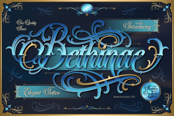
Best for: packaging, wordmark
Ornate but balanced, this suits a studio positioning itself as a fine-art or custom-only shop — premium packaging, certificates, or a refined secondary logo mark.
35. Desirable Calligraphy
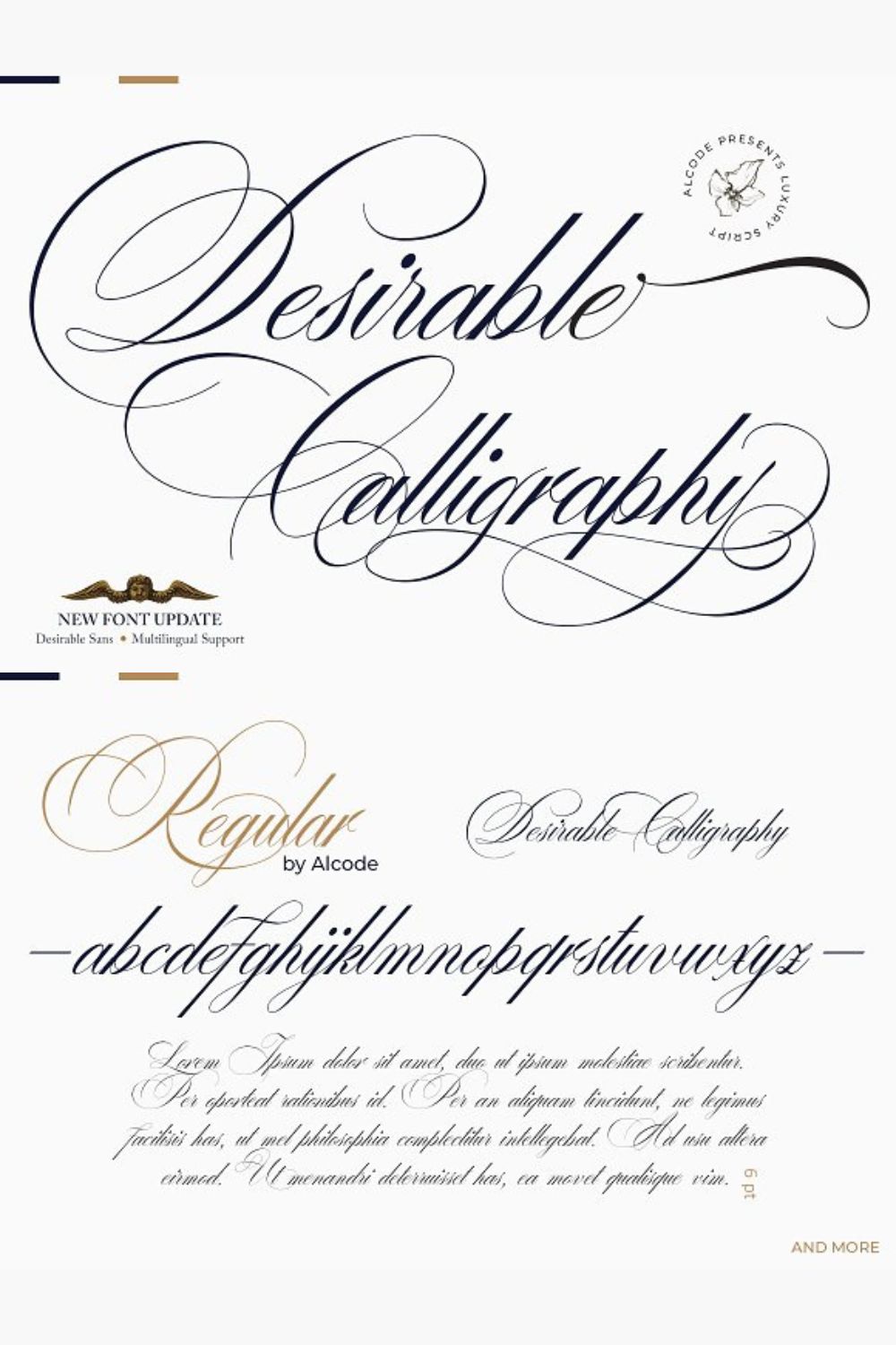
Best for: packaging, digital
Delicate strokes work best at small sizes with generous white space — think a product label, an email footer signature, or a subtle watermark rather than a bold storefront sign.
Applying Cursive Fonts to Tattoo Studio Branding
A heavily ornamented script rarely works as both logo and body copy. Pair one expressive display script (for the logotype) with a clean sans-serif or simple serif for supporting text — service menus, website copy, packaging fine print. This keeps the brand legible while still letting the script carry personality where it counts.
2. Test at Actual Application Size Before Choosing
The use of cursive tattoo fonts carries a deeper meaning than mere aesthetics. Cursive script is often associated with femininity, grace, and elegance. It can also symbolize creativity, passion, and individuality. The flowing strokes of cursive can also represent the interconnectedness of life and the fluidity of time.
3. Match Contrast to the Medium
Print and digital behave differently. A script that reads fine in black ink on white cardstock may lose detail when embroidered, laser-etched, or displayed on a small illuminated sign. High-contrast, simpler scripts (Arnovoid, Cardilan, Black Angela) tend to survive medium changes better than heavily filigreed ones (Carpellon, Neography).
4. Keep One Script as the "Signature" Font
Studios that rotate cursive fonts across every piece of marketing end up with a brand that feels inconsistent. Pick one primary script for the logotype and one secondary script (if any) for accents — event flyers, seasonal promos — and keep the rest of the system (colors, iconography, photography style) doing the work of variety.
5. Consider Licensing Before Committing to a Brand Identity
Many of these fonts are sold under personal-use or limited commercial licenses. Before locking in a font as a studio's permanent logotype, confirm the license covers commercial branding, merchandise production, and any embroidery or print-on-demand use — retroactively switching a core brand font is expensive and confusing for customers.
6. Design for Reproduction, Not Just Screen Display
A logo destined for embroidery, laser engraving, or vinyl cutting needs to survive being reduced to a single-color silhouette. Before finalizing a script as a primary mark, check how it looks in solid black with no color or gradient support — that's the version production vendors will actually work from.
Closing Thoughts
For a tattoo studio, the brand's typography is doing the same job the tattoo work itself does — establishing craft, trust, and a distinct point of view before a client ever sits in the chair. Treating font choice as a system decision (hierarchy, licensing, reproduction constraints) rather than a one-off aesthetic pick is what separates a studio brand that scales cleanly across signage, merch, and marketing from one that has to be redesigned every time it shows up somewhere new.
FAQS
There's no single best option — it depends on the brand's positioning. A studio going for a refined, boutique feel is better served by a cleaner script like Arnovoid or Cardilan, while a studio with a bold, traditional Americana identity might lean toward Chicano or Sinister. The right choice is the one that stays legible at logo scale and matches the studio's existing visual tone.
Only if the license explicitly allows commercial use. Many "free for personal use" fonts require a separate commercial license for business branding, merchandise, or client work. Always check the license file or the marketplace listing before applying a font to a paid product or storefront signage.
Simplify before you shrink. Reduce swashes and flourishes in a secondary, simplified logo lockup for small applications like social media icons or embroidered patches, and reserve the full ornamental version for large-format use like signage or packaging.
Not necessarily the exact same file, but the same font family or a closely related companion style helps keep the brand recognizable. Many of these fonts include alternate weights or companion sans-serifs specifically for this kind of hierarchy — check the font's included files before pairing it with something unrelated.
Choosing a font based on how it looks in a single dramatic mockup rather than testing it across every real touchpoint — website header, Instagram bio, receipt printer, embroidered apparel. A font that looks great once and breaks everywhere else isn't ready to be a brand's primary typeface.
Disclaimer:
This article is for informational purposes only. Some links may be affiliate links, meaning Advise Graphics may earn a commission at no extra cost to you. We do not guarantee results, and readers should do their own research before making any decisions.
Tags
Copyright
© 2025 Advise Graphics. All rights reserved.
Cop© 2025 Advise Graphics. All rights reserved.