
16 Victorian Fonts for Logos, Posters, and Branding


Some links in this post may be affiliate links. See our Affiliate Disclosure for details.
Victorian fonts are more than decorative typefaces—they’re powerful storytelling tools. Rooted in the 19th century, these ornate, expressive letterforms instantly evoke heritage, craftsmanship, and old-world sophistication. In an age where many brands look similar, Victorian typography helps designs stand out by adding personality, historical depth, and visual drama that minimal fonts often lack.
This style is especially relevant for branding and creative industries that rely on atmosphere and authenticity. Graphic designers, brand strategists, illustrators, publishers, and marketers working in sectors like luxury branding, hospitality, fashion, publishing, theater, music, packaging, and retro-inspired businesses often turn to Victorian fonts to communicate tradition, prestige, and timeless appeal. They’re also a favorite for logos, posters, book covers, signage, and premium packaging that needs a bold yet classic presence.
In this post, we’ll showcase 16 Victorian fonts perfect for logos, posters, and branding, and explain why each one captures the spirit of Victorian-era typography. You’ll discover how these fonts blend ornamentation, contrast, and historical charm—and how to use them effectively in modern design projects.
What Are Victorian Fonts? (And Why Designers Still Love Them)
Victorian fonts are typefaces inspired by the Victorian era (1837–1901), a period known for its industrial growth, elaborate craftsmanship, and visually rich design culture. During this time, typography became more expressive than ever, especially in posters, newspapers, book covers, signage, and advertisements. Designers embraced bold ornamentation, dramatic serifs, decorative flourishes, and high-contrast strokes to capture attention in crowded urban spaces—and those same qualities define Victorian fonts today.
One of the most recognizable traits of Victorian typography is its decorative nature. These fonts often feature intricate details, stylized serifs, engraved or wood-type influences, and strong vertical emphasis. You’ll commonly see slab serifs, ornamental display fonts, and embellished serif styles that feel bold, theatrical, and unmistakably vintage. While they’re rarely subtle, that’s exactly the point—Victorian fonts are designed to be seen.
So why do designers still love Victorian fonts in modern projects? Because they offer something many contemporary typefaces don’t: character and storytelling. In a design landscape dominated by clean sans-serifs and minimal layouts, Victorian fonts instantly set a mood of heritage, craftsmanship, and authenticity. They’re especially effective for logos, posters, packaging, and branding that aim to convey tradition, luxury, nostalgia, or historical depth. When used thoughtfully—often paired with modern typography and clean spacing—Victorian fonts bring timeless charm to contemporary design.
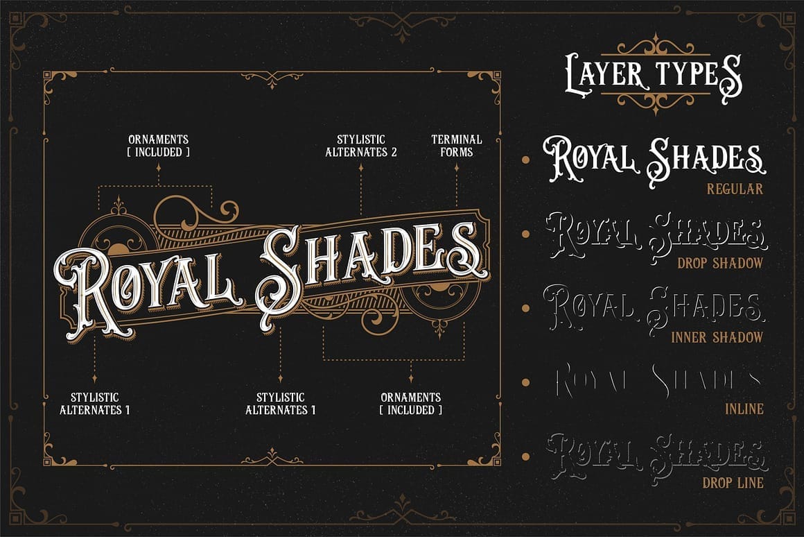
Key Characteristics of Victorian Fonts
Victorian fonts are instantly recognizable thanks to their bold, expressive, and highly decorative nature. Below are the core characteristics that define Victorian-era typography and make it so appealing for vintage-inspired design projects today:
Ornate and Decorative Details
Victorian fonts often feature embellishments, flourishes, shadows, outlines, or engraved effects designed to grab attention.High Contrast Strokes
Dramatic differences between thick and thin strokes create a bold, theatrical look that feels luxurious and historic.Decorative Serifs and Slab Serifs
Many Victorian fonts use exaggerated serifs or heavy slab serifs, adding weight, structure, and visual authority.Influence of Wood Type and Engraving
Inspired by 19th-century printing techniques, these fonts often reflect hand-carved wood type or engraved lettering.Bold, Display-Oriented Design
Victorian fonts are meant for headlines, logos, and posters—not long body text—making them perfect display typefaces.Vintage and Antique Aesthetic
Their overall look evokes old posters, circus signage, book covers, and classic advertisements from the Victorian era.Strong Vertical Emphasis
Tall letterforms and upright proportions give Victorian fonts a commanding, authoritative presence.Highly Expressive Personality
Each font feels unique and character-driven, helping brands stand out with a sense of history and storytelling.
These defining traits are what make Victorian fonts such a powerful choice for logos, posters, packaging, and branding that aim to feel classic, dramatic, and timeless.
16 Victorian Fonts for Logos, Posters, and Branding
In this section, we’ve curated 16 Victorian fonts that capture the essence of Victorian-era typography while remaining practical for today’s creative work. Each font on this list was selected for its authentic vintage character, visual impact, and versatility across logos, posters, packaging, and branding materials. You’ll find a mix of classic ornamental styles, bold wood-type inspired fonts, and refined serif designs—ranging from subtle elegance to eye-catching extravagance.
Style & personality
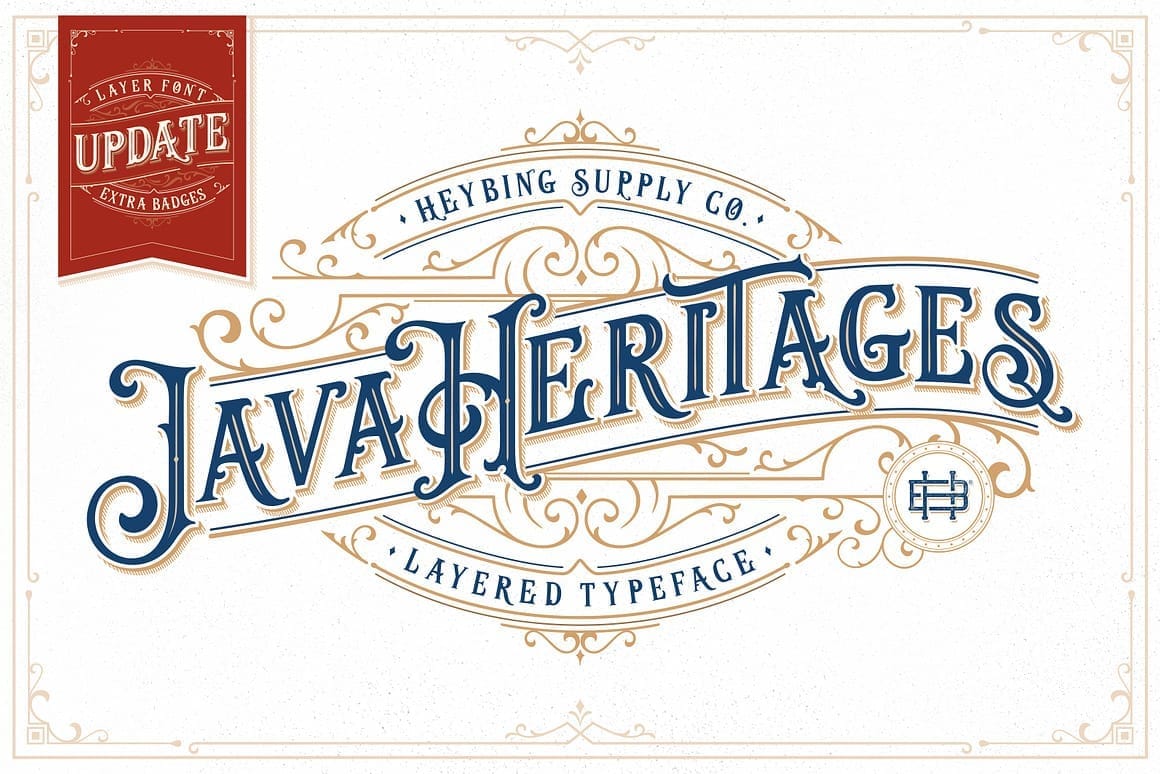
Java Heritages is a richly detailed Victorian-style typeface that channels the elegance of 19th-century signage and handcrafted lettering. With its ornate serifs, flowing curves, and decorative terminals, this font instantly feels historic yet refined. The layered construction—featuring outlines, shadows, and inline styles—adds depth and dimension, making it ideal for bold, eye-catching typography.
Best Use Cases
This font shines in logos, posters, packaging, badges, and heritage branding, especially for industries like coffee brands, barbershops, breweries, fashion labels, and luxury goods. Its classic Victorian personality communicates craftsmanship, tradition, and premium quality at a glance.
Why it feels Victorian:
Java Heritages draws heavily from engraved lettering and ornamental wood type, complete with flourishes and vintage embellishments that were popular in Victorian-era print design.
Use Java Heritages for headlines or logo marks, and pair it with a clean sans-serif or simple serif font for body text to keep your design balanced and readable.
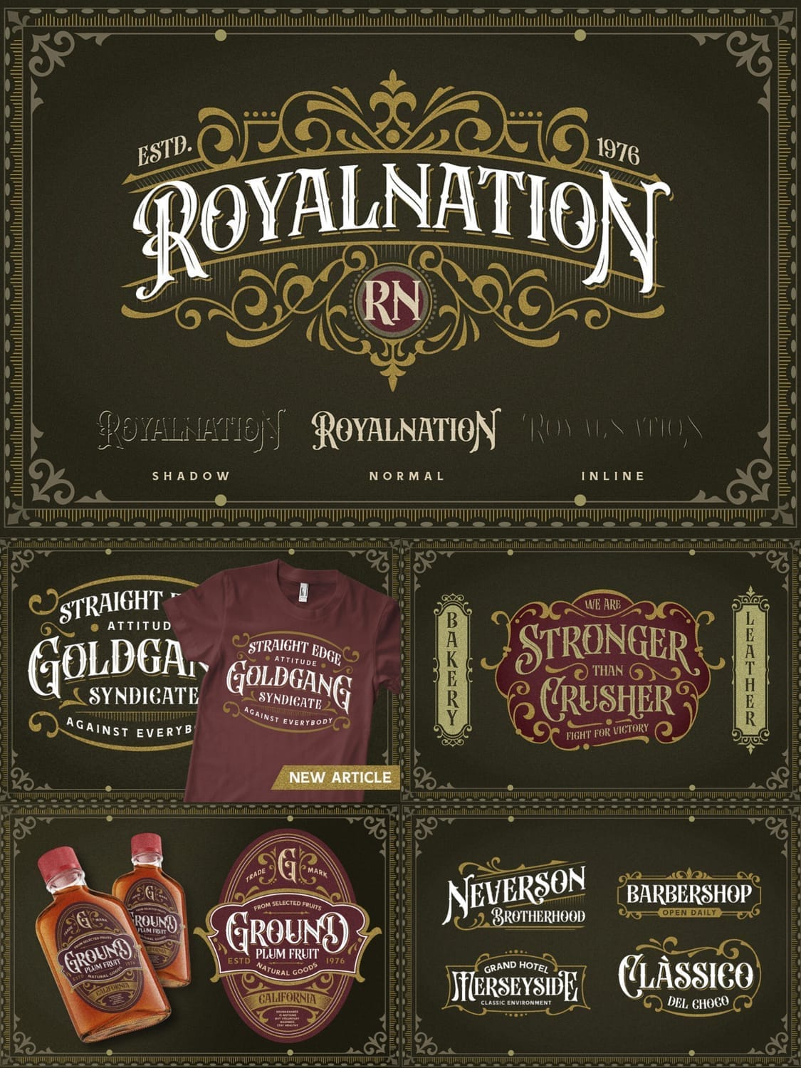
2. Everlines
Style & personality
Everlines is a classic Victorian typeface that blends ornamental elegance with romantic charm. Featuring decorative swashes, curved serifs, and beautifully balanced letterforms, this font feels straight out of 19th-century posters, wedding announcements, and theatrical playbills. Its graceful details give it a refined yet expressive personality, making it ideal for designs that need both sophistication and visual flair.
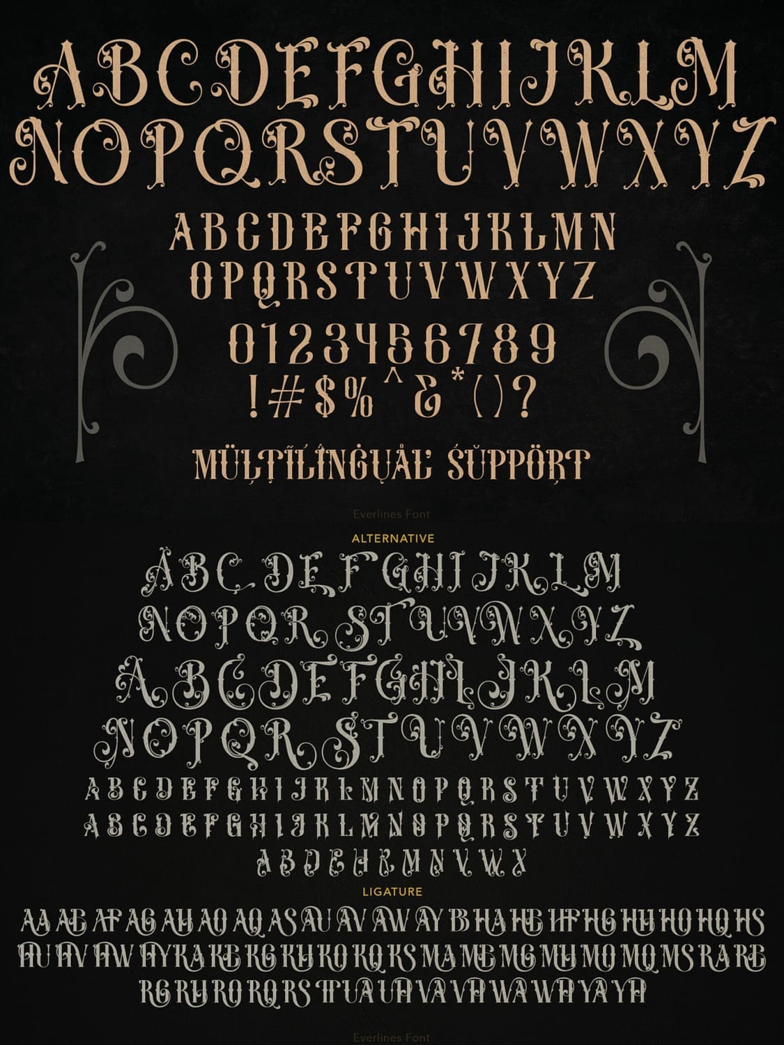
Best Use Cases
This font works exceptionally well for wedding branding, event posters, book covers, vintage packaging, logos, and editorial headlines. Creative industries such as fashion, publishing, hospitality, and artisan brands can use Everline to convey nostalgia, craftsmanship, and timeless elegance.
Why it feels Victorian:
Everlines draws inspiration from engraved display lettering and decorative Victorian typography, complete with ornamental curves and dramatic contrasts that were popular in historical print design.
Use Everlines for titles, names, or short phrases, and keep supporting text minimal to let its decorative details shine without overwhelming the layout.
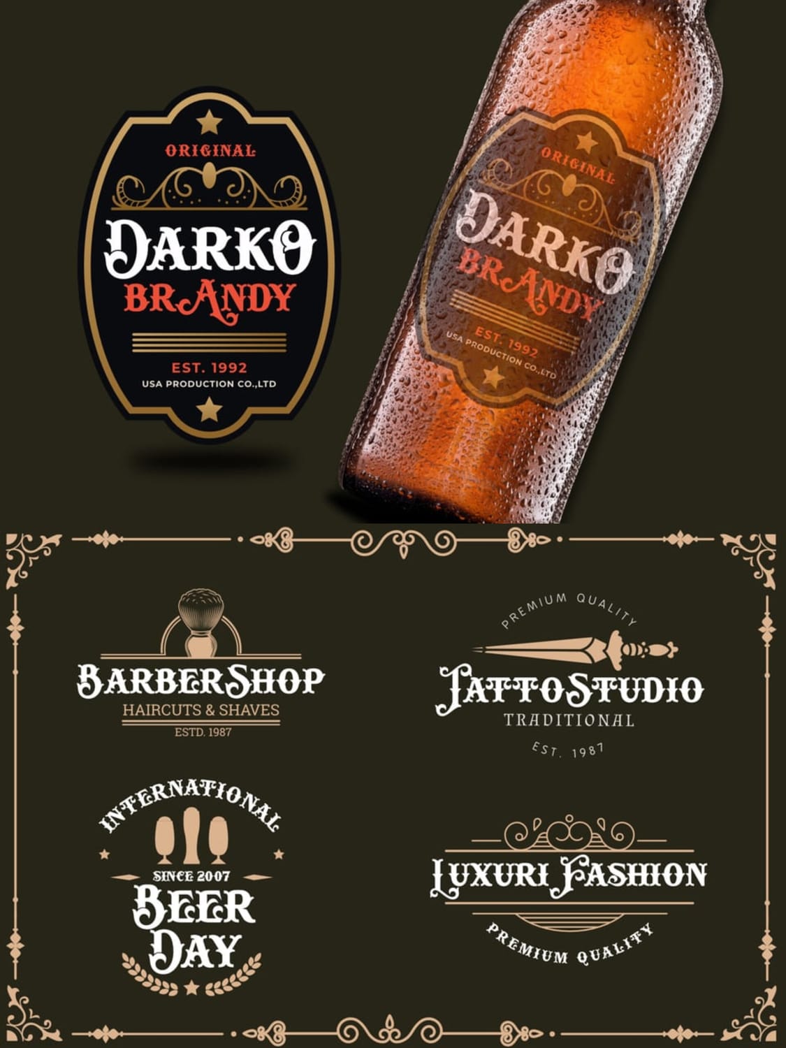
3. Beardsons
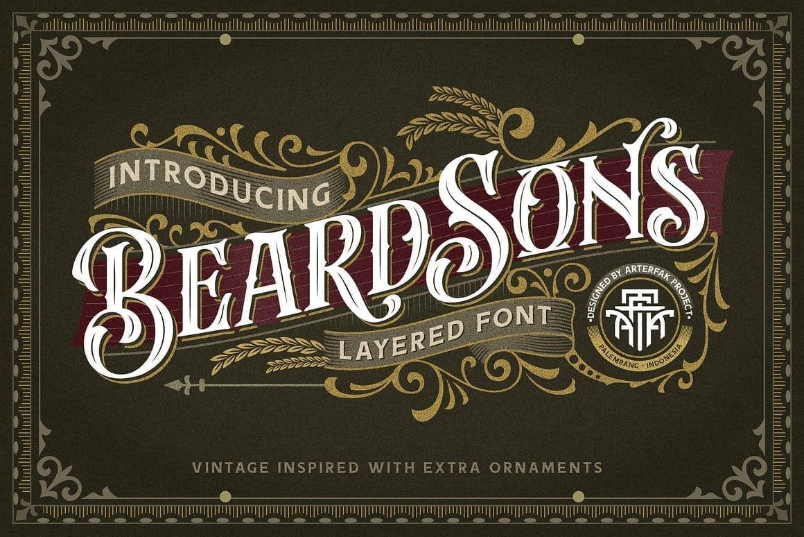
Style & personality
Beardsons is a bold, layered Victorian font designed to make logos and branding instantly memorable. With its thick letterforms, decorative serifs, and rich ornamental details, this typeface feels heavily inspired by classic 19th-century signage, vintage packaging, and barbershop branding. The layered construction adds depth and texture, giving designs a premium, handcrafted look.
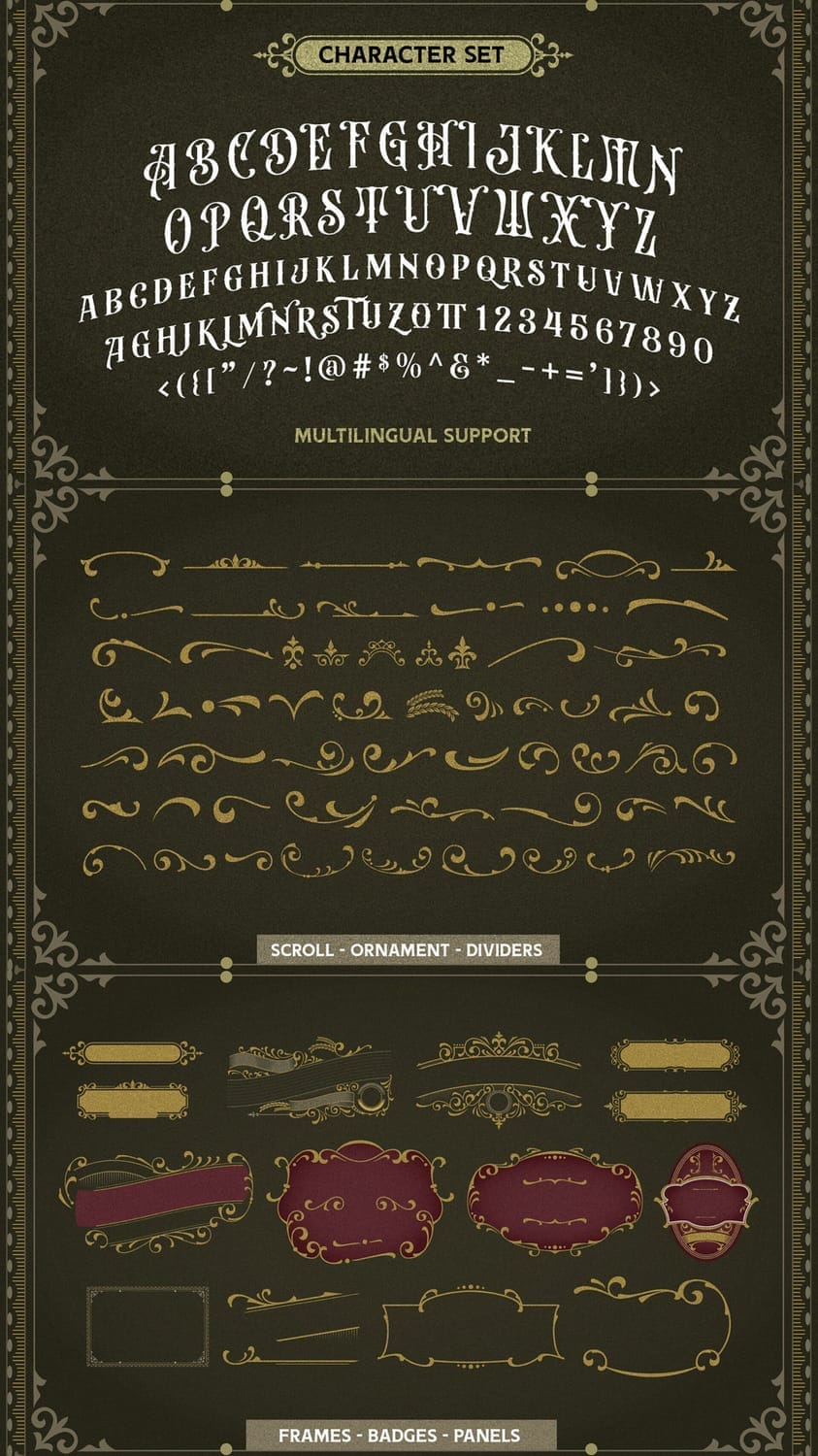
Best Use Cases
This font is an excellent choice for logos, product packaging, labels, badges, posters, and apparel designs. It works particularly well for industries such as barbershops, breweries, coffee brands, restaurants, streetwear, and heritage-style businesses that want a strong, masculine, vintage identity.
Why it feels Victorian:
Beardsons takes cues from Victorian-era wood type and engraved lettering, combining ornamental frames, curved terminals, and dramatic contrast that were common in historical branding and advertising.
Use Beardsons as a primary display font for logos or headlines, and keep backgrounds simple so the layered details and ornaments remain crisp and readable.
4. Barthez
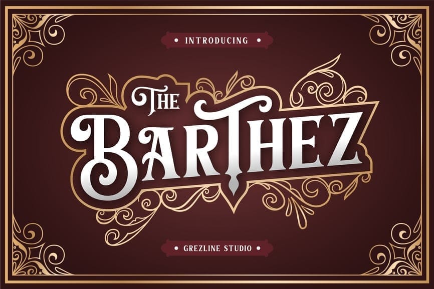
Style & personality
Barthez is a richly ornamented Victorian display font that blends classic serif structure with elegant decorative flourishes. Its letterforms feel bold yet refined, with smooth curves, vintage-inspired terminals, and subtle embellishments that give it a timeless, premium appearance. The multiple styles—such as regular, inline, and shadow—add flexibility for layered and dimensional typography.
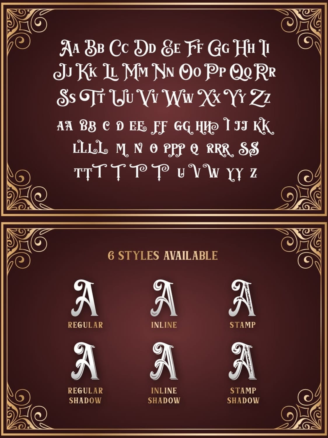
Best Use Cases
This font is particularly well-suited for logos, labels, packaging, barbershop branding, beverage labels, apparel, and vintage-themed posters. It shines in industries like hospitality, grooming, craft beverages, fashion, and heritage brands that want to project authenticity and tradition.
Why it feels Victorian:
Barthez draws from Victorian-era engraved lettering and classic signage, combining ornamental borders, dramatic contrast, and structured serifs typical of 19th-century typography.
Use Barthez for logo wordmarks or product names, and pair it with minimal layouts or modern sans-serifs to balance its decorative richness.
Style & personality
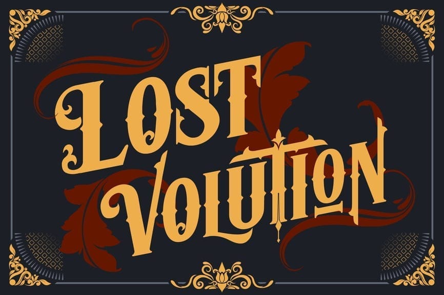
Evolution is a bold Victorian display font with a dramatic, story-driven presence. Its curved serifs, stylized terminals, and decorative flourishes give it a theatrical feel reminiscent of 19th-century posters, book titles, and historical signage. The font includes multiple alternates, allowing designers to create expressive wordmarks that feel handcrafted and unique.
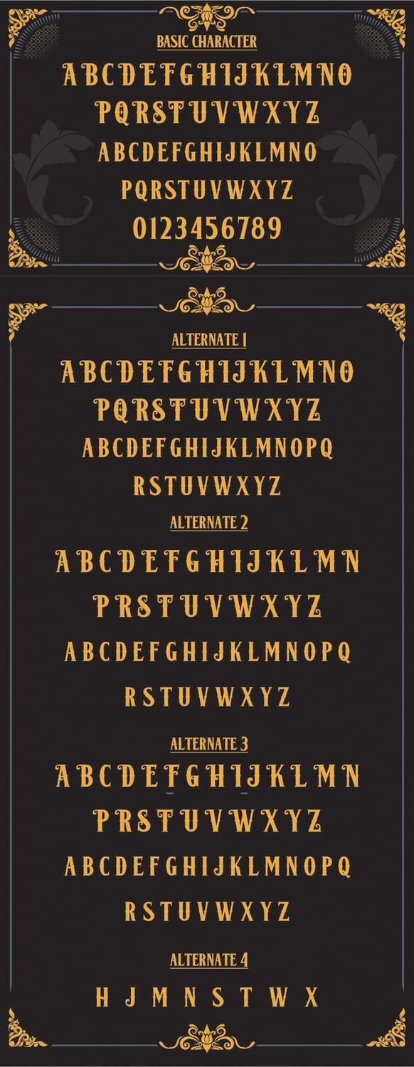
Best Use Cases
This typeface is ideal for poster design, book covers, album artwork, event branding, logos, and editorial headlines. It’s especially effective in creative sectors such as publishing, music, film, fashion, and heritage-inspired branding, where personality and visual impact matter.
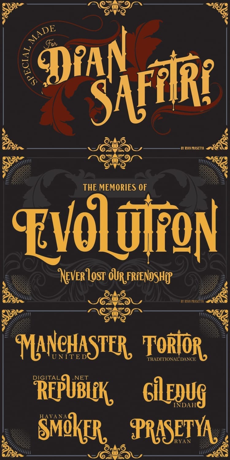
Why it feels Victorian:
Evolution draws from ornamental Victorian lettering and engraved typography, combining bold proportions with elegant curves and decorative accents typical of the era’s print culture.
Experiment with the alternate characters for custom-looking titles, but limit them to key letters to maintain clarity and balance.
6. Rumble Brave
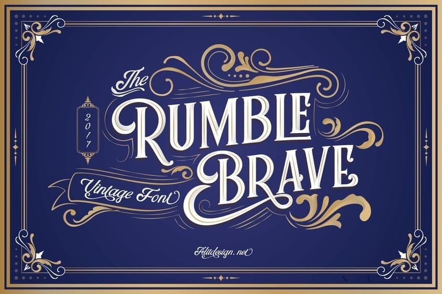
Style & personality
Rumble Brave is an elegant Victorian-inspired typeface that blends classic serif lettering with flowing ornamental swashes. Its refined curves, graceful contrast, and decorative flourishes give it a romantic, storybook quality while still feeling bold enough for statement typography. With a full set of alternates, ligatures, and ornaments, this font offers excellent creative flexibility.
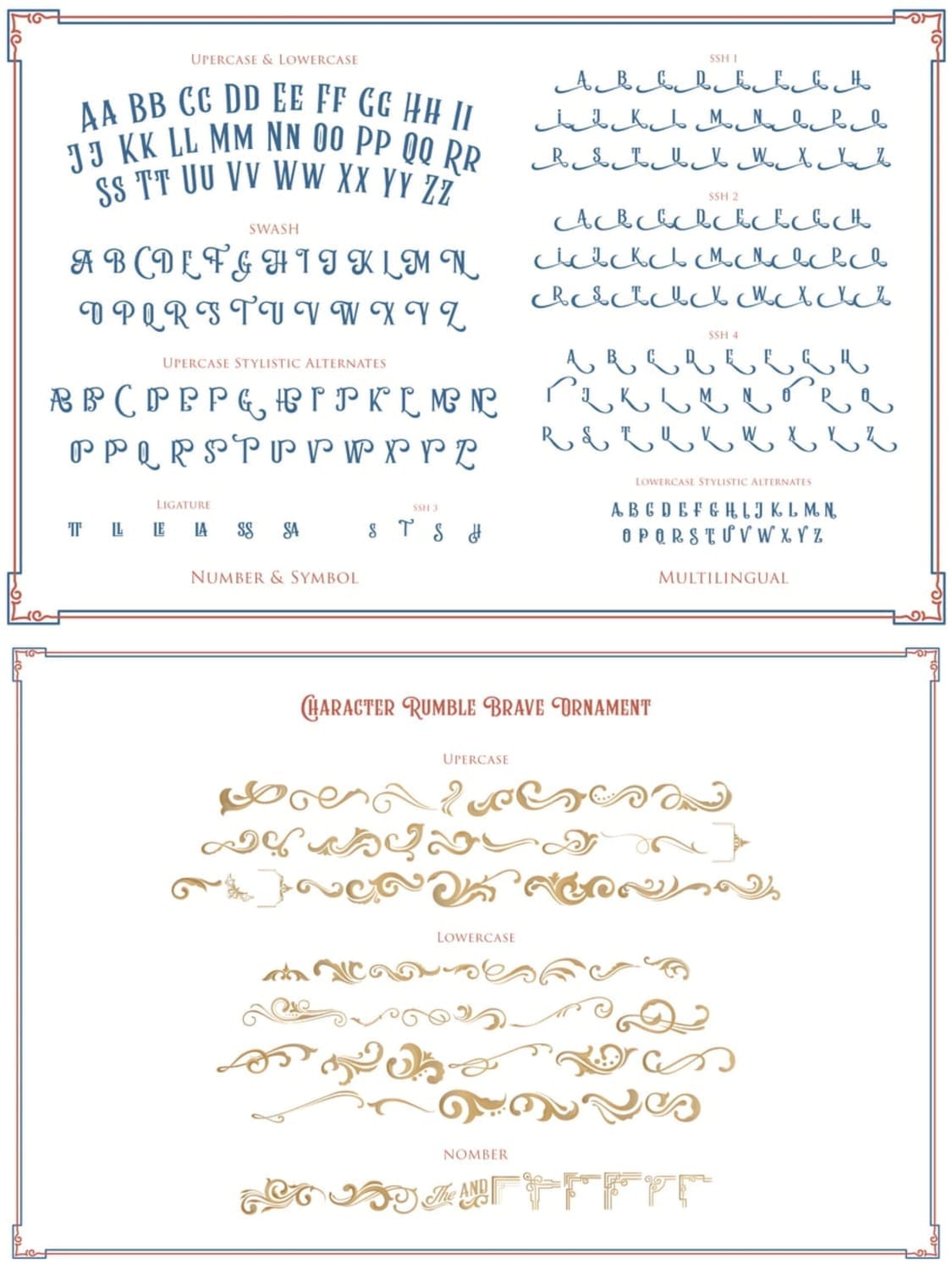
Best Use Cases
This font is ideal for logos, wedding branding, invitations, posters, book covers, premium packaging, and editorial headlines. It’s especially well-suited for luxury brands, event designers, publishers, and vintage-themed businesses that want a softer, more elegant take on Victorian typography.
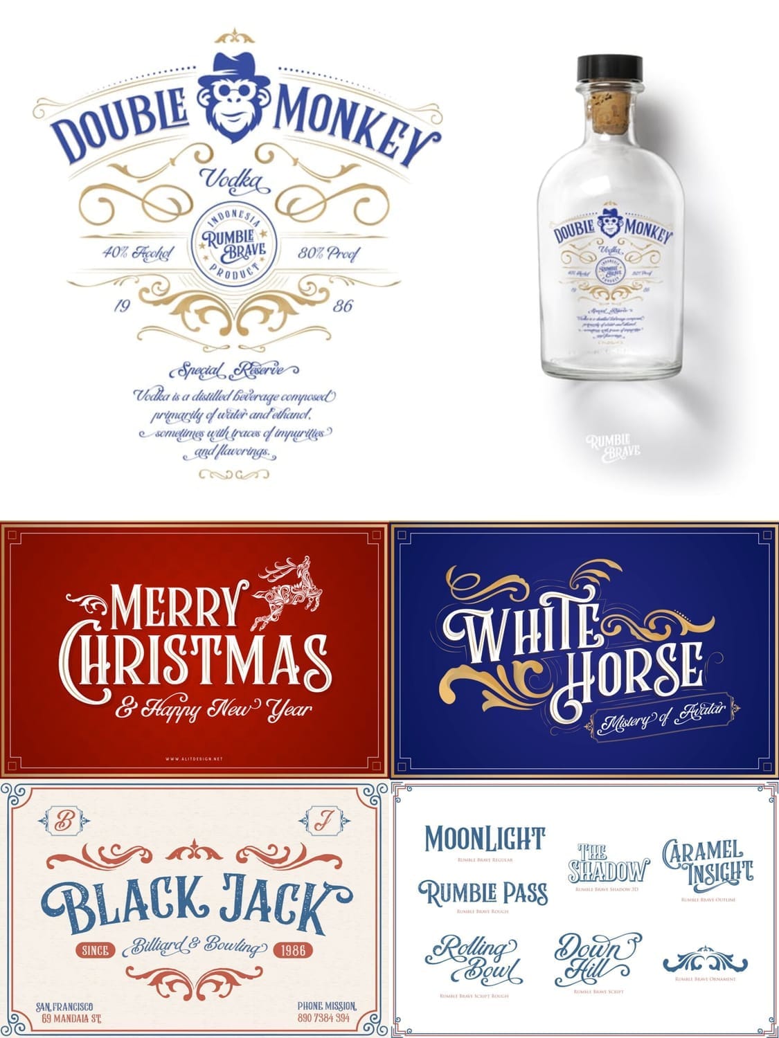
Why it feels Victorian:
Rumble Brave draws inspiration from 19th-century ornamental scripts and engraved serif lettering, combining decorative borders, swashes, and classic proportions typical of Victorian-era design.
Use the ornamental swashes sparingly on key letters or words to create a custom, high-end look without sacrificing readability.
7. The Arteria
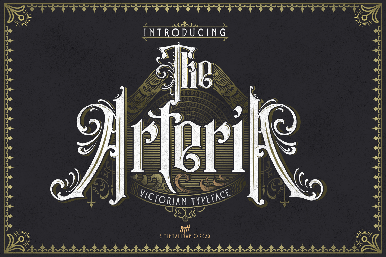
Style & personality
The Arteria is a striking Victorian typeface with a strong gothic and ornamental influence. Its tall letterforms, sharp serifs, and engraved-style details give it a dramatic, old-world presence that instantly commands attention. The decorative inlines and subtle flourishes add texture and authenticity, making the font feel deeply rooted in 19th-century print traditions.
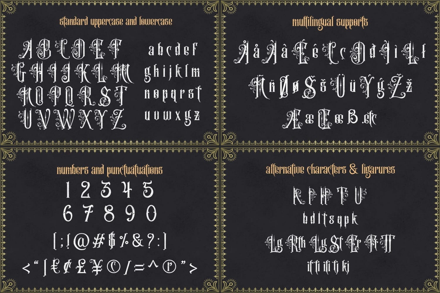
Best Use Cases
This font is best suited for posters, book covers, logos, album artwork, signage, and editorial headlines that require a bold, historic tone. It works particularly well in publishing, music, film, gaming, and heritage branding, where atmosphere and storytelling are essential.
Why it feels Victorian:
The Arteria draws inspiration from Victorian gothic lettering and engraved typography, featuring narrow proportions, ornamental strokes, and classic blackletter-adjacent forms common in the era.
Use The Arteria for short titles or focal text, and give it plenty of spacing so its intricate details remain clear and impactful.
8. Nymphaeas
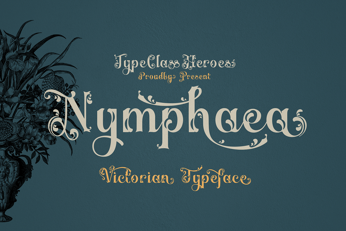
Style & personality
Nymphaeas is a beautifully romantic Victorian typeface that blends soft curves, decorative serifs, and floral-inspired details. Its letterforms feel graceful and storybook-like, evoking the charm of 19th-century literature, theater posters, and classic wedding print design. The subtle ornamentation gives it an elegant, handcrafted quality without feeling overly heavy.
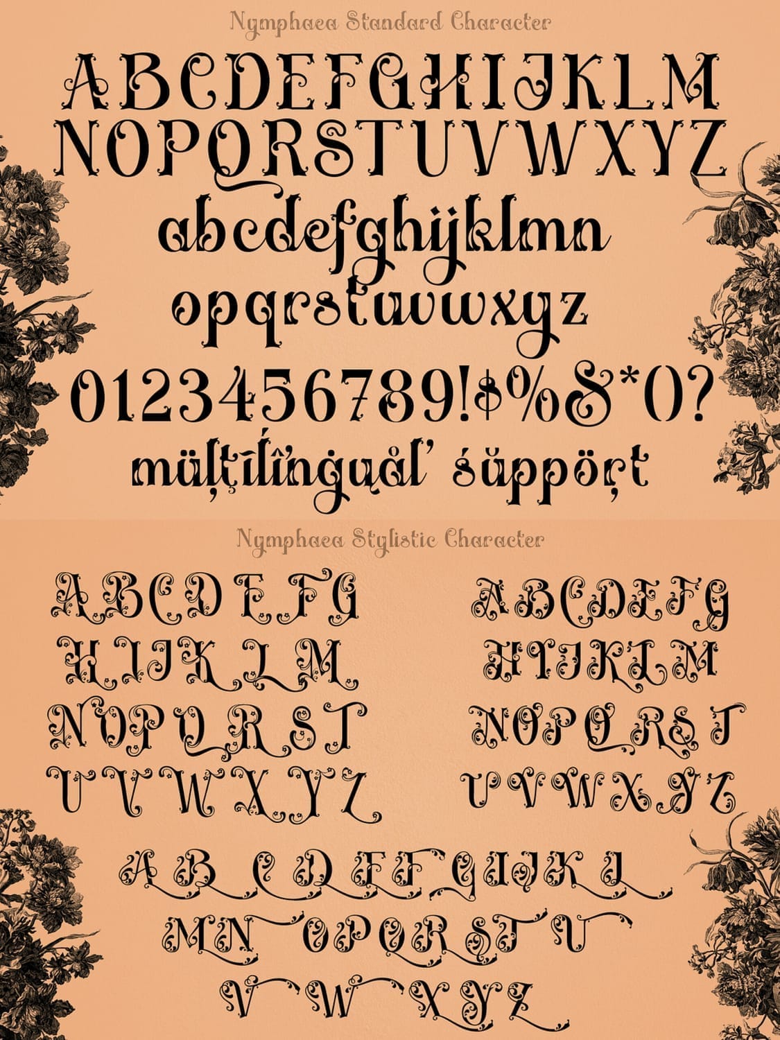
Best Use Cases
This font is an excellent choice for wedding invitations, event branding, book covers, boutique logos, theater posters, and luxury packaging. It’s especially well-suited for industries such as publishing, fashion, hospitality, and artisan brands that want to communicate elegance, nostalgia, and emotional warmth.
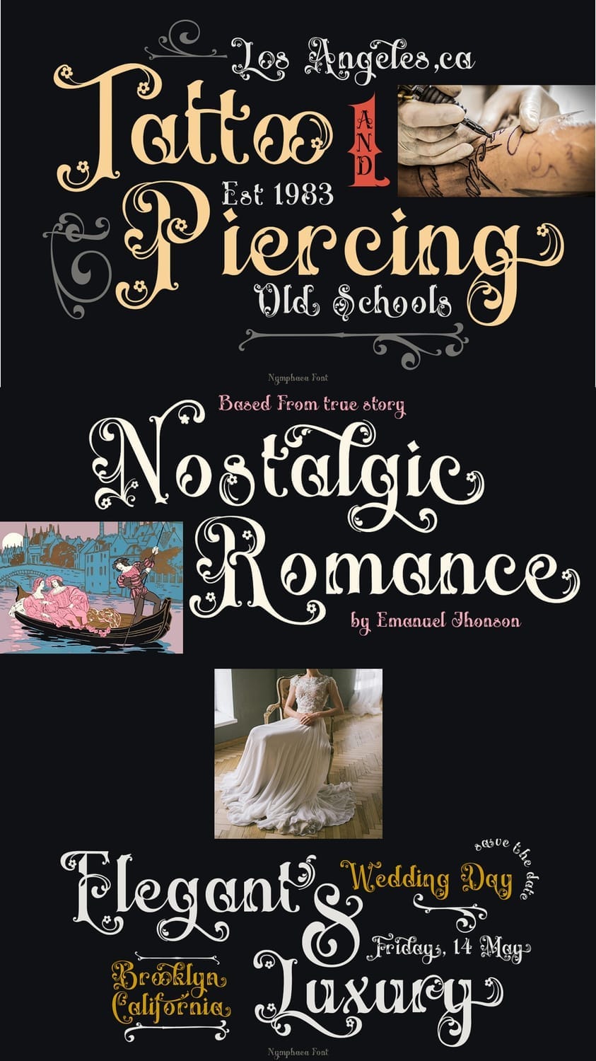
Why it feels Victorian:
Nymphaeas takes inspiration from Victorian-era decorative serif typography, incorporating organic flourishes, engraved-style strokes, and ornamental details commonly seen in historical print and book design.
Use Nymphaeas for titles, names, or short passages, and pair it with a clean serif or sans-serif for body text to maintain readability while preserving its romantic charm.
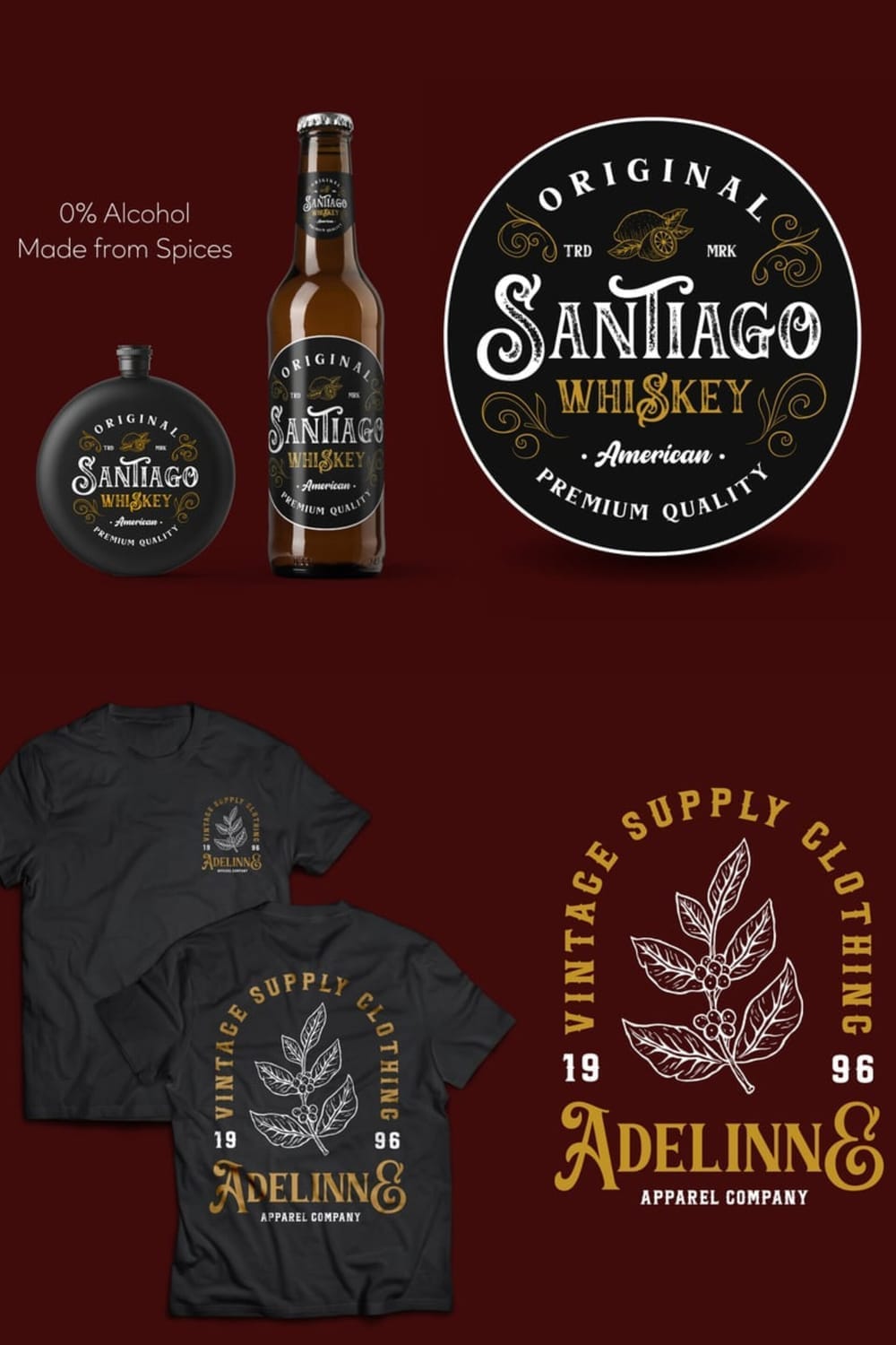
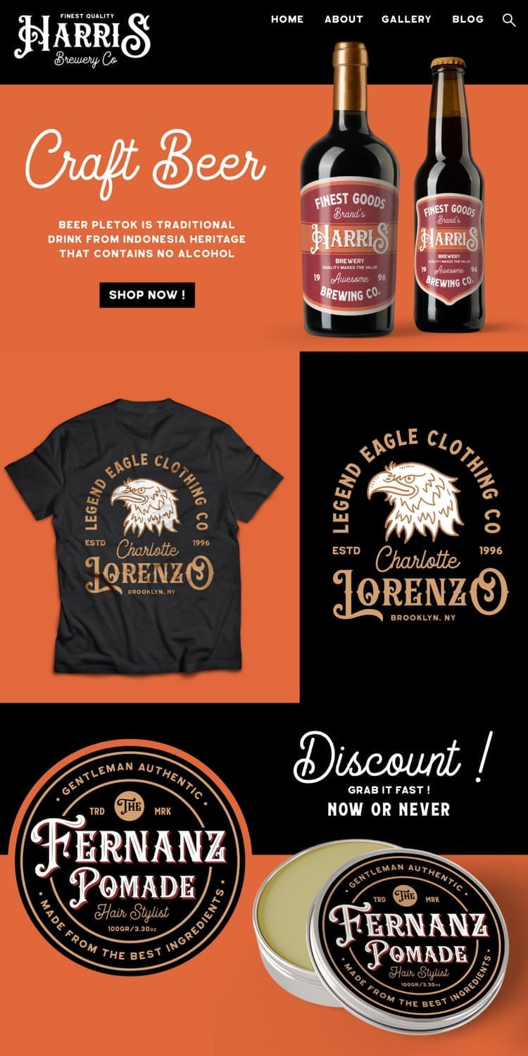
9. Geovano
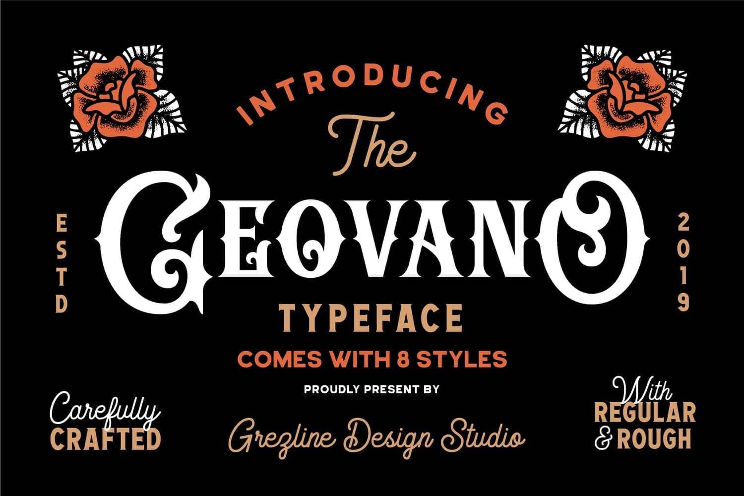
Style & personality
Geovano is a bold, handcrafted Victorian-inspired typeface built specifically for branding and logo design. With its rounded serifs, confident curves, and slightly playful proportions, it strikes a perfect balance between classic vintage charm and modern usability. The font comes in multiple styles, including regular and rough, making it versatile for both polished and rugged aesthetics.
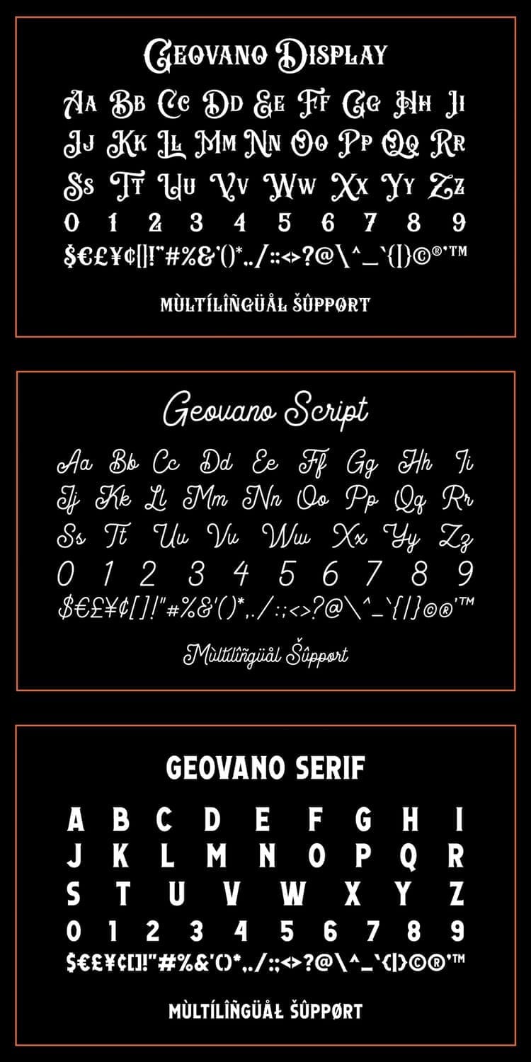
Best Use Cases
Geovano excels in logos, badges, labels, apparel graphics, barbershop branding, brewery packaging, and merchandise designs. It’s a strong fit for industries like craft beer, coffee brands, grooming, streetwear, food packaging, and heritage-style businesses that want typography with personality and authenticity.
Why it feels Victorian:
Geovano draws inspiration from Victorian-era signage and early 20th-century branding, using bold display letterforms, decorative curves, and emblem-ready construction reminiscent of vintage labels and storefronts.
Use Geovano’s rough style for apparel or rustic packaging, and the clean version for logos or digital branding to maintain clarity across formats.
10. Fragrance
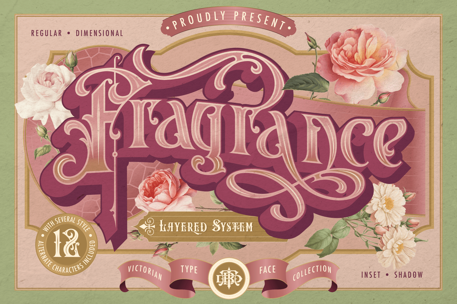
Style & personality
Fragrance is an ornate Victorian-inspired layered typeface designed for premium, decorative branding. Featuring dramatic swashes, dimensional layering, inset shadows, and multiple stylistic alternates, this font feels straight out of 19th-century perfume labels and luxury apothecary packaging.
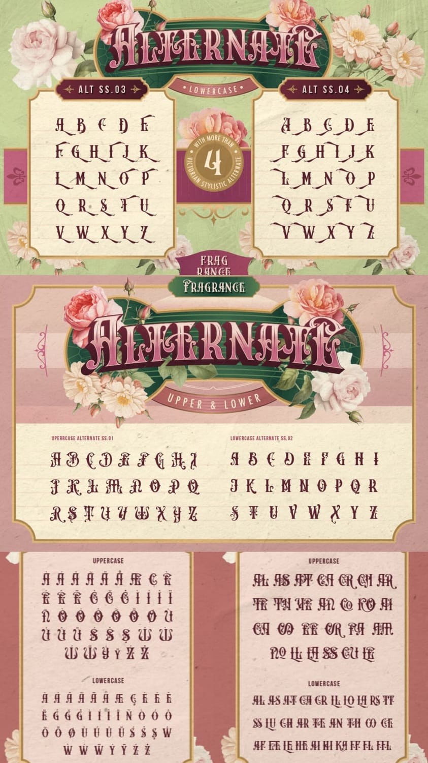
Best Use Cases
What truly sets Fragrance apart is its layered system—you can stack fills, shadows, and outlines to create rich, embossed typography that instantly commands attention. Paired with its floral ornamentation and classical letterforms, it’s ideal for perfume branding, wine & spirits labels, luxury cosmetics, wedding stationery, boutique logos, and editorial headlines.
Why it feels Victorian:
Fragrance borrows heavily from Victorian display typography, combining ornamental curves, high-contrast strokes, decorative terminals, and signage-style composition commonly found in historical product labels.
Use Fragrance at large sizes and pair it with a restrained serif or grotesk sans-serif for body text—this keeps the design elegant without overwhelming the viewer.
11. Rantser
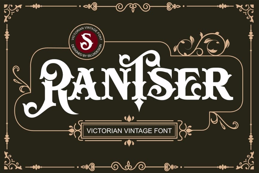
Style & personality
Rantser is an ornate Victorian display serif with dramatic curves, flared terminals, and engraved-style details. It feels bold yet elegant, combining theatrical flair with old-world craftsmanship.
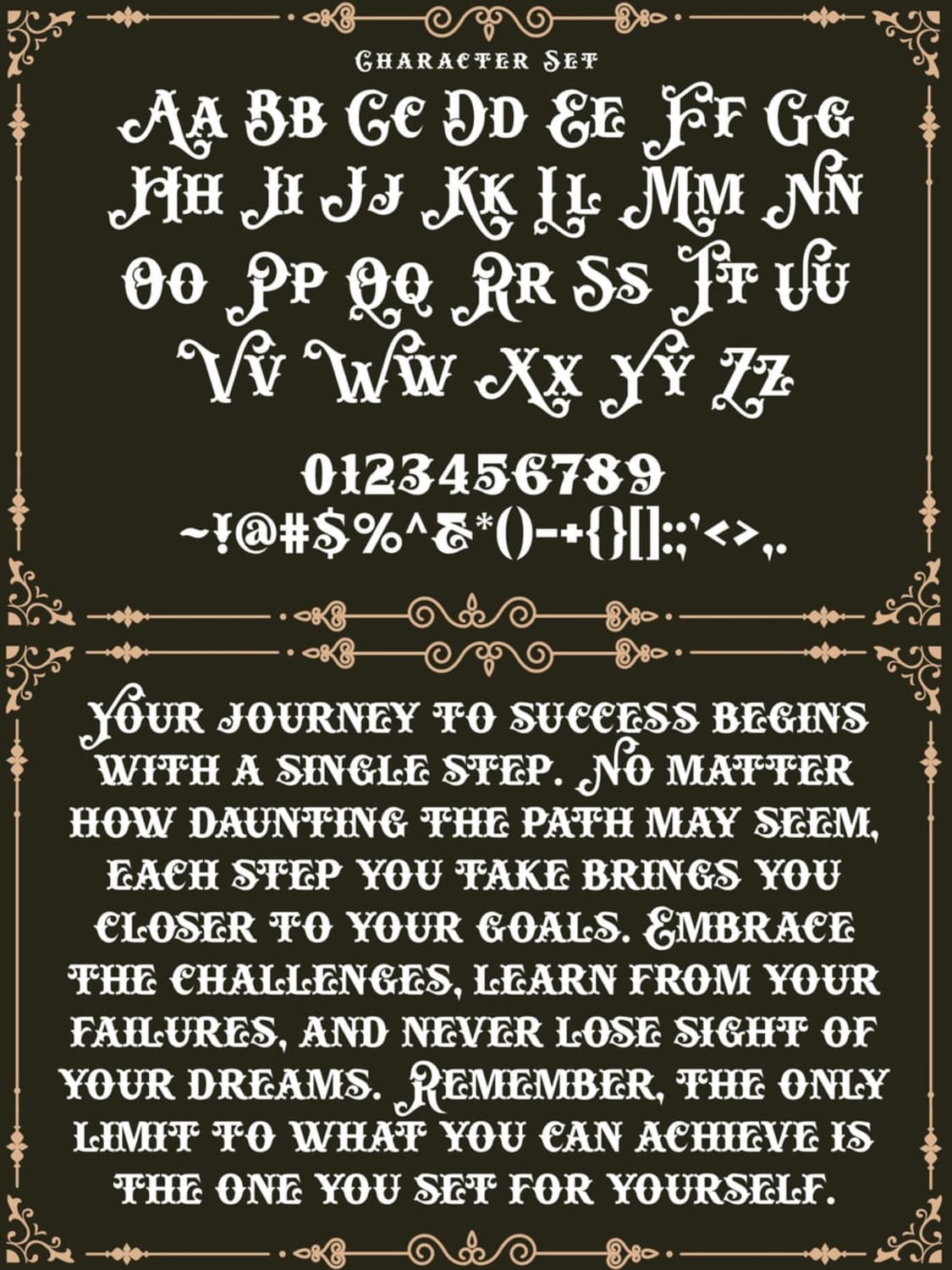
Best Use Cases
Vintage and heritage logos
Whiskey, coffee, or craft beer packaging
Barber shops, tattoo studios, and classic signage
Posters, labels, and brand headlines that need strong character
Why it feels Victorian:
Rantser draws heavily from 19th-century typography, especially hand-engraved signage and letterpress styles. The high contrast strokes, decorative serifs, and symmetrical flourishes echo the visual richness of the Victorian era—an age obsessed with detail, ornamentation, and prestige.
Use Rantser sparingly for headlines or logos and pair it with a clean sans-serif or simple serif for body text. This contrast keeps your design readable while letting the vintage personality shine without feeling overwhelming.
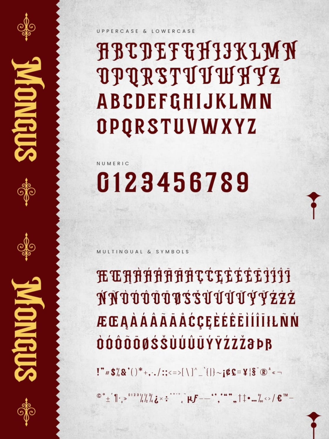
12. Mongus
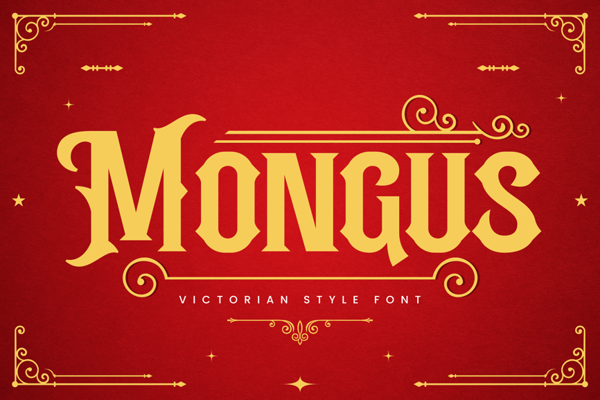
Style & personality
Mongus is a bold Victorian display serif with engraved and slightly gothic influences. Its sharp serifs, compact proportions, and confident vertical strokes give it a noble, authoritative, and luxurious personality.
Best Use Cases
Vintage or Victorian-style logos
Luxury branding and packaging
Book covers, posters, and editorial headlines
Historical themes, fashion labels, and classic signage
Why it feels Victorian:
Mongus reflects classic 19th-century typography through its strong slab-like serifs, ornamental framing, and formal letter construction. The structured forms and decorative accents echo Victorian-era print culture, where typography conveyed elegance, status, and craftsmanship.
Mongus works best in uppercase for headlines and short phrases. Pair it with a restrained serif or neutral sans-serif to balance its decorative strength and maintain a modern, polished look.
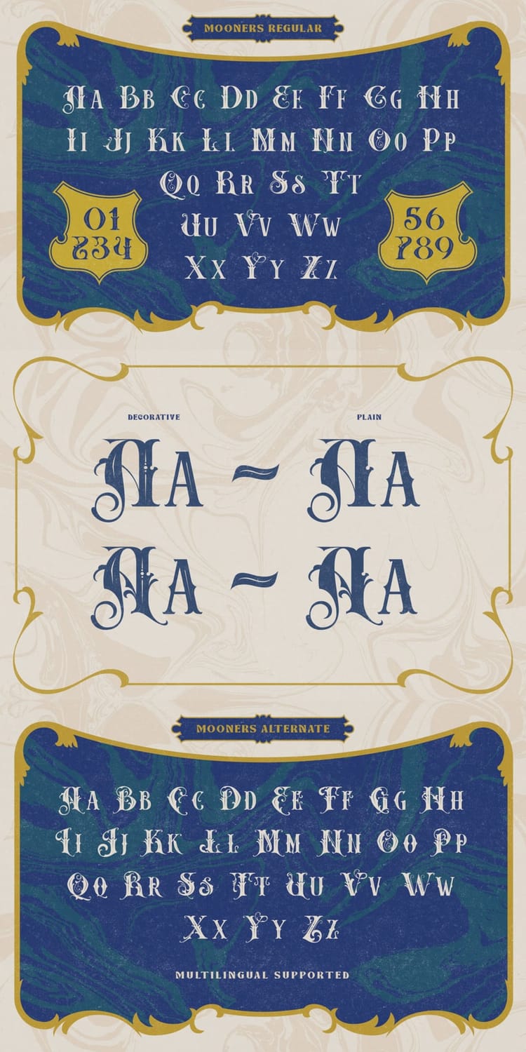
13. Mooners
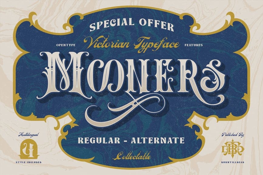
Style & personality
Mooners is an elegant Victorian display serif with ornate swashes and refined alternates. It blends decorative flourishes with readable letterforms, giving it a romantic, collectible, and slightly theatrical personality.
Best Use Cases
Vintage logos and heritage branding
Posters, signage, and editorial headlines
Packaging for artisan or premium products
Wedding stationery, invitations, and labels
Why it feels Victorian:
Mooners captures Victorian-era typography through its high-contrast strokes, ornamental curves, and classic serif structures. The availability of decorative and plain alternates mirrors 19th-century type found in advertisements, playbills, and product labels, where elegance and embellishment were key.
Use the decorative alternates sparingly for initials or key words, then switch to the regular style for the rest of the text. This keeps the design authentic and expressive without overwhelming modern layouts.
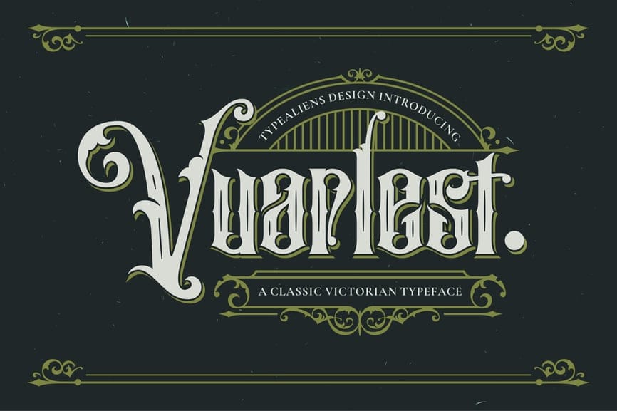
Style & personality
Vuarlest is a classic Victorian display serif with ornate terminals, sharp vertical stress, and decorative details. Its personality feels dramatic, authoritative, and slightly gothic—perfect for designs that want to feel historic and prestigious.
Best Use Cases
Vintage and heritage logos
Posters, book covers, and theatrical titles
Branding for barbershops, pubs, or craft brands
Certificates, labels, and old-world packaging
Why it feels Victorian:
This typeface channels true Victorian-era typography through its engraved-style letterforms, high contrast strokes, and ornamental flourishes. The embellished capitals and narrow proportions echo 19th-century printing, signage, and classical book typography.
Use Vuarrest mainly for headlines or logo marks, and pair it with a simple serif or sans-serif for body text. This contrast keeps the design readable while letting the Victorian character shine.
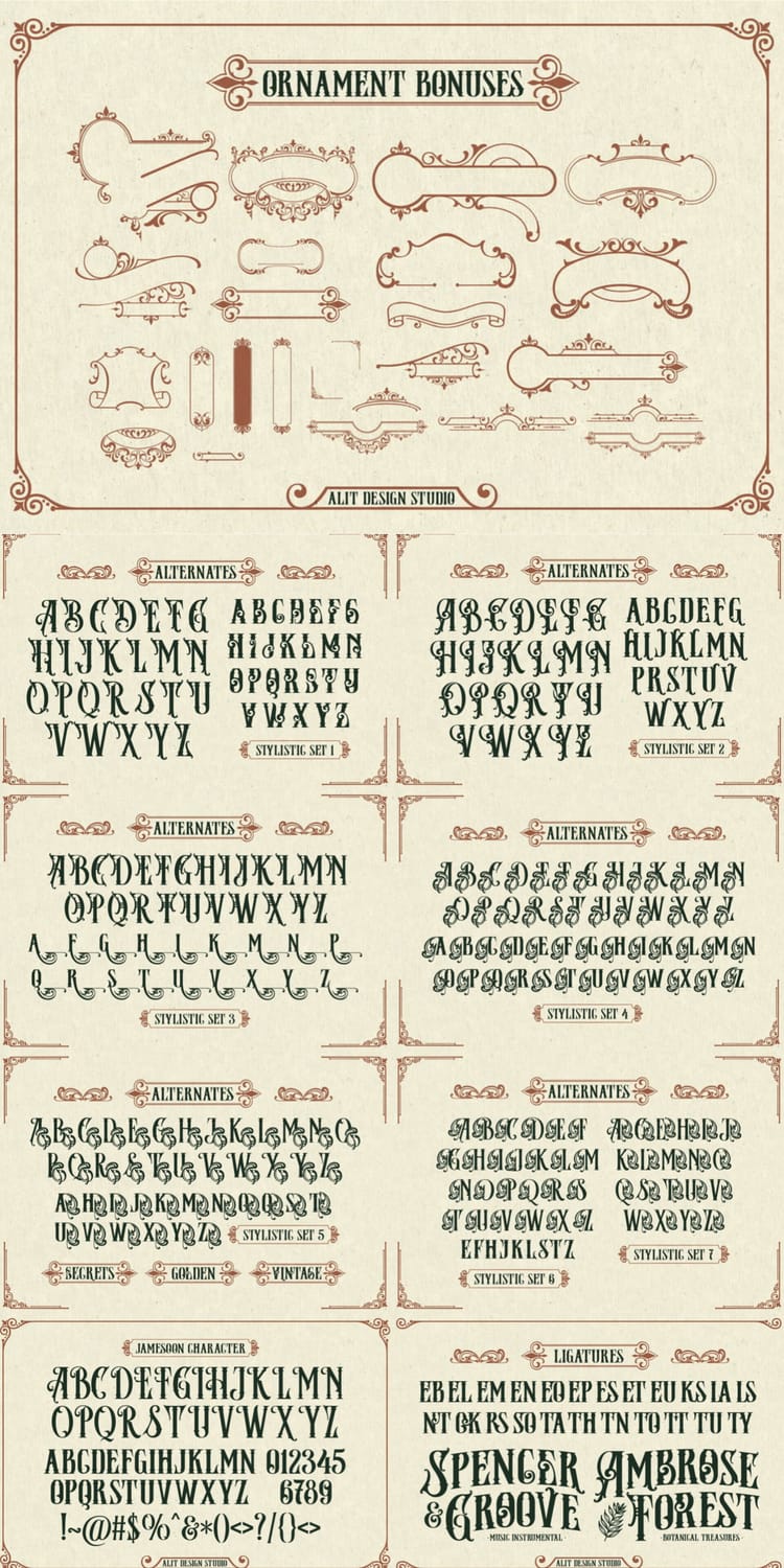
15. Jamesoon
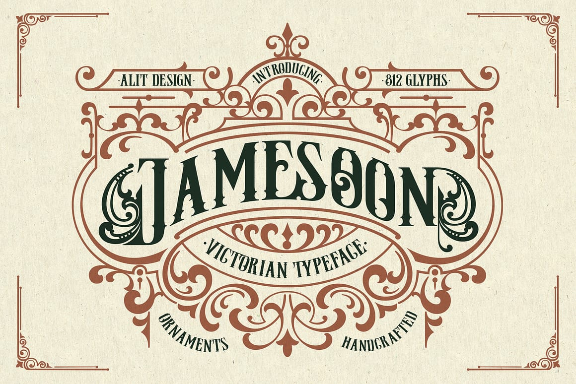
Style & personality
Jameson is an ornate Victorian display serif with strong engraved lettering and lavish decorative flourishes. Its personality feels handcrafted, premium, and theatrical—bold enough to command attention while still feeling refined and classic.
Best Use Cases
Heritage and vintage-style logos
Whiskey, rum, and craft beverage branding
Packaging, labels, and seals
Posters, signage, and historical-themed designs
Why it feels Victorian:
Jameson captures the essence of Victorian typography through its elaborate frame ornaments, high-contrast strokes, and engraved letterforms reminiscent of 19th-century posters and product labels. The ornamental symmetry and handcrafted details reflect the era’s obsession with craftsmanship and visual richness.
Use Jameson for logo marks, badges, or headline text rather than long paragraphs. Pair it with a clean serif or understated sans-serif to keep modern layouts balanced while preserving its vintage charm.
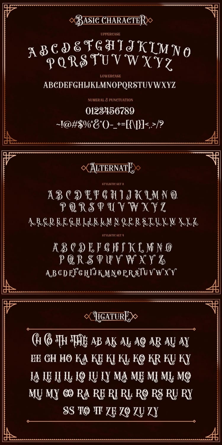
16. Herobeam
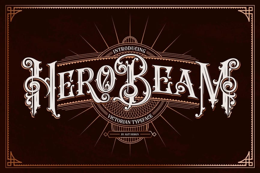
Style & personality
Herobeam is an ornate Victorian display serif with engraved detailing, decorative terminals, and dramatic ligatures. Its personality is bold, theatrical, and authoritative—perfect for designs that need a strong historical presence and visual impact.
Best Use Cases
Vintage and heritage-style logos
Posters and event headlines
Branding for barbershops, breweries, and craft brands
Packaging, labels, and badge-style designs
Why it feels Victorian:
Herobeam draws heavily from 19th-century engraved typography, featuring high-contrast strokes, ornamental letterforms, and elaborate ligatures typical of Victorian posters and signage. The symmetrical framing elements and decorative alternates echo the era’s love for grandeur, craftsmanship, and storytelling through type.
Activate ligatures and stylistic alternates selectively for key letters in logos or headlines. This keeps the design expressive and authentic without overwhelming the composition in modern layouts.
17. Auskane
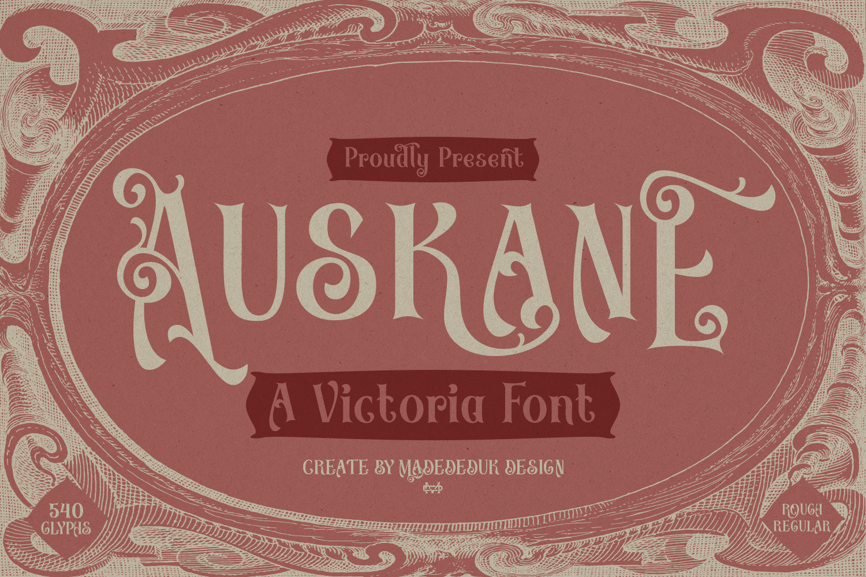
Style & personality
Auskane is a decorative Victorian display font with flowing swashes, curled terminals, and elegant ornamental details. Its personality feels graceful, romantic, and highly expressive—perfect for designs that want a soft yet sophisticated vintage aesthetic.
Best Use Cases
Luxury packaging and beauty product branding
Vintage-style logos and badges
Wedding invitations and stationery
Posters, labels, and boutique brand identities
Why it feels Victorian:
Auskane captures the spirit of Victorian typography through its ornate swirls, delicate curves, and decorative ligatures. These flourished details mirror the elaborate lettering styles commonly used in 19th-century advertisements, invitations, and ornamental print designs where craftsmanship and elegance were central.
Use Auskane for short phrases, titles, or initials to highlight its beautiful swashes. Pair it with a clean serif or minimalist sans-serif to maintain readability while letting the decorative Victorian charm stand out.
V. How to Use Victorian Fonts in Modern Design
Victorian fonts are rich, expressive, and full of character—but using them effectively in modern design is all about balance. When done right, they feel intentional and premium, not outdated.
1. Pair Victorian Fonts with Clean Modern Typefaces
Victorian fonts shine as display or headline fonts. Pair them with:
Sans-serifs like Montserrat, Inter, or Poppins for body text
Simple serifs like Playfair Display for supporting copy
This contrast keeps layouts readable and contemporary.
2. Use Them for Impact, Not Everything
Victorian typography works best when it’s used sparingly:
Headlines
Logos
Short phrases
Badges or seals
Avoid long paragraphs—it dilutes their visual power and hurts readability.
3. Simplify the Color Palette
Let the font do the heavy lifting. Stick to:
Black, cream, gold, burgundy, forest green
Flat backgrounds or subtle textures
Too many colors + ornate type = visual overload.
4. Leverage OpenType Features
Most premium Victorian fonts include:
Ligatures
Stylistic alternates
Swashes
Use them selectively for initials or focal letters to elevate the design without making it chaotic.
5. Blend Vintage with Modern Layouts
Try Victorian fonts inside:
Minimal grid layouts
Clean packaging designs
Modern UI hero sections
This contrast creates a timeless-meets-modern aesthetic that feels fresh and intentional.
VI. Free vs Premium Victorian Fonts
Not all Victorian fonts are created equal. Here’s how free and premium options compare:
Free Victorian Fonts
Pros
Good for personal projects and mockups
Easy to access
Useful for experimentation
Cons
Limited glyphs and alternates
Often lack multilingual support
Licensing may restrict commercial use
Less refined details
Best for: Practice designs, personal posters, concept work.
Premium Victorian Fonts
Pros
Extensive glyph sets and ligatures
OpenType features (stylistic sets, alternates)
Professional kerning and spacing
Commercial-use licensing
Higher craftsmanship and historical accuracy
Cons
Paid investment
Best for: Branding, logos, packaging, client work, print-on-demand products.
If Victorian typography is central to your brand or product, premium fonts almost always pay for themselves in quality and credibility.
VII. FAQs About Victorian Fonts
Victorian fonts are typefaces inspired by 19th-century typography, characterized by ornate details, decorative serifs, engraved strokes, and dramatic contrast.
Yes. Victorian fonts are widely used in modern branding, packaging, logos, and posters—especially for vintage, luxury, gothic, and heritage-style designs.
Fashion and luxury brands
Barbershops and tattoo studios
Breweries and coffee brands
Book covers and posters
Event and theatrical branding
Absolutely. Victorian fonts are excellent for logos, especially when you want a classic, bold, or nostalgic identity. Just pair them with simpler fonts for balance.
They can be if overused. Victorian fonts are best for headlines and short text, not long paragraphs or UI-heavy designs.
You can find premium Victorian fonts on marketplaces like Creative Fabrica, Graphic River, Envato Elements, and specialized type foundries. Free options exist, but always check licensing.
Victorian fonts are decorative and ornamental, while Gothic fonts (like Blackletter) are heavier, more angular, and rooted in medieval typography.
VIII. Conclusion: Bring Timeless Elegance to Your Designs
Victorian fonts offer something many modern typefaces don’t—personality, craftsmanship, and visual storytelling. From bold engraved lettering to delicate ornamental swashes, these typefaces instantly add a sense of history and sophistication to any project.
Whether you're designing:
A vintage logo 🏷️
Luxury packaging 🎁
Poster or book cover 📚
Boutique brand identity ✨
Wedding stationery 💌
Victorian fonts help create a memorable and distinctive look that stands out in today’s minimalist-heavy design landscape.
The key to using them successfully is balance:
Use them for headlines and focal points
Pair with clean modern fonts
Keep layouts simple
Leverage alternates and ligatures thoughtfully
If you're working on professional branding or products, investing in premium Victorian fonts can elevate your designs dramatically. But even free options can be powerful when used creatively.
Victorian typography isn’t just a trend—it’s a timeless design style that continues to inspire modern branding, packaging, and digital design.
👉 Choose your favorite from the list above and start experimenting. Your next vintage-inspired design might become your most eye-catching work yet.
Related articles
Disclaimer:
This article is for informational purposes only. Some links may be affiliate links, meaning Advise Graphics may earn a commission at no extra cost to you. We do not guarantee results, and readers should do their own research before making any decisions.
Tags
Subscribe
Join the Advise Graphics community and get exclusive design resources, tips, and updates delivered straight to your inbox.


Ads


Copyright
© 2025 Advise Graphics. All rights reserved.
Cop© 2025 Advise Graphics. All rights reserved.