
The Glitch & The Gloss: Mastering Y2K Design Trends in 2026


Some links in this post may be affiliate links. See our Affiliate Disclosure for details.
I. The 20-Year Rule: Why 2006 is the New 2026
Close your eyes and try to remember the specific high-pitched screech of a 56k dial-up modem. Picture the chunky, translucent plastic of an original iMac or the pixelated glow of a Tamagotchi. For a long time, we tucked those memories away in the "cringe" folder of our brains. But suddenly, as we hit 2026, the digital world is looking through a very specific, rose-tinted (or rather, iridescent-tinted) lens.
In the world of design, there’s an unwritten law called the 20-Year Rule. It’s the precise amount of time it takes for a trend to go from "cutting-edge" to "dated," and finally to "iconic nostalgia." We saw it with the 70s in the 90s, and the 90s in the 2010s. Now, the wheel has turned again. The mid-2000s—an era defined by extreme tech-optimism—has officially become the blueprint for modern cool.
The Death of "Sad Beige" Minimalism
For the last decade, we’ve lived in a world of "Corporate Minimalism." Everything was flat, matte, and—let’s be honest—a little bit sterile. We traded personality for "user-friendliness" and vibrant colors for shades of oatmeal and "slate gray."
But the vibe shift is here, and it’s loud.
Today’s creators are ditching the "less is more" philosophy for a "more is more" explosion of glitchy textures, liquid chrome, and high-gloss finishes. We aren't just looking for functional design anymore; we’re looking for energy. We want our digital spaces to feel like a futuristic rave, not a doctor’s waiting room. The Y2K aesthetic isn't just a throwback—it's a rebellion against the boring.
II. The Anatomy of the Y2K Aesthetic: Breaking Down the DNA
If Section I was about the why, this section is about the how. You can’t just slap a butterfly on a page and call it Y2K (though, honestly, it’s a good start). To truly master this look, you need to understand the three pillars that make this style instantly recognizable. It’s a mix of high-tech futurism and low-fi digital artifacts.
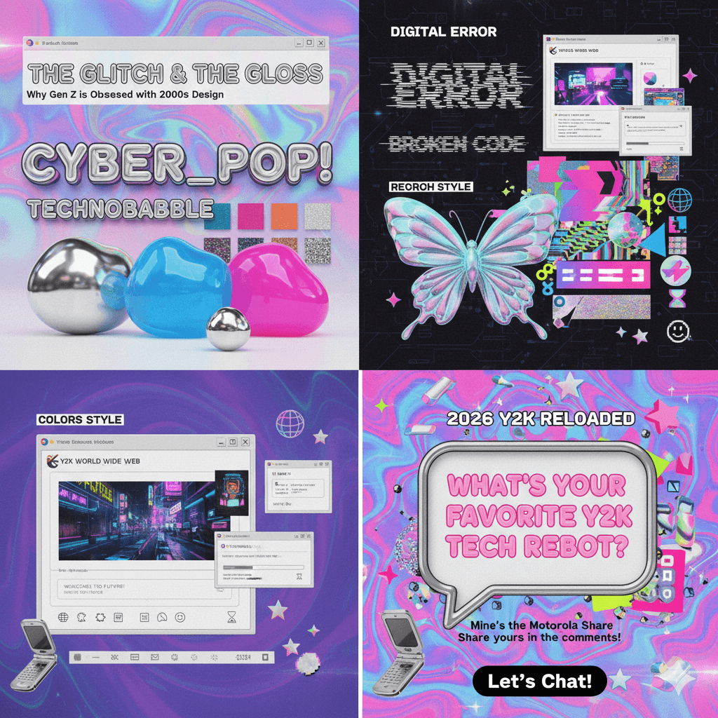
1. Colors & Textures: The "Liquid Metal" Look
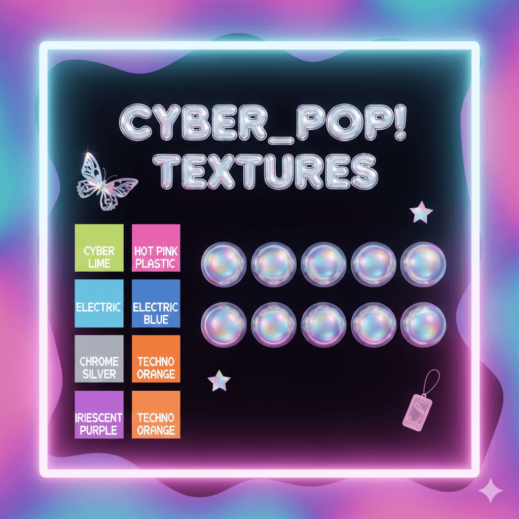
The Y2K palette isn't shy. It’s built on a foundation of high-contrast, high-saturation colors that look like they’ve been pulled straight from a 2004 music video.
The Palette: We’re talking Cyber Lime, Electric Blue, and Hot Pink Plastic. These aren't natural colors; they are "digital-first" hues designed to pop on a screen.
The Texture: The holy grail of Y2K is Chrome. We want everything to look like "liquid metal"—reflective, 3D, and slightly distorted. Combine this with iridescent overlays and holographic gradients to give your designs that "shimmering CD-ROM" effect.
2. Typography: From "Gumdrop" to "Glitch"
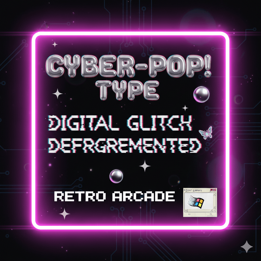
Fonts in the early 2000s were obsessed with the future. There are two main directions you can take:
The "Gumdrop" Style: Think thick, bubbly, and rounded. These fonts look like they were carved out of translucent plastic (like the "Cyber_Pop!" text on your mood board). They feel friendly, optimistic, and toy-like.
The "Digital Glitch": On the flip side, we have monospace fonts that look like computer code or VCR overlays. Distorting these fonts—stretching them, adding static, or "breaking" the letters—adds that necessary edge of "hacker" energy.
3. The "Retro UI" Interface
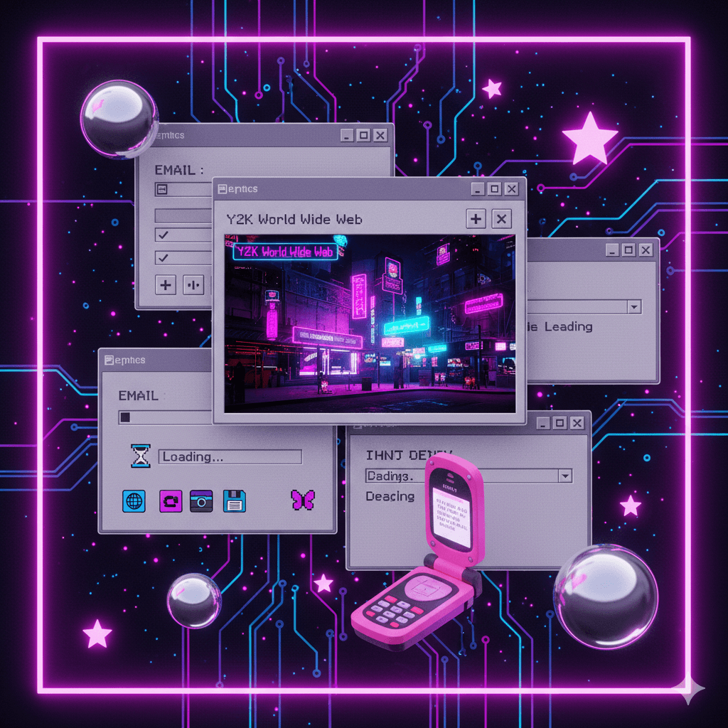
One of the coolest ways to use this style is to treat your canvas like an old operating system. Instead of a standard layout, try using:
Faux Desktop Windows: Frame your images inside "classic" grey computer windows with the minimize/maximize buttons in the corner.
Pixel Art Accents: Small, 8-bit icons (stars, hearts, or cursor arrows) add a touch of "low-fi" charm to an otherwise "high-tech" design.
Loading Bars & Hourglasses: These aren't just for waiting; they are iconic visual shorthand for the "World Wide Web" era.
III. Why is this Trend Exploding in 2026? (The Vibe Shift)
It’s not just a recycle; it’s a reclamation. As we move through 2026, the cultural landscape has shifted, making the high-gloss chaos of the early 2000s feel more relevant than ever. Here is why your blog readers are currently obsessed with this "Cyber-Pop" look.
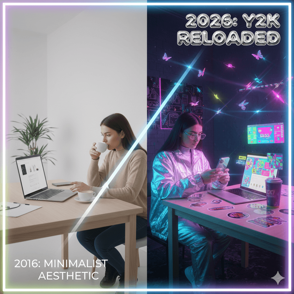
1. The Rebellion Against "Sad Beige" Minimalism
For nearly a decade, we were trapped in the "Tyranny of Minimalism." Everything was slate grey, oatmeal, and "frictionless." While that aesthetic was polished, it was also... silent. In 2026, we are collectively exhaling. The Y2K revival is a permission slip to be messy, loud, and unapologetically bold. It’s about choosing "fun" over "perfect taste."
2. Tech Optimism vs. Digital Burnout
In the early 2000s, we were excited about what computers could do. Today, we’re often overwhelmed by what they do to us (the endless scroll, the algorithms). Y2K design captures that "Pre-Optimization Paradise"—a time when the internet felt like a playground rather than a productivity trap. Using these visuals taps into that original, un-jaded "Tech Optimism."
3. The AI Irony
There is a poetic irony in 2026: we are using the most advanced AI tools to recreate the "glitchy" look of 20-year-old software. As AI-generated art becomes almost too perfect, designers are using "Y2K Reloaded" styles to add human-like errors, grainy textures, and "broken" elements back into their work. It’s a way to say, "A human (mostly) made this."
4. "Vicarious Nostalgia"
Interestingly, a huge part of this trend is driven by Gen Z and Gen Alpha—generations who weren't even around when the Motorola Razr was king. This is Vicarious Nostalgia: borrowing a memory from an era they didn't live through and remixing it. It’s not about an exact replica; it’s about a high-definition, 2026-flavored dream of the year 2000.
"We aren't just looking for nostalgia; we're looking for the future we were promised in 1999."
IV. 3 Ways to Inject Y2K into Your Content (The "How-To")
Knowing the theory is one thing, but how do you actually make your Instagram feed or blog headers look like they were pulled from a 2004 Dazed magazine? You don’t need a degree in graphic design to pull this off.
Here are three actionable "Cheat Codes" to instantly Y2K-ify your content.
1. The "Holographic Overlay" (The Shiny Factor)
The easiest way to give any flat image "depth" is to add a shimmering, oil-slick texture.
The Move: Find a high-res texture of a holographic foil or a CD-ROM reflection.
The Tech: In Canva or Photoshop, place this texture over your photo. Set the "Blending Mode" to Overlay or Screen, and drop the opacity to about 30–50%.
The Result: Your photo suddenly looks like it’s printed on a collectible trading card from the future.
2. The "Retro UI" Border (The Window Frame)
Stop using standard square crops. Instead, treat your images like they are "pop-ups" on an old operating system.
The Move: Create or download a graphic of a classic grey window frame (think Windows 95 or 98 style) with the "Minimize," "Maximize," and "Close" buttons in the top right.
The Tech: Place your photo inside the frame. For extra points, add a slight drop shadow behind the window to make it "float" off the background.
The Result: It adds an instant layer of storytelling and digital nostalgia to a basic headshot or product photo.
3. Kinetic Type (The Warped Factor)
Static text is so 2015. Y2K typography is about movement and "liquidity."
The Move: Take your headline and apply a "Warp" or "Mesh" effect.
The Tech: Stretch the middle of the word out, or give it a "wave" distortion. If you’re using video, have the text slowly pulse or "glitch" with a slight RGB split (where the red and blue edges of the letters separate).
The Result: It catches the eye mid-scroll and feels high-energy and experimental.
V. Tools to Get the Look: Your 2026 Starter Kit
You don’t need a time machine or a stack of floppy disks to recreate this aesthetic. In 2026, we have a mix of classic heavy-hitters and new AI-powered tools that make achieving the Y2K look faster (and much higher resolution) than it was in the actual 2000s.
The "Holy Grail" Fonts
Typography is 80% of the battle. Look for fonts that feel either "liquid" or "robotic."
The Go-To’s: Cyber Angel, Why2K, and Digibop are current favorites for that futuristic display look.
The Modern Classics: If you want something cleaner but still "tech," try Aeonik or Neue Montreal—they have that sleek, early-millennium corporate vibe.
Where to find them: Check out Enxyclo Studio or Dribbble for "Y2K font bundles" that include those iconic distorted glyphs.
Textures & Assets
Chrome & Holographics: Head to Freepik or Shutterstock and search for "3D Chrome Blobs" or "Liquid Metal PNG." These are essential for that "mercury-dripping" effect.
Asset Packs: Look for "Y2K Badge Packs"—these usually come with 200+ pre-made shapes like "tribal stars," "global wireframes," and "butterfly silhouettes."
The Software Stack
AI Design Tools: Use Google Stitch or Sleek to quickly generate UI mockups that look like retro-futuristic apps. They can take a text prompt and give you an editable layout in seconds.
Creative Powerhouses: Photoshop and Illustrator are still the kings for "Image Tracing" hand-drawn sketches into clean vectors.
Quick Content: Canva has exploded with Y2K "Scrapbook" templates and video intros that are perfect for YouTubers or TikTokers who need the vibe without the 4-hour editing session.
VI. Conclusion: Perfection is Out, Fun is In
The biggest takeaway from the Y2K revival? Design shouldn't be a chore. For years, we were told that "good design" had to be invisible, efficient, and minimal. But as we’ve seen in 2026, people are hungry for something that feels human, experimental, and a little bit "extra." Whether you’re slapping a chrome butterfly on a blog post or framing your photography in a retro Windows 95 border, you’re participating in a movement that chooses joy over logic.
So, don’t worry about making it look "perfect." The original Y2K era was built on the "glitch"—embrace the chaos, turn up the saturation, and let your creativity run a little wild.
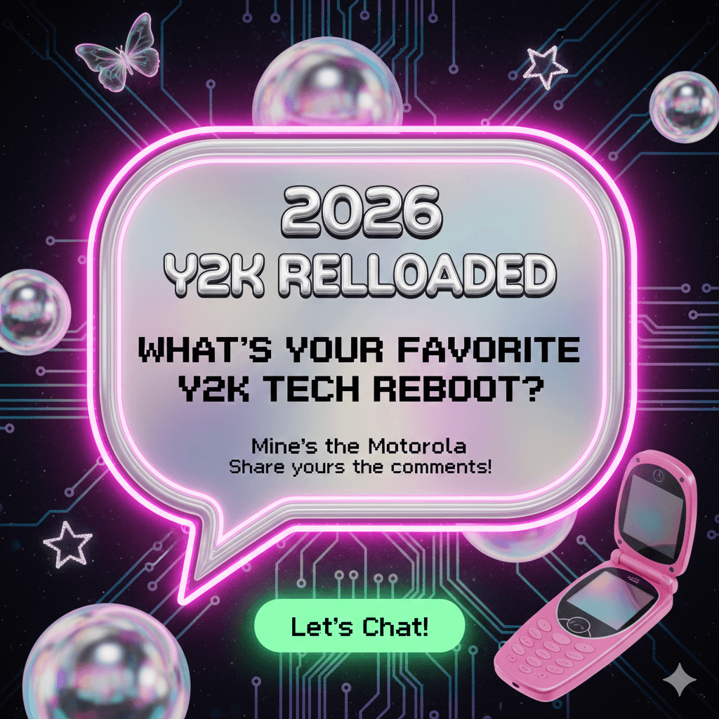
Let’s Chat!
What’s one piece of 2000s tech or design you’re most glad to see making a comeback? For me, it’s definitely the translucent plastic everything. Let me know in the comments below!
Disclaimer:
This article is for informational purposes only. Some links may be affiliate links, meaning Advise Graphics may earn a commission at no extra cost to you. We do not guarantee results, and readers should do their own research before making any decisions.
Tags
Subscribe
Join the Advise Graphics community and get exclusive design resources, tips, and updates delivered straight to your inbox.


Ads


Copyright
© 2025 Advise Graphics. All rights reserved.
Cop© 2025 Advise Graphics. All rights reserved.