
The Designer’s Definitive Guide to Serif Typography


Some links in this post may be affiliate links. See our Affiliate Disclosure for details.
In the world of high-stakes design, a serif is never just a "finishing stroke." It is a declaration of intent. While the minimalist "blanding" movement of the last decade pushed us toward a sea of sterile, uniform sans-serifs, the tide has officially turned. Today’s most visionary creatives are looking backward to move forward, reclaiming the soul, heritage, and undeniable authority of the serif.
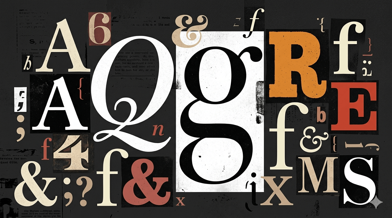
Whether it’s the intellectual rigor of a transitional face or the razor-sharp chic of a high-contrast Didone, serif typography carries an emotional weight that a sans-serif simply cannot replicate. It whispers of luxury, shouts with tradition, and—above all—establishes a human connection in an increasingly digital landscape.
But mastering the serif requires more than just an eye for aesthetics; it requires a deep understanding of anatomy, history, and technical precision. In this definitive guide, we are stripping typography down to its terminal points. We’ll explore the four essential classifications every designer must know, the psychology behind the stroke, and the professional rules for pairing these timeless faces in a modern, screen-first world.
Welcome to the definitive masterclass on the serif. It’s time to give your designs their voice back.
I. Anatomy of the Serif: Decoding the DNA of Type
To the untrained eye, a serif is merely a decorative "foot" at the end of a stroke. But for the professional designer, these terminals are the vital organs of a typeface. They dictate the rhythm of the reading experience, the weight of the brand’s voice, and the technical limits of the layout.
Understanding the anatomy of a serif is the difference between choosing a font that "looks nice" and selecting one that performs with precision.
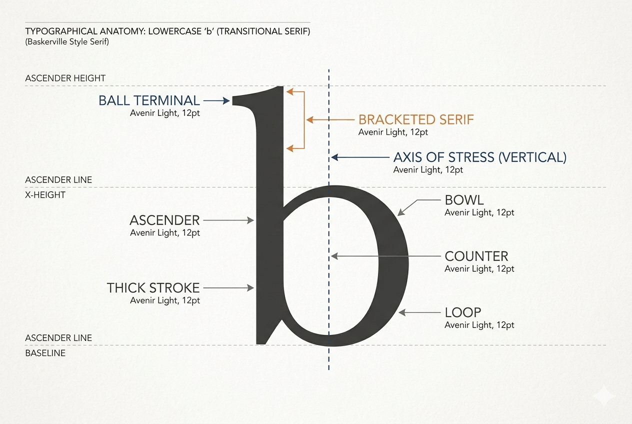
The Core Components
Before we can classify type, we must understand the architecture that defines it. Every serif face is built on three critical anatomical features:
The Bracket: The supportive curve that connects the serif to the main stroke. A "bracketed" serif feels organic and transitionary, while an "unbracketed" serif (found in Modern or Slab faces) creates a sharp, mechanical 90-degree angle.
The Axis (Stress): Imagine drawing a line through the thinnest parts of a letter like 'o'. In older, humanist serifs, this axis is tilted to the left, mimicking the natural angle of a calligraphy pen. In modern faces, this axis is perfectly vertical, creating a more structured, architectural feel.
The Stroke Contrast: This is the ratio between thick and thin lines. High-contrast faces (like Bodoni) radiate glamour and high-fashion, while low-contrast faces offer the rugged durability needed for small-scale print or long-form digital reading.
The "Horizontal Flow" Advantage
There is a functional reason why serifs have dominated the printed word for centuries. The serif acts as a visual guide, creating an invisible "railroad track" for the eye. By emphasizing the horizontal flow, serifs assist the brain in grouping letters into words more efficiently than their sans-serif counterparts.
In a world where attention spans are fractured, the serif remains the ultimate tool for readability—ensuring your audience stays engaged with the copy long after the initial visual hook has passed.
The Designer’s Eye: Form vs. Function
When evaluating a serif for your next project, look beyond the character map. Ask yourself:
Is the terminal rounded or sheared? (Organic vs. Precise)
Does the serif have a "cupped" base? (Classic vs. Contemporary)
Are the hairlines too thin for the intended screen resolution? (Digital Survival)
By mastering these micro-details, you stop "picking fonts" and start engineering visual hierarchies.
II. The Four Pillars of Serif Classification: A Designer’s Roadmap
Typography is a timeline. To choose the right serif, you must understand where it sits in history. Each of these four pillars carries a distinct "mood" that can either harmonize with your brand’s message or create a jarring visual conflict.
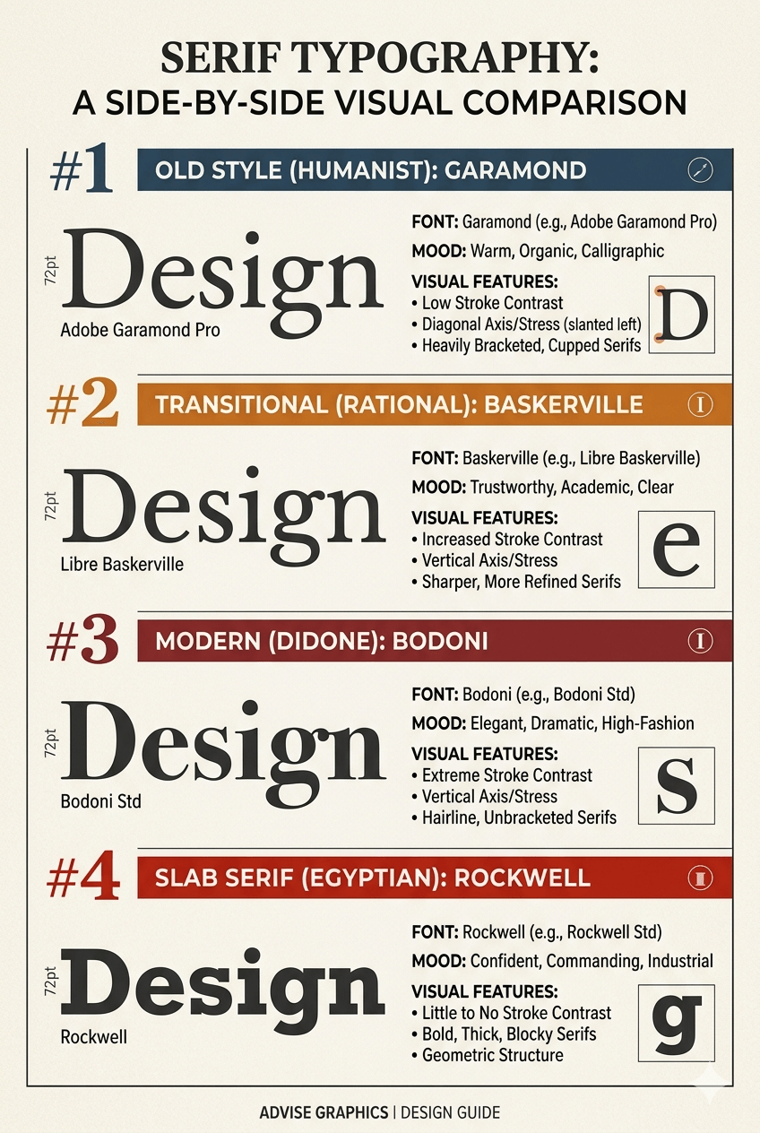
1. Old Style (Humanist): The Organic Intellectual
The Era: Late 15th to mid-18th century.
Visual Traits: Low stroke contrast, diagonal stress (leaning left), and heavily bracketed serifs.
The Mood: Warm, traditional, and incredibly readable.
Classic Examples: Garamond, Caslon, Sabon.
Old Style typefaces are the closest cousins to calligraphy. Because they lack the harsh geometry of later styles, they feel "human." They are the gold standard for book design and long-form editorial content where the goal is to make the typeface "disappear" so the reader can focus entirely on the narrative.
2. Transitional: The Bridge to Rationality
The Era: Mid-18th century (The Enlightenment).
Visual Traits: Increased contrast between thick and thin strokes, a more vertical axis, and sharper serifs.
The Mood: Professional, objective, and authoritative.
Classic Examples: Baskerville, Times New Roman, Mrs Eaves.
As printing technology improved, type designers like John Baskerville pushed the limits of precision. Transitional serifs represent a move away from the handwritten look toward a more engineered aesthetic. If you need to convey "trustworthy expertise"—think law firms, news outlets, or corporate reports—this is your category.
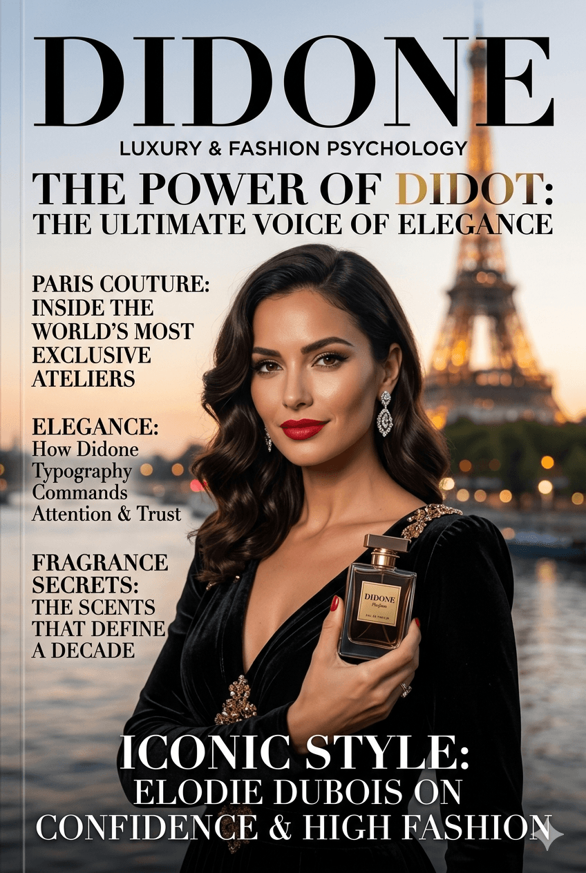
3. Modern (Didone): The Architecture of Luxury
The Era: Late 18th to early 19th century.
Visual Traits: Extreme stroke contrast (hairline thins vs. heavy thicks), vertical stress, and unbracketed, hairline serifs.
The Mood: Elegant, high-fashion, and dramatic.
Classic Examples: Didot, Bodoni, Walbaum.
Modern serifs are the "haute couture" of typography. They are structurally striking but fragile; those thin hairlines can easily break at small sizes. Use them for headlines in fashion editorials, luxury branding, or any project where visual impact is more important than sustained legibility.
4. Slab Serif (Egyptian): The Commanding Industrialist
The Era: 19th-century Industrial Revolution.
Visual Traits: Bold, heavy, block-like serifs with little to no stroke contrast.
The Mood: Confident, rugged, and impactful.
Classic Examples: Rockwell, Clarendon, Archer.
Born from the need for attention-grabbing advertising, Slab serifs (or "Egyptian" styles) are the heavy hitters. They trade the elegance of a Didone for the sheer presence of a poster. They work exceptionally well for tech branding, outdoor signage, or any design that needs to feel grounded and "unshakable."
Selecting the Right Pillar
When choosing between these four, ask yourself: What is the brand's heart?
If it's Heritage, go Old Style.
If it's Authority, go Transitional.
If it's Glamour, go Modern.
If it's Impact, go Slab.
III. Psychology & Branding: The Subconscious Power of the Stroke
In design, a typeface acts as the "voice" of the copy. Before a reader processes a single word, the visual structure of the letterforms has already triggered a psychological response. For the strategic designer, choosing a serif isn't just an aesthetic preference—it’s a calculated move to tap into centuries of collective human association.
Authority & Trust: The Weight of Tradition
There is a reason the world’s most prestigious institutions—from Ivy League universities to international law firms—rarely deviate from serif typography.
Serifs represent permanence. Because these forms have been carved into stone and printed on parchment for centuries, they carry an inherent sense of "The Establishment." When a brand uses a serif like Caslon or Baskerville, they are silently communicating: “We have been here, we know the rules, and we are built to last.”
Best for: Legal services, financial institutions, academic bodies, and heritage brands.
Luxury & Fashion: The "Editorial Look"
In the realm of high-end branding, contrast equals glamour. The "Modern" or "Didone" serif—characterized by its dramatic shift between thick vertical strokes and razor-thin hairlines—is the universal visual shorthand for luxury.
Think of the Vogue or Harper’s Bazaar logos. These high-contrast serifs mimic the sharp lines of a tailored suit or the delicate silhouette of a stiletto. They aren't designed for high-speed reading; they are designed for high-speed desire. By using a high-contrast serif, a brand positions itself as exclusive, elite, and unapologetically chic.
Best for: Beauty brands, luxury real estate, fashion editorials, and premium lifestyle products.
The Digital Shift: Breaking the "Print-Only" Myth
For years, the industry mantra was: “Serifs for print, Sans-Serifs for screen.” This was a technical necessity—low-resolution monitors simply couldn't render the fine details of a serif without it looking "blurry" or "aliased."
However, we are now in the era of Retina displays and 4K monitors. The technical barriers have crumbled. This has led to a massive digital shift:
The Human Connection: In an internet landscape dominated by "corporate" sans-serifs (like the ubiquitous Helvetica or Inter), a serif font feels refreshing, artisanal, and human.
Narrative Focus: Brands like Medium, The New York Times, and even high-tech startups are using serifs to signal that their content is worth slowing down for.
Choosing a serif for a digital interface today is a bold statement of quality over quantity. It tells the user that your digital space is a place for contemplation, not just mindless scrolling.
Brand Alignment Checklist:
Does the brand need to appear established or disruptive? (Serif = Established)
Is the price point mass-market or premium? (High-Contrast Serif = Premium)
Is the user experience functional or emotional? (Serif = Emotional)
IV. How to Pair Serif Fonts Like a Senior Designer
Pairing type is a delicate balancing act. Do it right, and you create a visual hierarchy that guides the eye effortlessly. Do it wrong, and you create "visual vibration"—a subtle tension that makes the reader want to look away.
To pair serifs like a veteran, you must move beyond "what looks good" and start applying the structural rules of typography.
1. The Contrast Rule: The Power of Opposites
The most effective way to use a serif is to let it be the star of the show while a sans-serif plays the supporting role. This is the "Industry Standard" for a reason: it creates instant clarity.
The Strategy: Pair a high-character Serif header (like a Modern Didone or a chunky Slab) with a neutral, highly legible Sans-Serif body (like Montserrat, Open Sans, or Inter).
Why it works: The serif provides the "flavor" and brand personality at a large scale, while the sans-serif ensures the body copy remains invisible and easy to digest on any screen.
Pro-Tip: Ensure the "x-height" (the height of the lowercase 'x') of both fonts is relatively similar. If one looks significantly smaller than the other at the same point size, the layout will feel "lopsided."
2. The Superfamily Shortcut: Guaranteed Harmony
If you want to eliminate the guesswork entirely, look for a Superfamily. This is a collection of fonts designed by the same typographer to work together perfectly.
The Strategy: Use a font family that includes both a Serif and a Sans-Serif version (e.g., FF Meta and FF Meta Serif, or PT Sans and PT Serif).
Why it works: Because they share the same underlying "skeleton" (cap height, stroke weight, and character width), they will always harmonize, regardless of how much you contrast the weights.
The Senior Move: Use the Extra Bold Serif for your H1 and the Regular Sans for your body. It creates a cohesive, professional "system" rather than a collection of random fonts.
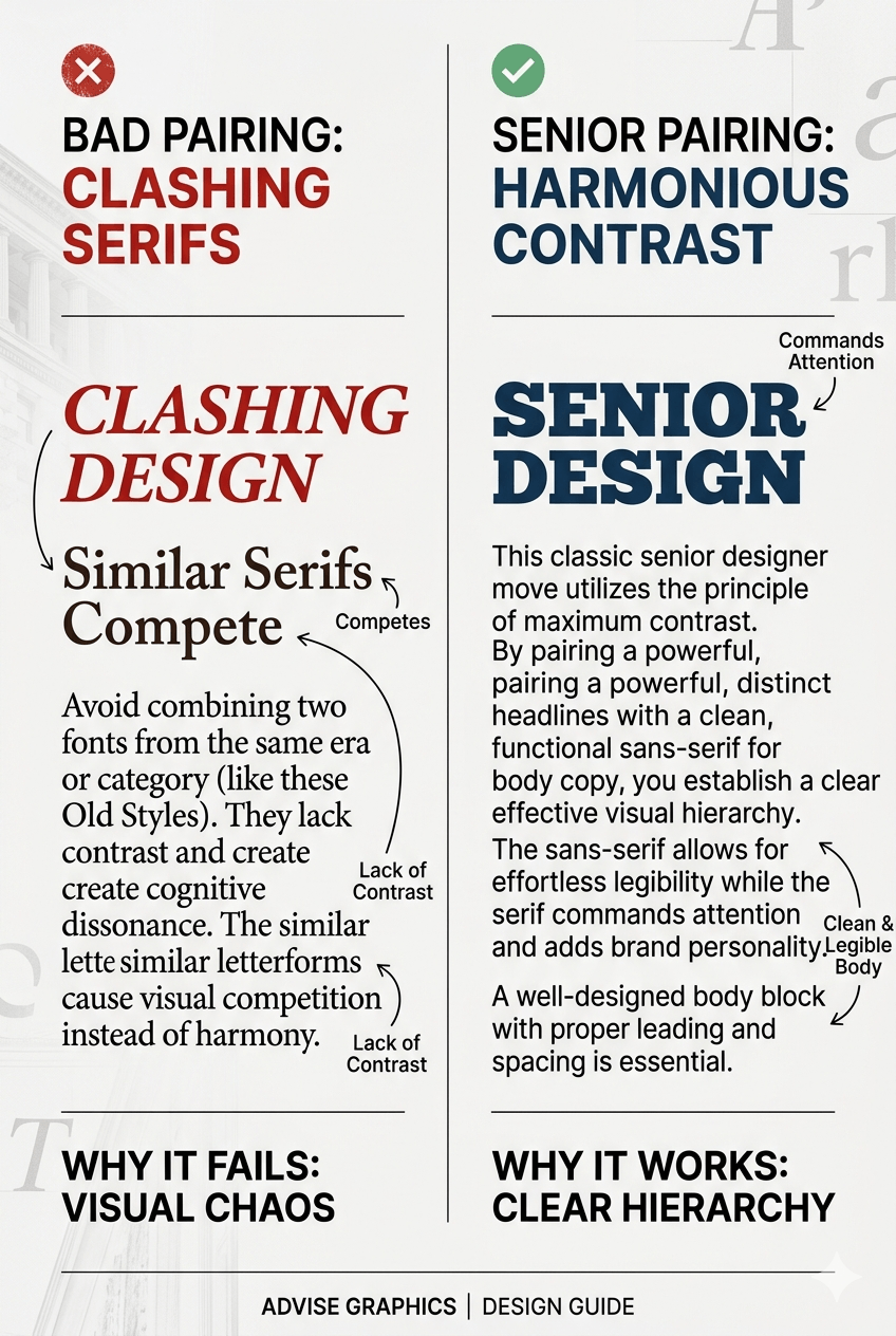
3. Avoid the Clash: The Two-Serif Trap
In typography, "similarity is the enemy of harmony." One of the most common mistakes junior designers make is trying to pair two different serif fonts in the same layout.
The Problem: If you pair a Garamond (Old Style) header with a Times New Roman (Transitional) body, they are different enough to be noticed, but similar enough to look like a mistake. This creates "typographic conflict."
The Rule: Avoid using two fonts from the same category unless there is a massive difference in scale or weight.
The Exception: If you must use two serifs, ensure they are at opposite ends of the spectrum—for example, a very heavy Slab Serif for headlines and a very light, delicate Old Style for body text.
V. 10 Essential Serif Typefaces for Your Toolkit
Every professional designer needs a "shortlist"—a curated selection of fonts that are versatile enough to handle everything from a high-fashion logotype to a 300-page corporate report.
This list balances the historical "workhorses" that never go out of style with the modern "trendsetters" that define the current visual landscape.
The Timeless Workhorses
These are the reliable classics that offer impeccable legibility and professional weight.
Adobe Caslon Pro: Often called the "designer's safety net." It is an Old Style face that is incredibly versatile. As the old saying goes: "When in doubt, use Caslon."
Baskerville (Libre or ITC): The quintessential Transitional typeface. It’s sharp, academic, and authoritative—perfect for brands that need to command respect.
Bodoni Poster: A Modern (Didone) masterpiece. With extreme contrast between thick and thin, it is the ultimate choice for high-end fashion and luxury headlines.
Sabon: A humanist serif known for its smoothness and elegance. It is widely considered one of the most readable fonts for printed books ever designed.
Rockwell: The definitive Slab Serif. It’s geometric, bold, and architectural. Use it when you want your headlines to feel "built," not just written.
The Modern Trendsetters
These fonts represent the "New Serif" movement—blending vintage DNA with contemporary quirks.
Recoleta: A stunning blend of 70s soft-serifs and traditional sketches. It has become the "it-font" for modern lifestyle brands looking for a nostalgic yet fresh vibe.
Ogg: Inspired by the hand-lettering of Oscar Ogg, this calligraphic serif is lyrical and high-fashion. It’s a favorite for editorial layouts that require a "poetic" touch.
Cormorant Garamond: A free Google Font that defies the "free font" stigma. It is a high-contrast, elegant version of the classic Garamond, optimized for large display use.
Noe Display: A heavy-hitter in the contemporary design world. Its sharp, "spiky" terminals give it a digital edge that feels both aggressive and sophisticated.
Fraunces: A variable font that bridges the gap between "Soft Serif" and "Old Style." Its unique personality makes it a standout choice for digital branding and apps that want to avoid the "tech-bro" sans-serif look.
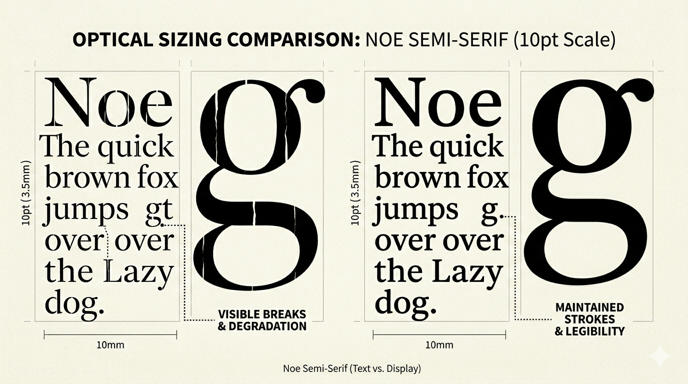
Selection Tip: Display vs. Text
When browsing this list, check for Optical Sizes.
Display versions (like Noe or Bodoni) are optimized for large headlines and have thinner, more delicate hairlines.
Text versions (like Caslon or Sabon) are beefed up to ensure they don't disappear when printed or viewed at small sizes on a screen.
VI. Technical Best Practices for Web & Print
A beautiful serif typeface is only half the battle. The other half is technical execution. Because of their delicate strokes and complex anatomy, serifs require a higher level of "finesse" than sans-serifs to ensure they remain legible across all mediums.
1. Optical Sizing: The Scale Factor
In the era of metal type, punchcutters would physically carve different versions of the same font for different sizes. Today, professional type families offer this through Optical Sizes.
Display Serifs: Designed for large-scale use (headlines). They feature high contrast, razor-thin hairlines, and tighter apertures. If you use a Display face for body text, the thin lines will "break" and disappear.
Text Serifs: Designed for small-scale use (body copy). The strokes are sturdier, the serifs are thicker, and the overall spacing is more generous to prevent the letters from "clogging" at small point sizes.
Pro-Tip: If you are using a variable font, you can often slide the "Optical Size" (opsz) axis to perfectly tune the font’s weight to your specific layout size.
2. Kerning & Leading: Managing White Space
Serifs take up more "visual real estate" than sans-serifs. To keep your layouts professional, you must adjust your spacing accordingly.
Leading (Line Spacing): Serifs generally require more leading than sans-serifs. Because the serifs create strong horizontal lines, the eye needs more vertical "breathing room" to distinguish between rows of text. Aim for a minimum of 1.4x to 1.6x the font size.
Kerning (Letter Spacing): Pay close attention to high-contrast fonts like Bodoni. The extreme difference between the thick and thin strokes can create "optical gaps." You may need to manually tighten the kerning between characters like 'T' and 'o' or 'A' and 'v' to maintain a consistent visual rhythm.
3. Accessibility: The Low-Res Survival Guide
One of the primary reasons serifs were avoided in early web design was aliasing—the jagged "stairs" effect on low-resolution screens. While 4K displays have mitigated this, accessibility remains a priority.
The Contrast Check: Thin serifs require a higher color contrast ratio to remain legible. Ensure your text-to-background contrast is at least 4.5:1 (WCAG AA standard).
Hinting: When selecting a web font, ensure it has high-quality "hinting." This is the digital instructions that tell the font how to align its strokes with the pixels on a screen, preventing "blurry" terminals.
Size Matters: Avoid using delicate, high-contrast serifs for body text smaller than 16px on screens. If the font feels "faint," switch to a sturdier "Old Style" or "Slab" variant.
VII. Conclusion: The Future of the Serif
As we navigate an era increasingly defined by algorithms and artificial intelligence, the role of the serif has evolved from a mere stylistic choice into a symbol of humanity. In a digital landscape that often feels cold, uniform, and clinical, the "imperfections"—the calligraphic curves of an Old Style face or the architectural drama of a Modern Didone—remind us of the human hand behind the screen.
The "Serif Renaissance" we are witnessing isn't just a trend; it is a return to storytelling. It is a rejection of the "one-size-fits-all" minimalism that stripped brands of their soul. For the modern creative, the serif is the ultimate tool for injecting personality, heritage, and emotional resonance into a project.
By mastering the anatomy, history, and technical precision of these timeless faces, you aren't just following a design movement—you are preserving the art of communication. The future of design isn't just about being seen; it’s about being felt. And nothing carries the weight of a message quite like a serif.
Disclaimer:
This article is for informational purposes only. Some links may be affiliate links, meaning Advise Graphics may earn a commission at no extra cost to you. We do not guarantee results, and readers should do their own research before making any decisions.
Tags
Subscribe
Join the Advise Graphics community and get exclusive design resources, tips, and updates delivered straight to your inbox.


Ads


Copyright
© 2025 Advise Graphics. All rights reserved.
Cop© 2025 Advise Graphics. All rights reserved.