
The Ultimate Guide to Typography: Mastering the Art and Strategy of Type

Some links in this post may be affiliate links. See our Affiliate Disclosure for details.
Why Typography is the Backbone of Design
Typography is often described as the "clothes" that words wear, but in the world of professional design, it is much more than an outfit—it is the structural integrity of the message itself. While a stunning color palette or a high-quality image might catch a viewer's eye, it is the typography that holds their attention and communicates the core intent of the brand.
Defining Typography Beyond "Choosing a Font"
Many beginners mistake typography for the simple act of scrolling through a font menu until something "looks good." In reality, typography is the strategic arrangement of type to make written language legible, readable, and appealing. It involves a complex balance of art and science, managing everything from the whitespace between characters to the mathematical proportions of a letterform. When executed correctly, typography becomes an invisible force that guides the reader’s eye exactly where it needs to go.
The Psychological Impact of Type on Brand Perception
Every typeface carries an inherent emotional weight. A sharp, geometric Sans Serif exudes modernism and efficiency, while a high-contrast Serif with delicate brackets feels rooted in heritage and luxury.
As a designer, you aren't just selecting letters; you are selecting a voice. The wrong typographic choice can create "cognitive dissonance"—where the visual style of the text contradicts the meaning of the words. Mastering the strategy of type means understanding how to evoke trust, excitement, or authority before the reader has even processed the first sentence.
How Typography Influences UX and Readability
In our digital-first landscape, typography is a critical component of User Experience (UX). With more content being consumed on mobile devices than ever before, the strategy of type must account for:
Legibility: How easily a reader can distinguish one letter from another.
Readability: How easily a reader can scan and absorb long blocks of text.
Accessibility: Ensuring that font size, weight, and color contrast meet global standards so that your message is inclusive to all users.
By treating typography as a strategic asset rather than a final flourish, you transform a standard layout into a high-performing piece of visual communication. In the following sections, we will break down the technical anatomy and the creative rules you need to master this essential craft.
The Anatomy of Type: Understanding the Basics

Before you can break the rules of design, you must first master the technical language of letterforms. Understanding the anatomy of type isn’t just for "font geeks"—it is a practical skill that helps you diagnose why a layout feels "off" and how to fix it.
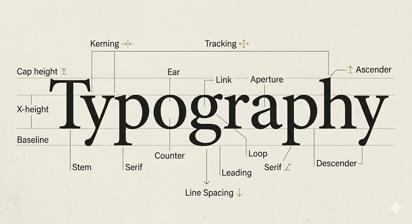
Key Terminology Every Designer Should Know
To achieve professional-grade layouts, you need to move beyond basic font selection and start manipulating the space within the text.
Kerning: This is the adjustment of space between individual letter pairs. Some character combinations (like "Va" or "Ty") create awkward gaps; manual kerning ensures the visual weight is even across the word.
Tracking: Often confused with kerning, tracking is the uniform adjustment of space across a whole range of characters. Tight tracking can feel urgent and modern, while loose tracking in all-caps headers adds an air of luxury and breathability.
Leading (Line Spacing): Named after the physical strips of lead once used in printing presses, leading is the vertical space between lines of text. For digital readability, a general rule is to set leading at approximately 120–150% of the font size.
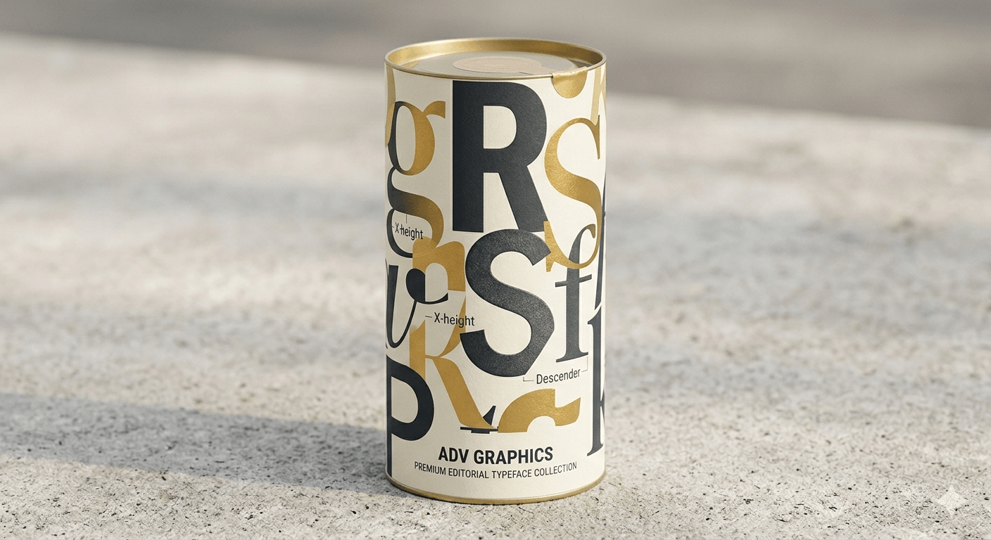
Baseline, X-Height, and Descenders: The baseline is the invisible line where all letters sit. The x-height is the height of the lowercase letters (like "x" or "a"), which dictates how "large" a font feels. Letters that dip below the baseline (like "y" or "g") are called descenders, while those that reach upward (like "k" or "h") are ascenders.
Classifying Typefaces
Categorizing fonts helps you narrow down your search when starting a new project. Most typefaces fall into one of these four primary buckets:
Serif: Defined by the small decorative "feet" at the ends of strokes. Serifs are traditionally associated with authority, history, and printed media. They are excellent for long-form reading in books or high-end editorial layouts.
Sans Serif: These fonts lack the decorative feet, offering a clean, geometric, and minimalist look. They are the standard for digital interfaces due to their high legibility on screens of all sizes.
Slab Serif: Characterized by thick, block-like serifs. These are bold, impactful, and often used in branding to convey a sense of ruggedness or confidence.
Script and Display: Script fonts mimic handwriting or calligraphy, while Display fonts are designed specifically for large sizes (like headlines). These are the "personality" fonts—perfect for making a statement but should be used sparingly to avoid clutter.
The Rise of Variable Fonts
As we move further into 2026, Variable Fonts have become a game-changer for web design. Unlike traditional font files where you need a separate file for "Bold," "Italic," and "Light," a Variable Font is a single file that contains the entire spectrum of weights and widths. This allows for fluid, responsive typography that can shift dynamically based on screen size or user interaction, significantly improving site performance and SEO.
The Core Principles of Effective Typography
Design is often a game of balance. While the anatomy of a typeface tells you what the letters are, these core principles dictate how they behave on the page. To master the strategy of type, you must move beyond decoration and focus on functional beauty.
Establishing Visual Hierarchy

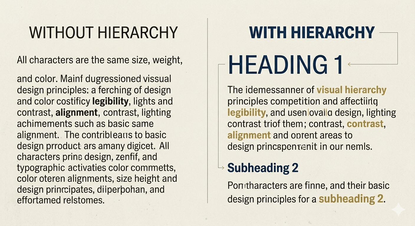
Visual hierarchy is the "map" you give your reader. Without it, every word competes for attention, leading to "visual fatigue" and high bounce rates. To create a clear path:
Size: The most obvious tool. Your H1 should be the clear hero, followed by progressively smaller H2s and H3s.
Weight: Use bold or medium weights to draw the eye to key phrases or calls to action. A thick weight creates an immediate focal point.
Color and Contrast: High-contrast pairings (like charcoal text on a light cream background) improve focus. You can also use a secondary brand color for subheaders to create a distinct secondary level of importance.
The Rule of Proximity and Alignment
Alignment provides the structural "grid" for your design.
Flush Left (Left-Aligned): The standard for readability. The "ragged right" edge provides a consistent starting point for the eye, making long-form blog posts much easier to digest.
Centered: Best reserved for short bursts of text, like titles, quotes, or invitations. Overusing centered text makes the edges unpredictable, which tires the reader's eyes.
Proximity: Group related elements together. For example, your subheader should be closer to the paragraph it introduces than the section above it. This "white space" management signals to the brain that the two elements belong together.
Contrast and Legibility
A common pitfall in modern design is prioritizing "the look" over the ability to actually read the content. True typographic strategy ensures accessibility across every device.
Body Text Sizing: For modern web design, 16px to 18px is generally considered the minimum for body copy to ensure it is legible on mobile devices.
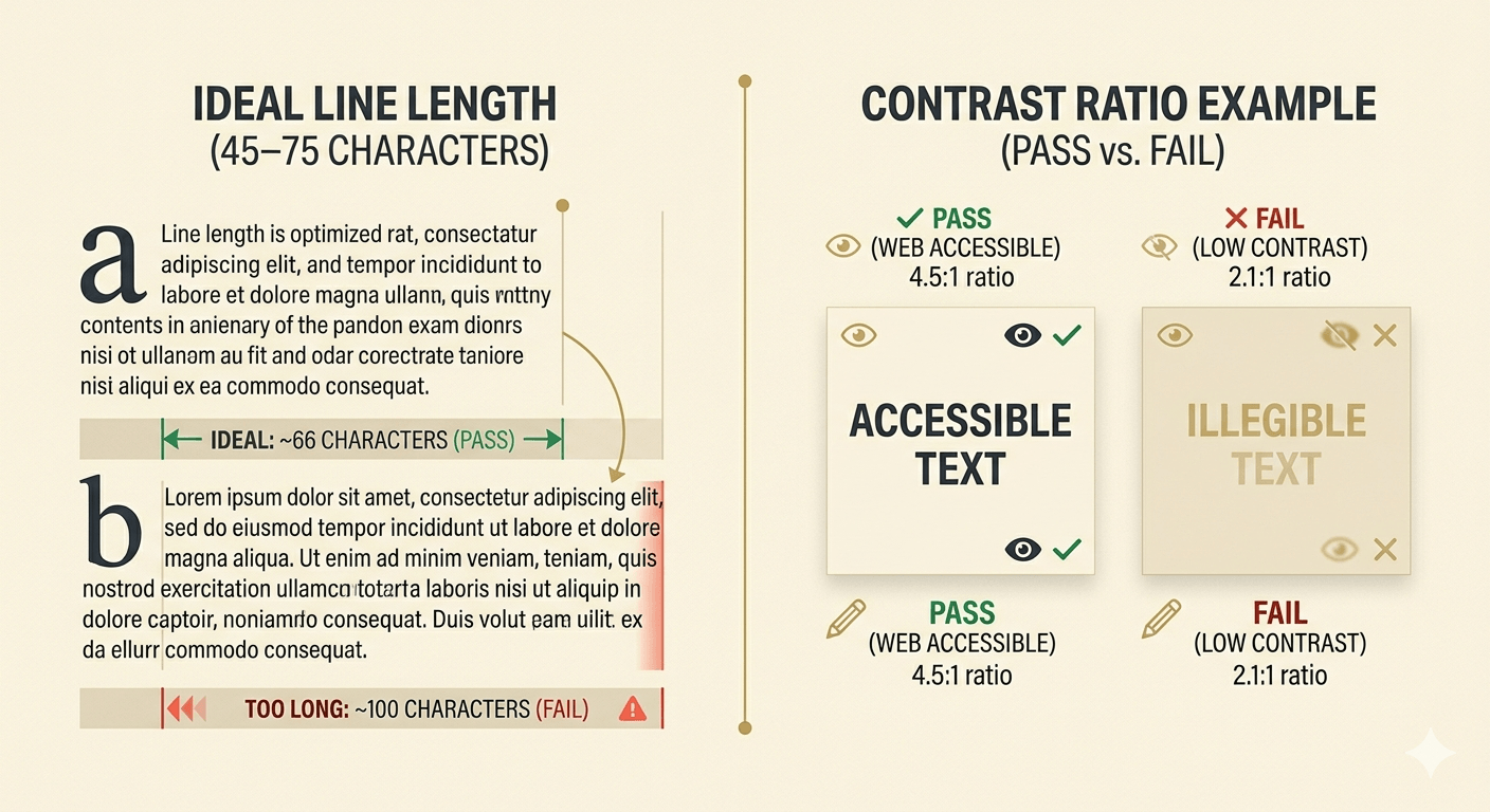
Line Length (Measure): The ideal line length for a comfortable reading experience is between 45 and 75 characters. If your lines are too long, the eye struggles to find the start of the next line; too short, and the constant jumping breaks the reader's rhythm.
Color Accessibility: Always check your text-to-background contrast ratios. Tools that follow WCAG (Web Content Accessibility Guidelines) are essential to ensure your content is inclusive for users with visual impairments.
By mastering these principles, you ensure that your typography doesn't just look professional—it performs. It keeps users engaged longer, lowers your bounce rate, and guides them toward your ultimate goal, whether that's a newsletter sign-up or a product purchase.
The Strategy of Font Pairing

If typography is a language, then font pairing is the art of conversation. A successful pairing creates a balanced dialogue between two different voices—ensuring they complement each other without competing for the spotlight. When you master the strategy of pairing, you move beyond "random selection" and start building a cohesive visual system.
Finding the Perfect Match
The secret to great font pairing lies in the balance of similarity and contrast. If two fonts are too similar (like two slightly different Sans Serifs), they create "visual discord," making the design look like a mistake rather than an intentional choice.
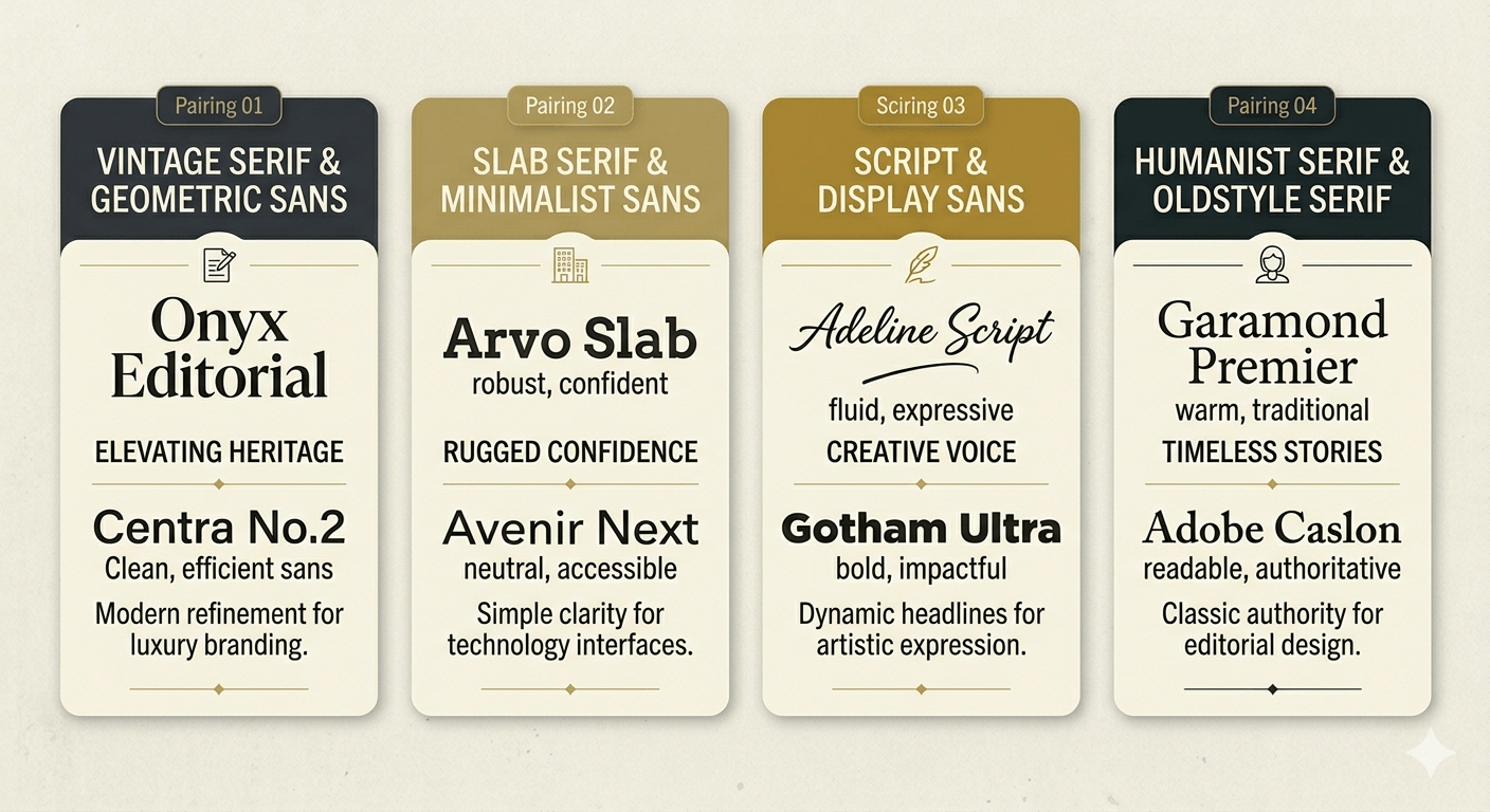
Opposites Attract: One of the most reliable strategies is pairing a high-personality Serif for headlines with a clean, neutral Sans Serif for body text. This creates a clear distinction between "authority" and "information."
The "One Family" Rule: If you are unsure, stick within a single "Superfamily." Many modern typefaces come with Serif, Sans, and even Slab versions designed by the same person. Since they share the same underlying structure (the "skeleton"), they will always harmonize perfectly.
Weight Contrast: Pair a very heavy, bold weight for your titles with a light or regular weight for your subheaders. This dramatic jump in thickness creates an immediate sense of professional hierarchy.
Avoiding Visual Conflict
Visual conflict happens when two fonts have "competing personalities." For example, pairing a highly decorative, loopy script with a rugged, distressed "tagging" style graffiti font can feel chaotic.
To avoid this, follow the "Lead and Support" rule: Let one font be the "star" (the one with the most character) and let the second font be the "supporting actor" (simple, legible, and unobtrusive). If your header font is loud and expressive—like a retro-futuristic display face—keep your body font quiet and functional.
Tools for Discovery
You don't have to guess which fonts work well together. Professional designers use several strategies to discover winning combinations:
Type Foundries & Marketplaces: Platforms like Creative Fabrica or Google Fonts often show "popular pairings" or "specimen sheets" that demonstrate the font in action.
In-the-Wild Inspiration: Look at high-end magazines, award-winning websites, or even premium product packaging. Take a screenshot and analyze why those two fonts feel right together.
Mood Boarding: Before committing to a design, place your header and body font side-by-side on a blank canvas. If they don't feel like they belong to the same "world," keep searching.
By being intentional with your pairings, you ensure your blog or product design feels polished and intentional, rather than a collection of mismatched ideas.
Modern Typographic Trends for 2026

Typography never stands still. As technology evolves and cultural tastes shift, the way we use type in 2026 has moved toward a "post-minimalist" era. We are seeing a fascinating blend of high-tech functionality and raw, human expression.
Kinetic and Animated Type
In a world dominated by short-form video and scrolling feeds, static type is no longer the only option. Kinetic typography—text that moves, stretches, or reacts to user interaction—has become a core design element.
Variable Animation: Using variable font technology to animate font weight or width as a user scrolls.
Micro-Interactions: Buttons or links where the typeface subtly "pulses" or shifts style when hovered over, providing immediate tactile feedback in a digital space.
Loud Authenticity and Maximalism
After years of "Blanding" (where every brand used the same minimalist Sans Serif), we are seeing a massive shift toward Loud Authenticity. This trend celebrates "perfectly imperfect" letterforms that feel human and expressive.
Experimental Shapes: High-contrast, loopy, or distorted fonts that prioritize mood over strict legibility.
Extreme Weight: Ultra-thick, "chunky" fonts that take up massive amounts of negative space, forcing the reader to stop and engage.
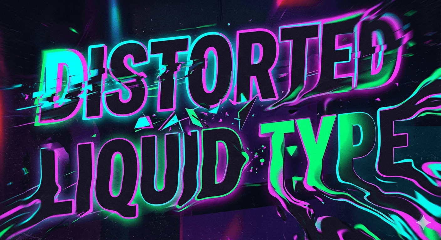
Heritage and Retro-Futurism
2026 is seeing a unique "mashup" of history. Designers are looking back at Victorian elegance—with its ornate flourishes and dramatic serifs—and blending it with Retro-Futuristic digital aesthetics (think neon glows, glitch effects, and monospace "coding" fonts).
The "Nostalgic Modern" Look: Using a classic, high-end Serif but applying a modern, vibrant gradient or 3D texture.
Tech-Cottagecore: A blend of organic, hand-drawn letterforms with sharp, pixelated digital accents.
Technical SEO & Best Practices for Web Type

A beautiful font won't help your blog if it slows down your site or breaks on a mobile device. For a pillar post to truly rank, your typography must be technically optimized for search engines.
Web Safe Fonts vs. Custom Embeds
While custom fonts give your site personality, they come with a "weight" cost.
System Fonts: Fonts like Arial or Georgia are "web safe" and load instantly because they are already on the user's device.
Self-Hosting: For the best SEO performance, host your custom font files on your own server rather than relying on third-party links. This reduces "DNS lookups" and speeds up your Largest Contentful Paint (LCP).
Optimizing for Performance
Google’s Core Web Vitals track how stable your page is as it loads.
Preventing Layout Shift (CLS): Ever notice how text "jumps" as a custom font finally loads? Use a font-display: swap; property in your CSS. This tells the browser to show a fallback font immediately and swap in the custom font once it's ready.
Subsetting: If you only need the English alphabet, don't load the entire font file containing 500+ international characters. "Subsetting" allows you to strip away unused characters, shrinking the file size significantly.
Accessibility Standards
SEO and Accessibility are two sides of the same coin. Google rewards sites that are easy for everyone to navigate.
Color Contrast: Ensure a contrast ratio of at least 4.5:1 for normal text.
Scalable Units: Use rem or em units in your code instead of fixed pixels (px). This allows the text to scale correctly if a user has their browser zoom or font size settings adjusted for visual aid.
Professional Workflow: From Concept to Mockup

Mastering typography isn’t just about knowing the rules—it’s about knowing when and how to apply them in a real-world production environment. A professional workflow ensures that your type choices aren't just beautiful in a vacuum, but functional across every medium your brand touches.
How to Choose Type Based on the Project's "Voice"
Before opening your design software, you must define the project's personality. Is the brand's voice "Corporate and Trustworthy" or "Rebellious and Trendsetting"?
The Keyword Method: Write down three adjectives for the brand. If the brand is "Elegant, Minimalist, and Timeless," you immediately know to look for high-contrast Serifs or ultra-thin Sans Serifs.
Audience Context: A font intended for a high-end skincare line (luxury, calm) will differ vastly from a font meant for a gaming app (high energy, tech-focused).
Testing Type in Real-World Environments
A font that looks great in a 1200px Photoshop canvas might fail in the real world. Professionals use mockups to stress-test their typographic systems.
Scale and Distance: If you are designing for a billboard, your type needs to be legible from 100 yards away at 60 mph. This requires generous leading and high-contrast weights.
Environmental Lighting: For physical products like packaging or apparel, consider how light hits the surface. Foil stamping or embossing can change how "readable" a thin font appears.
Digital Responsiveness: Always test your type pairings on an actual mobile device. What looks balanced on a desktop monitor can feel cramped and overwhelming on a 6-inch screen.
Setting Up Style Guides for Brand Consistency
Consistency is what separates a "project" from a "brand." Once you have perfected your typography, document it in a style guide to ensure it stays consistent across all platforms.
Define the Stack: List your Primary (Header), Secondary (Subheader), and Tertiary (Body) fonts.
Specify the Rules: Include exact values for tracking (letter-spacing), leading (line-height), and paragraph spacing.
The "Don't" List: Explicitly state what not to do (e.g., "Do not stretch the font," "Do not use vibrant yellow on a white background").
Conclusion: Finding Your Typographic Voice
Typography is the bridge between a thought and its expression. It is one of the few design disciplines that is simultaneously a rigid science and an limitless art form. By mastering the anatomy, principles, and strategic application of type, you aren't just making things "look better"—you are ensuring that your message is heard, felt, and remembered.
The most successful designers in 2026 are those who respect the timeless traditions of the past while embracing the "Loud Authenticity" of the future. Don't be afraid to experiment, break a few rules, and most importantly, keep your reader's experience at the heart of every choice.
Ready to transform your designs?
Explore: Check out our latest Curated Font Lists for more inspiration.
Subscribe: Sign up for our newsletter to get typography trends delivered straight to your inbox.
Share: If this guide helped you, share it with a fellow designer!
Frequently Asked Questions
Think of it like music: A typeface is the song (the creative design), while a font is the MP3 or Vinyl (the delivery mechanism or specific file you use, like "Helvetica Bold 12pt").
As a general rule, stick to 2 to 3 fonts. Using too many creates visual clutter and confuses the hierarchy. You can often get more variety by using different weights (Light, Bold, Black) of the same font family.
Sans Serif fonts with a generous x-height and open counters (the holes in letters like 'o' or 'e') are best. Popular choices include Inter, Roboto, and Open Sans.
Disclaimer:
This article is for informational purposes only. Some links may be affiliate links, meaning Advise Graphics may earn a commission at no extra cost to you. We do not guarantee results, and readers should do their own research before making any decisions.
Tags
Subscribe
Join the Advise Graphics community and get exclusive design resources, tips, and updates delivered straight to your inbox.


Ads


Copyright
© 2025 Advise Graphics. All rights reserved.
Cop© 2025 Advise Graphics. All rights reserved.