
Varsity Fonts: The Ultimate Guide to Level Up Your Designs


Some links in this post may be affiliate links. See our Affiliate Disclosure for details.
I. What Makes Varsity Fonts a Design MVP?
There's something undeniably captivating about varsity fonts. They instantly bring to mind the roar of the crowd, the thrill of competition, and the proud tradition of academic achievement. More than just letters on a page, these fonts are powerhouses of nostalgia and energy, capable of injecting a dynamic, classic, or collegiate vibe into almost any design project.
But what exactly is a varsity font? Simply put, it's a style of typeface characterized by its bold, blocky, and often slightly condensed appearance, echoing the lettering seen on sports jerseys, school pennants, and athletic apparel. Think of the iconic numbers on a football jersey or the classic lettering on a university sweatshirt – that's the essence of varsity.
Their enduring appeal lies in their ability to convey a sense of heritage, teamwork, and accomplishment. Whether you're aiming for a vintage sports look, a spirited academic feel, or just a strong, impactful statement, varsity fonts deliver.
In this ultimate guide, we'll dive deep into the world of varsity fonts. We'll explore their different types, uncover countless ways to use them in your designs, reveal the best places to find them (both free and paid), and even share our top font recommendations to help you score big with your next creative project. Get ready to level up your design game!
II. Types of Varsity Fonts
Just like athletes come in all shapes and sizes, so do varsity fonts. While they all share that unmistakable athletic spirit, there's a good amount of variety within this category. Knowing the different types can help you pick the perfect font to match your project's vibe.
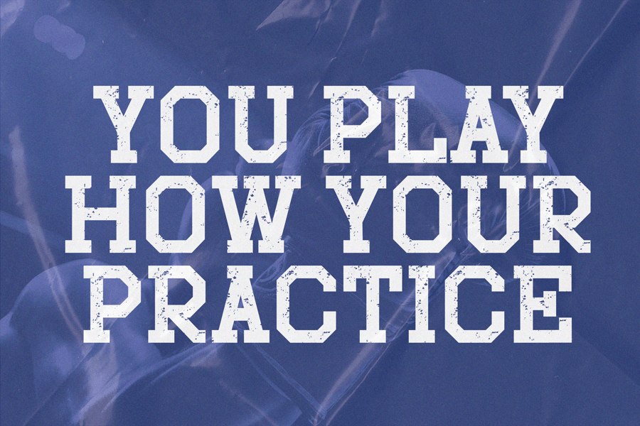
1. Classic Block Varsity
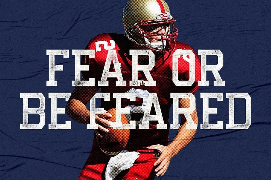
This is likely what first comes to mind when you think of a varsity font. Classic block varsity fonts are the OGs of the athletic typography world. They feature sturdy, often slightly condensed, block letters that are incredibly legible, even from a distance. They typically have sharp, clean lines, though some variations might include subtle serifs or rounded corners.
Description: Traditional, robust, and straightforward block letters. They're designed for impact and clarity, often with a slightly squared-off appearance.
Examples/Use cases: You'll see these everywhere from official sports jerseys and team logos to high school and university branding. They're perfect for conveying a timeless, strong, and official athletic feel. Think classic baseball or football uniforms.
2. Stitched/Appliqué Varsity
Want to add a touch of handcrafted authenticity to your designs? Stitched or appliqué varsity fonts are your go-to. These fonts are designed to mimic the look of letters sewn onto fabric, complete with textured edges, faux stitching details, or a slightly raised appearance.
Description: Fonts that replicate the visual texture of fabric patches or embroidery, often with visible stitch lines or a slightly irregular, soft edge.
Examples/Use cases: Ideal for custom apparel design, crafting projects (like t-shirts, hoodies, or bags), and designs aiming for a vintage or DIY aesthetic. They add a tactile, cozy, and authentic touch.
3. Distressed/Grunge Varsity
Sometimes, you want that worn-in, battle-hardened look, and that's where distressed or grunge varsity fonts shine. These variations add textures, scuffs, scratches, or unevenness to the classic varsity shapes, making them look aged, rugged, or well-loved.
Description: Varsity fonts that have intentional imperfections, such as rough edges, faded areas, or a gritty texture, to give them a vintage, edgy, or weathered appearance.
Examples/Use cases: Great for alternative sports branding, concert merchandise, casual streetwear designs, or any project that needs a raw, rebellious, or retro feel with a bit of character.
4. Outline/Stencil Varsity
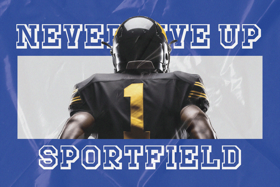
For a bolder statement or a more dynamic visual, outline or stencil varsity fonts come into play. Outline versions feature just the stroke of the letter, allowing backgrounds or other elements to show through, while stencil versions have breaks in the letterforms, as if they were cut out of a template.
Description: Fonts that consist solely of an outer stroke (outline) or have intentional gaps within the letterforms (stencil) for a cutout effect.
Examples/Use cases: Excellent for layering effects in graphic design, creating impactful headlines, signage that needs to be bold and clear, or modern athletic designs that want to break away from the traditional solid fill.
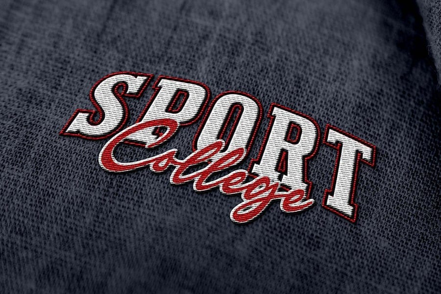
5. Script Varsity (Less Common but Exists)
While less common than their blocky counterparts, some fonts blend the fluidity of script with the athletic energy of varsity styles. Script varsity fonts might feature a more dynamic flow or connecting letters, but still maintain a certain boldness and collegiate flair.
Description: Fonts that incorporate cursive or flowing elements, but are still thick and impactful, retaining an athletic or collegiate feel rather than delicate elegance.
Examples/Use cases: Used for more unique or stylized branding, formal athletic events that require a touch of sophistication, or when you want to combine tradition with a bit of artistic flourish.
III. Where to Use Varsity Fonts
Now that we've explored the different types of varsity fonts, let's talk about where they truly shine. The versatility of these typefaces means they can elevate a surprising range of projects, adding that touch of classic athleticism, academic pride, or bold energy. Here's a breakdown of the most common and impactful "playing fields" for varsity fonts:
Sports & Athletics
This is the most obvious and perhaps most fitting application. Varsity fonts are the natural choice for anything related to sports, competition, and team spirit.
Team Logos and Mascots: Instantly convey professionalism, history, and a strong identity for sports teams at any level, from local leagues to professional organizations.
Jerseys, Uniforms, and Fan Apparel: Essential for player numbers, team names, and slogans on athletic wear. They create that authentic, game-day look.
Event Posters, Flyers, and Tickets: Grab attention for game announcements, tournaments, marathons, or any sporting event. The bold nature ensures visibility.
Gym and Fitness Branding: Perfect for logos, signage, and marketing materials for gyms, fitness studios, and athletic clubs, suggesting strength, dedication, and energy.
Education & Academia
Beyond the sports field, varsity fonts have a deep connection to educational institutions, evoking a sense of tradition, school pride, and community.
School Logos and Crests: Many schools, colleges, and universities utilize varsity styles to represent their heritage and values.
Yearbook Designs: Give yearbooks a classic, nostalgic feel that celebrates student life and academic achievements.
Club and Society Branding: Ideal for student organizations, sports clubs, or academic societies to create cohesive and spirited branding.
Educational Material Headings: Can be used for titles and headers in presentations, school reports, or course materials to add a scholarly, yet energetic, touch.
Crafting & DIY
The clear, bold nature of varsity fonts makes them incredibly popular and effective for various crafting projects, especially those involving cutting or heat transfer.
T-Shirt Designs (HTV, Sublimation): Easily cut from vinyl or sublimated onto fabric, making them perfect for custom apparel for individuals, teams, or events.
Tumblers and Mugs: Personalize drinkware with names, monograms, or motivational quotes in a classic, sporty style.
Home Decor (e.g., Sports-Themed Nurseries): Create wall art, pillow covers, or decorative signs with a distinct athletic or collegiate theme.
Personalized Gifts: From custom keychains to engraved items, varsity fonts add a bespoke and thoughtful touch.
Branding & Marketing
Beyond their direct association with sports and schools, varsity fonts can lend a specific aesthetic to a wide array of commercial and marketing efforts.
Casual Wear Brands: Companies selling casual clothing, especially sportswear or athleisure, often use varsity fonts to evoke a relaxed yet stylish vibe.
Retro-Themed Products: For brands aiming for a vintage or throwback aesthetic, varsity fonts are a powerful tool to capture the essence of past decades.
Food and Beverage Packaging: Certain products, like energy drinks, protein bars, or even craft beers, might use varsity fonts to suggest strength, vitality, or a competitive edge.
Event Branding (e.g., Concerts, Festivals): Depending on the theme, varsity fonts can create an energetic, youthful, or classic vibe for event promotions and merchandise.
By understanding these diverse applications, you can effectively leverage varsity fonts to connect with your audience and enhance your design's message, no matter the "playing field."
IV. Where to Find Quality Varsity Fonts
You've got a design vision and a clear understanding of where varsity fonts can make an impact. Now, the big question is: where do you actually find these awesome typefaces? Whether you're on a tight budget or ready to invest in professional assets, there are plenty of places to discover quality varsity fonts.
Free Resources: Get Started Without Breaking the Bank
Free font sites are a fantastic starting point, especially for personal projects or when you're just experimenting with styles. However, always remember to double-check the licensing for commercial use, as many free fonts are restricted to personal projects only.
Google Fonts: While their selection of strict varsity fonts is somewhat limited, Google Fonts offers a growing library of high-quality, open-source typefaces that are free for both personal and commercial use. Look for bold, blocky sans-serifs that can be adapted.
DaFont & Font Squirrel: These are popular repositories for free fonts. DaFont has a vast collection, often categorized well (look under "Basic" or "Stenciled, Army"). Font Squirrel focuses on hand-picked, high-quality fonts that are mostly free for commercial use, making it a great resource.
MyFonts (Freebies Section): Even paid font marketplaces sometimes offer free fonts or rotating promotions. Keep an eye on the "Free Fonts" or "Special Offers" sections of sites like MyFonts.
Paid Resources: Invest in Professional Grade
For professional projects, commercial use, or when you need a wider variety of styles and weights, investing in paid fonts is often the best route. Paid fonts typically come with comprehensive licensing and are part of larger font families, offering different weights (light, regular, bold), italics, and extended character sets.
Creative Market & Envato Elements: These are powerhouse marketplaces for designers. You'll find thousands of unique font bundles, including many high-quality varsity and athletic styles, often with multiple weights and stylistic alternatives. Envato Elements operates on a subscription model, offering unlimited downloads, which can be very cost-effective if you need many assets.
Adobe Fonts (with Creative Cloud Subscription): If you're an Adobe Creative Cloud subscriber, you already have access to a massive library of fonts directly within your applications. Adobe Fonts includes a strong selection of classic and modern athletic typefaces that are perfect for professional use.
Specific Font Foundries: Many independent type foundries and designers specialize in creating unique typefaces. Sites like Lost Type Co-op, Latinotype, or specific foundries discovered via Behance or Dribbble can offer truly original and high-quality varsity styles.
Key Considerations When Sourcing Fonts
No matter where you find your varsity font, always keep these critical points in mind:
Licensing: This is paramount! Understand if the font is free for personal use, commercial use, or both. Commercial licenses are required if you're using the font for anything that generates revenue (e.g., client work, products you sell, business branding).
Font Families: A good font often comes as part of a "family," meaning it includes multiple weights (light, regular, bold, black), italics, and sometimes condensed or extended versions. These variations provide flexibility and consistency in your designs.
Character Sets: Ensure the font includes all the characters you need, especially if you're working with special symbols, accented letters, or different languages.
By strategically scouting these resources and keeping licensing in mind, you'll be well-equipped to find the perfect varsity font for any project!
V. Our Top Varsity Font Picks
With so many options out there, picking the right varsity font can feel like trying to choose a starting lineup from an entire league of MVPs! To help you out, we've scouted the field and put together an "All-Star Roster" of some of our favorite varsity fonts. We'll include both free and premium options, keeping your budget and project needs in mind.
A quick but crucial note: Font licenses can change, so always, always double-check the current licensing terms on the font's download page before using it, especially for commercial projects.
Free Varsity Fonts to Get Started
These fonts are fantastic for personal projects, quick mock-ups, or when you're just dipping your toes into the varsity aesthetic.
1. Varsity

"Varsity" by Brøderbund Software is an exceptionally popular and classic representation of the collegiate font style. Its bold, blocky letterforms with subtle serifs provide a strong, authoritative presence that evokes a deep sense of tradition and academic pride. This widely recognized font is an excellent choice for school branding, sports graphics, and any design aiming for an authentic, timeless varsity look.

"Imagine Sports" is a bold and dynamic sans-serif font that perfectly embodies the athletic spirit. Its strong, clean lines and slightly angled design give it a modern yet classic varsity feel, making it ideal for sports branding, headlines, and impactful designs. Best of all, it's 100% free for use, offering excellent value for any project needing a powerful, energetic aesthetic.

"Octin Sports Free" by Typodermic Fonts is a robust and versatile typeface, perfect for designs needing a strong, athletic presence. Its angular, energetic letterforms are ideal for sports jerseys and headlines, while the availability of seven weights (even in the free version for personal use) allows for dynamic typographic hierarchy. This font truly embodies a competitive spirit, making your designs stand out with a winning edge.

"Sport Varsity Font" is a crisp and modern outline display font that captures the classic collegiate aesthetic with a clean edge. Its distinct inline style makes it perfect for dynamic headlines, sports-related designs, and jersey numbers, offering great visual impact. As a free download from Creative Fabrica, it also comes with a commercial license, making it a valuable and versatile addition to any designer's toolkit.
5. Sports World

"Sports World" by Sergiy S. Tkachenko is a robust and classic varsity-style font, perfect for evoking a sense of athletic tradition and strong team spirit. Its bold, slightly condensed letterforms with subtle serifs deliver a powerful visual impact, making it excellent for sports branding, headlines, and merchandise. As a 100% free font with broad usage, it's a fantastic asset for designers seeking an authentic collegiate look.

"Sports Jersey" by Arfurware is a quintessential varsity font, designed to evoke the classic numbering and lettering found on athletic apparel. Its clean, bold, and slightly condensed structure ensures excellent readability, even at a distance, making it perfect for custom sportswear, team logos, and fan gear. As a 100% free font, it offers an authentic, ready-to-use solution for any project needing that traditional sports aesthetic.
Premium Varsity Fonts for Professional Projects
When you need that extra polish, unique flair, or comprehensive font families for commercial work, these premium options offer superior design and broader usage rights.

"Varsity Signature" by Blankids Studio offers a comprehensive and stylish take on the collegiate aesthetic, combining a bold slab serif with a flowing script font. This premium font package is incredibly versatile, ideal for creating impactful logos, sports branding, and eye-catching product packaging. Its combination of strong, sporty uppercase letters and an elegant signature script provides a dynamic duo for diverse design applications.

Inspired by vintage sportswear, "Courage Union" is a versatile athletic slab font by InvasiStudio, offering a fantastic range of styles. With six variants including regular, rough, halftone, and their outline counterparts, it provides immense flexibility for designers. This premium font is perfect for creating authentic vintage athletic branding, dynamic headlines, and sports-themed content with a powerful, textured look.

"Chicago Shift" by Letterhend is a dynamic display font perfectly crafted for sports themes, offering a bold and versatile aesthetic. With its strong uppercase letters, thoughtful stylistic alternates, and multilingual support, it's ideal for headlines, apparel, and branding that needs to convey both vintage charm and modern appeal. This font's robust design and OpenType features make it a powerful choice for creating impactful sports-related content.

"Sportfield Varsity" by Randiirvan is a powerful athletic slab serif font family designed to make a significant impact in sports-related designs. Its strong, angular letters convey motion and intensity, making it ideal for logos, headlines, and game-day graphics. This versatile font family is perfect for any project requiring a bold, energetic, and professional athletic aesthetic.

"Golden Varsity" is a dynamic font combination by Blankids Studio that perfectly captures a retro sporty and collegiate vibe. This premium package includes regular, outline, and script versions, allowing for diverse applications in branding, posters, and product packaging. Its versatile styles make it an excellent choice for designs aiming for a strong, nostalgic, and spirited aesthetic.

"Chicago Athlete" by Blankids Studio is a fantastic retro-sporty font combination, offering a versatile blend of slab serif and script styles. This premium font family, featuring four distinct variations, is ideal for creating dynamic logos, nostalgic branding, and impactful posters. It perfectly captures a vintage athletic vibe, providing designers with powerful tools for modern and retro-themed projects.

"Bullsy College" by Marvadesign is an authentic display font that perfectly encapsulates the classic collegiate and sports aesthetic. Its robust slab serif design comes with four versatile styles (including regular, halftone, and outline), allowing for dynamic layering and textured effects. This font is an excellent choice for logos, sports branding, and any project aiming for a timeless, impactful, and spirited athletic look.
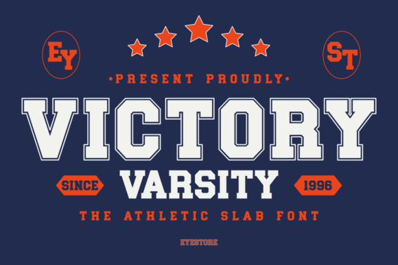
Victory Varsity by Eyestore is a bold and impactful athletic slab font that perfectly captures the essence of classic sports typography. Its strong, blocky letterforms with clean lines are ideal for conveying power and team spirit, making it suitable for sports branding, merchandise, and impactful headlines. Available in both outline and regular styles, this font provides excellent versatility for a winning design.
9. Jersey Font
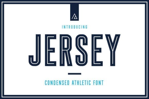
Jersey Font by Aurora Graphics is a condensed sans-serif typeface, drawing inspiration from college sports and football jerseys. It offers both outline and regular solid fill versions, making it versatile for various design needs. This font is an excellent choice for titles and headlines due to its strong, athletic appearance. It includes uppercase and lowercase letters, numbers, symbols, and supports European languages.
Tips for Choosing from the Roster
Match the Mood: Does your project need a vintage feel (distressed)? A clean, modern look (classic block)? Or something unique (script/inline)?
Consider Legibility: Especially for logos or jersey numbers, ensure the font is clear and readable at various sizes and distances.
Check Font Family Options: If you need versatility (e.g., bold for headlines, regular for sub-headings), a font family with multiple weights is invaluable.
By exploring these recommended fonts, you're sure to find the perfect typeface to give your designs that winning edge!
VI. Best Practices for Using Varsity Fonts
Having a great varsity font is like having a star player on your team – but you still need a solid game plan to win! Simply choosing a varsity font isn't enough; knowing how to use it effectively will make your designs truly stand out. Here are some coaching tips to help you master the art of incorporating varsity fonts into your projects:
Legibility is Key: Readability Wins the Game
Varsity fonts are known for their boldness, but that doesn't always guarantee readability. Especially if you're using them for logos, jerseys, or signage that needs to be seen from a distance, clarity is paramount.
Keep it clean: Avoid overly complex backgrounds or textures behind varsity text that can obscure the letterforms.
Optimal spacing: Pay attention to kerning (the space between individual letters) and tracking (the overall letter spacing). Too tight, and the letters merge; too loose, and they float apart. Good spacing ensures crisp readability.
Consider the medium: A font that looks great on a screen might be less legible when embroidered on a cap or printed very small on a ticket. Test your font in its intended context.
Pairing Perfection: Building a Winning Font Team
Varsity fonts are strong characters, and they often work best when paired with fonts that complement rather than compete with them. Think of them as the star player, with other fonts providing solid support.
Sans-serifs are your best friend: Clean, simple sans-serif fonts (like Helvetica, Open Sans, or Montserrat) provide an excellent contrast to the bold, often angular nature of varsity styles. They offer readability for body text or subheadings without distracting from the main varsity element.
Simple scripts for flair: If you want to add a touch of elegance or dynamic movement, a clean, legible script font can pair well, but use it sparingly and ensure it doesn't clash with the strong varsity lines.
Avoid clashing styles: Steer clear of pairing a varsity font with another heavily decorative font, as this can make your design look cluttered and messy.
Color & Texture: Adding Depth to Your Playbook
The right colors and textures can significantly enhance the impact of your varsity font, bringing out its athletic or collegiate personality.
Team colors: Naturally, using school or team colors with a varsity font is a no-brainer. Bold, high-contrast combinations often work best.
Layering effects: Many varsity fonts look fantastic with outlines, shadows, or inner fills. Experiment with contrasting colors for these layers to create depth and a classic "stitched" or "stacked" effect.
Texture play: Adding a subtle distressed texture, a faux-stitch effect, or even a slight fabric-like overlay can give your varsity text a realistic, tactile feel, especially for apparel designs.
Don't Overdo It: Less is Often More
Varsity fonts are impactful, but using them for every piece of text can quickly become overwhelming and lose its special appeal.
Accent, not body copy: Reserve varsity fonts for headlines, logos, team names, prominent numbers, or short, impactful phrases. They are not designed for long blocks of body text.
Strategic placement: Use them where you want to grab attention and convey a specific mood (athletic, traditional, strong).
Hierarchy is key: Let the varsity font be the focal point, with supporting information presented in a simpler, more understated typeface.
Consider the Context: Does it Fit the Arena?
Before committing, take a moment to consider if a varsity font truly aligns with the overall message, brand identity, and audience of your project.
Brand personality: Does your brand aim for traditional, edgy, playful, or serious? Varsity fonts can fit several of these, but ensure the specific style you choose matches.
Target audience: Will your audience resonate with the athletic or collegiate vibe? For example, it might be perfect for a youth sports league but less so for a high-end gourmet restaurant.
By following these "coaching tips," you'll not only select the perfect varsity font but also wield it with precision, ensuring your designs score big every time!
VII. Conclusion: Your Design's Winning Season
And there you have it – your comprehensive guide to mastering varsity fonts! From understanding their distinct types to knowing where to find the perfect one and applying best practices, you're now equipped to bring that powerful, nostalgic, and spirited energy to your own creative endeavors.
We've explored how these iconic typefaces, with their bold blocks and athletic flair, effortlessly evoke everything from thrilling sports arenas and proud academic halls to classic Americana. We delved into the nuances of classic block, stitched, distressed, outline, and even script varsity styles, demonstrating their versatility across countless applications – whether you're designing a high school yearbook, branding a new fitness studio, crafting personalized apparel, or marketing a retro-themed product.
Remember that the right varsity font isn't just about aesthetics; it's about conveying a message of strength, tradition, teamwork, and achievement. By strategically choosing and implementing these fonts, you can add incredible depth and character to your designs, making them resonate more powerfully with your audience.
So, go ahead and experiment! Now that you're armed with this knowledge, confidently explore the vast world of varsity fonts. Whether it's for a client project or a personal passion, let these powerful typefaces help your designs score big and truly shine.
Disclaimer:
This article is for informational purposes only. Some links may be affiliate links, meaning Advise Graphics may earn a commission at no extra cost to you. We do not guarantee results, and readers should do their own research before making any decisions.
Tags
Subscribe
Join the Advise Graphics community and get exclusive design resources, tips, and updates delivered straight to your inbox.


Ads


Copyright
© 2025 Advise Graphics. All rights reserved.
Cop© 2025 Advise Graphics. All rights reserved.