
10 Stunning Business Proposal Designs


Some links in this post may be affiliate links. See our Affiliate Disclosure for details.
Have you ever spent countless hours perfecting a business proposal, only to have it feel… flat? You know your solution is solid, your research is thorough, and your numbers are sound, but the document itself just isn't capturing the imagination of your potential client. You’re not alone. In today’s fast-paced world, a winning business proposal isn't just about the words on the page; it's about the entire visual experience.
A well-designed proposal can do more than simply present information—it can tell a story, build credibility, and demonstrate your creativity before the client even reads the first sentence. It’s an opportunity to show, not just tell, them who you are and what you can do.
That's why we've curated a list of 10 stunning business proposal designs from a variety of industries. From sleek and minimalist layouts to bold and data-rich infographics, these examples are here to ignite your creativity and help you see what’s possible. They're not meant to be copied, but rather to inspire you to think differently about how you present your next big idea. So, get ready to find the perfect design to inspire your next project!
The 10 Stunning Proposal Designs
Now that we’ve established the power of a great design, let’s get into the inspiration. We've hand-picked 10 unique business proposal designs that each bring something special to the table. As you explore these examples, pay attention to the use of color, typography, imagery, and layout—and consider how you might adapt these ideas to fit your own brand and project.
1. The Professional & Corporate
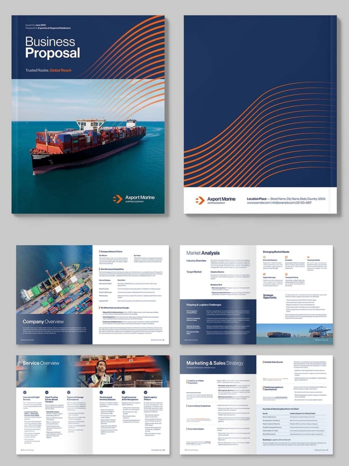
This business proposal design is a masterclass in professional, corporate communication. It perfectly balances a clean, structured layout with subtle visual elements to create a document that feels both trustworthy and modern. The cover immediately sets a serious tone with a powerful image of a shipping vessel, using a cool blue color palette with a dynamic orange wave pattern to represent movement and global reach.
Why it works: The design’s strength lies in its meticulous organization. Each section—from the Table of Contents and Executive Summary to the Market Analysis and Operations Plan—is clearly defined and easy to navigate. The use of a grid system and consistent formatting for headlines and body text ensures a smooth reading experience. It uses icons and subtle graphics to break up dense paragraphs, making complex information digestible without sacrificing its professional feel. This design proves that a corporate proposal can be visually engaging while remaining highly credible.
Best for: This style is perfect for industries where trust and clarity are paramount, such as logistics, finance, consulting, and B2B services. It's ideal for a company that wants to present a well-researched and highly professional plan to potential partners or clients.
2. The Creative & Structured
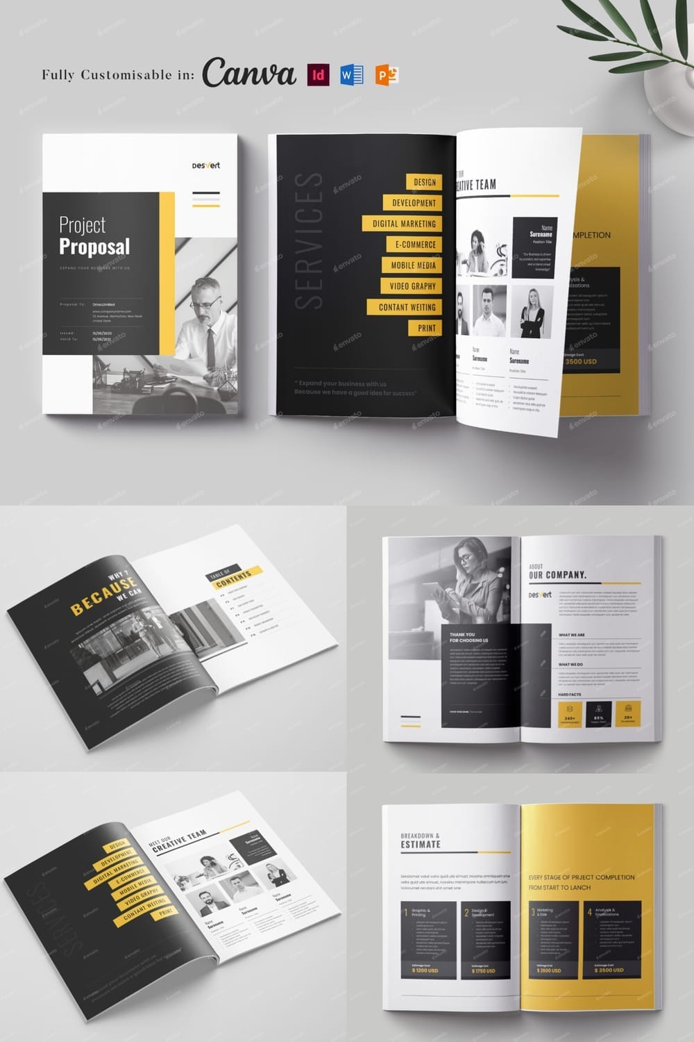
This proposal design strikes a perfect balance between creative expression and professional structure. The color scheme—a bold, dark gray and vibrant yellow—creates immediate visual interest and energy. The typography is modern and confident, particularly with the large, impactful headings. The design cleverly uses columns, white space, and subtle geometric shapes to organize a wide variety of information, from a Table of Contents and a "Meet Our Team" section to a detailed Breakdown & Estimate.
Why it works: This design excels at making the information visually digestible. The use of a strong grid and a limited color palette prevents the many different sections from feeling cluttered. The yellow highlights are used strategically to draw the eye to key elements like page numbers, section titles, and important facts, such as the number of "Happy Clients." It feels dynamic and showcases a brand that is both organized and creatively forward-thinking.
Best for: This style is ideal for creative agencies, marketing and design firms, and freelance professionals who want to demonstrate their modern aesthetic and organized approach. It's a great choice for projects that require a clear breakdown of services and costs in a visually appealing format.
3. The Energetic & Modern
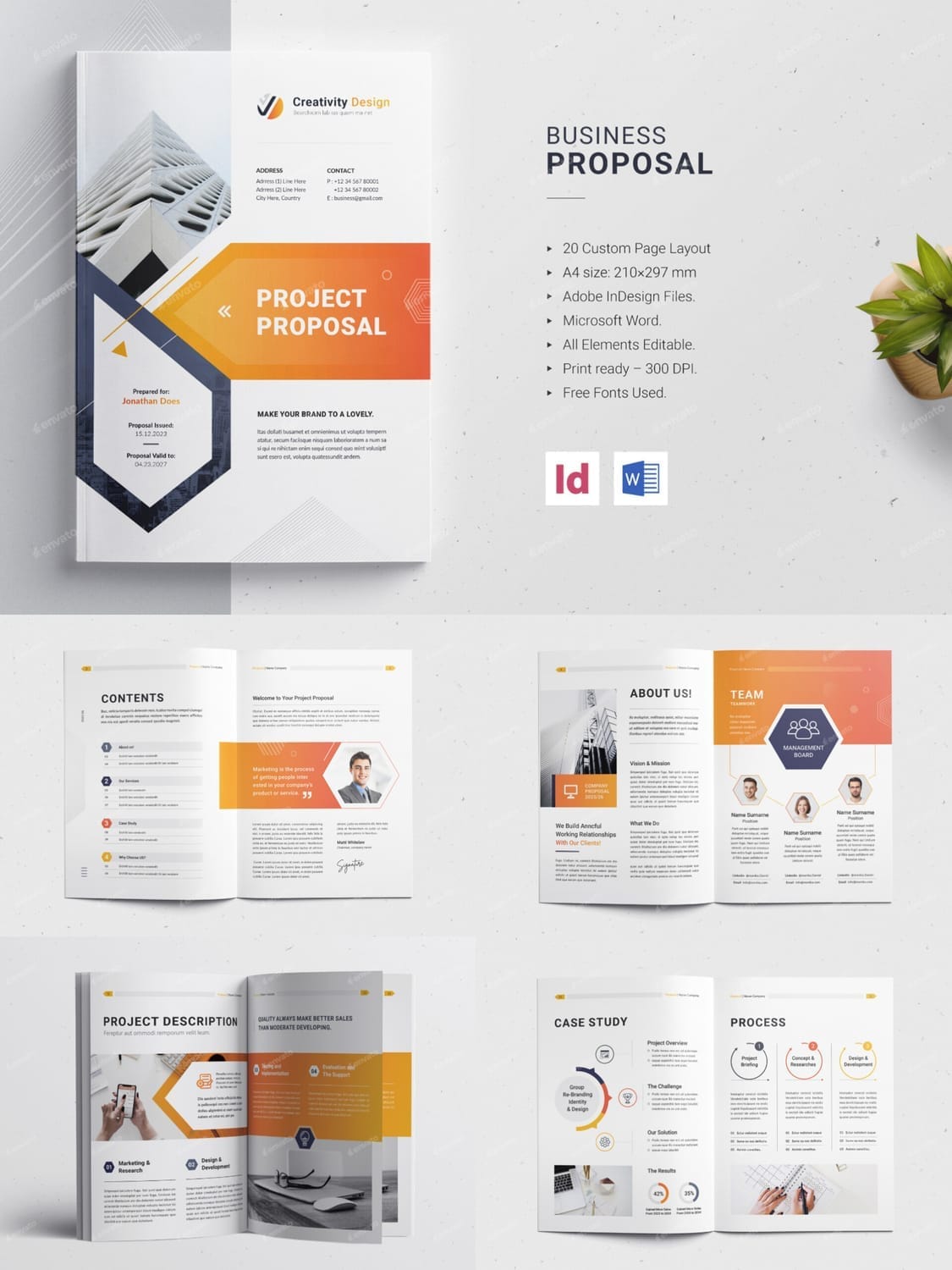
This proposal design is a dynamic showcase of a company's modern approach and collaborative spirit. The striking yellow-to-orange gradient and geometric shapes give it a fresh, energetic feel, while the clean, white background ensures readability. The design effectively uses large, bold headings and a mix of full-bleed images and circular, hexagonal, and rectangular shapes to break up content and highlight key information. The inclusion of sections like a "Team" page with photos and a step-by-step "Process" page makes the proposal feel transparent and human.
Why it works: The design’s creativity is its key strength. It turns the often-dry process of a project description into a visually appealing and easy-to-follow flow. The use of icons and numbered steps clearly outlines the journey the client will take, building confidence and showing a well-thought-out plan. It balances professional details with a welcoming, creative tone, making it ideal for a client seeking an innovative partner.
Best for: Creative and digital agencies, marketing consultants, and tech startups. It's an excellent choice for any business that wants to convey a sense of modern expertise, collaborative teamwork, and a clear, logical process.
4. The Industrial & Technical
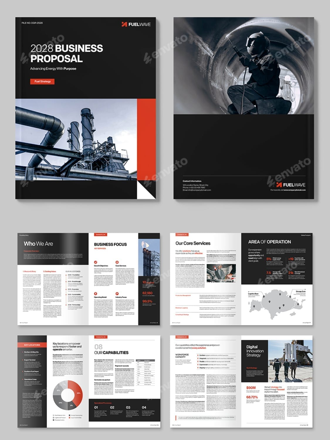
This business proposal design is all about conveying strength, reliability, and expertise. With a bold color palette of deep black, white, and a powerful red-orange accent, it immediately feels grounded and serious. The layout is structured and clean, making it easy to navigate a large amount of detailed information. It effectively uses charts, graphs, and maps to present complex data in a digestible format.
Why it works: The design’s power comes from its no-nonsense, highly functional approach. Large, impactful images of industrial sites and engineers reinforce the company's technical proficiency and hands-on capability. The clear section headers like "Business Focus," "Our Capabilities," and "Area of Operation" give the document a clear and logical flow. It manages to present a large volume of text and data without looking cluttered or overwhelming.
Best for: This proposal design is a perfect fit for engineering firms, manufacturing companies, energy and industrial services, and other businesses where a strong, credible, and detailed presentation is essential. It's the ideal choice when you need to prove your operational excellence and deep industry knowledge.
5. The High-Tech & Strategic
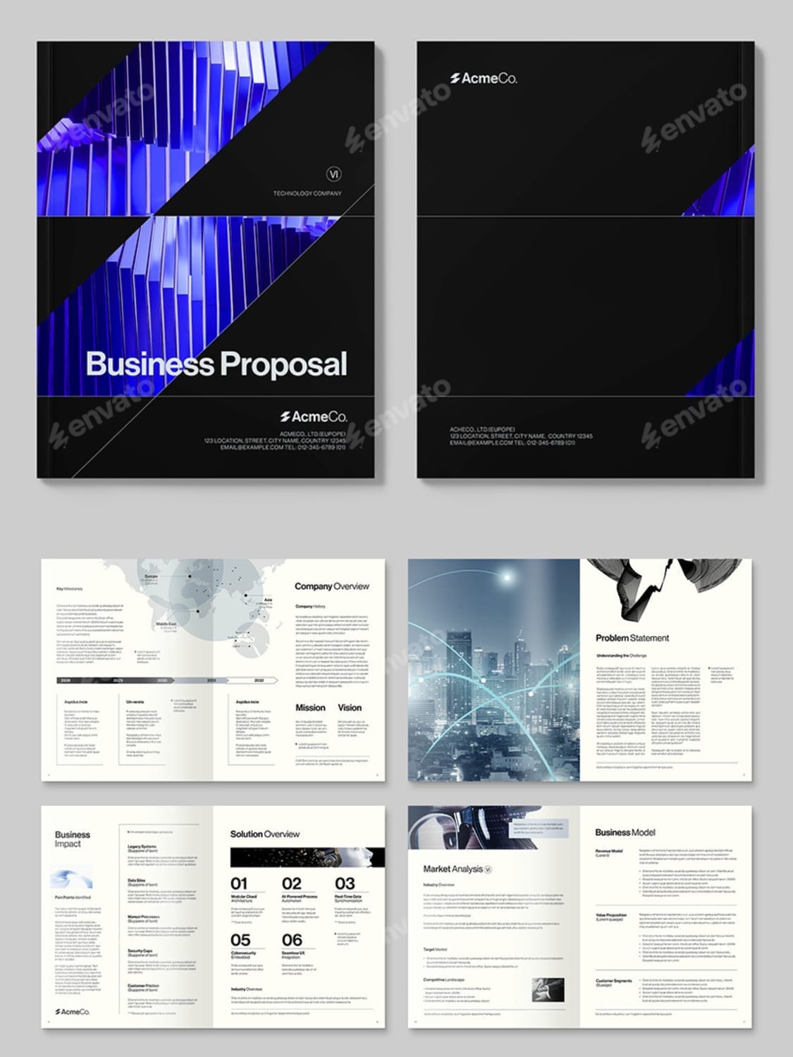
This design is a perfect blend of sleek sophistication and strategic depth. The cover, with its futuristic blue and purple geometric pattern against a black background, immediately grabs attention and signals that this is a tech-forward brand. The internal pages use a balanced mix of light and dark layouts, which adds visual variety and helps to differentiate key sections. It uses subtle data visualizations like maps and timelines to concisely convey complex information about global reach and company milestones.
Why it works: The design is highly effective at conveying a sense of innovation and professional expertise. It leverages abstract, high-tech imagery to create a modern feel, while the structured, grid-based layout ensures all information is easy to follow. Sections like "Business Impact," "Solution Overview," and "Technology Stack" are clearly defined with clean, minimalist graphics that make the content highly scannable. This proposal feels like it's from a company that not only understands the future but is building it.
Best for: Tech companies, software developers, IT consulting firms, and any business in the innovation or AI space. It's the ideal design for a proposal that needs to look both cutting-edge and highly credible.
6. The Trustworthy & Relatable
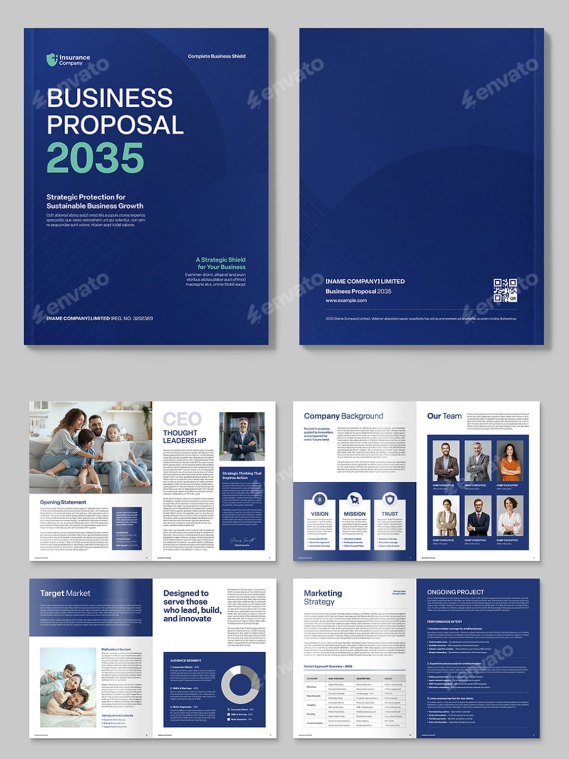
This business proposal design is crafted to build a deep sense of trust and human connection. The dominant blue color palette evokes stability, professionalism, and confidence. Unlike more abstract or industrial designs, this one prominently features relatable, family-oriented imagery. Photos of smiling people and families are integrated throughout the document, making the brand feel approachable and empathetic.
Why it works: The design uses a powerful emotional appeal. It goes beyond charts and data by visually communicating that the company is about people, not just products or services. The structured, clean layout—with a clear Table of Contents, well-defined sections, and digestible information—supports this feeling of transparency and reliability. It's a strategic move to soften the corporate feel and make the proposal feel personal.
Best for: This style is perfectly suited for insurance companies, financial advisors, healthcare providers, and any business that needs to establish a strong, trusting relationship with its clients. It's an excellent choice when your service is personal and your message is about protecting what matters most.
7. The Soft & Minimalist
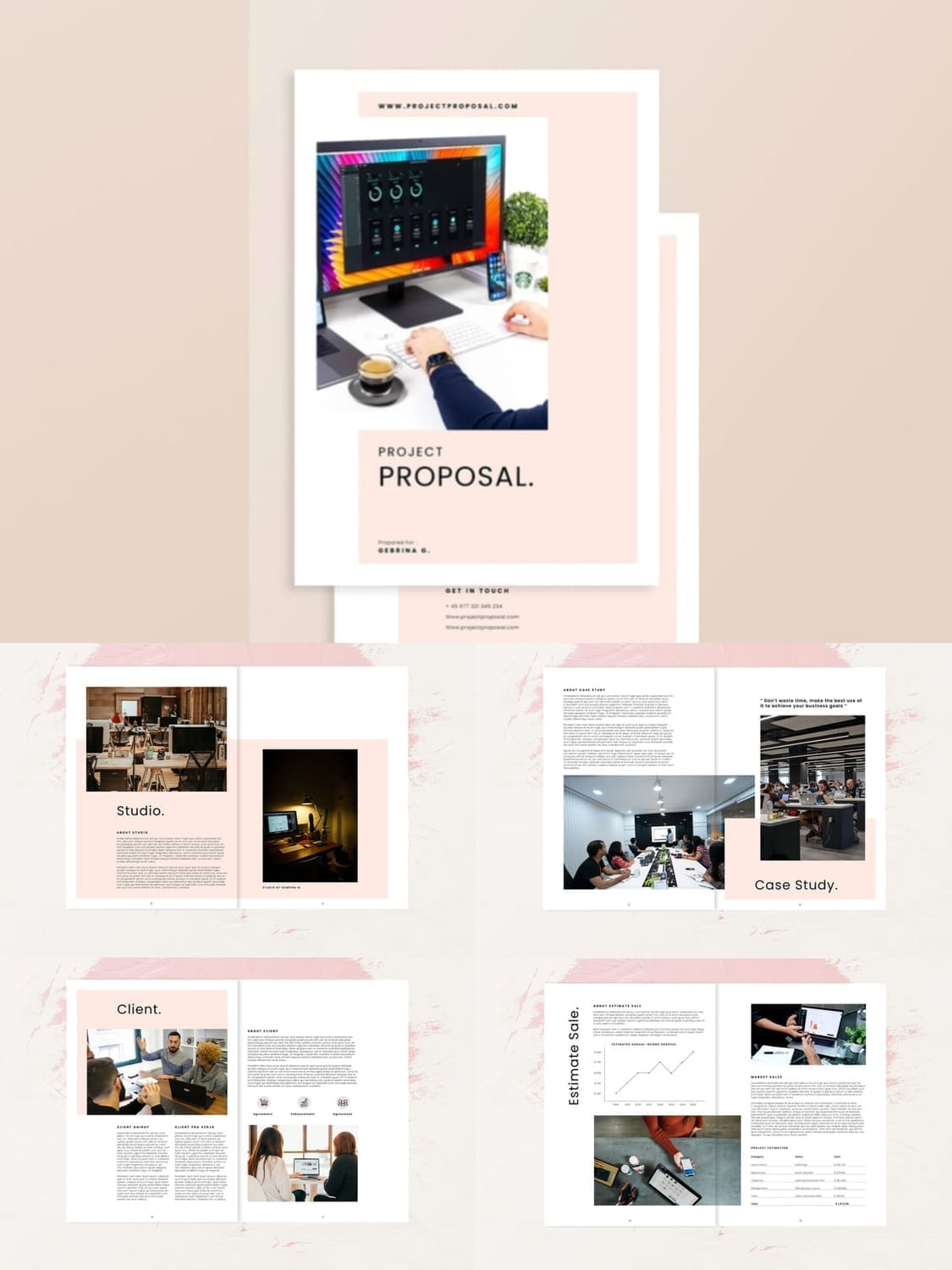
This business proposal design is the epitome of soft, friendly minimalism. The color palette—featuring a gentle, blush pink and a clean, crisp white—creates a sense of calm and approachability. The layout relies heavily on white space to give each element room to breathe, while a simple, modern sans-serif font keeps the text clean and readable. The design feels personal and intimate, making the client feel as though they're reading a thoughtfully crafted story rather than a sterile business document.
Why it works: Its power lies in its quiet confidence. The design doesn't shout for attention; instead, it uses a subtle, elegant approach to make a lasting impression. The intentional placement of images and short, punchy headlines like "Client." and "Studio." breaks the content into digestible sections. The overall aesthetic is warm and inviting, perfect for building a personal connection.
Best for: This proposal design is ideal for creative freelancers, boutique agencies, photographers, and consultants in the wedding, home decor, or wellness industries. It's the perfect choice when your brand is built on a foundation of personal service, trust, and creative passion.
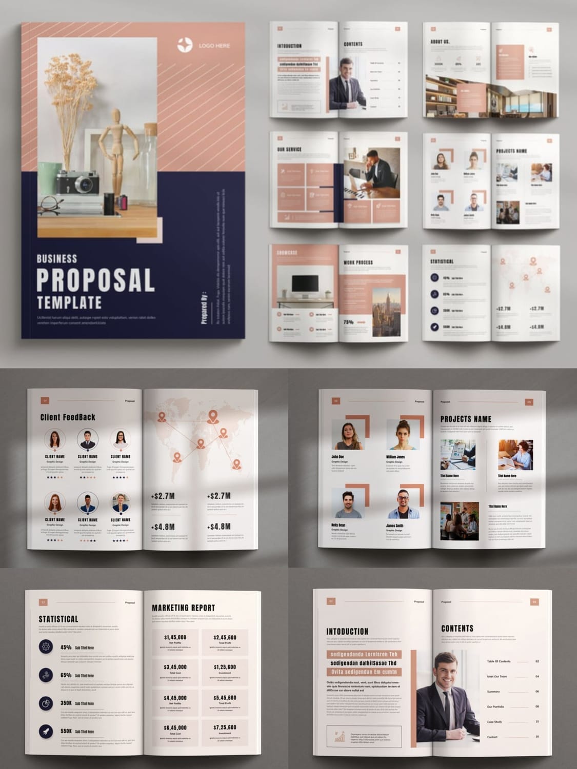
8. The Elegant & Organic
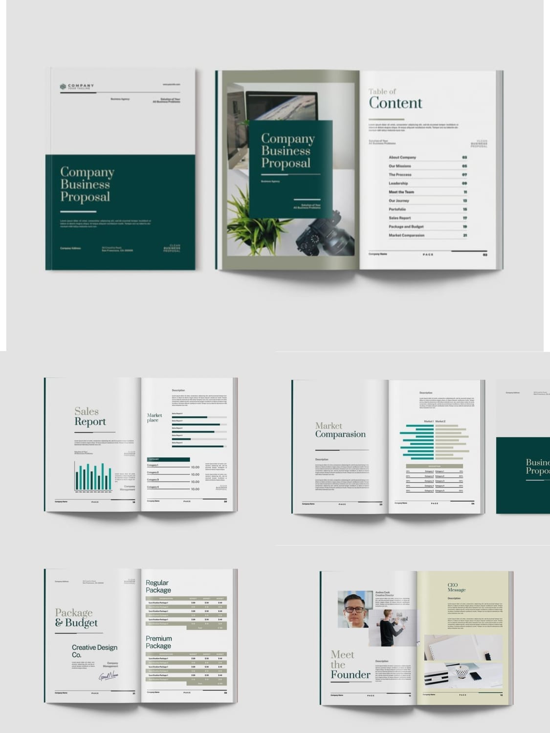
This business proposal design is defined by its sophisticated color palette and organic feel. The rich, deep teal and a warm, creamy gray create a luxurious and serene mood. This is contrasted with a clean, classic serif font for titles and a modern sans-serif for body text, creating a timeless yet current look. The imagery is a key component, with artfully arranged photos of flowers, plants, and tasteful office setups that make the brand feel approachable and high-end.
Why it works: This design feels both professional and personal. The use of multiple images on a single page in a collage-like fashion adds visual interest and a sense of creativity. Sections like "About Company" and "Package & Budget" are presented with a minimalist and spacious layout, which makes the information feel less intimidating. It successfully balances detailed business information, like a "Sales Report" with graphs and a "Market Comparison" chart, with a calming, aesthetic presentation.
Best for: This style is perfect for boutique consulting firms, interior design studios, wellness brands, or any creative business that wants to project an image of calm, refined expertise and a personal touch. It's the ideal choice for a proposal that needs to feel luxurious and trustworthy.
9. The Bold & Impactful
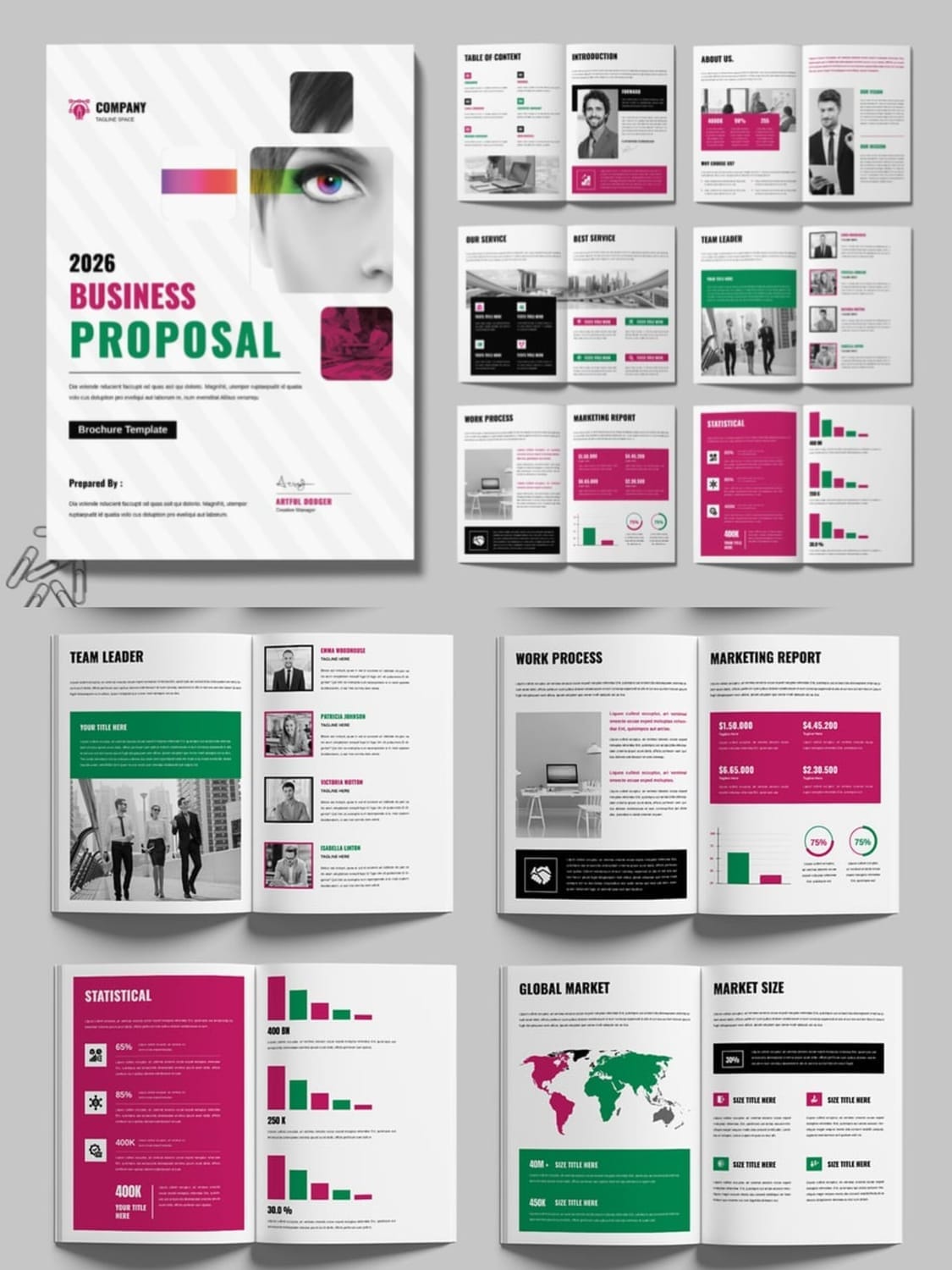
This business proposal design is all about making a powerful statement. The design uses a dynamic and high-contrast color palette, combining a neutral black and white with vibrant magenta and bright green. This bold choice creates an energetic and modern feel, perfect for a brand that wants to stand out. The layout is equally striking, featuring a mix of geometric shapes and grids that guide the reader’s eye through the content. The cover, with its fragmented, abstract image of a person's eye, suggests a focus on insight and vision.
Why it works: This proposal is highly effective at presenting data and key information in a visually exciting way. Sections like the "Marketing Report" and "Statistical" pages use colorful bar charts and graphs to make numbers engaging and easy to understand. The contrasting colors are strategically used to highlight crucial details and create a clear visual hierarchy. This design feels confident, data-driven, and creatively daring.
Best for: Marketing agencies, data analytics firms, branding consultants, or any business in a competitive industry that needs to look confident, forward-thinking, and impactful.
10. The Clean & Professional
This design is a testament to the power of a clean, minimalist approach. It uses a neutral color palette of soft grays, white, and a subtle accent color to create a highly polished and professional feel. The layout is structured and clean, making it exceptionally easy to read and navigate. It uses simple graphics, such as circles and squares, to present data and key points without being distracting. The focus is clearly on the content, allowing the strength of the text and the quality of the imagery to take center stage.
Why it works: Its simplicity is its greatest asset. The design feels spacious and organized, which conveys confidence and a well-thought-out plan. It doesn't rely on flashy elements; instead, it uses a logical flow and clear visual hierarchy to communicate a powerful message. This approach makes it a versatile template that can be easily adapted to a variety of industries without losing its professional integrity.
Best for: This is a versatile design perfect for startups, consultants, and service-based businesses that need a clean and professional proposal that’s easy to customize. It works for a wide range of fields, from business consulting to web development, where the focus should be on the solution, not the design itself.
Key Takeaways and Actionable Tips
Looking at these amazing designs is one thing; applying the principles to your own work is another. While you don’t need to be a professional designer to create an impactful proposal, you can learn from what makes these examples so effective. Here are some key principles to keep in mind for your next project:
Prioritize Visual Hierarchy: Guide your reader's eye through the document. Use size, color, and placement to highlight the most important information, whether it's the client's problem, your solution, or your pricing. Don't make them hunt for the details that matter most.
Embrace Your Brand's Personality: Your proposal is an extension of your brand. Use your company's colors, fonts, and visual style to create a consistent and professional experience. If your brand is playful, your proposal can be too. If it's serious, a clean and classic design is a better fit.
Clarity Over Complexity: A beautiful design is useless if it's hard to read. Ensure your fonts are legible, your colors provide enough contrast, and your layout is logical. The design should support the message, not distract from it.
Tell a Story: The best proposals do more than list features and benefits—they tell a compelling story. Use your design to lead the client from their current challenge to their future success with your help. Use imagery and flow to create a persuasive narrative.
Know Your Audience: Always design with your specific client in mind. A minimalist proposal might work for a tech startup, but a more formal, data-rich document might be what a traditional firm expects. Tailor your design to your client's industry and expectations.
Conclusion
Creating a great business proposal is about more than just numbers and words; it’s about making a lasting impression. By focusing on smart design, you can transform a simple document into a powerful tool that demonstrates your creativity, professionalism, and commitment to excellence.
We hope these examples have sparked some fresh ideas for your next project. Remember, the goal isn't to copy, but to be inspired. Now, go create something amazing!
What's a design element you find most inspiring? Share your thoughts in the comments below!
Disclaimer:
This article is for informational purposes only. Some links may be affiliate links, meaning Advise Graphics may earn a commission at no extra cost to you. We do not guarantee results, and readers should do their own research before making any decisions.
Tags
Subscribe
Join the Advise Graphics community and get exclusive design resources, tips, and updates delivered straight to your inbox.


Ads


Copyright
© 2025 Advise Graphics. All rights reserved.
Cop© 2025 Advise Graphics. All rights reserved.