
Spray Paint Fonts – Add a Bold Urban Edge to Your Designs


Some links in this post may be affiliate links. See our Affiliate Disclosure for details.
I. Introduction
Hey there, design enthusiasts and creative minds! Ever been drawn to the raw, rebellious energy of street art and wished you could inject that same gritty vibe into your digital projects? Well, you're in the right place! We're diving into the fascinating world of spray paint fonts – those awesome digital typefaces designed to mimic the authentic look and feel of hand-sprayed lettering. Think bold strokes, rough edges, and that unmistakable urban edge. Whether you're crafting a poster that needs to scream attitude, designing edgy merchandise, or just want to add a touch of authentic grit to your visuals, understanding spray paint fonts can be a game-changer. So, grab your virtual can of paint, and let's explore how these unique fonts can bring a splash of streetwise style to your creative toolkit!
II. What Makes a Font Say "Spray Paint"? The Characteristics
Okay, so what exactly gives a font that unmistakable "freshly sprayed" look? It's all in the details! Spray paint fonts are masters of imperfection, and that's precisely what makes them so cool. Let's break down the key visual elements:
Rough Edges and Imperfections: Forget those perfectly smooth curves! Spray paint fonts embrace the jagged, uneven, and slightly messy. This is crucial for capturing the spontaneous and unfiltered nature of spray painting. Think of those little imperfections as the font's personality shining through.
Uneven Strokes and Splatters: Just like a real spray can, the strokes in these fonts often vary in thickness, and you'll sometimes see little "splatters" or stray marks around the edges. This adds to the organic, hand-done feel.
Texture and Graininess: Many spray paint fonts incorporate subtle textures and grain, mimicking the way paint interacts with a surface. This can range from a slightly rough, sandpaper-like effect to a more pronounced, gritty feel.
Drips and Bleeds: Ah, the classic drip! Some of the most iconic spray paint fonts feature drips and bleeds, where the letterforms seem to have paint running down them. This is a powerful visual cue that instantly says "street art."
Variations in Thickness and Density: The ink flow from a spray can isn't always consistent, and spray paint fonts often reflect this with variations in the thickness and density of the letterforms. This creates a dynamic and visually interesting effect.
More Than Just Looks: The Emotional Impact
But spray paint fonts aren't just about the visuals; they also pack an emotional punch. They tap into a range of powerful associations:
Rebellion and Counter-Culture: Spray paint is inherently linked to graffiti and street art, which have historically been forms of expression for those pushing against the mainstream. Using these fonts can instantly add an element of rebellion and nonconformity to your design.
Creativity and Individuality: Spray paint is all about expressing yourself freely and creatively. These fonts celebrate that spirit, making them perfect for projects that want to stand out and showcase a unique voice.
Energy and Dynamism: There's a certain energy and dynamism to spray paint, and these fonts capture that perfectly. They're visually active and attention-grabbing, making them great for designs that need to make a statement.
Authenticity and Rawness: In a world of polished perfection, spray paint fonts offer a dose of raw authenticity. They feel real, unfiltered, and honest, which can resonate with audiences looking for something genuine.
Spray Paint vs. Other Grunge Fonts
It's worth noting that while spray paint fonts are a type of "grunge" font, they have a distinct flavor. Other grunge fonts might be distressed, weathered, or industrial, but spray paint fonts specifically aim to replicate the look and feel of aerosol art. This focus on the spray paint medium sets them apart and gives them their unique character.
III. The Hunt is On: Where to Find Your Spray Paint Font
Finding the right spray paint font can feel like uncovering a hidden gem in a back alley – exciting! Here are some of the best places to start your search:
Font Foundries and Marketplaces:
These are your big online hubs for all things fonts, and they often have a dedicated selection of spray paint styles. Think of platforms like:
Adobe Fonts: If you're an Adobe Creative Cloud user, this integrated library offers a curated selection of high-quality fonts, and you'll likely find some great spray paint options within their collection. The best part? They're usually included with your subscription!
MyFonts: This is a massive marketplace with a vast array of fonts from independent designers and foundries worldwide. Their search filters are excellent, allowing you to narrow down your options by style, including "grunge," "distressed," and specifically "spray paint."
Creative Market: Known for its diverse range of creative assets, Creative Market often features unique and artistic fonts, including many that capture the spray paint aesthetic. You'll find both individual fonts and font bundles here.
Envato Elements: If you're looking for a subscription-based model, Envato Elements offers unlimited downloads of a huge library of fonts, graphics, and templates, and you're sure to stumble upon some cool spray paint fonts in their collection.
Creative Fabrica: This platform is a popular choice, offering both individual font purchases and subscription options. They often have a wide variety of unique and handcrafted fonts, including many that perfectly capture the spray paint style.
GraphicRiver (part of Envato Market): While Envato Elements offers a subscription, GraphicRiver operates on a pay-per-item basis. It's another excellent marketplace to find individual spray paint fonts created by a diverse community of designers.
Free Font Websites:
For those on a budget, there are numerous websites that offer free fonts. While the quality and licensing can vary, you can definitely find some decent spray paint options if you're willing to do a bit of digging. Just be sure to carefully check the license to understand how you can use the font (personal vs. commercial projects). Some popular free font sites include:
Google Fonts: While not exclusively focused on grunge styles, you might find a few subtly textured or distressed fonts that could work in a spray paint context, or fonts that pair well with more explicit spray paint styles.
Fontspace, Dafont, 1001 Fonts: These sites have large collections of free fonts contributed by various designers. Use their search features with terms like "spray," "graffiti," "grunge," and "distressed" to see what comes up. Be prepared to sift through a wider range of quality here.
Independent Designers:
Don't underestimate the power of discovering individual font creators! Platforms like Behance, Dribbble, and personal portfolio websites often showcase unique and niche fonts that you might not find on larger marketplaces. Supporting independent designers can lead you to truly distinctive and high-quality spray paint fonts.
Tips for Searching:
To make your hunt more effective, try using specific keywords when searching on these platforms. Think beyond just "spray paint font" and try terms like:
Stencil font (often associated with spray paint)
Grunge font
Distressed font
Urban font
Street art font
Rough font
Ink splatter font
By exploring these different avenues and using the right search terms, you'll be well on your way to finding the perfect spray paint font to add that urban edge to your creative projects! Now, once you've found some contenders, the next step is knowing how to use them effectively, which is what we'll dive into next!
IV. Unleashing the Urban Edge: Using Spray Paint Fonts Effectively
Spray paint fonts aren't a one-size-fits-all solution, but when used in the right context, they can add a powerful and unique visual punch. Here's a breakdown of how to make the most of them:
Best Use Cases:
Where do these fonts truly shine? Consider these scenarios:
Posters and Flyers (especially for music, events, activism): If you're promoting a punk rock gig, a street art festival, or a campaign with a rebellious message, a spray paint font can instantly set the right tone.
Album Artwork: For genres like hip-hop, punk, hardcore, and alternative music, a gritty spray paint font can perfectly complement the album's aesthetic.
Website Headers and Branding (for a specific niche): If your brand has a strong urban, edgy, or artistic identity (think skate shops, tattoo parlors, independent art studios), a spray paint font can create a memorable and authentic visual identity. Use it sparingly for headers or key branding elements.
Social Media Graphics: Grab attention on social media with bold and impactful text using a spray paint font, especially for announcements, promotions, or content with an urban or artistic theme.
Merchandise Design (t-shirts, stickers): A cool spray paint font can add instant street cred to apparel and accessories.
Video Titles and Graphics: Inject energy and visual interest into your video projects, especially those with an urban, action-packed, or artistic feel.
Considerations for Legibility:
While the raw and imperfect nature of spray paint fonts is their charm, it's crucial to keep legibility in mind, especially for longer blocks of text.
Use them primarily for headlines, titles, and short bursts of text. Avoid using highly textured or drippy spray paint fonts for extensive paragraphs.
Consider the size and contrast. Ensure there's enough contrast between the font color and the background to make it readable. Larger sizes generally improve legibility for more intricate spray paint styles.
Test it out! Always preview your design at the intended size to make sure the text remains clear.
Pairing with Other Fonts:
Spray paint fonts often work best when paired with cleaner, more legible fonts. This creates a visual hierarchy and prevents your design from becoming too overwhelming. Some good pairings include:
Clean Sans-Serifs: A simple and modern sans-serif can provide a strong contrast and make the spray paint font stand out.
Bold Serifs: A classic serif font with strong letterforms can create an interesting juxtaposition with the raw energy of a spray paint font.
Monospaced Fonts: Their uniform character width can offer a cool, industrial contrast to the organic feel of spray paint.
Color Palette Considerations:
The colors you choose can significantly enhance the impact of your spray paint font. Consider:
Bold Contrasts: Think bright colors against dark backgrounds or vice versa for a classic graffiti feel.
Neon Colors: To really amplify the urban energy.
Muted Earth Tones: Can create a more subtle but still gritty aesthetic.
Limited Palettes: Often, keeping the color palette simple can make the spray paint texture the star of the show.
Adding Effects and Textures:
Don't be afraid to play around with additional effects in your design software to further enhance the spray paint look. This could include:
Subtle Drop Shadows or Outer Glows: To make the text pop.
Layering Textures: Adding a subtle background texture that mimics a brick wall or concrete can amplify the urban feel.
Using Clipping Masks: To confine the spray paint effect within specific shapes or areas.
Licensing Considerations:
We touched on this earlier, but it's worth reiterating: always check the font license! Understand whether the font is free for personal use only or if you need a commercial license for projects you intend to profit from. This will save you potential headaches down the line.
By keeping these tips in mind, you can wield the power of spray paint fonts effectively and add that authentic urban edge to your designs without sacrificing legibility or overall visual appeal. Next up, let's take a look at some specific examples of popular spray paint fonts to give you a better idea of the variety out there!
V. Editor's Picks: A Selection of Standout Spray Paint Fonts
Having explored the world of spray paint fonts, I've come across some truly exceptional typefaces that perfectly capture the urban spirit. Here's a selection of my personal favorites, showcasing a range of styles and potential applications:

Style: A versatile family offering both serif and sans-serif versions, designed with a clear stencil influence and a consistent spray paint texture. The letterforms are clean and geometric, maintaining good legibility while the overlaid spray effect provides the characteristic urban grit. The availability in multiple weights suggests flexibility for various design needs.
Why I love it: Octin Spraypaint stands out for its versatility. The inclusion of both serif and sans-serif options within the same aesthetic allows for cohesive design systems. The clean stencil structure ensures readability, making it suitable for a wider range of applications compared to more heavily stylized spray paint fonts, while the texture adds the necessary urban edge.
Best For: Branding projects seeking an urban yet structured feel, posters and flyers where legibility is important alongside the spray paint aesthetic, website headers and body text (especially the lighter weights), and designs that require a consistent urban voice across different text hierarchies. The multiple weights offer flexibility for emphasis and visual interest.

Style: A bold, uppercase stencil font with a distinct, slightly rough spray paint texture applied to both the solid and outlined versions. The letterforms are geometric and impactful, characteristic of stencil designs, with the added texture providing an authentic spray-painted appearance. The example showcases versatility through solid fills, outlines, and layering of colors.
Why I love it: This font effectively captures the essence of stencil art created with spray paint. The clean stencil structure ensures legibility, while the subtle texture adds a layer of realism and urban grit. The ability to use it as a solid fill or an outline provides design flexibility for creating visual hierarchy and emphasis.
Best For: Posters, flyers, and album art with an urban or street art theme, impactful headlines and titles, branding for edgy or industrial businesses, and designs where a strong, stencil-inspired message with a tactile spray paint feel is desired. The different fill options make it adaptable for various visual contexts.

Style: A dynamic and expressive graffiti-style font with a hand-drawn feel. It features a mix of uppercase and lowercase letters with varying stroke weights, sharp angles, and playful additions like a crown, smiley face, arrow, and drips, all contributing to a vibrant urban aesthetic. The overall texture suggests a marker or spray paint effect.
Why I love it: Urban Stars is bursting with personality and energy. The combination of different graphic elements integrated into the lettering makes it stand out and feel authentically hand-created. It's a font that isn't afraid to be bold and expressive, capturing the raw creativity of street art.
Best For: Eye-catching logos, impactful social media graphics, streetwear branding, posters for urban events, and any project aiming for a youthful, energetic, and authentically graffiti-inspired visual style. The integrated graphics add a unique flair that can instantly grab attention.

Style: A stylized graffiti font that blends traditional tagging elements with a more contemporary, almost brush-script-inspired flow. It features bold strokes, sharp angles, and intentional breaks, giving it a hand-drawn feel with a slightly cleaner and more stylized aesthetic than some raw tag fonts. The integrated arrow adds a dynamic visual element.
Why I love it: Graffiti Hipster offers a unique take on the graffiti style, making it feel both authentic and slightly refined. The smooth curves combined with the sharp edges create an interesting visual contrast. It's a graffiti font that feels modern and could appeal to a broader audience.
Best For: Logos and branding for creative or urban-influenced businesses, eye-catching headlines, social media graphics, apparel design, and projects aiming for a stylish and contemporary graffiti aesthetic. The integrated arrow can be a useful design element or simply a stylistic flourish.

Style: A casual, hand-drawn script font with a slightly rough texture, evoking the feel of marker or perhaps a quick spray paint tag. The letterforms are uneven, with varying stroke weights and playful quirks, contributing to its informal and urban aesthetic. The added doodles and swashes further enhance its street art vibe.
Why I love it: Laugh Together feels spontaneous and full of personality. Its hand-drawn style and urban inspiration make it relatable and approachable. The subtle texture adds a touch of authenticity, suggesting a real-world application with a marker or spray can.
Best For: Social media graphics, casual branding, posters for informal events, merchandise with a youthful and urban feel, and any project aiming for a hand-drawn, approachable street art style. The added doodles offer extra creative elements for visual interest.

Style: A dynamic, flowing graffiti script font with sharp angles, extended swashes, and integrated graffiti elements like arrows and a smiley face. The strokes vary in thickness, mimicking the movement of a spray can, and subtle spray paint textures are visible, adding to its authentic urban feel.
Why I love it: Madsen Graffiti exudes a youthful and energetic vibe. The combination of the script style with classic graffiti elements creates a visually engaging and expressive typeface. It feels like a tag that has been quickly and confidently applied.
Best For: Logos and branding for urban-inspired businesses, social media graphics, streetwear designs, posters for music or youth events, and any project aiming for an authentic, hand-style graffiti look with added flair. The integrated elements give it a unique and memorable character.

Style: A bold and dynamic graffiti script font with a rounded, bubble-like structure and a noticeable outline. It features smooth curves, varying stroke weights, and classic graffiti elements like drips and splatters. The overall impression is energetic and eye-catching, reminiscent of vibrant street art.
Why I love it: Skylight Graffiti has a friendly yet impactful vibe. The rounded forms make it approachable, while the bold weight and outline ensure it stands out. The subtle drips and splatters add an authentic graffiti touch without being overly aggressive.
Best For: Logos and branding for youth-oriented or creative businesses, eye-catching social media graphics, apparel design, posters for events with a fun and urban feel, and any project aiming for a bold, legible graffiti style with a touch of playfulness. The outline makes it particularly versatile for layering and creating visual depth.


Style: A collection of highly realistic, hand-drawn graffiti tag fonts. The example showcases a dynamic script style with sharp angles, flowing lines, and authentic imperfections that mimic the look of quick spray paint tags. Details like drips, splatters, and varying stroke weights contribute to its genuine urban feel.
Why I love it: Street Tag Vol 1 truly captures the energy and immediacy of real graffiti tagging. The level of detail in replicating the nuances of spray paint application makes it incredibly authentic and impactful. It feels like genuine street art captured in a digital format.
Best For: Logos and branding for urban culture-related businesses, impactful social media graphics, streetwear design, event posters, and any project aiming for a raw, authentic, and hand-applied graffiti tag aesthetic.


Style: A hand-drawn, uppercase font designed to authentically replicate the look of rough spray paint on a textured surface. The letterforms are uneven, with varying stroke widths and a highly textured fill that mimics the splatters and inconsistencies of real spray application. The example showcases a bright white on a dark background, further emphasizing the contrast and raw quality.
Why I love it: Rough Spray truly captures the tactile and imperfect nature of actual spray painting. The high level of texture and the slightly shaky letterforms give it an undeniable sense of realism and immediacy. It feels like genuine graffiti applied directly to a wall.
Best For: Designs aiming for an authentic, gritty urban feel, impactful headlines and short phrases, social media graphics that need a raw edge, and projects where the texture of real spray paint is a key visual element. Its uppercase nature makes it particularly suitable for strong statements.

Style: A dynamic, hand-drawn graffiti script font with a strong sense of movement and energy. The letterforms feature varying stroke weights, sharp angles, and intentional imperfections, mimicking the fluid and spontaneous nature of tagging with a spray can. Splatters and rough edges further enhance its authentic graffiti vibe.
Why I love it: Mister Dangerous exudes a raw and rebellious energy. Its hand-painted style feels genuinely authentic, capturing the speed and attitude of street art. The varying thickness and sharp flicks give it a distinct personality and visual impact.
Best For: Urban-themed branding, skateboard or streetwear designs, music artwork (especially for genres with an edge), impactful social media posts, and any project aiming for a bold, hand-drawn graffiti aesthetic that feels genuinely "off the wall."
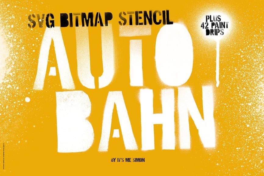
Style: A classic stencil-style font with a distinct spray paint texture. The letterforms feature the characteristic breaks associated with stencils, overlaid with a noticeable, slightly gritty spray effect. It appears to come with additional paint drip elements for added customization.
Why I love it: Autobahn Stencil strikes a great balance between the structured look of a stencil and the raw feel of spray paint. The inclusion of extra paint drips offers fantastic versatility for adding authentic details and visual interest. It's highly legible while still retaining a strong urban edge.
Best For: Posters, branding for industrial or urban-inspired businesses, merchandise (especially apparel), and designs where a clear yet impactful stencil/spray paint aesthetic is desired. The added drips make it particularly suitable for eye-catching headlines and artistic compositions.
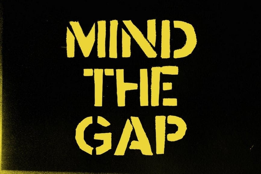
Style: A bold, uppercase stencil font with a clearly defined, slightly distressed spray paint texture. The characteristic stencil breaks are prominent, giving it a strong, industrial, and urban feel. The spray effect adds a layer of roughness and authenticity.
Why I love it: This font immediately evokes a sense of urban environments and carries a recognizable cultural weight due to the famous phrase. Its strong, blocky letterforms make it highly legible, while the spray paint texture adds a touch of gritty realism.
Best For: Posters with a clear message, urban-themed graphics, DIY projects, stenciling applications (both digital and physical), and designs aiming for a straightforward and impactful urban aesthetic. Its inherent legibility makes it suitable for shorter headlines and impactful statements.
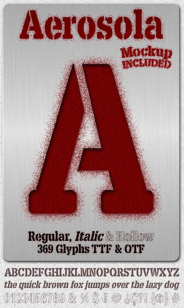
Style: A stencil-inspired font family offering Regular, Italic, and Hollow styles, all featuring a subtle yet distinct spray paint texture. The letterforms are clean and geometric, characteristic of stencil designs, with a slightly rounded quality. The spray effect adds a tactile, slightly gritty feel without compromising legibility. The inclusion of a Hollow style provides additional design versatility.
Why I love it: Aerosola offers a refined take on the spray paint aesthetic. The clean stencil structure combined with the subtle texture makes it versatile for a wider range of applications where a clear yet slightly edgy feel is desired. The inclusion of Italic and Hollow styles expands its usability within a design system.
Best For: Branding projects seeking an urban or industrial touch with good readability, posters and flyers, website headers, packaging design, and applications where a stencil-inspired look with a tactile spray paint feel is appropriate. The different styles allow for creating visual hierarchy and adding emphasis.
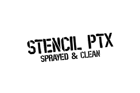
Style: A classic, bold stencil font available in two primary styles: "Sprayed" and "Clean." The "Sprayed" version features a distinct, slightly rough spray paint texture applied to the solid stencil letterforms, providing an authentic urban feel. The "Clean" version retains the sharp, geometric structure of a stencil without the added texture, offering a more straightforward and legible option.
Why I love it: The Stencil PTX family offers excellent versatility by providing both a textured and a clean version of the same fundamental stencil design. This allows for consistent branding and visual language across different applications, where sometimes the raw spray effect is desired, and other times, cleaner legibility is paramount.
Best For: Urban-themed posters, industrial branding with a gritty edge, impactful headlines, and designs where the tactile feel of spray paint is desired.
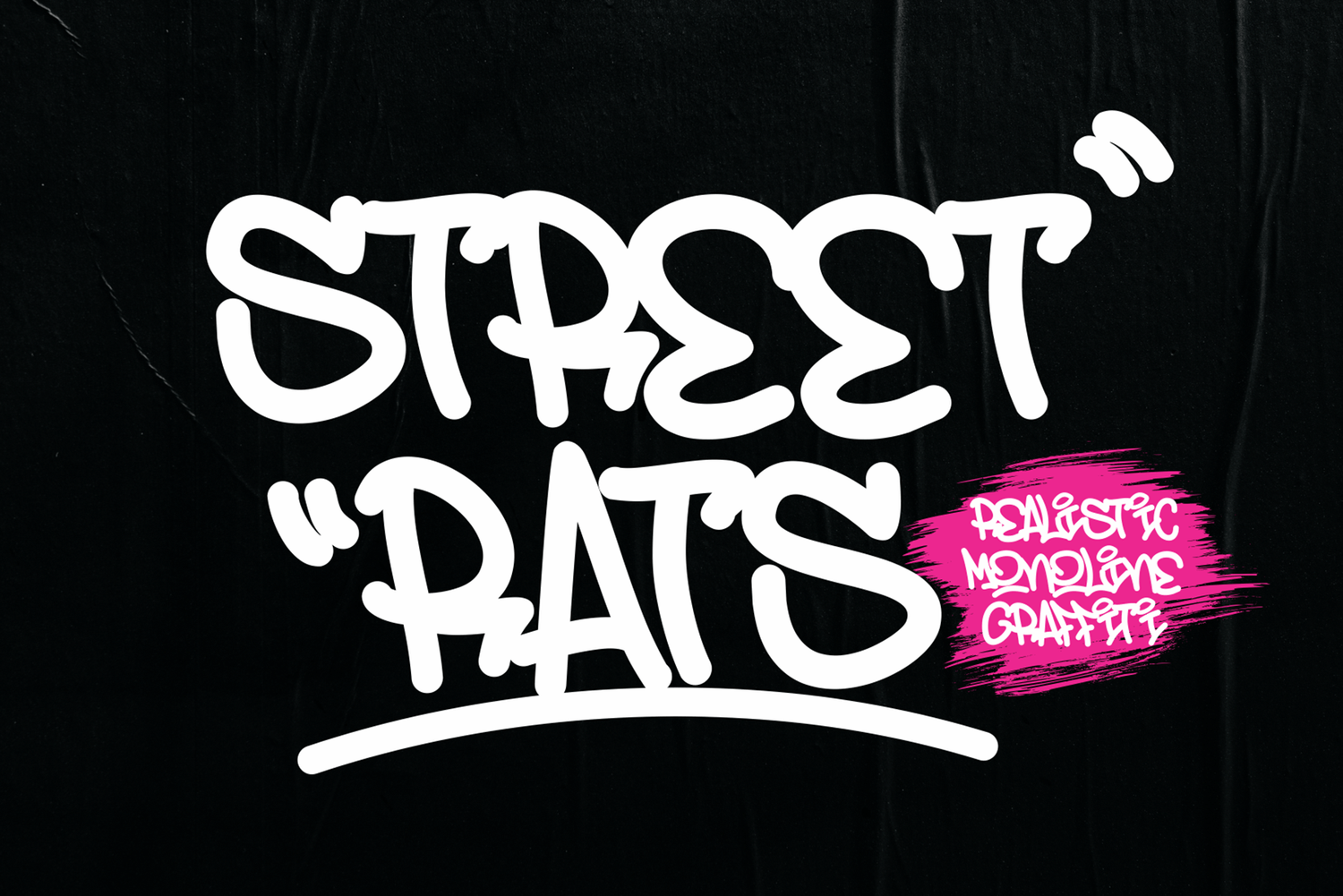
Style: A smooth, monoline script font designed to mimic the look of graffiti created with a single, consistent stroke width. Despite being monoline, it retains a dynamic and flowing quality, characteristic of hand-drawn lettering. Subtle imperfections and slightly rounded terminals contribute to its realistic graffiti feel.
Why I love it: This font offers a clean yet authentic take on graffiti. The monoline style provides a modern and legible approach while still capturing the essence of hand-drawn urban art. It avoids overly aggressive textures, making it versatile for a wider range of applications where a smooth, stylish graffiti vibe is desired.
Best For: Logos and branding for urban-inspired businesses, social media graphics, apparel design, website headers, and projects aiming for a contemporary and legible graffiti aesthetic. The monoline style makes it particularly suitable for designs that need to scale well and maintain a clean appearance.
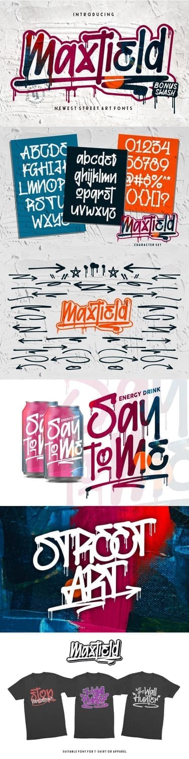
Style: A dynamic and expressive graffiti-style font with a distinctly messy and energetic feel. It features a combination of thick and thin strokes, sharp angles, splatters, drips, and rough edges, all contributing to an authentic street art aesthetic. The inclusion of bonus swashes, arrows, and potentially other graphic elements suggests versatility for creating impactful designs.
Why I love it: Maxtield truly captures the raw and spontaneous nature of street art. The messy details and energetic lines convey a sense of urgency and creativity. The bonus elements offer designers extra tools to enhance their compositions and add unique visual flair.
Best For: Eye-catching logos, impactful social media graphics, streetwear and merchandise design, posters for urban events, album artwork, and any project aiming for a bold, authentic, and highly expressive street art style. The bonus elements make it particularly useful for creating dynamic and personalized visuals.
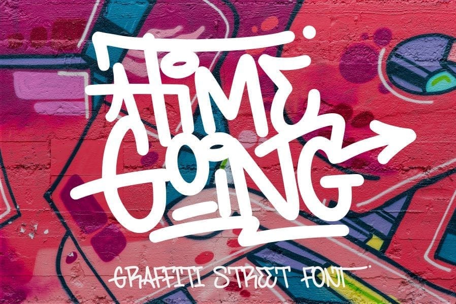
Style: A dynamic and flowing graffiti tag-style font with a slightly rounded and elongated letterform. It features varying stroke weights, sharp angles, and connecting swashes that create a sense of movement and speed, typical of quick street tags. The overall impression is energetic and hand-applied.
Why I love it: Time Going captures the fluid and spontaneous nature of tagging. The elongated forms and connecting strokes give it a unique rhythm and visual interest. It feels like a tag that was applied quickly and with confidence, adding an authentic urban energy to any design.
Best For: Logos and branding for urban lifestyle or action-oriented businesses, impactful social media graphics, streetwear design, event posters, and any project aiming for a raw, energetic, and hand-style graffiti tag aesthetic. The flowing connections can add a unique visual signature.
Each of these fonts offers a unique way to incorporate the edgy, rebellious feel of spray paint into your projects. Experiment with different styles to find the perfect fit for your design needs!
VI. Conclusion: Embrace the Authentic Edge
Spray paint fonts are more than just a stylistic choice; they're a statement. They embody the raw energy, rebellious spirit, and unfiltered creativity of street art, bringing a touch of urban authenticity to the digital realm. Whether you're aiming for bold impact, a subtle texture, or a hand-drawn feel, there's a spray paint font out there to help you capture that unique vibe.
Don't be afraid to experiment! Play with different styles, pair them with contrasting fonts, and explore color palettes that amplify their inherent energy. Remember to always consider legibility and licensing to ensure your creative explorations are both impactful and responsible.
Ultimately, the power of a spray paint font lies in its ability to communicate a sense of realness and individuality. In a world often dominated by clean and polished aesthetics, these fonts offer a refreshing dose of imperfection and character. So go forth, embrace the authentic edge, and let your designs make a statement with the unmistakable spirit of the streets!
Disclaimer:
This article is for informational purposes only. Some links may be affiliate links, meaning Advise Graphics may earn a commission at no extra cost to you. We do not guarantee results, and readers should do their own research before making any decisions.
Tags
Subscribe
Join the Advise Graphics community and get exclusive design resources, tips, and updates delivered straight to your inbox.


Ads


Copyright
© 2025 Advise Graphics. All rights reserved.
Cop© 2025 Advise Graphics. All rights reserved.