
16 Stylish Serif Fonts for Elegant Wedding Invitations


Some links in this post may be affiliate links. See our Affiliate Disclosure for details.
Introduction:
Imagine opening a wedding invitation and instantly feeling the elegance, sophistication, and love behind the event. Serif fonts can evoke that magical feeling.
Your wedding invitation is more than just a piece of paper—it’s the first chapter of your love story that your guests will experience. Choosing the right font plays a crucial role in setting the tone for your celebration. Serif fonts, with their classic lines and timeless charm, have long been a favorite for wedding invitations.
In this guide, we’ll explore the beauty of serif fonts, provide practical tips for incorporating them into your designs, and highlight seven exceptional serif fonts that can make your invitations unforgettable.
Understanding Serif Fonts
Serif fonts are defined by their small decorative strokes, or "feet," at the ends of letters. These design elements lend a sense of sophistication and refinement, making serif fonts a natural choice for formal and elegant events.
Types of Serif Fonts
Classic Serif: Known for high contrast between thick and thin strokes, these fonts suit traditional, grand weddings.
Modern Serif: Featuring cleaner lines and less contrast, they’re perfect for contemporary or minimalist wedding styles.
Transitional Serif: A blend of classic and modern, these fonts are versatile and ideal for a wide range of wedding themes.
Why Choose Serif Fonts for Wedding Invitations?
Beyond their aesthetic appeal, serif fonts offer several advantages for wedding invitations:
Readability: The distinctive features of serif fonts enhance letter recognition, ensuring your invitation is easy to read.
Elegance: The delicate serifs add a touch of sophistication and refinement to the overall design.
Formality: Serif fonts convey a sense of formality and tradition, making them perfect for formal wedding occasions.
By understanding the different types of serif fonts and their characteristics, you can select the perfect font to complement your wedding vision.
Best Serif Fonts for Wedding Invitations
Here are sixteen carefully curated serif fonts to elevate your wedding invitations:

The French Kiss Royal Typeface is a beautiful example of a modern serif that masterfully combines classic elegance with artistic experimentation. Its defining characteristic is the use of dramatic creative ligatures—the interconnected and flowing lines that join certain letters—which introduce an organic, hand-drawn feel to the otherwise structured serif form. The letters feature extremely high contrast between thin and thick strokes, with tall x-heights and delicate, needle-sharp serifs, lending it a distinctly romantic and fashionable air. This font is perfectly suited for a chic Parisian-inspired wedding, a sophisticated minimalist celebration, or any event where the aesthetic needs to feel effortlessly luxurious and highly curated. It functions best as a display font for headers, couple's names, or important dates, as the intricate ligatures require space to breathe and maintain legibility, often complemented by a clean, simple body font.
2. Paris Forbel

The Paris Forbel typeface is a contemporary ode to timeless sophistication, making it an exquisite choice for modern wedding invitations with a refined edge. Classified as a modern stylish serif, it features high-contrast strokes—verticals that are notably thick and horizontals that are delicate and thin—giving it a tall, elegant, and almost architectural presence. What truly defines its style are the subtle, unique decorative elements: geometric diamond shapes and celestial starbursts integrated into the serifs and terminals of certain letters. This font exudes a chic, fashion-forward appeal, perfectly fitting for a minimalist wedding, a high-end urban celebration, or a wedding seeking a blend of classic formality and contemporary design. Used prominently for headings and the couple's names, Paris Forbel creates a powerful first impression of organized beauty and effortless luxury, easily complementing a simple, legible font for the smaller details.
3. Gemola


The Gemola typeface is a striking example of a modern stylish serif, designed to give wedding invitations a refined, editorial feel. Its basic structure features clean, tall letterforms with a high contrast between vertical and horizontal strokes, lending it a polished and minimalist elegance. The true versatility of Gemola, however, lies in its included alternate styles and ligatures. These decorative options allow letters to connect and flourish with graceful, sweeping swashes and unique loops, transforming the font from elegantly simple to dramatically chic. This adaptability makes Gemola ideal for a wide range of wedding styles, from contemporary and luxurious to slightly bohemian and vintage-inspired. It works exceptionally well as a primary heading font for the couple's names, where the designer can strategically place the alternates to create a distinctive, personalized logo or monogram effect that becomes the sophisticated centerpiece of the invitation suite.
4. Chrome Slab


The Chrome typeface is a bold, aesthetic semi-condensed serif that provides a dramatic, high-impact look for contemporary wedding stationery. This font stands out with its striking high contrast in stroke weight—featuring razor-thin horizontals and bold, structural verticals—and its use of unexpected, large geometric curves. The elegant ligatures, where letterforms overlap or connect with sweeping, architectural lines, elevate it from a simple serif to a piece of art. Being an all-caps display font, Chrome is specifically designed to be the star of the invitation, making it an exceptional choice for the main heading, the couple's initials, or a prominent monogram. It is perfectly suited for a gallery wedding, a sleek rooftop reception, or any celebration where a refined, modern-meets-glamorous aesthetic is paramount. Pair it with a simple, high-legibility font like Garamond or Roboto for the smaller details to ensure the key information remains readable while the Chrome heading commands attention.
5. Notica Serif


The Notica Serif typeface by Hansco Studio is a sophisticated and highly versatile modern serif, designed to deliver a romantic yet luxurious look for high-end wedding invitations. It blends classic elegance with a contemporary display style. It features tall, sleek vertical strokes and refined, bracketed serifs. The highlight of this typeface is its extensive use of stylistic alternates and ligatures, which allow letters to connect and flow beautifully, such as the elaborate loops visible on the 'N', 'O', and 'A' in the display image. This provides a custom, handcrafted feel without sacrificing legibility. This font is an exceptional choice for the couple's names and key headers, where its unique ligatures can serve as the primary decorative element. It's perfectly suited for chic, romantic, or fashion-forward wedding themes. To create a balanced hierarchy, pair the display style of Notica Serif with a simple, high-contrast serif for body text, like a classic Cormorant or a clean sans-serif like Montserrat, to let the primary script shine.
6. Hisav


The HISAV font by flawlessandco is a striking example of a modern high-contrast serif, designed for maximum impact and a contemporary, sophisticated feel. The name itself is displayed with dramatic flair, emphasizing the unique characteristics of the typeface. HISAV features extremely thin horizontal strokes juxtaposed with thick, authoritative vertical strokes, giving it a classic Didone structure with a minimalist, fashionable twist. It utilizes bold ligatures and swashes (as seen in the unique connection of the 'H' to the 'I', and the curved bar of the 'S') that lend an artistic, custom-lettered look to key words. This typeface is ideal for wedding monograms, bold headers, and invitation titles in formal, architectural, or gallery-style wedding themes. Its clean lines and dramatic contrast make it perfectly suited for foil stamping or letterpress printing. To balance its dramatic display nature, pair HISAV with a light, simple sans-serif like Open Sans Light or a standard serif like Times New Roman for the essential, smaller body text to ensure maximum readability.
7. Giza Pro
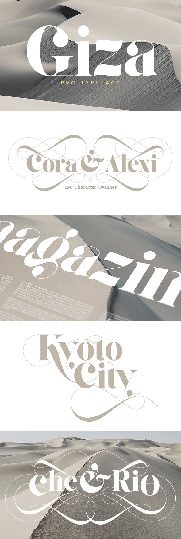
The Giza Pro Typeface is a magnificent display serif known for its exaggerated, voluptuous forms and opulent swashes, making it perfect for creating a grand, luxurious statement on wedding invitations. Giza Pro features highly stylized, broad letterforms with both classic serifs and dramatically curved, ornate flourishes (swashes) that connect letters in an elaborate, romantic fashion. The version shown is the display swash style, offering up to 190 character swashes, which allows for immense customization in forming the couple's names, as seen in "Cora & Alexi" and "Chee & Rio." The serif itself is bold and contemporary, often used in magazine headlines for maximum impact. This font is the definition of a statement piece, perfect for a formal, lavish, or editorial-style wedding. It should be used exclusively for the couple's names and the most important headings to capitalize on its high-art visual appeal. Because of the font's busy, highly decorative nature, it should be paired with the absolute simplest and cleanest sans-serif available, such as Poppins or a basic Arial, to ensure all the wedding details remain starkly readable against the elegant flourish of the names.
8. Lovelyn


The Lovelyn typeface is an elegant, high-contrast serif that leans into a classic, romantic aesthetic, making it an excellent choice for couples seeking a refined and timeless look for their wedding stationery. Lovelyn features an authoritative, high-contrast stroke weight (thin horizontals, thick verticals) typical of a traditional Didone or classic serif. Its key feature is the inclusion of sophisticated stylistic alternatives and swashes, such as the elaborate script-like flourish seen connecting the letters in the display. These embellishments offer a wide range of possibilities to customize the look of the names and titles, providing an air of formality and luxury. This font is ideal for main titles, invitation headings, and formal signage where its decorative swashes can be used to underscore or connect important words. It perfectly suits traditional, formal, or European-inspired wedding themes. Since Lovelyn has a high degree of contrast and includes decorative elements, pair it with a clean, classic body text font like Baskerville or a modern, easy-to-read sans-serif to maintain balance and legibility.


The Royále & Co. typeface is a spectacular choice for couples seeking to infuse their invitations with a sense of high-end luxury and modern sophistication. This is not a traditional serif; its striking, highly decorative letterforms feature elegant swashes, unique geometric cutouts, and an overall Art Deco flair that sets it apart. The high contrast between the thick and thin strokes, combined with the stylized serifs, makes it an excellent focal point for the couple's names or the main heading on the invitation. Available in four weights—Light, Regular, Medium, and Bold—this font is perfectly suited for a black-tie affair, a glamorous destination wedding, or any celebration demanding a bold, contemporary statement of elegance. When paired with a clean, classic sans-serif for body text, Royále & Co. becomes the unforgettable signature of a truly luxurious wedding suite.
10. Magic Love


For couples who want their wedding invitations to whisper tales of enchantment and deep affection, the Magic Love font is an exquisite selection. This "Lovely Serifs Collection" typeface beautifully blends the structured elegance of serifs with a whimsical, romantic flourish, reminiscent of a fairy tale. Its unique charm comes from the delicate heart-shaped accents subtly integrated into certain letterforms, alongside graceful swashes and star-like sparkle details. While clearly a serif at its core, Magic Love transcends traditional boundaries to offer a look that is both ornate and deeply personal. It's an ideal choice for a romantically themed wedding, a whimsical garden ceremony, or an event where the celebration of love takes center stage. To maintain readability, it's best utilized for key elements like the couple's names, event titles, or short, impactful phrases, allowing its magical character to truly shine.
11. Black Champ


The Black Champ Serif Display Font is the epitome of high-fashion and vintage luxury, making it an excellent statement piece for sophisticated wedding stationery. Its design is a dazzling nod to the Art Deco era, characterized by dramatically tall, condensed letterforms and an impressive contrast in stroke weight. The most arresting features are the elegant, long swashes and flourishing terminals that trail beneath the baseline, giving the entire word a fluid, almost regal movement. This font is perfect for couples hosting a glamorous roaring '20s-inspired event, a chic city wedding, or a formal black-tie affair where an air of exclusivity is desired. Black Champ's distinctiveness means it should be reserved for the couple's names and primary headings, allowing the intricate detail of its style to capture attention against a clean background, ideally paired with a simple, high-legibility serif or sans-serif for the informational text.
12. Finola
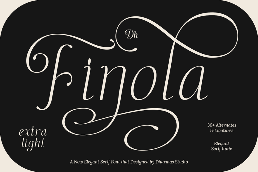
The Finola typeface by Dharmas Studio is a dramatic and highly expressive elegant serif, designed to capture the romance and fluid motion of script writing while maintaining a serif structure. It is presented in an Extra Light Italic weight, giving it a delicate, airy quality.
Finola is defined by its exaggerated, continuous swashes and over 30 alternates and ligatures that allow letters to intertwine beautifully. The elegant, thin strokes mimic handwriting, giving it a personal and artistic touch. The italic slant adds to its romantic, flowing character, making it appear more like calligraphy than a traditional serif.
This font is ideally suited for the couple's names, RSVP headers, or any short, impactful phrases that require a highly decorative, signature look. It perfectly complements a whimsical, garden, or modern fine-art wedding theme.
Due to its exceptional decorative complexity and light weight, Finola must be paired with a very simple, grounded font for all body text. A minimal, straight-laced sans-serif like Futura or a medium-weight serif without any added flourish will provide the necessary contrast and legibility.
13. Duarose
The Duarose typeface (as seen in the "Roney & Maria" sample) is a bold, joyful display serif that uses dramatic weight and elaborate swashes to create a highly romantic and visually dominant aesthetic.
Rosaline features thick, high-contrast letterforms with geometric serifs and a stately all-caps structure. The most striking aspect is the inclusion of decorative swashes (like those extending from the 'R' and '&') and small, diamond-shaped embellishments (seen over the 'O' and in the ampersand), which give it an energetic, yet vintage-glam feel. The combined weight and flourish make it stand out against any background.
This font is perfect for high-impact headings, titles, and the couple's names on digital invites, social media graphics, or save-the-dates. It perfectly suits a romantic vintage or bold, celebratory wedding theme.
Since Duarose is already very bold and decorative, it should be paired with a simple, high-legibility font in a light or regular weight for the secondary details. A classic option like Georgia or a clean sans-serif like Proxima Nova will prevent the overall design from becoming too busy.
14. Renoka
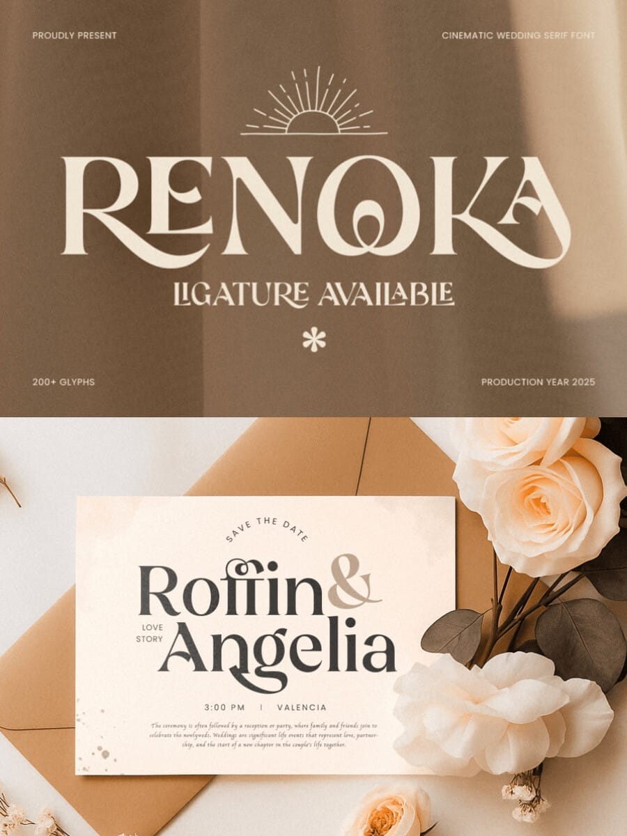
The Renoka typeface is a dramatic and modern display serif designed with a cinematic, narrative feel, making it an excellent choice for a wedding that seeks to tell a grand story.
Renoka features wide, stylized letterforms with unique curves and cutouts (notice the 'R', 'E', 'N', and 'O'). Its most striking characteristic is the bold use of ligatures and alternates (over 200 glyphs available), which create seamless, artistic connections between letters, giving the typeface a custom-lettered and high-art appearance. The high contrast in stroke weight adds a layer of vintage sophistication.
This font is ideal for main wedding headers, monograms, or short, impactful quotes on save-the-dates or main invitations. It perfectly suits editorial, bohemian luxury, or destination wedding themes where an expansive, romantic feel is desired.
The decorative style of Renoka is best anchored by a clean, neutral, and highly legible font for the body details. A thin, modern sans-serif like Lato or a balanced serif like Merriweather will ensure the important information is easily read.
15. Bridens
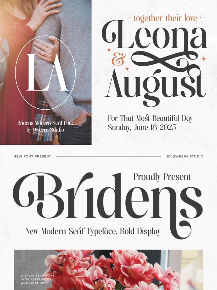
The Bridens typeface by Qweera Studio is a bold display serif that skillfully balances heavy, classic forms with intricate, almost calligraphic ligatures. It is designed to be a centerpiece for contemporary and highly stylized wedding stationery.
This font features an assertive, bold weight contrasted with unexpected curved terminals and elegant swirls, creating a highly decorative feel. The sample shows a huge variety of unique alternates and ligatures—including lowercase letters with elaborate descenders and connected uppercase pairs—allowing designers to customize words like the names "Leona & August" with unique flair. The boldness ensures it commands attention, while the curves maintain a romantic quality.
Bridens is perfect for main titles, monograms, and save-the-date cards where a striking, modern-meets-vintage aesthetic is desired. It is an excellent fit for urban chic, black-tie, or glamorous hotel wedding themes.
Since Bridens is so bold and decorative, the body text should be kept simple and subtle. A highly legible, thin sans-serif like Century Gothic or a balanced, light serif will complement the display font without competing with its dramatic weight and swirls.
16. Noble Serenity
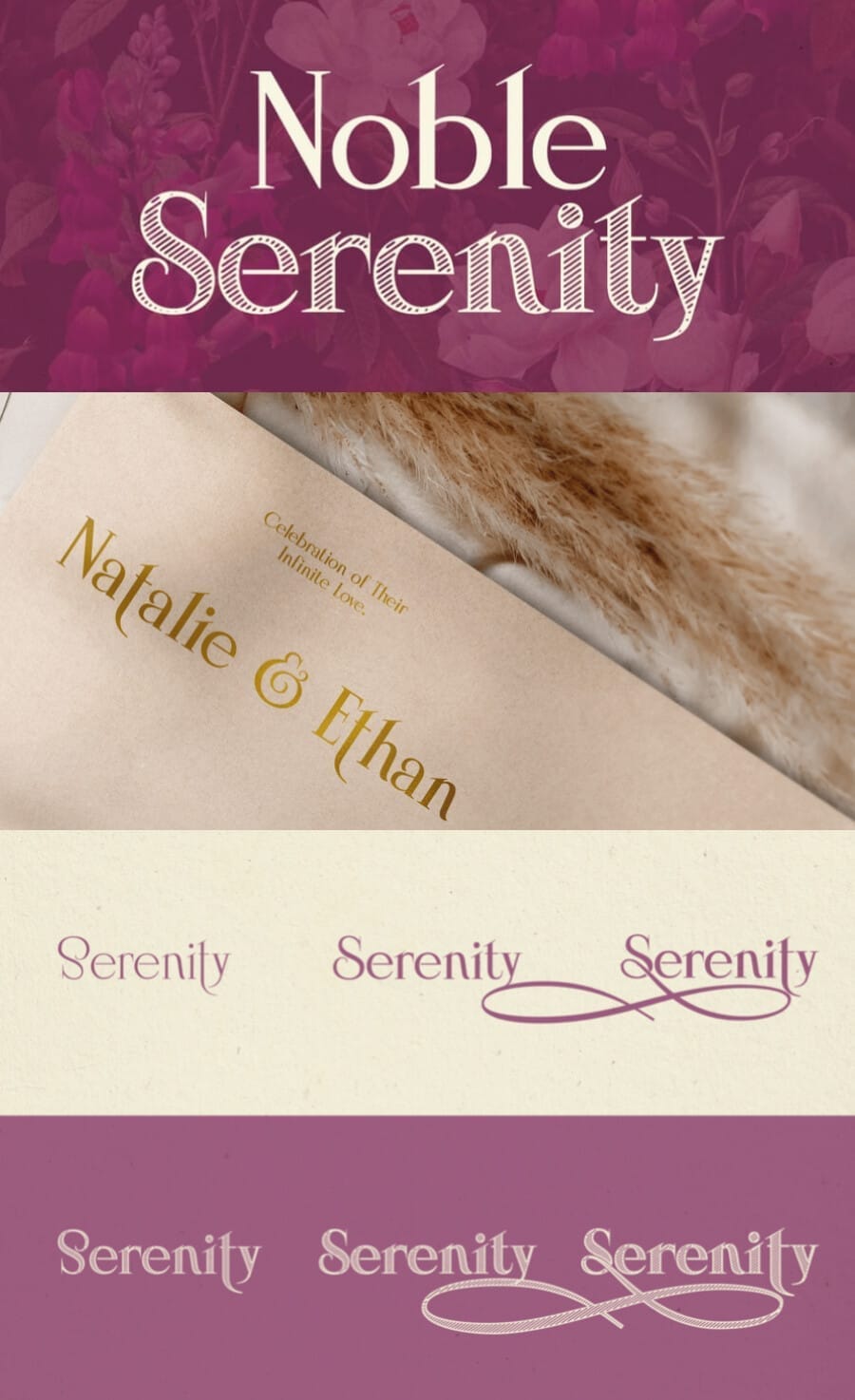
The Noble Serenity typeface is a highly adaptable display serif that offers a spectrum of styles from bold formality to delicate swash-laden romance, making it incredibly versatile for sophisticated wedding stationery.
The typeface features classic, refined serifs with a noticeable contrast in stroke weight. Its versatility comes from the numerous stylistic options: one style offers a clean, all-caps formality (top sample); another provides an elegant italic with a soft, flowing baseline (middle sample); and a third includes beautiful, customizable swashes and ligatures (bottom samples) to link letters seamlessly, perfect for names. This font is a true workhorse for elegant design.
Because of its range, it can handle both primary headers and secondary headings within an invitation suite. The clean styles are perfect for formal church details or headings, while the swash styles are ideal for the couple's names or romantic phrases. It suits classic, rustic chic, or garden-party wedding themes.
When using the more decorative italic or swash styles for the names, pair them with the clean, upright Regular style of the same font for the rest of the details to maintain a beautiful, consistent typographic voice.
Remember: These are just a few examples, and the best font for your wedding invitation will ultimately depend on your personal taste and the overall style of your event.
Incorporating Serif Fonts into Your Wedding Invitation Design
Font Pairings: The Perfect Match
While serif fonts exude elegance on their own, combining them with the right font can elevate your invitation to new heights. Here are some popular pairings:
Serif and Sans-serif: This classic combination offers a balance of formality and modernity. Consider pairing a classic serif like Times New Roman with a clean sans-serif like Helvetica for a timeless look.
Serif and Script: For a romantic and flowing aesthetic, pair a serif font with a script or calligraphy font. This combination works well for vintage-inspired or bohemian weddings.
Serif and Modern Serif: If you prefer a more contemporary feel, consider pairing two different serif fonts with contrasting styles. For example, combine a classic serif with a modern serif for a sophisticated and edgy look.
Serif Fonts for Different Wedding Styles
The choice of serif font can greatly impact the overall tone of your wedding invitation. Let's explore how to select the perfect serif font for various wedding styles:
Classic Wedding: Opt for traditional serif fonts with strong contrasts, such as Times New Roman or Garamond. These fonts exude elegance and sophistication.
Rustic Wedding: Choose a serif font with a warmer and more informal feel, like Caslon or Perpetua. These fonts complement natural elements and create a cozy atmosphere.
Modern Wedding: Select a clean and contemporary serif font, such as Didot or Bodoni. These fonts add a touch of sophistication to a modern design.
Bohemian Wedding: Consider a serif font with a vintage or handcrafted look, such as a script-inspired serif or a font with irregular letterforms.
Tips for Using Serif Fonts
To make the most of your serif font choice, keep these tips in mind:
Consider readability: While elegance is important, ensure your chosen font is easy to read, especially for older guests.
Experiment with size and spacing: The size and spacing of your font can significantly impact the overall look of your invitation.
Balance with other elements: Your font should complement the other design elements on your invitation, such as colors, paper, and embellishments.
Less is often more: Avoid overcrowding your invitation with too many different fonts. Stick to a maximum of two or three fonts for a clean and polished look.
By following these guidelines, you can create stunning wedding invitations that leave a lasting impression on your guests.
Conclusion
Serif fonts offer a timeless and elegant touch to wedding invitations. By understanding the different types of serif fonts, exploring font pairings, and following design best practices, you can create invitations that perfectly reflect your wedding style. Remember, the key to a successful invitation is to choose a serif font that complements your overall aesthetic and enhances the excitement of your special day.
With careful consideration and a touch of creativity, you can craft wedding invitations that will be cherished by you and your guests for years to come.
Need more inspiration? Explore a vast collection of stunning serif fonts on online marketplaces like Creative Fabrica, Envato Element, and GraphicRiver. These platforms offer a wealth of options to elevate your wedding invitation design.
Related articles
Disclaimer:
This article is for informational purposes only. Some links may be affiliate links, meaning Advise Graphics may earn a commission at no extra cost to you. We do not guarantee results, and readers should do their own research before making any decisions.
Tags
Subscribe
Join the Advise Graphics community and get exclusive design resources, tips, and updates delivered straight to your inbox.


Ads


Copyright
© 2025 Advise Graphics. All rights reserved.
Cop© 2025 Advise Graphics. All rights reserved.