
Mastering the Neon Graphic Design Trend: 2026 Style Guide


Some links in this post may be affiliate links. See our Affiliate Disclosure for details.
Let’s face it: after years of "sad beige" minimalism and safe, flat UI, our eyes were practically begging for a retinal recharge. Enter the neon renaissance of 2026.
What started as a nostalgic nod to 80s synthwave has mutated into a high-octane design powerhouse that’s currently slicing through digital noise like a laser through glass. We’ve moved far beyond the flickering dive bar signage of the past; today’s neon is about digital maximalism, bioluminescent depth, and a bold refusal to blend into the background. Whether it’s the soft "halo" of a glassmorphic interface or the high-contrast grit of a cyberpunk brand identity, electric hues are the new standard for catching eyes in a crowded feed.
In this guide, we’re going to look under the hood of this high-energy trend, exploring the psychology of light-play and the technical secrets you need to make your designs vibrate off the screen.
I. Why Neon Works: The Psychology of Glow
In a world where we scroll through miles of content every day, our brains have become experts at filtering out the mundane. This is where the neon aesthetic thrives—it doesn’t just ask for attention; it demands it.
1. The Attention Economy
Neon’s primary weapon is luminance. Unlike standard flat colors, neon shades mimic a light source. This triggers a primal response in the human eye: we are biologically wired to notice light in the darkness. In a sea of muted "millennial pink" and corporate blues, a streak of electric lime acts as a visual disruptor, forcing the thumb to stop mid-scroll.
2. Emotional Resonance and "Night Mode" Culture
As our digital lives shift increasingly toward "dark mode" interfaces, neon has become the natural language of the screen. It taps into a specific emotional duality:
Futuristic Optimism: It feels like the high-tech, clean energy future we were promised in sci-fi.
Late-Night Mystery: It carries the "noir" energy of a rainy city street at 2:00 AM, lending a sense of cool, underground exclusivity to a brand.
3. Contrast is King
The magic of neon isn't actually in the color itself, but in the surrounding darkness. To make a glow feel authentic, you need high-contrast environments. This is why the trend is synonymous with deep charcoals, "true blacks," and navy shadows. By pulling the background into the shadows, the design creates a three-dimensional depth that flat design simply can’t replicate.
II. Key Elements of the 2026 Neon Aesthetic
If you think neon is just "saturated colors on a black background," think again. In 2026, the aesthetic has matured into something much more nuanced. It’s no longer just about the flicker of a 1950s diner sign; it’s about light as an atmosphere.
Here are the defining features of the current neon wave:
1. Atmospheric Halos and "Soft" Light
We’ve moved away from the harsh, thin lines of the early 2010s. Modern neon is all about the diffusion. Think of it as a "light fog"—where the color bleeds into the surrounding space, creating a soft, ethereal glow that feels tactile and immersive.
2. The Neon-Glass Hybrid (Glassmorphism 2.0)
One of the biggest trends this year is the interaction between neon light and translucent surfaces. When a neon "light source" sits behind a frosted glass element, it creates a sophisticated, multi-layered look that feels premium rather than kitschy.
3. Retro-Futurist Typography
Fonts aren't just carriers of information anymore; they’re light fixtures. We’re seeing a surge in:
Inline Fonts: Double-lined characters that mimic actual glass tubing.
"Dead Pixel" Effects: Subtle glitches in the glow to add a layer of grit.
Sleek Sans-Serifs: High-contrast, wide-set kerning that feels like a spaceship dashboard.
4. High-Impact Duotone Palettes
Instead of a chaotic rainbow, 2026 favors curated color pairs. The most popular combinations right now?
Cyber Pink & Deep Cobalt (The "Synthwave" classic)
Electric Lime & Slate Grey (The "Industrial Tech" look)
Ultraviolet & Molten Orange (The "Sunset Noir" vibe)
In 2026, neon is being used to highlight texture. Try applying a neon glow over a grainy, "noise-heavy" background to give your digital design a gritty, film-like quality.
III. Practical Applications in Design: Where Neon Lives in 2026
Neon isn’t just "eye candy" for Dribbble portfolios anymore; it’s a functional tool that solves modern design problems. In 2026, the application of neon is tactical—it's used to guide, emphasize, and immerse.
1. UI/UX Design: Navigating the Dark Mode Era
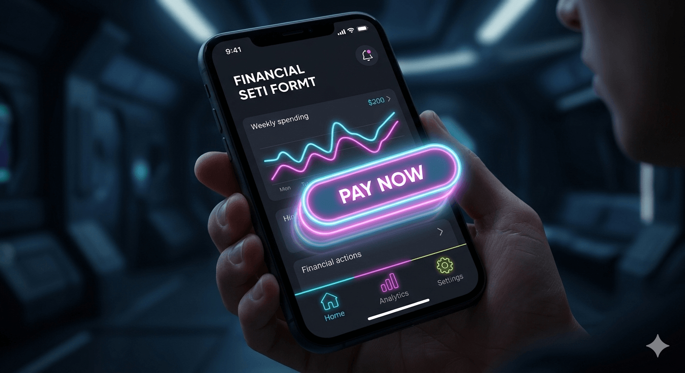
Since "Dark Mode" became the default setting for most night owls (and anyone who values their battery life), neon has stepped up as the ultimate UI navigator.
High-Luminance CTAs: Instead of a flat blue button, designers are using "glowing" states for Call-to-Action buttons. A soft outer glow makes the button feel like it's hovering above the interface, making it impossible to miss.
Active States: Using thin, electric lines to indicate "active" tabs or menu items adds a high-tech, premium feel to mobile apps.
2. Social Media Branding: Fighting "Scroll Fatigue"
On platforms like TikTok and Instagram, you have approximately 0.4 seconds to stop a user’s thumb.
Neon Overlays: Static photos are being "electrified" with neon line art traced around subjects. It adds movement and energy to a still image.
Thumbnails: High-contrast neon typography (Electric Lime on Deep Navy) remains the king of YouTube click-through rates because it remains legible even at a tiny scale.
3. Packaging Design: The "Phygital" Aesthetic
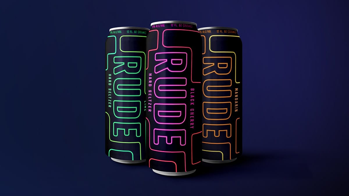
In 2026, we’re seeing a massive trend in "glow-in-the-dark" and UV-reactive inks for physical products.
Beverage & Tech Hardware: Luxury energy drinks and PC components are using holographic foils that mimic neon light shifts.
Minimalist Boxes with Hidden Depth: A box that looks plain black under normal light, but reveals a neon-mapped "circuitry" pattern under UV light or specific angles.
4. Gaming and Metaverse HUDs
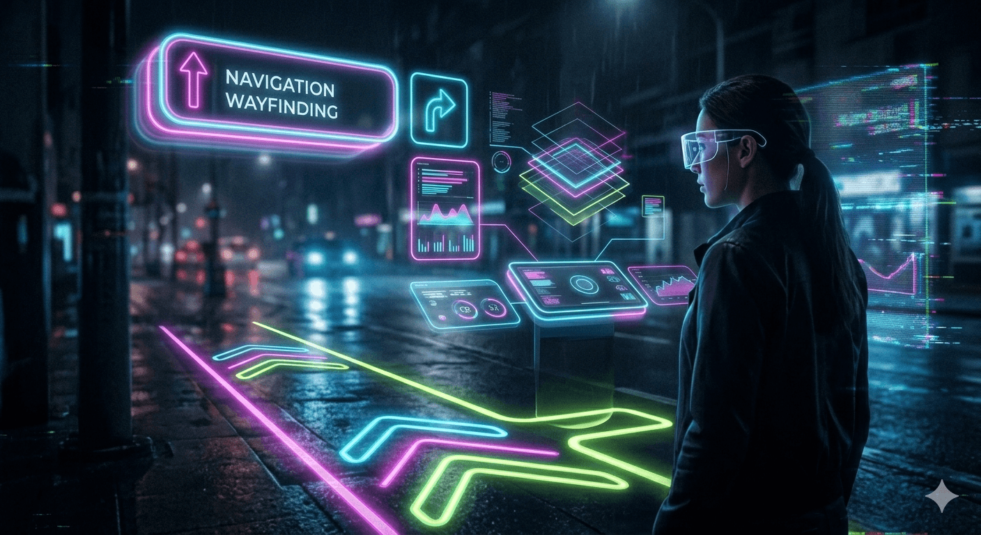
As VR and AR become more mainstream, neon is the logical choice for Heads-Up Displays (HUDs). Because it mimics light, it feels natural when projected onto a real-world environment through AR glasses. It provides a "layered" reality that doesn't obstruct the user's view.
IV. Technical Tips: How to "Neon-ify" Your Designs
Creating a neon effect that actually sizzles—instead of looking like a blurry 2005 Photoshop filter—requires a bit of light-theory finesse. In 2026, the pros are moving away from simple "outer glow" presets and toward a more layered, realistic approach.
1. The "Triple Layer" Glow Technique
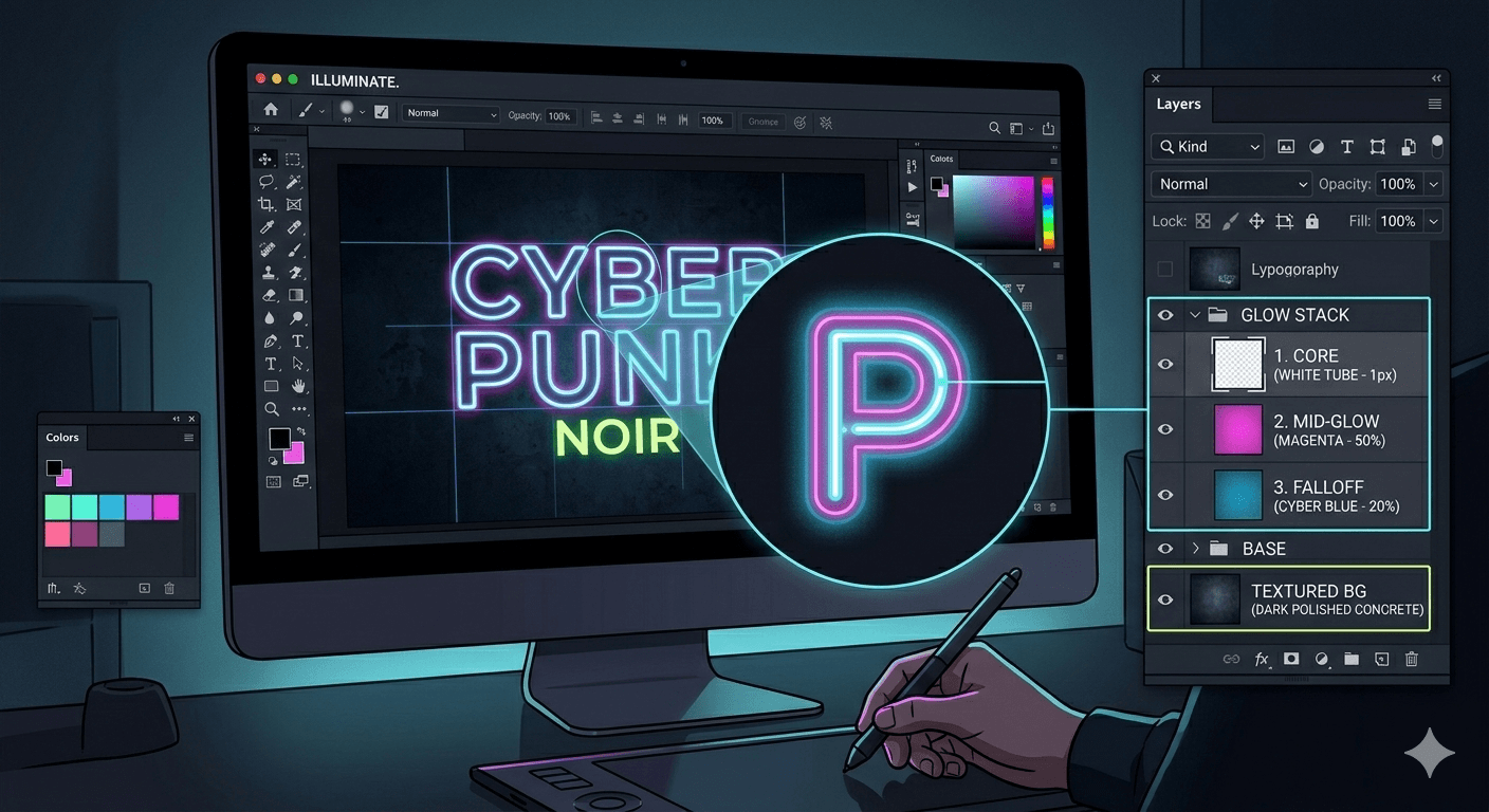
To get that deep, vibrating light effect, you can't rely on a single layer. You need to build the light's intensity from the center out:
The Core (The Tube): A very thin, almost white line (or a very desaturated version of your color). This represents the gas-filled tube.
The Mid-Glow (The Aura): A slightly thicker line with your primary brand color (e.g., Electric Lime) at roughly 50-70% opacity.
The Atmospheric Falloff: A large, soft, feathered brush stroke or a Gaussian blur at 10-20% opacity that spreads the light onto the "surfaces" around it.
2. Design in RGB, Not CMYK
This is the golden rule. Neon represents emitted light, which is exactly what the RGB color space was built for. If you try to design neon in CMYK, your colors will look muddy and "printed."
Pro Tip: If you're designing for physical packaging, use Spot Colors (like Pantone Neons) to ensure the printer uses actual fluorescent inks rather than trying to mix them from standard cyan and magenta.
3. Mastering "Light Spillage"
Light doesn't just stop at the edge of a letter. To make a neon sign look real, it needs to interact with its environment:
Color Dodge is your best friend: In Photoshop or Illustrator, set your glow layers to Color Dodge or Linear Dodge (Add). This makes the neon "react" to the texture of the background, whether it’s a brick wall or a brushed metal surface.
The Shadow Gap: Real neon tubes sit on "standoffs." Add a tiny, sharp drop shadow under the neon tube but above the soft glow to give the illusion that the light is hovering a few inches off the wall.
4. Use "Noise" for Realism
Perfectly smooth digital gradients often look "fake." By adding a subtle Grain or Noise filter (approx 2-3%) to your glow, you mimic the organic vibration of ionized gas. It adds a gritty, cinematic texture that feels grounded in reality.
Conclusion: Don’t Be Afraid of the Dark
As we’ve seen throughout 2026, the neon trend isn’t just a passing flash of nostalgia—it’s a sophisticated response to our digital-first reality. It’s the visual language of high-performance tech, late-night creativity, and a bold refusal to be ignored.
Whether you’re using it to guide a user through a complex app interface or to give a lifestyle brand a gritty, cinematic edge, the power of neon lies in its contrast. By embracing the shadows, you allow your designs to truly shine. Neon reminds us that even in a crowded, noisy digital landscape, a little bit of well-placed light can make all the difference.
So, the next time you’re staring at a flat, uninspired canvas, remember: don’t just add color—add energy. Experiment with those glows, play with your blending modes, and let your brand glow up.
FAQs
Absolutely. In 2026, neon has evolved from a purely nostalgic 80s throwback into a functional tool for dark mode interfaces and augmented reality (AR). It is currently a cornerstone of "Cyber-Neon" and "Digital Maximalism," styles that prioritize high-energy, immersive visuals over the flat minimalism of the early 2020s.
While classic pinks and blues remain staples, 2026 is seeing a shift toward "Hyper-Colors" like:
Electric Lime: Used heavily in Fintech and Fitness branding.
Cyber Magenta: A deeper, more sophisticated purple-pink.
Radioactive Orange: A high-visibility choice for "After-Dark" aesthetics.
Bioluminescent Cyan: Popular in eco-tech and wellness apps.
The secret to a realistic 2026 neon effect is layering. Instead of a single outer glow, pros use a three-step process:
The Core: A thin, nearly white center line.
The Mid-Glow: A saturated version of the color at 50% opacity.
The Falloff: A wide, soft Gaussian blur at 10-20% opacity using the Color Dodge blending mode to interact with background textures.
Neon is the perfect partner for Dark Mode. Its high luminance creates a natural hierarchy, making call-to-action (CTA) buttons and active states "pop" without overwhelming the user. In 2026, we’re also seeing "Vibe Creation," where app themes shift to neon gradients during evening hours to match the user's energy.
Yes, but with a caveat. Standard CMYK printing cannot replicate the "glow" of a digital screen. To achieve a neon look in print, you must use fluorescent spot colors (like Pantone 800-series inks) or UV-reactive coatings that physically reflect more light than standard inks.
Disclaimer:
This article is for informational purposes only. Some links may be affiliate links, meaning Advise Graphics may earn a commission at no extra cost to you. We do not guarantee results, and readers should do their own research before making any decisions.
Tags
Subscribe
Join the Advise Graphics community and get exclusive design resources, tips, and updates delivered straight to your inbox.


Ads


Copyright
© 2025 Advise Graphics. All rights reserved.
Cop© 2025 Advise Graphics. All rights reserved.