Creating Urban Vibes: Using Graffiti Fonts in Your Designs
Some links in this post may be affiliate links. See our Affiliate Disclosure for details.
Graffiti art has transcended its underground roots and exploded into a vibrant expression of urban culture. From towering murals to intricate tags, these bold visuals pulsate with energy and rebellion. But graffiti's influence extends beyond concrete canvases. Today, the spirit of street art finds a new home in the digital realm, with graffiti fonts taking the design world by storm.
For graphic designers, bloggers, and small business owners looking to create eye-catching visuals, graffiti fonts offer a unique opportunity to stand out from the crowd. These fonts, inspired by the dynamic lettering styles of graffiti artists, inject energy and a raw, urban aesthetic into your designs. Whether you're crafting a logo for a streetwear brand, designing a website banner for an edgy music festival, or simply adding a touch of rebellion to your blog post, graffiti fonts can be your secret weapon for grabbing attention.
Make a bold statement: Graffiti fonts are inherently attention-grabbing. Their unconventional letterforms and dynamic structures instantly draw the eye, making them perfect for headlines, posters, or packaging that needs to leave a lasting impression.
Add a unique touch to your brand: Graffiti fonts can help you cultivate a specific brand personality, particularly for businesses associated with urban culture, street art, or youth-oriented products.
Stand out from the crowd: In a sea of generic fonts, graffiti fonts offer a refreshing alternative. They showcase your brand's individuality and trendsetting nature.
Now that you're ready to unleash your inner street artist, let's delve into the world of graffiti fonts!
Understanding Graffiti Fonts: A Deep Dive into Street Style Lettering
Before we unleash the spray can of creativity with graffiti fonts, let's gain a deeper understanding of what defines them and the diverse styles they encompass. Graffiti fonts are more than just mimicking the visual appearance of spray paint – they capture the essence of street art through their form, texture, and the very spirit they evoke.
The Hallmarks of Street Style Typography:
Flow and Rhythm: Imagine a skilled graffiti artist effortlessly maneuvering their can, leaving behind a trail of dynamic lettering. Graffiti fonts translate this movement into their design. They often incorporate sweeping curves, sharp angles, and unexpected connections between letters. Think of fonts with elongated strokes that seem to "flow" across the page, or letters that intertwine with each other, creating a sense of rhythm and energy.
Bold Strokes and Imposing Presence: Just like the thick lines left behind by a spray paint nozzle, graffiti fonts are typically bold and heavy. This visual weight makes them stand out on a design, demanding attention and leaving a lasting impression. Imagine a website banner with a chunky, graffiti font headline – it wouldn't be easily ignored.
Embracing Imperfections: The beauty of graffiti lies in its raw, unpolished nature. Graffiti fonts capture this essence by incorporating imperfections that add a touch of authenticity. This might manifest as textured letterforms that emulate a rough brick wall, splatters and drips reminiscent of an energetic spray paint session, or slightly uneven edges that hint at the hand-painted origins of the art form.
Exploring the Spectrum of Graffiti Font Styles:
The world of graffiti fonts isn't a monolith. Just like different graffiti artists develop their unique styles, so too do graffiti fonts offer a diverse range of aesthetics.
Here's a deeper dive into some of the most common ones:
Throw-Up Fonts:
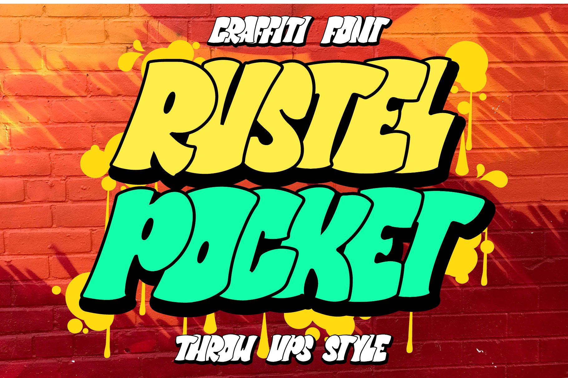
Remember those chunky, bubble letters that dominate walls? Throw-up fonts capture that essence with bold, rounded characters, often featuring dripping effects and uneven fills for a hand-painted look.
Characteristics:
Bold, rounded characters with a "bubble letter" look.
Often have uneven fills and dripping effects, mimicking a hand-painted style.
Colors tend to be contrasting and vibrant.
Examples:
Tag Fonts:
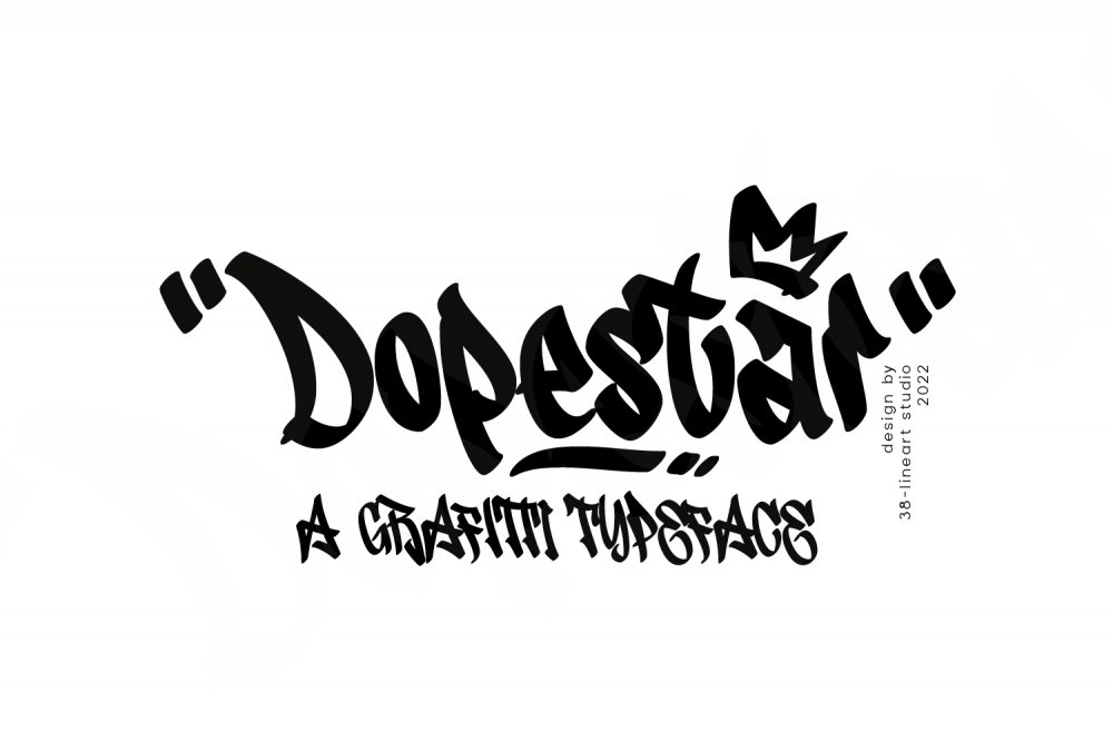
Simple and quick, tags are the signatures of graffiti artists. Tag fonts mimic this style with clean lines and a focus on readability. Think of them as streetwise versions of basic fonts, perfect for short, impactful messages.
Characteristics:
Simple and clean lines for quick readability.
Typically all-caps with a limited range of styles.
May have a slightly slanted or "handwritten" feel.
Examples:
Wildstyle Fonts:
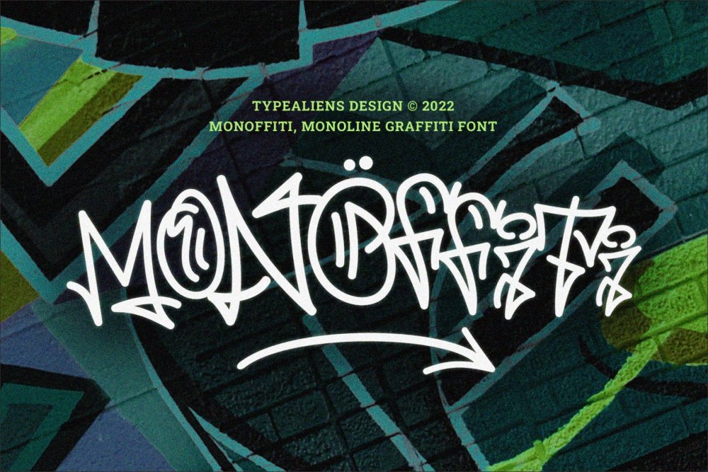
Graffiti isn't just about letters; it's about pushing boundaries. Wildstyle fonts translate that complexity into digital form. Expect intertwined letters, extensions, and a more abstract structure, making them ideal for conveying a sense of energy and artistic mastery.
Characteristics:
Most complex category, pushing the boundaries of letter form.
Letters are intertwined, extended, and often abstract.
May incorporate 3D effects, shadows, and highlights.
Can be challenging to read due to their complexity.
Examples:
Stencil Fonts:
Stencils are a popular graffiti technique for creating crisp, uniform lettering. Stencil fonts replicate this look with sharp edges and solid fills, perfect for bold statements and a touch of urban authenticity.
Characteristics:
Crisp, uniform edges with solid fills.
Often have a single color for a bold statement.
May incorporate a slight texture to mimic the imperfections of stencils.
Examples:
3D Graffiti Fonts:
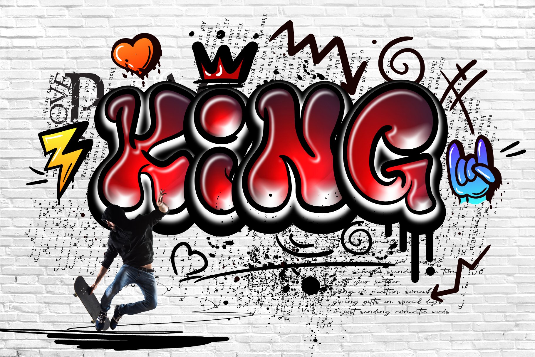
Want to add depth to your design? 3D graffiti fonts use shading and highlights to create the illusion of three-dimensional letters, mimicking the way graffiti artists play with perspective on walls.
Characteristics:
Use shading, highlights, and gradients to create the illusion of three-dimensional letters.
Can appear flat or have a beveled edge for added depth.
Offer a dynamic element to your designs.
Examples:
Grunge Graffiti Fonts:
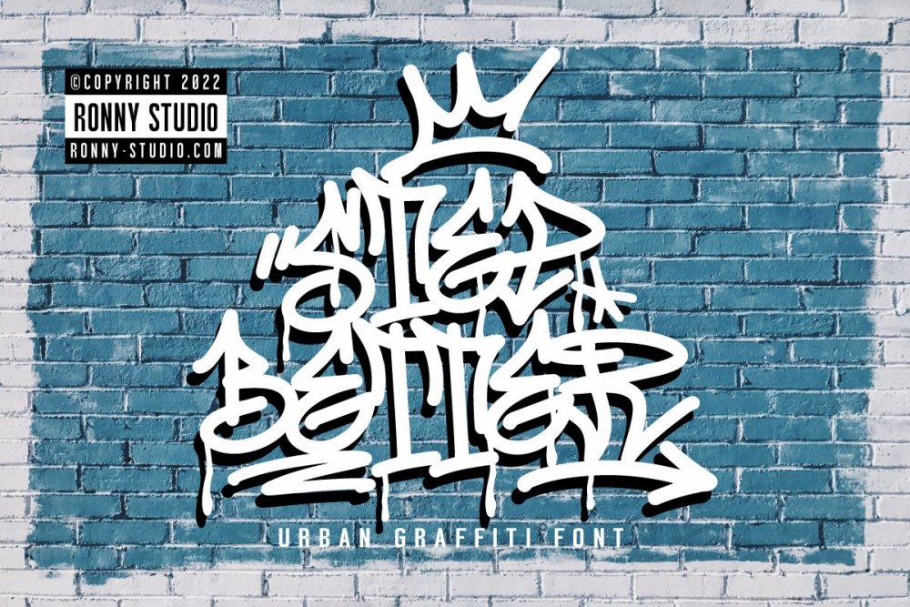
Embrace the raw energy of the streets with grunge graffiti fonts. These fonts incorporate imperfections, drips, splatters, and distressed textures, reflecting the rebellious spirit of graffiti art.
Characteristics:
Embrace a rough and raw aesthetic.
May have imperfections, drips, splatters, and distressed textures.
Often weathered or faded for a vintage look.
Convey a sense of rebellion and urban grit.
Examples:
Dripping Paint Fonts:
As the name suggests, these fonts emphasize the dripping effect seen in many graffiti styles. Letters appear to have paint dripping down, adding movement and dynamism to your designs.
Characteristics:
Emphasize the dripping effect seen in graffiti art.
Letters appear to have paint dripping down, adding movement and dynamism.
May have a single dripping color or multiple colors for a more stylized look.
Examples:
Urban Fonts:
This broader category encompasses fonts that capture the overall vibe of urban art. They might not strictly adhere to a specific graffiti style but evoke a sense of street culture with bold lines, textures, and a weathered look.
Characteristics:
Capture the overall vibe of urban art without strictly adhering to a specific style.
May have bold lines, textures, and a weathered look.
Can be a mix of different influences, like throw-up elements with a grunge texture.
Examples:
It's important to note that these categories can overlap. A font might have characteristics of both throw-up and grunge styles, for example.
When choosing a graffiti font, consider the overall message you want to convey and the style that best complement your design project. With this understanding of the diverse styles within graffiti fonts, you'll be well-equipped to make the perfect choice and inject a touch of urban energy into your creative endeavors.
By understanding these core characteristics and the spectrum of styles within graffiti fonts, you'll be well-equipped to choose the perfect font that injects the right dose of urban energy and artistic expression into your next design project.
Who Should Use Graffiti Fonts
Graffiti fonts, with their bold visuals and urban edge, can elevate a variety of design projects. But like any design tool, they work best when used strategically. Here's a deeper dive into who can benefit from using graffiti fonts and some additional factors to consider:
Thriving with Graffiti Fonts:
Streetwear and Urban Culture: Naturally, graffiti fonts find their home in designs associated with streetwear fashion, skateboarding brands, hip-hop music, or any project aiming to capture the raw energy of street life. Their inherent vibrancy complements the bold and often rebellious nature of these cultures.
Creative Industries: Graffiti fonts can add a unique layer of artistic expression to invitations, album covers, posters for concerts or art shows, and even film titles. They can evoke a sense of youthful energy, counterculture, or artistic freedom, perfectly aligning with the creative spirit of these industries.
Social Commentary and Advocacy: When addressing social issues or urban realities, graffiti fonts can add a powerful and relevant voice to your message. Their inherent association with street art and social commentary allows them to effectively communicate themes of social justice, community, or the struggles of urban life.
Eye-Catching Marketing and Advertising: In a world bombarded by visual stimuli, graffiti fonts can grab attention quickly. Consider using them for short bursts of text in advertisements, flyers, or packaging to make your product stand out, particularly if it targets a younger demographic.
Approaching with Caution:
Formal Communication: While some businesses might embrace a touch of urban cool, graffiti fonts generally don't work well in formal settings. Stick to cleaner and more traditional fonts for legal documents, financial reports, or presentations where professionalism is paramount.
Educational Materials: Since most graffiti fonts prioritize style over readability, they can hinder comprehension, especially for younger audiences. They might be suitable for playful elements in educational materials, but opt for clear and easy-to-read fonts for the main content.
Luxury Brands: The luxurious image most high-end brands cultivate is often at odds with the raw, edgy aesthetic of graffiti fonts. These fonts might downplay the prestige and sophistication associated with luxury products.
Beyond the Basics:
Creative Harmony: Don't underestimate the power of pairing! Combine the bold statements of graffiti fonts with cleaner, more readable fonts for body text. This creates a visually interesting composition while maintaining clarity.
Target Audience Awareness: Understanding who you're trying to reach is crucial. Certain graffiti font styles might resonate more with a younger demographic, while others might evoke a more nostalgic vibe for older audiences. Choose a font that aligns with the interests and sensibilities of your target group.
Readability Reigns Supreme: As tempting as it is to get caught up in the visual flair of graffiti fonts, prioritize readability. If the message gets lost in the complexity of the font, it defeats the purpose of communication.
Experimentation is Key: The beauty of design lies in its creative potential. Don't be afraid to experiment with different graffiti font styles to find the perfect match for your project. Explore their variations and how they can breathe life into your design vision.
By understanding these guidelines and the inherent qualities of graffiti fonts, anyone from graphic designers to social advocacy groups can leverage their power to create impactful and memorable visual statements.
Mastering the Art: Tips for Using Graffiti Fonts Effectively
Now that you've discovered an arsenal of amazing graffiti fonts, let's explore some best practices for incorporating them seamlessly into your designs. After all, wielding these powerful fonts requires a touch of finesse to maximize their impact.
1. Consider Color Combinations and Readability:
Graffiti fonts thrive on bold statements, but remember, legibility is key. Here are some strategies to ensure your message shines through:
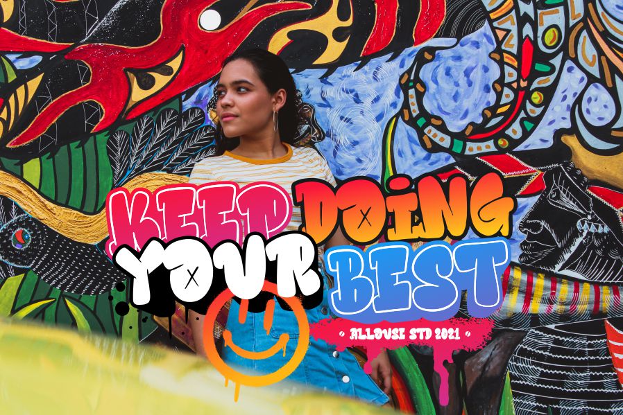
High-Contrast is Your Friend: Opt for contrasting colors between your graffiti font and the background. Think of a bold, black graffiti headline popping off a crisp white background, or a vibrant yellow font standing out against a deep blue. This creates a clear distinction between the text and its surroundings, ensuring your message is easily understood.
Avoid Color Clashes: Graffiti fonts are inherently bold, so avoid overly complex color combinations that might overwhelm the viewer. Imagine a chunky red graffiti font layered over a busy green and purple background – it would be visually jarring and difficult to decipher. Stick to color palettes that complement the boldness of the font and enhance its overall impact.
2. Use Graffiti Fonts Strategically: A Balancing Act
Graffiti fonts are attention-grabbers, so use them wisely. Don't overwhelm your design by overusing them. Consider these strategies for a balanced approach:
Reserve Them for Key Elements: Think of headlines, logos, short bursts of text, or call-to-action buttons. These are prime locations to leverage the attention-grabbing power of graffiti fonts. Let them take center stage and draw the viewer's eye to the most important parts of your design.
Support with Readable Fonts: For body text or lengthy paragraphs, opt for cleaner, more traditional fonts like sans-serif or serif options. This ensures the overall readability of your design and prevents viewers from getting overwhelmed by the boldness of the graffiti font.
3. Embrace the Power of Contrast: Unexpected Juxtapositions
Graffiti fonts often possess a raw, urban aesthetic. Play with this by juxtaposing them against contrasting elements for a captivating design:
Sleek and Modern Elements: Imagine a chunky graffiti font headline paired with clean lines and minimalist backgrounds. This unexpected pairing creates a tension that draws the viewer in and amplifies the impact of both the graffiti font and the clean design elements. Think of a website banner with a bold graffiti font title set against a sleek black background – it's simple yet undeniably eye-catching.
Soft Touches: For a more nuanced approach, explore layering a graffiti font over a delicate script font. This creates a unique visual texture and adds a touch of softness to the raw energy of the graffiti font. Imagine a clothing brand logo with a playful bubble letter graffiti font layered over a flowing script, hinting at a youthful and fun personality.
4. Experiment with Combinations: Beyond the Obvious
Don't be afraid to mix and match! While graffiti fonts make bold statements on their own, explore combining them with other font styles for a truly unique look:
Sleek and Modern Elements: Imagine a chunky graffiti font headline paired with clean lines and minimalist backgrounds. This unexpected pairing creates a tension that draws the viewer in and amplifies the impact of both the graffiti font and the clean design elements. Think of a website banner with a bold graffiti font title set against a sleek black background – it's simple yet undeniably eye-catching.
Soft Touches: For a more nuanced approach, explore layering a graffiti font over a delicate script font. This creates a unique visual texture and adds a touch of softness to the raw energy of the graffiti font. Imagine a clothing brand logo with a playful bubble letter graffiti font layered over a flowing script, hinting at a youthful and fun personality.
5. Respect Copyright and Licensing: Using Fonts Responsibly
Before using any font, especially commercial ones, ensure you have the proper license. Research the specific font's licensing terms to understand how and where you can use it. Many reputable font distributors provide clear information about personal and commercial use licenses. This ensures you're using the fonts legally and ethically, avoiding any copyright infringement issues.
By following these tips, you'll transform your graffiti fonts from mere visual elements to powerful tools that elevate your designs, inject urban energy, and capture the rebellious spirit of street art.
Conclusion: Unleashing Your Creative Voice with Graffiti Fonts
The world of design is your canvas, and graffiti fonts are your vibrant paints. By understanding their characteristics, exploring the diverse styles, and wielding them with a touch of strategic finesse, you can create designs that pulsate with energy, stand out from the crowd, and capture the essence of urban rebellion.
Remember, the key lies in experimentation. Don't be afraid to play with color combinations, explore unexpected font pairings, and use graffiti fonts to make a bold statement. Let your inner artist shine through, and unleash the creative potential that lies within these unique typographic elements.
So, grab your metaphorical spray can (or mouse), choose your perfect graffiti font, and get ready to leave your mark on the design world!
Disclaimer:
This article is for informational purposes only. Some links may be affiliate links, meaning Advise Graphics may earn a commission at no extra cost to you. We do not guarantee results, and readers should do their own research before making any decisions.
Tags
Subscribe
Join the Advise Graphics community and get exclusive design resources, tips, and updates delivered straight to your inbox.
Copyright
© 2025 Advise Graphics. All rights reserved.
Cop© 2025 Advise Graphics. All rights reserved.


