Beyond the Cover: The Crucial Role of Graphic Design in Your Business Proposal
Some links in this post may be affiliate links. See our Affiliate Disclosure for details.
The First Impression Is Everything: The Power of Visuals
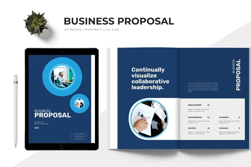
You've spent hours perfecting your business proposal, crafting a solution that’s a perfect fit for your client. But what happens when it lands in their inbox, buried among a dozen other text-heavy documents? The truth is, most clients make a snap judgment before they’ve read a single word. This is where the power of graphic design comes in.
A professionally designed proposal isn't just a "nice-to-have"; it's your firm handshake. It’s the first impression you make, and it sets the stage for how your entire business is perceived. Think of it like a product's packaging. You wouldn't expect a high-end product to come in a crumpled, brown paper bag. Similarly, a proposal with a polished design signals that your services are high-quality and that you pay attention to detail.
When a client sees a clean, well-organized document with a cohesive color palette, clear typography, and your brand's logo, they subconsciously begin to trust you. This visual professionalism tells them you are serious, reliable, and capable of delivering on your promises. In contrast, a generic, poorly formatted proposal can unintentionally communicate a lack of effort or, worse, a lack of competence. Don't let your hard work get overlooked just because of a weak first impression.
Clarity Through Design: Making Your Proposal Easy to Digest
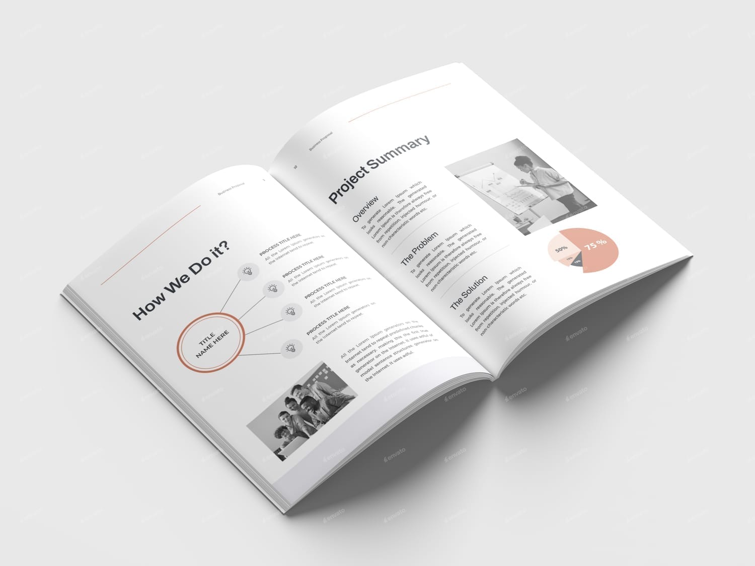
Your proposal's primary job is to communicate your value, but what good is a brilliant idea if it’s lost in a wall of text? This is where graphic design becomes a powerful tool for clarity. We’ve all encountered a document that was so dense and poorly formatted we gave up before we even started. A great design prevents this from happening.
Good design uses key elements like white space, headings, and a logical layout to act as a roadmap for your reader. It breaks down complex information into manageable, bite-sized pieces, guiding their eye from one point to the next. Instead of a long, overwhelming block of text, the reader sees a clear, scannable document that invites them to keep reading.
Furthermore, design allows you to visually represent data that would be tedious to explain in words alone. Charts, graphs, and icons can illustrate your market research, project timelines, or ROI projections with a single glance. This not only makes your proposal more persuasive but also demonstrates that you've done your homework. A well-designed proposal shows that you respect your client’s time and have made it as easy as possible for them to understand—and approve—your vision.
Beyond Aesthetics: Building Trust with a Consistent Brand Identity
A winning proposal is more than just a pretty face; it’s a tangible representation of your brand. When you infuse your company's unique identity into every page, you're not just making the document look good—you're building a foundation of trust and credibility.
Consider the impact of a consistent brand presence. By incorporating your logo, brand colors, and specific fonts, you ensure the proposal feels like an authentic extension of your business. This familiarity reassures the client, as it links the quality of the document directly to the professionalism of your company. It shows that you've put thought and care into every detail, reinforcing your brand's reliability.
In a competitive landscape, clients are looking for a partner they can depend on. A proposal that looks haphazard or uses a generic, stock template can raise a red flag. It might suggest a lack of commitment to your own business, making a client question if you'll be as committed to theirs. A polished, branded proposal, however, communicates confidence and a serious investment in your work. It tells the client you are a credible, established business they can confidently choose.
The Strategic Edge: Why Design Wins Bids
In today's competitive market, a generic proposal is a death sentence. When your potential client is faced with several options that all offer a similar service, the deciding factor often comes down to who made the best impression. This is where a strategic, well-designed proposal gives you a powerful competitive advantage.
A visually compelling proposal not only captures attention—it holds it. While competitors may submit boring, uninspired documents, your proposal becomes a memorable and unique representation of your brand. It shows you’ve gone the extra mile and have put genuine effort into earning their business. This thoughtful approach can subconsciously convince a client that you will apply the same level of care and detail to their project.
Moreover, a strong design can be a powerful persuasive tool. When you present your solutions using professional layouts, custom graphics, and compelling data visualizations, you demonstrate confidence in your work. You're not just providing information; you're building a compelling case that is both easy to understand and hard to ignore. This strategic use of design can be the final nudge a client needs to choose you over the competition, proving that a winning design is not just a nice bonus, but a necessity for securing the deal.
Conclusion: Your Proposal is an Investment, Not an Expense
When you’re under a deadline to submit a business proposal, it can be tempting to focus solely on the content and see design as an afterthought. But as we've explored, that approach is a missed opportunity. Your proposal is more than just a document outlining a service—it's a critical sales tool, a visual resume, and a powerful statement of your brand's value.
By investing in a thoughtful design, you are not simply making your proposal look better; you are making it work harder. You're building instant trust, making your message impossible to ignore, and giving yourself a decisive edge in a crowded market.
So, the next time you craft a proposal, think beyond the cover. Take the time to ensure your design is as compelling as your solution. It’s a strategic choice that can pay dividends, transforming a simple document into your most effective tool for winning new business.
Disclaimer:
This article is for informational purposes only. Some links may be affiliate links, meaning Advise Graphics may earn a commission at no extra cost to you. We do not guarantee results, and readers should do their own research before making any decisions.
Tags
Subscribe
Join the Advise Graphics community and get exclusive design resources, tips, and updates delivered straight to your inbox.
Copyright
© 2025 Advise Graphics. All rights reserved.
Cop© 2025 Advise Graphics. All rights reserved.


