
12 Best Coding Fonts of 2026: Boost Legibility & Productivity


Some links in this post may be affiliate links. See our Affiliate Disclosure for details.
In a world where developers spend upward of 2,000 hours a year staring at a code editor, your choice of typography is no longer a "nice-to-have" aesthetic—it is a critical piece of your engineering stack.
In 2026, the landscape of coding fonts has evolved beyond the simple monospace basics of the past decade. With the rise of ultra-high-definition displays, complex ligatures, and a new design movement favoring "functional minimalism," the font you choose directly impacts your debugging speed and your long-term eye health. Whether you are looking for the geometric precision of the latest Vercel-inspired aesthetics or the accessibility-first clarity of an Intel-designed typeface, the "perfect" font is the one that reduces your cognitive load and lets the logic of your code take center stage.
In this guide, we aren't just listing popular fonts. We are analyzing the top 12 coding fonts of 2026 through the lens of a designer and the rigor of a developer. We’ve tested these against the "1-l-I" legibility test, checked their rendering across modern IDEs like Cursor and VS Code, and evaluated how they handle the latest programming ligatures.
2026 Quick Picks: The TL;DR
If you’re in the middle of a sprint and just need a refresh, here are our top three recommendations based on your specific workflow:
Best Overall: JetBrains Mono – Still the reigning champion for vertical rhythm and pure developer productivity.
Best for Modern Aesthetics: Geist Mono – The gold standard for the "Designer-Developer" who wants their IDE to match a high-end UI portfolio.
Best for Eye Strain: Intel One Mono – Unrivaled for accessibility and reducing fatigue during 10-hour sessions.
A great coding font should be "invisible." If you find yourself noticing the curves of your s or the tail of your g instead of the bug in your if statement, it’s time to switch.
I. What Makes a "Perfect" Coding Font? (The Selection Criteria)
Choosing a font for your IDE isn't just about "vibes"—it's a technical decision. To separate a mediocre monospaced font from a world-class programming typeface, we evaluate them against four core pillars of typographic performance.
1. Character Distinction: The "1-l-I" and "0-O" Test
In standard typography, "homoglyphs" (characters that look nearly identical) are a minor annoyance. In coding, they are a syntax error waiting to happen. A high-performance coding font must pass the "legibility stress test" by creating unique shapes for:
The Number 1, lowercase L (l), and uppercase I (I).
The Number 0 and uppercase O (O). (Look for a "slashed" or "dotted" zero).
The Number 5 and uppercase S.
Double vs. Single Quotes.
If you have to lean in to your monitor to tell the difference between a variable named l1 and ll, the font has already failed you.
2. Ligature Support: The "Symbol Revolution"
Programming ligatures take multiple characters and merge them into a single, cohesive glyph. For example, => becomes a sleek arrow (⇒), and != becomes a slashed equals sign (≠).
Why they are polarizing: Proponents argue they reduce visual noise and represent the "logical" meaning of the code. Critics argue they hide the actual character count and can be confusing for beginners or during pair programming.
The 2026 Verdict: Most modern fonts like Fira Code and Monaspace support ligatures, but top-tier fonts now allow you to toggle specific "stylistic sets" so you can keep the arrows but ditch the more experimental symbols.
3. X-Height & Tracking: The Science of Vertical Space
In coding, vertical rhythm is just as important as horizontal clarity.
X-Height: This refers to the height of lowercase letters (like "x") relative to uppercase letters. A taller x-height makes small text much easier to read on 14-inch laptop screens.
Tracking & Line Height: Coding fonts need "breathing room." A font with a generous default line height prevents your code from looking like a wall of text, which significantly reduces the cognitive load during long-form code reviews.
4. License Types: Open Source vs. Premium
The "Best" doesn't always mean free, though in 2026, the gap is closing.
SIL Open Font License (OFL): These are free and open-source (e.g., JetBrains Mono, Geist). You can use them anywhere, from your IDE to your design mockups, without worrying about a bill.
Premium (Paid) Licenses: Fonts like Operator Mono or Dank Mono come with a price tag (often $30–$200). What are you paying for? Usually, it's the "italics"—high-end fonts often include hand-drawn cursive italics for keywords like function or return, adding a layer of sophisticated visual hierarchy that free fonts rarely match.
Before committing to a font, try the "punctuation check." Look at how it renders semicolons (;) and colons (:). If the semicolon is too small, you'll find yourself constantly hunting for missing terminations in your C++ or JavaScript files.
III. The 2026 "Heavy Hitters" (Top Recommendations)
If you are looking for a font that is battle-tested, widely supported, and designed specifically for the modern high-resolution screen, these four "Heavy Hitters" dominate the 2026 landscape.
1. Geist Mono: The Modern Minimalist
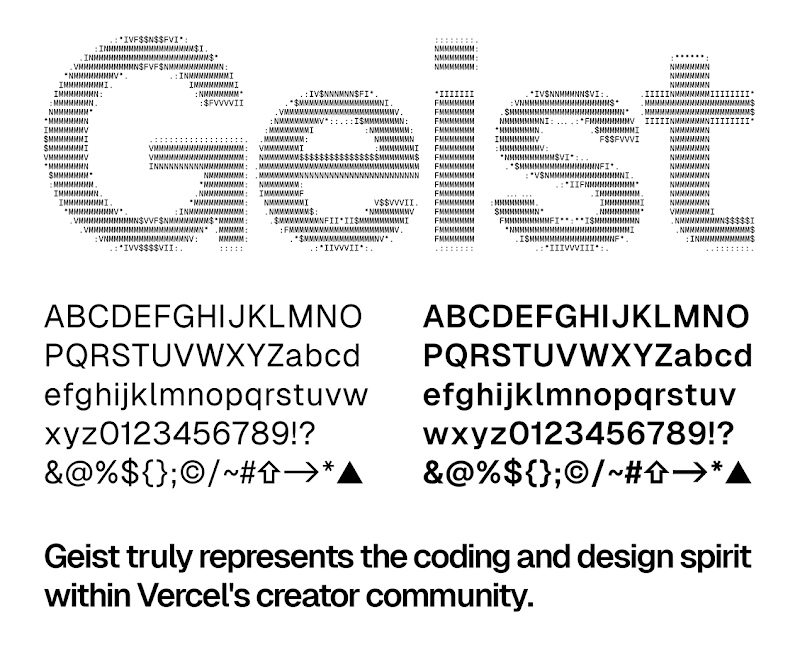
Released by Vercel, Geist Mono has rapidly become the visual language of the modern web. Built with a "Swiss-design" philosophy, it prioritizes geometric precision and extreme readability.
The Vibe: High-end, technical, and surgical. It feels like the typography you’d see in a premium SaaS dashboard.
Why it’s a 2026 Favorite: It was designed to work seamlessly with the "Geist" design system. For developers who also spend time in Figma or building UI components, Geist Mono creates a perfect visual bridge between your code and your canvas.
2. JetBrains Mono: The Developer’s Choice
Even years after its release, JetBrains Mono remains the gold standard for pure functionality. Unlike fonts designed for general use, every decision in this typeface was made to solve a specific coding problem.
The "Secret Sauce": It features an increased x-height and specific oval shapes that make the characters remain distinct even at very small font sizes (10pt or lower).
Best For: Long-haul coding sessions. Its vertical rhythm reduces eye travel, making it the most "comfortable" font for reading thousands of lines of logic.
3. Monaspace: The Innovator
GitHub’s Monaspace project is perhaps the most significant typographic innovation we’ve seen in years. It addresses the "Monospace Problem"—the fact that a wide "W" and a narrow "i" usually have to occupy the same width, creating awkward gaps.
Texture Healing: This is the magic feature. Monaspace uses "Texture Healing" to subtly adjust the spacing of characters based on their neighbors. It preserves the monospaced grid (your cursor still moves in fixed steps), but it visually "heals" the white space for a smoother reading experience.
Diversity: The system includes five distinct styles (Neon, Argon, Radon, Xenon, and Krypton), allowing you to mix and match aesthetics within a single cohesive family.
4. Fira Code: The Ligature King
No list of coding fonts is complete without the font that started the "Symbol Revolution." Fira Code was the first major open-source font to bring ligatures to the masses.
The Power of Symbols: By turning -> into a crisp arrow or === into a triple-bar equals, Fira Code allows your brain to process logic as mathematical symbols rather than a series of keystrokes.
Still Relevant in 2026: While many newer fonts offer ligatures, Fira Code’s library of symbols remains the most extensive and polished. If you want your code to look like a modern mathematical proof, this is still the king.
IV. Niche & Aesthetic Picks (For the "Vibe" Focused)
While the "Heavy Hitters" focus on mass appeal, 2026 has seen a surge in developers looking for personality in their workspace. These niche picks move away from the "corporate tech" look and lean into specific design subcultures.
5. Martian Mono: The Industrial Workhorse
Developed by the team at Evil Martians, Martian Mono is the monospaced cousin of the Martian Grotesk family. It is the perfect choice for fans of Brutalist and Industrial design.
The Vibe: Raw, sturdy, and unpretentious. It feels like code written on a retro-futuristic terminal.
Why it Works: It features a tall x-height and a "variable" font weight, meaning you can dial in the exact thickness that works for your monitor's contrast.
Technical Edge: It is designed specifically for the pixel grid, ensuring that characters remain sharp and legible even at microscopic sizes (8pt or 9pt).
6. Comic Code: The "Code Like Nobody’s Watching" Pick
Don't let the name fool you—Comic Code is a professional-grade typeface that takes the friendliness of Comic Sans and optimizes it for high-density programming.
The Vibe: Casual, approachable, and surprisingly human. It breaks the "rigid" feeling of traditional coding.
The Secret Benefit: There is significant evidence suggesting that the irregular, handwritten-style shapes of "comic" fonts can be highly beneficial for developers with dyslexia. * Details: Unlike the free Comic Mono, the paid Comic Code version includes hand-crafted ligatures and multiple weights, making it a legitimate productivity tool rather than a joke.
7. Operator Mono: The Premium Stylist
For the developer who treats their IDE like a piece of high-end stationery, Operator Mono remains the ultimate luxury pick. At a premium price point (often starting around $200), it is a status symbol in the dev world.
The Script Effect: Its standout feature is its beautiful, cursive-inspired italics. When your syntax highlighter turns a keyword like function, export, or return into italics, it switches to a flowy script that creates a stunning visual hierarchy.
The Vibe: Sophisticated and artisanal. It’s for the developer who wants their screen to look like a spread in a design magazine.
Best For: Fans of high-contrast themes (like Night Owl or Monokai Pro) where the script italics can truly pop against the background.
The "Vibe" Verdict
Go Martian Mono if you want your terminal to look like it belongs in a sci-fi movie.
Go Comic Code if you want a friendly, legible experience that reduces the "intimidation" of complex blocks of code.
Go Operator Mono if you want the most beautiful, "designer" coding environment money can buy.
V. Accessibility & Wellness Focus
In 2026, we are seeing a long-overdue shift in development culture: prioritizing "eye health" over "cool aesthetics." For developers dealing with astigmatism, dyslexia, or simply the biological fatigue of a 10-hour sprint, these two fonts are literal game-changers.
8. Intel One Mono: The Science of Sight
Developed by Intel’s Brand Team in collaboration with VML and Frere-Jones Type, Intel One Mono wasn’t built to look "techy"—it was built to be seen. It was designed specifically for low-vision developers and has undergone rigorous testing to ensure maximum legibility.
The Problem it Solves: Most fonts "blur" together when scaled down or when viewed by a tired eye. Intel One Mono uses a high degree of character differentiation. For example, the lowercase "f" and "t" have distinct crossbar heights to prevent them from looking like the same vertical stroke.
High-Fatigue Performance: It performs exceptionally well in "Dark Mode" environments where high-contrast text can sometimes cause a "halo" effect. The spacing (tracking) is slightly wider than average, giving each character its own breathing room.
The Vibe: It feels industrial and academic. It’s not "pretty" in a traditional sense, but it is incredibly calming to read for hours on end.
9. Atkinson Hyperlegible: The Clarity Champion
Originally designed for the Braille Institute, Atkinson Hyperlegible isn't a traditional "coding font," but the monospaced variants appearing in 2026 have gained a cult following in the dev community.
The Philosophy: This font operates on the principle that every character should be unmistakable. If you saw only the top half of a letter, could you still tell what it is? Atkinson says "Yes."
Key Design Features:
Exaggerated Forms: Circular strokes are distinct from square ones.
Angled Terminals: The ends of letters like "l" and "j" have sharp, distinct hooks.
The "Il1" Test: It passes this more effectively than almost any other font on the market.
Best For: Developers who find themselves leaning toward the screen or squinting at small font sizes. It’s a "safety first" typeface that happens to look remarkably clean in a modern IDE.
Even with a great font, your eyes need a break. We recommend the 20-20-20 Rule: Every 20 minutes, look at something 20 feet away for 20 seconds. Pair that habit with Intel One Mono, and your "late-night coding headaches" might finally become a thing of the past.
VI. How to Choose Based on Your IDE
Your coding font doesn't exist in a vacuum—it lives inside an editor. The way a font renders can change dramatically depending on whether you are using a modern Electron-based app or a terminal-based power tool.
1. VS Code & Cursor: Best for Modern Electron Editors
VS Code and its AI-first successor, Cursor, are built on the Electron framework. This means they have excellent support for high-resolution rendering and complex OpenType features.
The Best Fit: Monaspace or Fira Code.
Why: These editors handle "Texture Healing" and complex ligatures flawlessly. Because VS Code/Cursor are often used for web development (React, TypeScript, CSS), you want a font that can handle a high density of symbols (=>, ===, </>) without losing clarity.
Pro Tip: In Cursor, look for fonts with a slightly higher "Weight" setting (like 450-500) to ensure the AI-suggested ghost text remains distinct from your active code.
2. Neovim & Terminal: The "Nerd Font" Requirement
If you live in the terminal, your font choice isn't just about the letters—it’s about the icons. To get those sleek status lines, file icons, and git branch symbols in Neovim or Tmux, you need a Nerd Font.
The Best Fit: Anka/Coder or Hack (Nerd Font Edition).
Why: Neovim users often favor a "retro-tech" or minimalist aesthetic. Anka/Coder is a condensed monospace font that allows you to see more code horizontally—perfect for split-pane workflows where screen real estate is at a premium.
Terminal Match: Pair these with high-performance terminal emulators like Ghostty (the 2026 standout) or Alacritty to ensure zero-latency rendering of your ligatures.
3. Light Mode vs. Dark Mode: The "Weight" Shift
Have you ever noticed that a font looks "bolder" in Dark Mode? This is a visual illusion called irradiation—light text on a dark background tends to bleed into the darkness, making it look thicker.
For Dark Mode: Use a lighter weight (Regular or Light). Fonts like JetBrains Mono are specifically optimized for dark backgrounds, maintaining crisp edges without excessive "glow."
For Light Mode: You need more "bite." Switch to a medium weight or a font with high stroke contrast like IBM Plex Mono. This prevents the characters from looking "washed out" against a bright white or light gray background.
The 2026 Strategy: Many developers are now using Variable Fonts (like the Monaspace family). These allow you to adjust the weight by single-pixel increments, so you can have a "425" weight for your morning light-mode session and a "375" weight for your late-night dark-mode crunch.
If you switch to Light Mode and the text feels "thin" or "sharp," increase your font weight by one step (e.g., from Regular to Medium). If Dark Mode feels "blurry," drop it down one step.
VII. Conclusion: Choosing Your Final "Stack"
In 2026, your coding font is more than just a stylistic choice—it is a functional tool that sits at the intersection of design, engineering, and personal wellness. Whether you prioritize the architectural beauty of a Swiss-designed typeface or the biological necessity of a high-legibility font, the "best" choice is the one that disappears while you work.
The Final Verdict: Which One Should You Install Today?
To make your decision easier, we’ve broken down the winners by "Developer Persona":
The Modern Minimalist: Go with Geist Mono. If you value a clean, geometric look that mirrors the best of 2026 web design, this is your new default.
The Marathon Coder: Stick with JetBrains Mono. Its vertical rhythm and x-height are still unbeaten for those 8-hour deep-work sessions.
The Innovation Hunter: Try Monaspace. If you’ve always hated the "gaps" in monospace type, "Texture Healing" will change how you perceive your code.
The Accessibility First Coder: Download Intel One Mono. Your eyes will thank you by 4:00 PM every single day.
How to "Audit" Your New Font
Before you settle in, perform this quick 30-second check in your IDE settings:
Test the Punctuation: Type ({;,:}) at a small font size. Can you see the dots clearly?
Check the Italics: Turn on a theme that italicizes comments or keywords. Does it add hierarchy or just clutter?
Toggle Ligatures: If you’re using Fira Code, try a few logic gates like !== or &&. If they feel "distracting," remember you can always disable ligatures while keeping the font.
What’s in your settings.json?
Choosing a font is deeply personal. We want to hear from the Advise Graphics community—are you a ligature enthusiast or a purist? Are you rocking a premium "script" font or an open-source workhorse?
Drop your current font choice and your favorite VS Code theme in the comments below!
Disclaimer:
This article is for informational purposes only. Some links may be affiliate links, meaning Advise Graphics may earn a commission at no extra cost to you. We do not guarantee results, and readers should do their own research before making any decisions.
Tags
Subscribe
Join the Advise Graphics community and get exclusive design resources, tips, and updates delivered straight to your inbox.


Ads


Copyright
© 2025 Advise Graphics. All rights reserved.
Cop© 2025 Advise Graphics. All rights reserved.