
The 2026 Typography Forecast: 7 Styles Set to Dominate Branding


Some links in this post may be affiliate links. See our Affiliate Disclosure for details.
For the better part of a decade, we’ve been living in the era of the homogenized grotesque. Driven by the "mobile-first" mandate and a corporate obsession with scalability, brands across every vertical—from Silicon Valley startups to legacy fashion houses—sacrificed their visual DNA for the safety of geometric sans-serifs. It was the age of "Blanding," where legibility was the only metric that mattered.
As we move into 2026, that era is officially over.
The driver of this shift is a profound professional fatigue with "pixel-perfect" design. In a landscape where AI can now output optimized, technically "correct" layouts at scale, the value of a designer is no longer in maintaining the grid, but in subverting it. We are seeing a pivot toward "Expressive Friction"—typography that prioritizes character, kinetic energy, and analog-inspired imperfection over sterile efficiency.
This year, the design toolkit is expanding into more visceral territory. We’re seeing a massive resurgence of funky, high-contrast serifs that borrow from the 1970s psychedelic revival, utilizing extreme x-heights and liquid Bézier curves to create warmth. We’re witnessing novel italics being used not as a secondary emphasis, but as a primary display tactic to disrupt the horizontal baseline. Perhaps most jarringly, "chaotic scripts" are emerging as a high-concept rejection of digital cleanliness, favoring the raw, unrefined energy of hand-drawn "anti-design."
For the modern typographer, 2026 isn't about finding the perfect font; it’s about deploying type as a visceral brand voice. The following seven trends represent the new visual vocabulary of branding—a world where the most impactful move you can make is to finally break the rules.
Style 1: Funky Curvy Serifs (The 70s Retro Revival)
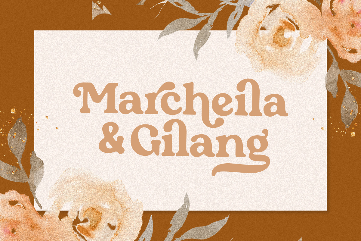
If the 2010s were defined by the rigid, mathematical geometry of the "Tech Sans," 2026 belongs to the liquid serif. This isn't just a nostalgic nod to 1970s phototypesetting; it is a high-contrast, variable-font evolution that prioritizes organic flow and visual density.
For designers, this style is less about "vintage" and more about "personality-driven ergonomics." It provides a tactile, "juicy" feel that digital-first brands are using to appear more approachable and less like faceless algorithms.
The Technical Anatomy
Exaggerated Ball & Teardrop Terminals: The "ends" of the letterforms are no longer sharp or subtle. We’re seeing oversized, bulbous terminals that add a sense of weight and "squish" to characters like f, r, j, and y.
Deep, Liquid Curves: Think of the transition between the stem and the bowl. Instead of a standard bracketed serif, 2026 serifs use soft, melting junctions that mimic liquid or molten glass.
Extreme X-Heights with Tight Tracking: To achieve that "wall of type" look seen in 70s editorial design, these faces feature tall lowercase letters and are designed to be kerned "touching" or nearly touching.
The "Elastic" Baseline: Thanks to variable font technology, these serifs often include an axis for "funk" or "flair," allowing designers to extend swashes or fluctuate the baseline rhythm dynamically.
Strategic Implementation
The Contrast Rule: To keep this from looking like a thrift store flyer, pair these high-character display faces with ultra-functional, low-contrast monospaced fonts or "invisible" sans-serifs. The goal is a "Hero vs. Utility" hierarchy.
Color Theory: Avoid the cliché 70s brown and orange. To modernize the look, apply acidic neons, deep chromes, or desaturated "concrete" neutrals.
Best For: Brand identities that need to signal "premium comfort"—think high-end wellness, ethical fintech, or artisanal food and beverage.
When working with these curves in Illustrator or Glyphs, focus on Point Continuity. To get that authentic "liquid" feel, ensure your Bézier handles are perfectly symmetrical across extreme points to avoid "flat" spots in the curves—especially on the oversized bowls of letters like a and g.
Style 2: Novel Italics (Slanted with Attitude)

In traditional typography, an italic is a supporting player—a quiet "whisper" used to emphasize a word or denote a book title. In 2026, italics are being promoted to the lead vocalist. We are seeing a move toward "Hyper-Slanted" faces that break the standard 8° to 12° convention, often pushing into aggressive 25° + territory.
This isn't just about leaning; it’s about kinetic energy. These fonts look like they are moving at terminal velocity, providing a sense of "forward momentum" that static, upright fonts simply cannot replicate.
The Technical Break: Slant vs. Speed
True Italics vs. Obliques: For 2026 branding, designers are favoring "True Italics"—where characters like a, e, f, and g are completely redrawn with calligraphic influence—rather than just "obliquing" or shearing a Roman face. This adds a "liquid" quality to the speed.
The 45-Degree Ceiling: We are seeing "Extremist Italics" that push toward a 45-degree angle. At this point, the font ceases to be a text face and becomes a geometric pattern, creating a striped, rhythmic texture on the page or screen.
Backslanting (The "Reverse Italic"): A major sub-trend for "anti-design" brands. Leaning the type left instead of right creates an immediate sense of unease and disruption, perfect for counter-culture or high-concept fashion labels.
Managing the "Leaning Tower" (Legibility Tips)
When you push a typeface to an extreme slant, the traditional rules of kerning and balance fly out the window.
Optical Compensation: At high angles, horizontal strokes (like the bars on an H or E) appear thinner than they actually are. You must manually increase the weight of horizontals to maintain visual "color" across the wordmark.
Counter-Space Management: Extreme slants cause "clashing" between characters like V and A. Designers are solving this by using deep ink traps and "looser" tracking than they would for upright faces.
The "Vertical Anchor" Rule: To keep a layout from feeling like it's sliding off the screen, pair hyper-italics with at least one strong vertical element—usually a heavy border, a vertical rule, or a single line of perfectly upright, monospaced metadata.
Strategic Implementation
The "Speed-Dating" Effect: Use these for brands that want to signal disruption and agility. It’s the visual equivalent of "moving fast and breaking things."
Pairing Strategy: Hyper-italics work best when they occupy the "Display" role. Pair them with a "Static Sans" (like a customized Helvetica or Akzidenz-Grotesk) to provide a grounding force.
Best For: Fintech (the "future of money"), performance sportswear, and cutting-edge digital agencies.
If you are building a custom wordmark with an extreme slant, don't just use the "Shear" tool in Illustrator. It distorts the "O" and "S" into awkward, pinched ovals. Instead, use a Variable Font with a 'slnt' axis, or manually adjust your nodes to ensure the curves remain "open" and optically circular.
Style 3: Chaotic Scripts (The Rise of Anti-Design)
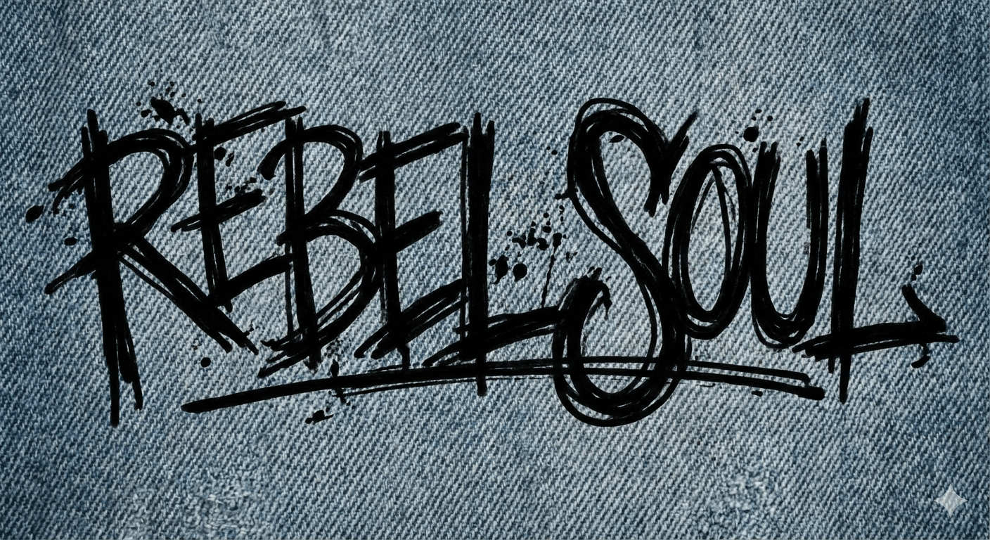
If 2024 was the year of "Quiet Luxury," 2026 is the year of Loud Authenticity. As high-fidelity, AI-perfected imagery becomes the baseline, designers are pivoting toward "Chaotic Scripts"—typefaces that look like they were scrawled with a dying Sharpie on a napkin or scratched into a desk with a key.
For a brand, this style signals that there is a human behind the machine. It’s raw, it’s unpolished, and it creates an immediate sense of intimacy.
The "Deliberate Mess" Framework
To the untrained eye, these scripts look accidental. For the professional designer, they are a masterclass in rhythm and counter-balance.
Inconsistent Baselines: Unlike traditional scripts that sit on a horizontal line or a gentle curve, chaotic scripts "vibrate." The letters jump up and down, creating a visual staccato that keeps the eye moving.
Variable Stroke Pressure: These faces mimic the physics of a real hand—heavy pressure on the downstrokes and "ink starvation" on the tails. This tactile quality is essential for breaking the "glass screen" feel of digital branding.
Aggressive Overlapping: In the world of legibility, overlapping is a sin. In 2026, it’s a feature. Allowing characters to collide or stack creates a dense, "sticker-bomb" texture that feels urban and lived-in.
Technical Execution: Avoiding the "Repeating Character" Trap
Nothing kills the "handwritten" illusion faster than seeing two identical 'e's next to each other.
Leveraging OpenType Alternates: To execute this properly, you must use fonts with deep character sets. Successful chaotic scripts in 2026 use contextual alternates to automatically swap out glyphs so that no two letters look the same in a single wordmark.
Analog-to-Digital Workflow: The most effective chaotic scripts aren't "designed" in Glyphs; they are captured. Designers are scanning real-world artifacts—scuffs from a photocopier, dry-brush strokes, or actual graffiti—and vectorizing them while retaining the "noise" or "grit" on the edges.
The "Clean Anchor" Necessity: Because the script is chaotic, the rest of the brand system must be surgically precise. Use a strict grid and high-contrast white space to frame the "mess," proving to the viewer that the chaos is a choice, not a mistake.
Strategic Implementation
The Gen Z "Ugly-Cool" Aesthetic: This style resonates with a demographic that views "perfect" branding as manipulative. It’s the visual language of the "photo dump" and the unedited vlog.
Pairing Strategy: Pair a chaotic script with an ultra-light, wide-tracked sans-serif. This creates a "Gallery Effect"—the script is the raw art, and the sans-serif is the clean museum label next to it.
Best For: Streetwear labels, independent music festivals, "rebel" skincare (e.g., Starface), and experimental editorial platforms.
When vectorizing your own "chaotic" hand-lettering, resist the urge to use the "Simplify Path" tool. The magic is in the anchor point clusters that create those tiny, jagged imperfections. If the file size becomes an issue, manually delete points only on the straightaways, but keep the "grit" in the curves.
Style 4: Kinetic & Variable Type (The Living Wordmark)
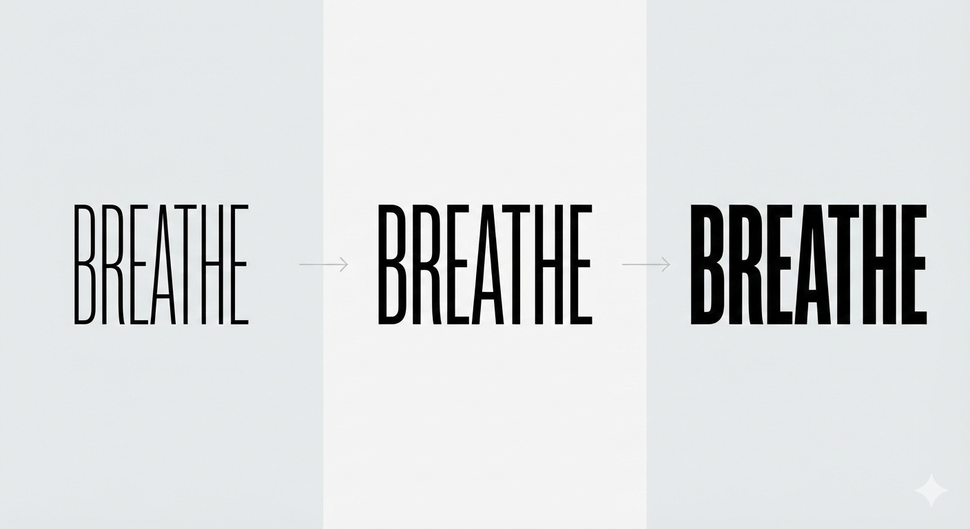
In 2026, the static logo is becoming an outlier. As branding shifts almost entirely to digital-first surfaces—dynamic web headers, AR overlays, and social video—typography is no longer a fixed asset. It is a living organism.
We are moving beyond simple "hover states" into an era of Environmental Reactivity, where type responds to scroll depth, cursor velocity, or even ambient audio levels.
The Technical Shift: From "Styles" to "Axes"
The backbone of this trend is the OpenType Variable Font (OTVAR). For designers, this means moving away from a folder of "Light, Regular, and Bold" and toward a multi-dimensional design space.
Custom Creative Axes: While standard fonts offer wght (weight) and wdth (width), 2026 trends see designers building custom axes into their brand fonts. These include FLARE (increasing serif size), VOID (increasing letter cut-outs), or GRAV (simulating gravity by shifting the weight to the bottom of the letter).
Interpolation as Interaction: The "motion" isn't just a video loop. Brands are using JavaScript to link the font-variation-settings to user behavior. As a user scrolls down a page, the headlines might "inflate" or "stretch" to fill the viewport, creating a literal physical connection between the user and the brand.
Design Strategy: The "Breathe" Factor
To master kinetic type, designers must think like animators.
The "Squash and Stretch" Rule: To make type feel organic, designers are applying Disney’s classic animation principles to letterforms. A "breathing" logo that subtly expands and contracts at a resting state feels more "human" and "premium" than a static SVG.
Liquid Layouts: In 2026, type is used as a liquid container. Variable fonts allow headlines to automatically reconfigure their width and tracking to ensure they are always "edge-to-edge," regardless of the device’s aspect ratio. This eliminates the awkward "widows and orphans" of responsive design.
Strategic Implementation
Differentiating via Motion: If your competitor has a static sans-serif, your brand wins by having a wordmark that "reacts" when the user clicks. It transforms the brand from a passive image into an active participant.
The "Vibe" Shift: Kinetic type allows a brand to change its tone without changing its font. A "Professional" weight for a landing page can morph into a "Playful" width for a marketing campaign, all within the same font file.
Best For: High-growth tech, streaming platforms, interactive editorial, and any brand living primarily in the "Attention Economy."
When designing variable fonts, use Dinamo’s Font Gauntlet or Adobe’s Variable Fonts panel to test your extremes (the "Masters"). Ensure that as you move between axes, the internal counter-spaces of the letters don't collapse. A common mistake is "clogging" the 'e' or 'a' when the weight axis is pushed to the limit—solve this by using optical sizing (opsz) to automatically open the counters at display sizes.
Style 5: Soft Brutalism (Minimalism with a Soul)
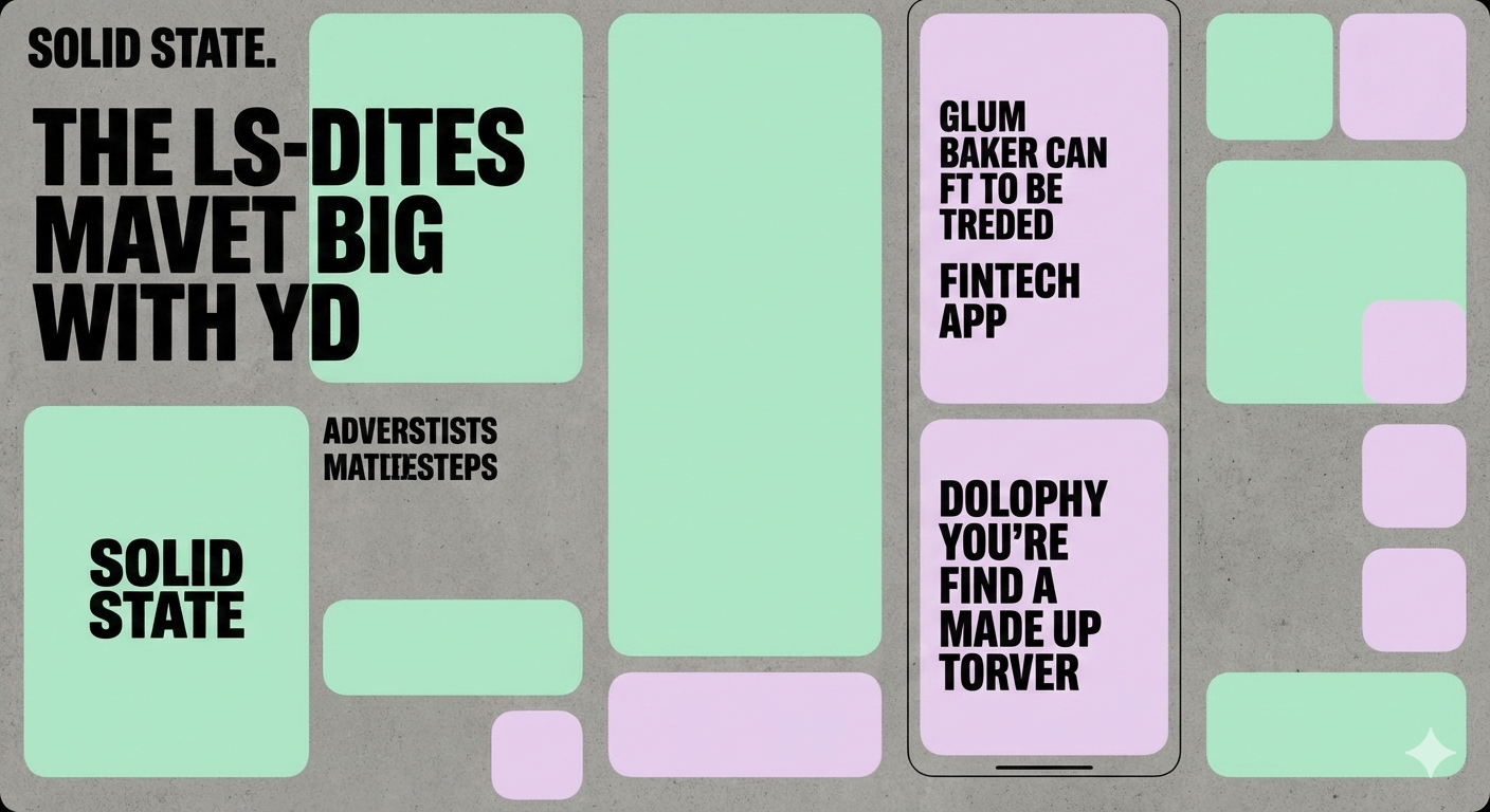
For years, "Brutalism" in digital design meant raw, harsh layouts—unrated HTML, neon-on-black color schemes, and sharp, monospaced type that felt intentionally "ugly." In 2026, we are seeing the evolution into Soft Brutalism. This style retains the confidence and structural integrity of industrial design but rounds off the sharp edges to make it palatable for a mainstream audience.
It is the visual equivalent of a concrete building with plush velvet furniture inside: imposing structure meets human comfort.
The Technical Anatomy
The Overbuilt Grid: Soft Brutalism doesn't hide the layout. Expect to see heavy borders (2pt to 4pt), visible table cells, and "blocky" sections that define the information hierarchy.
The "Squircle" Influence: While the layout is modular and boxy, the corners are rarely sharp. Designers are using high corner radii or "squircles" (mathematical hybrids of squares and circles) to soften the impact of heavy type and thick strokes.
High-Impact Terminals: The typography is typically heavy—think Ultra-Black or Poster weights—but with a twist. The terminals are often rounded or "ink-trapped" in a way that feels bubbly rather than aggressive.
The Pastel-Industrial Palette: Unlike the "Hard Brutalism" of 2018, the 2026 version uses a palette of "utility pastels"—safety orange, mint green, or lilac—against a backdrop of stark greys or off-whites.
Strategic Implementation
The "Trust" Factor: This style is perfect for brands that need to appear stable and institutional but want to avoid looking "corporate" or "stale." It suggests a brand that is technically proficient but has a sense of humor.
Hierarchy over Decoration: In Soft Brutalism, the type is the decoration. There is little need for photography or illustration when the letterforms and the grid do the heavy lifting.
Best For: "New Age" Fintech (e.g., Wise or Gumroad), high-end hardware/electronics, and SaaS platforms that prioritize "work-mode" efficiency.
When building Soft Brutalist layouts in Figma or Illustrator, avoid using standard "Inner Shadows" to create depth. Instead, use hard, offset shadows with 0% blur to maintain the architectural feel. For the type, look for "Ink Trap" fonts (like Whyte Inktrap or PP Neue Montreal)—at display sizes, these deep notches add a mechanical, precision-engineered look that defines the style.
Style 6: 3D & Tactile Lettering (Typography for the Z-Axis)
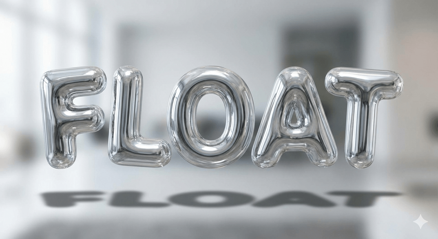
As we move toward 2026, the screen is no longer a flat surface—it’s a window. With the maturation of Spatial UI (driven by Apple Vision Pro and advanced mobile AR), typography is breaking out of the X and Y axes. We are seeing a move toward "Hyper-Physicality," where letterforms possess mass, gravity, and material properties like glass, chrome, or even inflatable plastic.
For designers, this is the final frontier of "Blanding" defiance. You can’t ignore a wordmark that looks like it’s floating in your living room.
The Technical Anatomy: Designing with Depth
Ray-Traced Realism: 2026 typography leverages real-time lighting. We aren't just adding a "drop shadow"; we’re designing specular highlights (where the light hits the "gloss") and refraction (how the letter distorts the background behind it).
The "Inflatable" Aesthetic: A major sub-trend is the "Puffer" or "Balloon" font. These are ultra-bold, rounded characters that look pressurized. They use ambient occlusion (the soft shadows in the cracks where letters touch) to create a sense of extreme "squish."
Materiality as Brand Voice: Instead of a color palette, brands are choosing a "Material Palette." A fintech brand might use "Liquid Mercury" type to suggest fluidity and value, while a sustainable brand might use "Recycled Frosted Glass."
Strategic Implementation
The Immersive Factor: In Spatial UI, type needs to be legible from multiple angles. This is leading to the rise of "Chunky Display" faces that maintain their silhouette even when viewed at a $45^\circ$ angle.
Micro-Interactions: Imagine a mobile app where the "Submit" button text slightly "deflates" when you press it. This tactile feedback creates a Dopamine loop that flat design simply cannot match.
Best For: Luxury fashion (the "Digital Silk" look), gaming, high-end consumer tech, and "Meta-Brands" that exist primarily in virtual spaces.
You no longer need to be a Cinema 4D expert to play in this space. Tools like Spline allow you to export interactive 3D type directly to the web (React/Three.js). When designing for the Z-axis, remember the "Shadow Anchor" rule: without a soft contact shadow beneath your 3D type, it will look like it’s "hallucinating" on the screen. Always ground your type with a subtle, realistic shadow to give it weight.
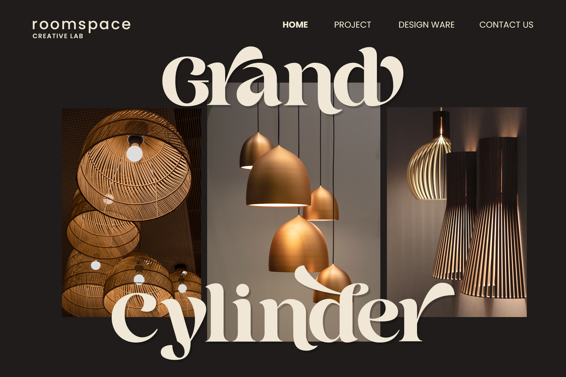
Style 7: The "New Editorial" (High-Contrast Elegance)
As the "loud" trends of 3D bubbles and chaotic scripts reach their saturation point, the "New Editorial" serves as the industry’s sophisticated palate cleanser. This isn't just a return to traditional Didot or Bodoni; it is a high-definition evolution of elegance that leverages modern rendering power to achieve razor-thin hairlines that were previously impossible to maintain on digital screens.
In 2026, this style represents "Quiet Luxury"—the visual language of brands that don't need to shout because their authority is implicit.
The Technical Anatomy
Extreme Stroke Contrast: The "New Editorial" pushes the ratio between the thick stem and the thin hairline to its absolute limit. We are seeing hairlines that are practically 1-pixel wide at display sizes, creating a shimmering, "staccato" effect on the page.
Verticality & Compression: Unlike the wide, expansive "Tech Sans" of the past, these faces are often tall and condensed. This vertical emphasis draws the eye upward, suggesting growth and premium stature.
Sharp, Unbracketed Serifs: The transition from stem to serif is no longer a soft curve. We’re seeing "abrupt" or unbracketed serifs—flat, horizontal lines that look like they were sliced with a scalpel.
Generous Leading & Negative Space: The "New Editorial" is as much about the space between the lines as the lines themselves. Designers are using exaggerated leading (line height) to allow the letterforms to "breathe," signaling that the content is important enough to deserve the extra room.
Strategic Implementation
The "Museum" Effect: By surrounding high-contrast type with massive amounts of white space, you create a "gallery" environment. This immediately increases the perceived value of the product, whether it's a $200 face cream or a $50,000 SaaS platform.
The Utility Offset: To keep this from feeling too "old world," pair it with an Industrial Mono-spaced font for metadata (labels, dates, or prices). This "High-Low" pairing—mixing luxury display type with utilitarian functional type—is the hallmark of the 2026 editorial look.
Best For: High-end skincare, boutique architectural firms, "Expert-Led" consulting brands, and heritage fashion houses looking to modernize.
The biggest challenge with high-contrast serifs is legibility at small sizes. When the hairline "disappears" on lower-resolution screens, it’s called "dazzle." To combat this, always select a font family with a dedicated Optical Sizing (opsz) axis. Use the Display cut for headlines (maximum contrast) and the Text cut for body copy (lower contrast, sturdier hairlines) to ensure your brand remains functional across all devices.
Conclusion: The Future is Expressive
The 2026 Typography Forecast marks the definitive end of the "one-size-fits-all" design philosophy. Whether through the nostalgic warmth of funky serifs, the kinetic speed of novel italics, or the architectural structure of Soft Brutalism, the goal for the modern designer is clear: find the brand’s friction.
In an AI-saturated world, the fonts that dominate branding will be the ones that feel the most human—flaws, curves, and all.
Disclaimer:
This article is for informational purposes only. Some links may be affiliate links, meaning Advise Graphics may earn a commission at no extra cost to you. We do not guarantee results, and readers should do their own research before making any decisions.
Tags
Subscribe
Join the Advise Graphics community and get exclusive design resources, tips, and updates delivered straight to your inbox.


Ads


Copyright
© 2025 Advise Graphics. All rights reserved.
Cop© 2025 Advise Graphics. All rights reserved.