

What Are Script Fonts? A Complete Guide for Designers (2026)


Some links in this post may be affiliate links. See our Affiliate Disclosure for details.
Scroll through any wedding invitation, luxury product label, or trending Instagram post, and you'll likely spot them: fonts that flow like handwriting, with letters that seem to dance and connect across the page. Few typefaces carry as much personality or visual charm as script fonts, which is exactly why they've become a design staple for brands, events, and editorial work alike.
At their core, script fonts are typefaces modeled after handwriting and calligraphy — flowing, expressive, and full of character. But not all scripts are created equal, and choosing the wrong one (or using it the wrong way) can undermine an otherwise great design.
In this guide, you'll learn what script fonts are, the different types you'll encounter, when and how to use them, and how to pair them like a pro.
What Are Script Fonts? (Definition)
Script fonts are typefaces designed to mimic the fluid, connected strokes of handwriting or calligraphy. Unlike standard serif or sans-serif fonts, where each letter stands independently, script fonts often feature letters that flow into one another, varying stroke weights, and a sense of movement — as if someone wrote them with a pen, brush, or quill.
Their roots trace back to centuries-old penmanship traditions and formal calligraphy, from the ornate copperplate scripts used in 18th-century correspondence to the expressive brush lettering found in Western sign-painting. Digital type design later adapted these handwritten forms into scalable, reusable fonts — making that same elegant or playful handwriting look accessible for everyday design work.
A few characteristics define most script fonts:
Flowing, connected strokes that mimic natural handwriting motion
Variable stroke weight — thick and thin lines created by pen pressure or brush angle
Slant and rhythm, giving the font a sense of movement rather than static, upright letterforms
Personality-driven design, since script fonts often carry more emotional tone (elegant, playful, romantic) than functional typefaces
This blend of history and expressiveness is exactly why script fonts remain a go-to choice for designers looking to add warmth, sophistication, or personality to a project.
Types of Script Fonts
Not all script fonts serve the same purpose. Knowing the distinctions between styles will help you choose the right one for your project instead of defaulting to whatever looks "pretty."
1. Formal Script Fonts
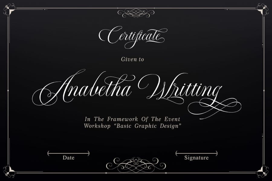
Formal scripts are the most elegant and refined of the bunch, often modeled on classic copperplate or engraver's calligraphy. Letters are typically thin, precise, and highly ornamental, with delicate flourishes. These fonts are a natural fit for wedding invitations, luxury branding, certificates, and any design that calls for a polished, high-end feel.
2. Casual Script Fonts
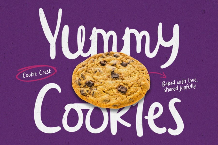
Casual scripts feel more relaxed and personal, resembling everyday handwriting rather than formal penmanship. They're less structured, often slightly uneven, and carry a friendly, approachable tone. You'll see these frequently in social media graphics, product packaging, and branding for lifestyle or food-related businesses looking to feel warm and human.
3. Calligraphy Fonts
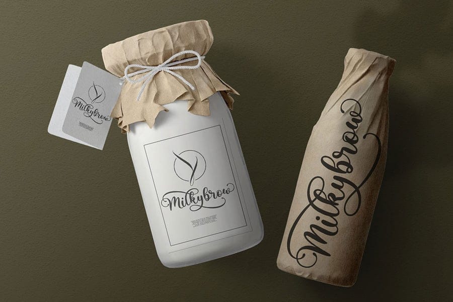
Calligraphy fonts are digitized versions of hand-lettering created with a brush, pen, or nib. They emphasize the artistic technique behind the strokes — sharp contrasts between thick downstrokes and thin upstrokes, and often subtle imperfections that give them an authentic, handcrafted feel. These fonts work well for artistic branding, invitations, and designs that want to highlight craftsmanship.
4. Cursive Fonts

Cursive fonts are the closest digital relative to traditional joined-up handwriting taught in schools. Letters connect in a continuous flow, but the style tends to be simpler and more legible than formal script or calligraphy. Cursive fonts are versatile and often used where readability matters alongside a handwritten feel, such as signage or body copy accents.
5. Brush Script Fonts
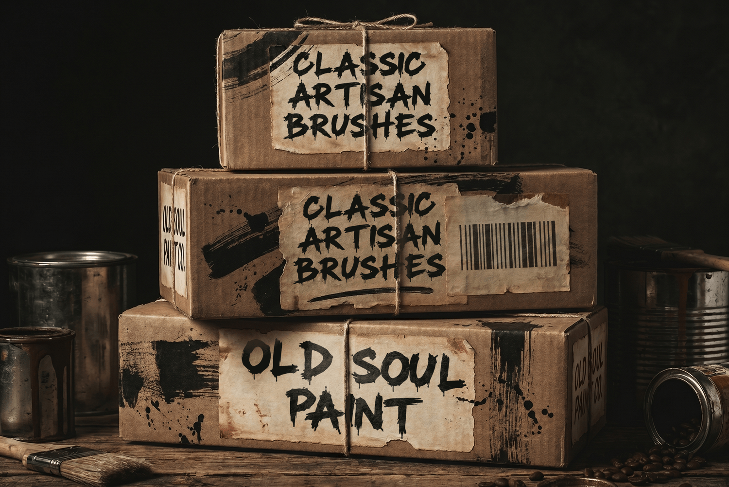
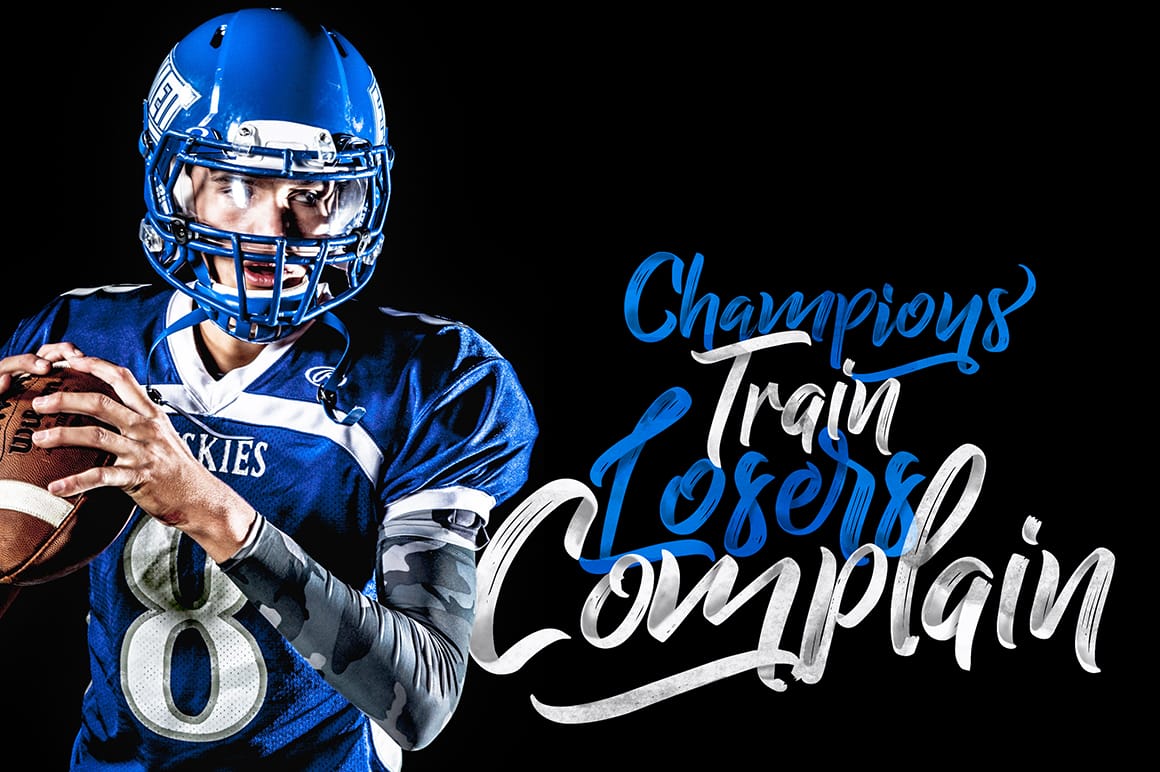
Brush scripts mimic the bold, expressive strokes of a paintbrush or marker. They're characterized by thick, often uneven lines, visible texture, and an energetic, dynamic feel. This style is popular in modern branding, sports and streetwear design, and anywhere a design needs to feel bold, confident, or hand-painted.
6. Modern/Blackletter Hybrid Scripts
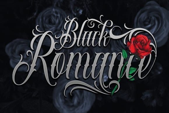
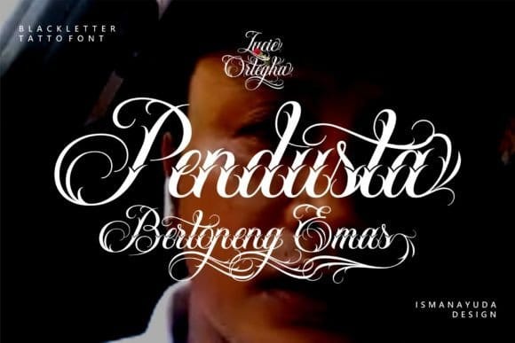
A newer trend blends traditional script flourishes with blackletter (Gothic) or geometric elements, creating edgy, contemporary typefaces. These hybrids often show up in streetwear, music branding, and tattoo-inspired design, offering the elegance of script with an unexpected, modern twist.
7. Signature Script Fonts
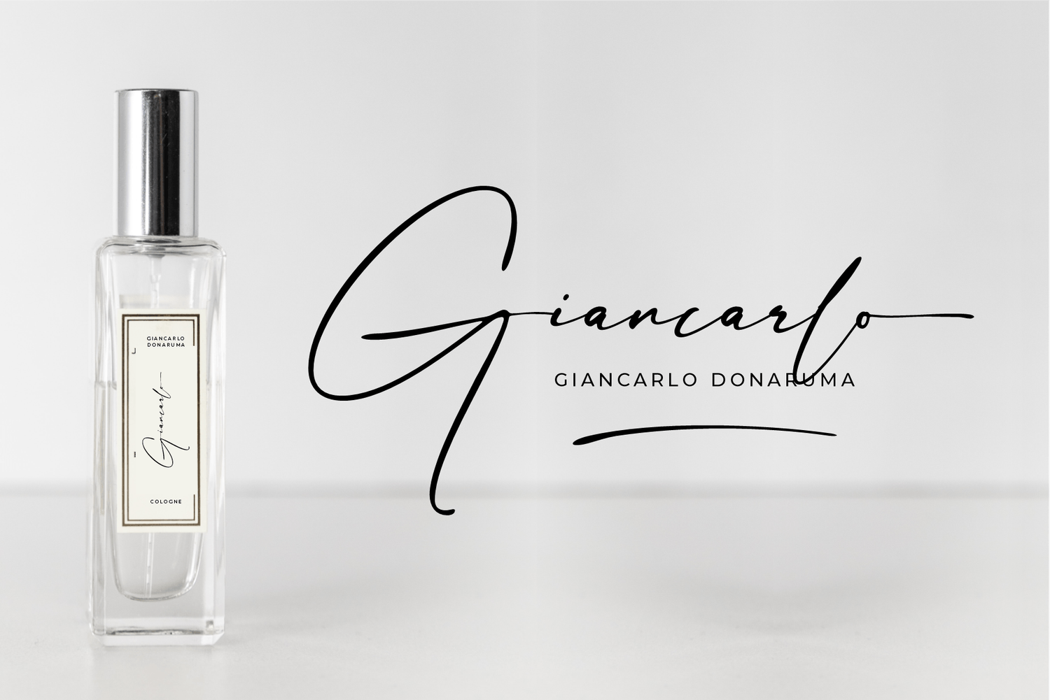
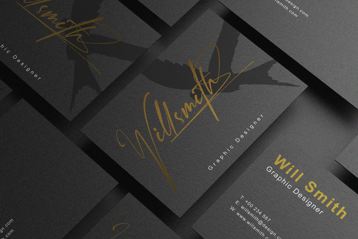
Signature fonts mimic the look of an actual handwritten signature — fluid, looping, and often slightly irregular, just like a real autograph. Unlike casual scripts, which evoke general handwriting, signature fonts are designed to feel like one specific person's mark, making them a popular choice for personal branding (authors, consultants, influencers), founder or designer signatures in logos, certificates and diplomas, and autograph-style social graphics. They also show up frequently on wedding save-the-dates and invitations, where a couple's names appear in an elegant, signature-like flourish.
Script Fonts vs. Cursive vs. Calligraphy Fonts (Clarifying Confusion)
These three terms get used interchangeably all the time, but they aren't quite the same thing. "Script" is the umbrella category; cursive and calligraphy are specific styles within it.
Term
Definition
Typical Look
Script
Umbrella term for any font styled after handwriting
Ranges from elegant to casual
Cursive
A specific script style with continuous, joined letters
Simpler, more legible, school-style handwriting
Calligraphy
Fonts modeled on hand-lettering with a pen or brush
Ornate, variable stroke weight, artistic
In short: all cursive and calligraphy fonts are technically scripts, but not all scripts are cursive or calligraphic. Some scripts (like brush or casual styles) don't fit neatly into either category — they're simply their own thing.
Where and When to Use Script Fonts
Script fonts shine when a design calls for personality, elegance, or a human touch — but they're not right for every context. Here's where they tend to work best.
1. Branding & Logo Design
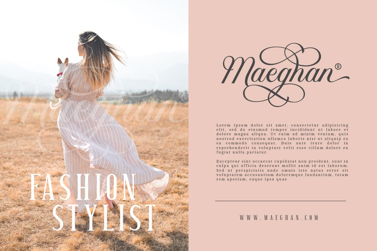

A well-chosen script can give a brand instant character, whether that's the timeless elegance of a fashion label or the playful energy of a coffee shop. Script logos work especially well for brands built around craftsmanship, tradition, or personal connection.
2. Wedding & Event Invitations
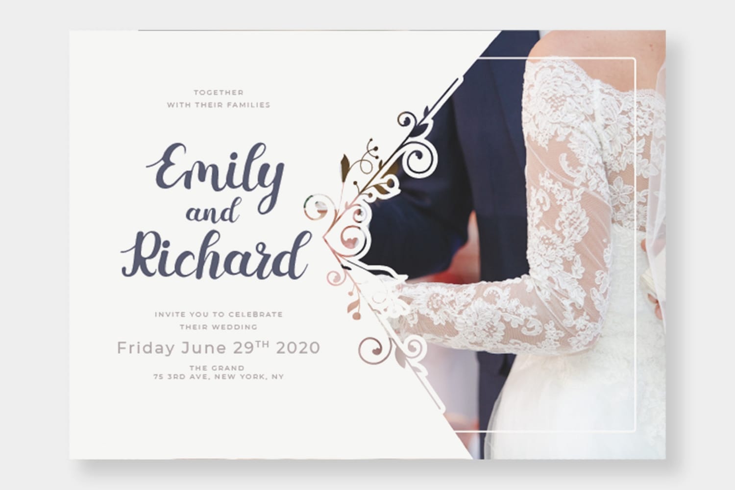
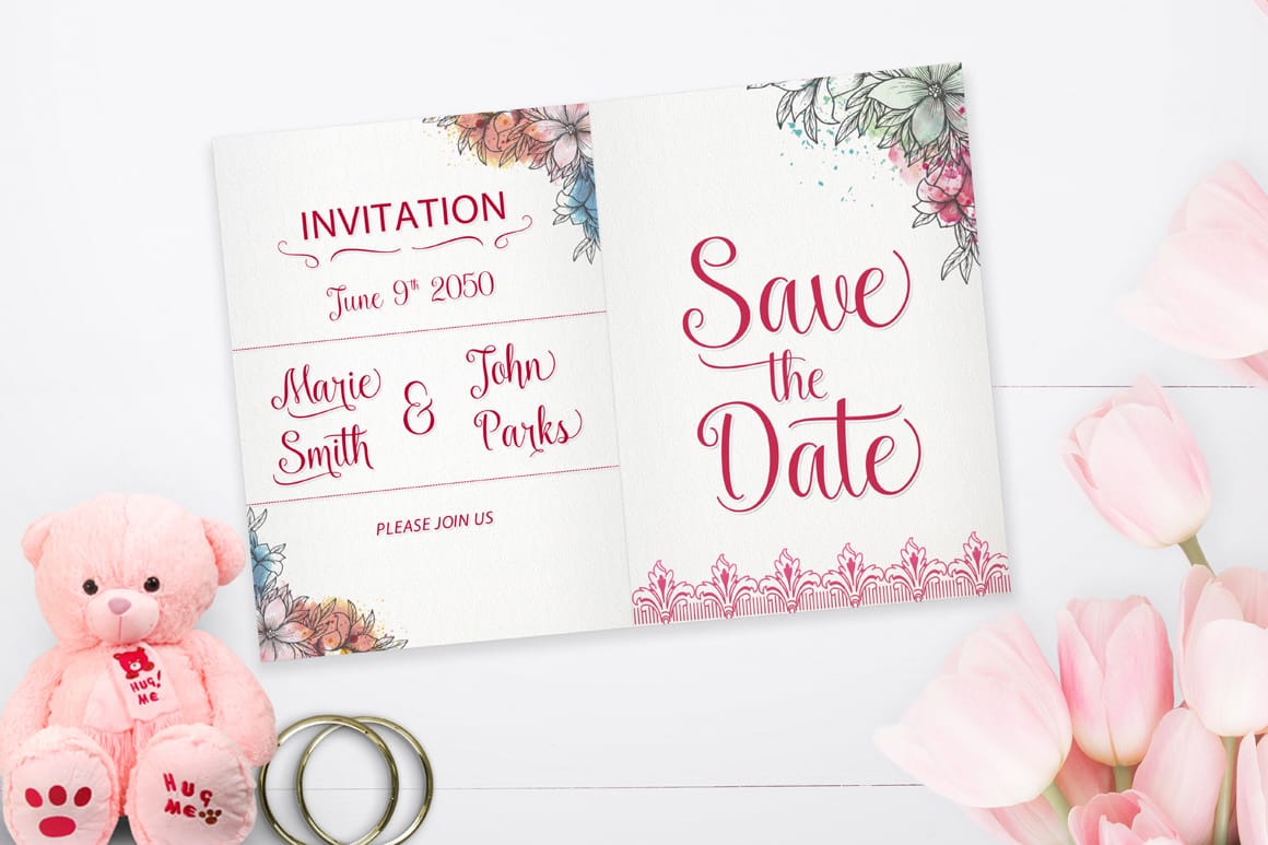
Formal scripts and calligraphy fonts are practically synonymous with wedding stationery. They set a romantic, elegant tone and signal the formality of the event before a guest even reads the details.
3. Packaging Design
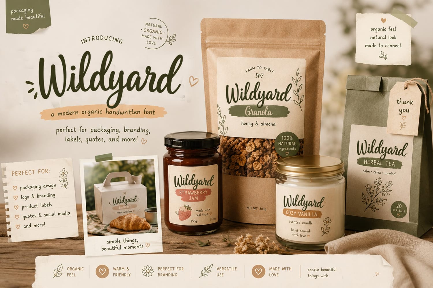
Casual and brush scripts add warmth and authenticity to packaging, particularly for food, beverage, and artisanal products. A handwritten feel can suggest small-batch, handmade quality — even for larger brands.
4. Social Media Graphics
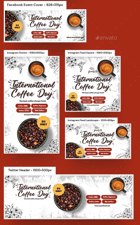
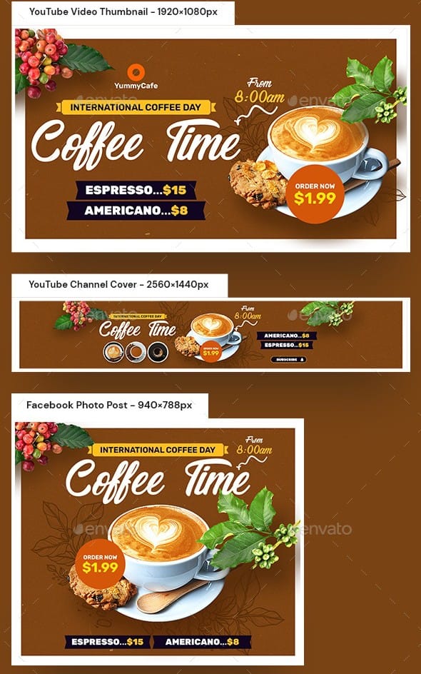
Script fonts help quote graphics, promotional posts, and story templates stand out in a crowded feed. Casual scripts, in particular, feel approachable and on-trend for social content.
5. Editorial & Print Design
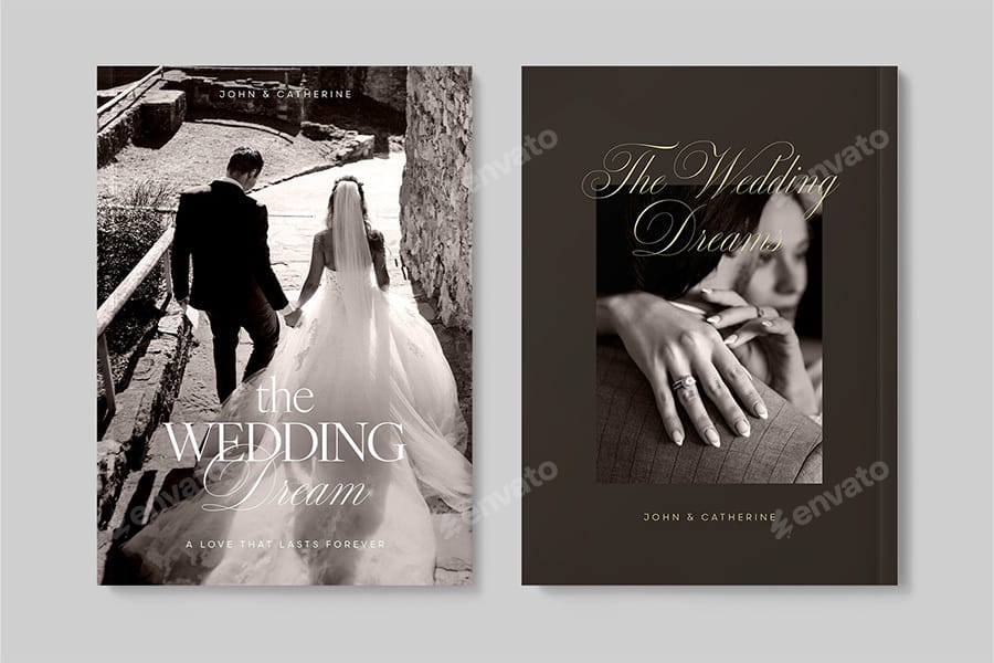
In magazines, book covers, and print layouts, script fonts are often used as accents — for pull quotes, section headers, or decorative titles — adding visual contrast against body copy set in serif or sans-serif type.
How to Choose the Right Script Font
With so many options available, narrowing down the right script font comes down to a few key questions:
What tone does the project need? Elegant and formal calls for a different script than playful and casual.
How legible does it need to be? Highly ornamental scripts can sacrifice readability — fine for a single word or short phrase, risky for longer text.
Where will it be used — digital or print? Some intricate scripts render beautifully in print but lose detail or clarity at small digital sizes.
Does it match your brand or project's existing visual language? A script font should feel like a natural extension of the overall design, not a mismatched afterthought.
Best Practices for Using Script Fonts in Design
Script fonts are powerful, but they're easy to misuse. Keep these best practices in mind:
Don't overuse them. Script fonts work best in small doses — headlines, accents, or single words. Pair them with a clean sans-serif or serif for body text to maintain readability.
Mind your spacing. Script fonts often need adjusted letter-spacing (tracking) to preserve the connections between letters; default spacing can break the flow.
Prioritize accessibility. Highly stylized scripts can be difficult to read for some users, including those with visual impairments. Reserve them for decorative or short text, and ensure sufficient contrast.
Avoid all-caps. Because script fonts mimic handwriting, setting them in all capital letters often looks awkward and disrupts the natural flow the font was designed to have. Stick to sentence case or title case.
Script Font Pairing Guide
Pairing is where script fonts truly come to life. The goal is contrast: let the script carry personality while a simpler typeface supports legibility.
Script + Sans-serif: A clean, modern sans-serif (like a geometric or grotesque style) balances the ornamentation of a script font, creating a polished, contemporary look. This pairing is common in branding and web design.
Script + Serif: Pairing a script with a classic serif creates a more traditional, editorial feel — often seen in wedding stationery, book covers, and luxury branding where an elegant, timeless tone is the goal.
General pairing logic: Use the script for emphasis (headlines, logos, accents) and the secondary font for readability (body text, captions, navigation). Limit yourself to two typefaces per design to avoid visual clutter.
Popular Script Fonts Designers Love
Great Vibes – Elegant, flowing formal script; popular for invitations
Pacifico – Casual, rounded script with a friendly, retro feel
Alex Brush – Delicate calligraphy-style script for upscale branding
Sacramento – Lightweight, monoline casual script
Playfair Display Script (if available in family) – Refined, editorial-style script
Lobster – Bold, curvy script popular in branding and web design
Allura – Graceful, formal calligraphy script
Amatic SC (semi-script/handwritten) – Playful, condensed handwritten style
Brittany Signature – Fluid, personal signature-style script
Kaushan Script – Energetic brush script with strong personality
(Note: availability varies by license — always confirm usage rights before publishing.)
Where to Find Quality Script Fonts
Free resources: Google Fonts offers a solid selection of free, web-safe script fonts suitable for commercial use.
Premium marketplaces: Envato Element, Creative Fabrica, and Graphic River offer higher-quality, more distinctive script fonts, often with extended character sets and ligatures.
Licensing considerations: Always check whether a font's license covers your intended use — especially for logos, merchandise, or commercial products. Free fonts aren't always cleared for commercial work, and premium fonts often require specific licenses for different use cases (web, print, app embedding, etc.).
FAQs About Script Fonts
Script is the broader category of handwriting-style fonts; cursive refers specifically to a joined, flowing style similar to traditional handwriting taught in schools.
Yes, especially for brands wanting to convey elegance, tradition, or personality. However, they should be tested for legibility at small sizes and in single-color applications.
Simpler cursive or casual scripts with consistent letterforms and moderate spacing tend to be the most readable. Highly ornamental formal scripts are less suited for extended reading.
Generally, no — script fonts are best reserved for headlines, accents, or short phrases. Using them for large blocks of body text can hurt readability.
It depends on the font and its license. Some free fonts (like many on Google Fonts) permit commercial use, while others require a separate commercial license. Always check the license terms before using any font in paid or public work.
Final Thoughts
Script fonts bring a level of warmth, elegance, and personality that few other typefaces can match — but using them well requires understanding their different styles and knowing when (and when not) to reach for them. Whether you're designing a logo, an invitation, or a social post, the right script font, paired thoughtfully and used with restraint, can elevate your design from good to memorable.
Ready to put these fonts to work? Browse Creative Fabrica's free script fonts to find your next favorite typeface and start bringing that handwritten charm into your designs today.
Disclaimer:
This article is for informational purposes only. Some links may be affiliate links, meaning Advise Graphics may earn a commission at no extra cost to you. We do not guarantee results, and readers should do their own research before making any decisions.
Tags
Popular articles
Copyright
© 2025 Advise Graphics. All rights reserved.
Cop© 2025 Advise Graphics. All rights reserved.