

How to Use Script Fonts in Branding Without Looking Amateur


Some links in this post may be affiliate links. See our Affiliate Disclosure for details.
A script font can make your brand feel warm, personal, even a little luxurious. It's why so many small businesses reach for one the moment they start designing a logo — it feels like it has personality baked right in.
But script fonts are also one of the easiest ways to make a brand look unintentionally homemade. The wrong choice (or the right choice used the wrong way) can make a business look less established than it actually is, even when the product or service is great.
The good news: you don't need a design degree to get this right. You just need to know a handful of rules that professional designers follow instinctively — and avoid the mistakes that give script fonts a bad reputation in the first place.
Here's how to use script fonts in your branding so they read as polished and premium, not DIY.
Why Script Fonts Trip Up Small Business Owners
1. They feel "personal" and "handwritten" — but that's exactly the risk
Script fonts mimic handwriting, which is part of their appeal. They feel warm and human in a way that clean sans-serif fonts don't. But that same quality is a double-edged sword: handwriting-style fonts can easily tip into looking unprofessional, especially if the font is one of the free, generic ones bundled into every design tool.
2. What customers subconsciously associate with bad script fonts
Fonts send signals before anyone reads a single word. A poorly chosen script can (often unfairly) read as "hobby business," "still figuring it out," or "low investment" — even if the actual product or service is excellent. Customers won't consciously think this, but it shapes their first impression before they've engaged with anything else.
3. The free font trap
Open Canva, search "script font," and you'll see the same five or six options every other small business has already used. These fonts aren't bad — but they're often overused, which strips away the "unique brand personality" a script font is supposed to add in the first place. The instinct to grab the first pretty option is exactly what leads to a logo that looks like a template rather than a brand.
5 Mistakes That Make Script Fonts Look Amateur
1. Using script for your whole logo instead of one word or accent
It's tempting to set your entire business name in script because it looks pretty in the preview. But a whole logo in script often becomes hard to read at a glance — and readability is the first job of a logo. The fix: use script for one word (your first name, a tagline, a single standout word) and pair it with a clean, simple font for the rest.
2. Making text too small or thin to read
Script fonts often have thin strokes and tight curves that look elegant at large sizes but disappear into a blur once shrunk down — think Instagram profile icons, favicons, or a small label on packaging. If you can't read your logo at the size of a thumbnail, customers won't be able to either.
3. Pairing script with another decorative or "cute" font
Two fonts with personality competing for attention usually cancel each other out instead of complementing each other. If your script font already has flourish and character, everything else in your branding should be quiet and simple by comparison — not another fun, decorative font trying to share the spotlight.
4. Not checking how it looks in black and white or small sizes
A script font might look great in the soft pink color scheme you designed it in — but what happens when it's stamped on a receipt, printed on a black-and-white invoice, or embroidered on a hat? Testing your font in plain black text, at a small size, and in a low-quality printer setting will reveal problems you won't catch on a bright screen.
5. Picking a font because it's trendy, not because it fits your brand
Certain script fonts go viral in the small business world — everyone starts using the same one because it showed up on a "best fonts for branding" Pinterest board. But a trendy font that doesn't match your brand's actual personality (a rustic candle company using a delicate, feminine script, for example) creates a disconnect that customers can sense even if they can't articulate why.
How to Pick a Script Font That Fits Your Business
1. Match the "feel" — elegant vs. playful vs. rustic/handmade
Not all script fonts say the same thing. A thin, flowing script reads as elegant and upscale — think bridal shops or fine skincare. A bouncier, rounded script feels playful and approachable — good for kids' brands or casual food businesses. A rougher, brush-style script feels rustic and handmade — a natural fit for farms, candle makers, or artisan goods. Before choosing a font, get clear on which of these your brand actually is. A font that's beautiful but mismatched will always feel slightly off, even to customers who can't say why.
2. Think about where customers will see it
A font that looks stunning on a large printed sign might completely fall apart as a tiny app icon or a stitched label on a tote bag. Before committing, think through the real places your logo will live — website header, Instagram profile, packaging, a storefront sign, a business card — and choose a font that holds up in the smallest of those uses, not just the largest.
3. Test it small — if you can't read it at thumbnail size, skip it
This is the fastest gut-check available. Shrink your logo down to the size of a social media profile photo (about 110x110 pixels) and look at it without zooming in. If you have to squint or guess at letters, the font is too delicate for real-world use — no matter how nice it looks at full size.
4. Where to find good ones
You don't need to buy expensive fonts to get something that looks professional:
Google Fonts — free, commercially safe, and includes solid script options like Alex Brush, Sacramento, and Playfair Display Italic (technically a serif, but a nice alternative if script feels risky)
Canva Pro — a large library of script fonts with commercial licensing built into your subscription
Creative Market — a good source when you want something less common than what everyone else is using, often for a small one-time fee
Creative Fabrica — a subscription-based library with a huge range of script and handwritten fonts, often bundled with commercial licenses and useful for businesses that want frequent new options
Envato Elements — an all-you-can-use subscription that includes fonts alongside templates, graphics, and design assets, handy if you're also sourcing other brand materials
GraphicRiver — good for one-off purchases when you find a specific font you love and don't need an ongoing subscription
Simple Font Pairing Formula (No Design Degree Required)
1. The rule of one: one script font + one clean, simple font
The easiest way to avoid a cluttered, amateur look is to limit yourself to just two fonts total — one script font for personality, and one plain sans-serif or serif for everything else (your tagline, website text, packaging details). The script font gets to be the star; the second font's whole job is to stay quiet and let it shine. If you're ever tempted to add a third font "just for variety," that's usually the moment to stop.
2. Easy pairing examples you can copy
You don't have to design this from scratch — some combinations just work:
A flowing, elegant script (like Alex Brush) + a simple all-caps sans-serif (like Montserrat or Futura) for a polished, upscale feel
A bouncy, casual script (like Amatic or Pacifico) + a rounded, friendly sans-serif (like Quicksand) for approachable, playful brands
A rustic brush script (like Sail or Homemade Apple) + a basic serif (like Lora) for handmade, farm-to-table, or artisan brands
A good rule of thumb: the plainer and more neutral your second font is, the more your script font gets to stand out the way it's supposed to.
3. Free tools that pair fonts for you
If choosing feels overwhelming, let a tool do the matching:
Canva — has built-in font pairing suggestions right in the design editor
Font Pair — a free website that shows pre-matched font combinations by style
Fontjoy — generates pairing suggestions using AI, with a slider to adjust how much contrast you want between the two fonts
Where to Use Script Fonts in Your Branding
1. Logo or wordmark (as an accent, not the whole thing)
This is the most natural home for a script font — but the key word is accent. Use it for one word (often your first name or a short brand name) rather than a full business name with multiple words. If your business name is long, consider setting just one word in script and the rest in your clean secondary font.
2. Social media headers and highlight covers
Script fonts work well in places where they're seen briefly and at a slightly larger size — like an Instagram bio graphic, a highlight cover icon, or a Facebook cover photo. These are lower-stakes spots to experiment, since they're easy to update if something isn't landing.
3. Packaging, labels, and thank-you cards
This is where script fonts genuinely shine for small businesses — a candle label, a soap wrapper, a thank-you card tucked into an order. These items are meant to feel personal and special, and a well-placed script font reinforces that without needing to carry the weight of being read quickly or from a distance.
4. Where NOT to use it: website body text, menus, product descriptions
Anywhere customers need to read more than a few words quickly, skip the script. A restaurant menu, a product description, an "About" page — these need to be scanned easily, and script fonts slow readers down or get skipped over entirely. Save the script font for short, decorative moments and let a clean font carry the actual information.
Before/After: Amateur vs. Polished Script Font Branding
Example 1: The full-name logo
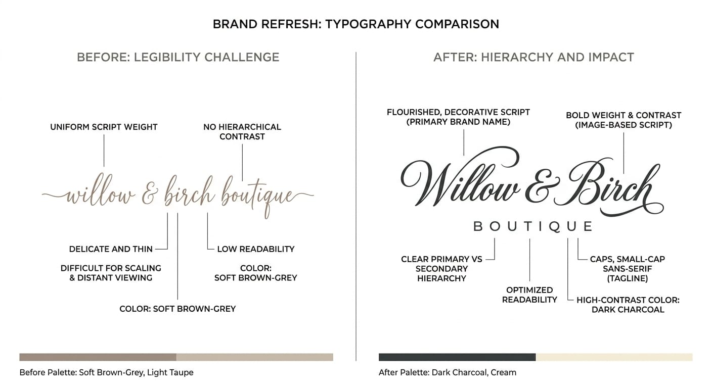
Before: An entire business name — say, "Willow & Birch Boutique" — set completely in a thin, flowing script, all one size, no hierarchy.
After: Just "Willow & Birch" in script, with "BOUTIQUE" set below in small, spaced-out capital letters in a clean sans-serif. The script gets to be decorative because it's no longer responsible for carrying the whole name legibly.
Example 2: The busy pairing
Before: A bakery logo pairing a curly script with a bubbly, rounded secondary font — both fonts fighting for attention, making the whole thing feel cluttered.
After: The same script paired with a simple, neutral sans-serif in all caps. The script now has room to breathe, and the logo reads as intentional rather than crowded.
Example 3: The shrink test failure
Before: A delicate, thin script logo that looks beautiful on a large sign but turns into an illegible smudge as a small Instagram profile photo.
After: The same font, but bolded or thickened slightly, with tighter letter spacing — still elegant at full size, but now readable even when shrunk down to a thumbnail.
What changed to make it look professional
In each case, the fix wasn't a totally different font — it was restraint. Less of the logo set in script, fewer competing elements, and testing at the actual sizes the logo will be used. Professional-looking branding usually comes down to editing out the extra, not adding something fancier.
Quick Checklist Before You Finalize Your Logo
Before you commit to a script font for your brand, run through this list:
Is script used for only one word or accent — not the entire logo?
Can you read it clearly at thumbnail size (110x110 px or smaller)?
Does it still look good in plain black and white?
Is it paired with just one simple, neutral secondary font?
Does the style (elegant, playful, rustic) actually match your brand's personality?
Have you checked the commercial license if it's not from a free source?
Have you tested it on the actual places it'll appear — packaging, social icons, signage?
If you can check every box, you're in good shape.
FAQ
Yes — when used sparingly and paired well. Script fonts fall out of favor when they're overused or applied to a whole logo, but as an accent alongside a clean secondary font, they remain a popular and effective choice across food, beauty, and boutique retail branding.
Often yes, but always check the license first. Many free fonts on sites like Google Fonts are cleared for commercial use, but some free fonts found elsewhere online are for personal use only. Read the license terms before using any font in a business logo.
Look for Canva's built-in "Pro" script fonts rather than the very first free options in the search results, since those tend to be the most overused. Testing a few options at thumbnail size before deciding will help you avoid the most common picks.
Not necessarily. Font choice is one of the more DIY-friendly parts of branding if you follow a few core rules (one script font, one plain pairing, test at small sizes). A designer becomes more valuable if you want custom lettering or a fully unique visual identity beyond font selection.
Conclusion
A script font isn't something to avoid — it's something to use with a light hand. The businesses that pull it off aren't the ones with access to expensive designers; they're the ones who use script as an accent, pair it with something simple, and actually test how it looks in the real world before committing.
Get those basics right, and a script font can do exactly what it's supposed to: make your brand feel warm, personal, and a little bit special — without ever looking amateur.
Disclaimer:
This article is for informational purposes only. Some links may be affiliate links, meaning Advise Graphics may earn a commission at no extra cost to you. We do not guarantee results, and readers should do their own research before making any decisions.
Tags
Popular articles
Copyright
© 2025 Advise Graphics. All rights reserved.
Cop© 2025 Advise Graphics. All rights reserved.