
15+ Stunning Japanese Fonts (and How to Use Them in 2026)


Some links in this post may be affiliate links. See our Affiliate Disclosure for details.
Typography is the silent pulse of visual communication, and in 2026, Japanese fonts have evolved into a vital bridge between heritage and high-tech efficiency. As the design world shifts toward "Bold Minimalism" and "Refined Maturity," the architectural precision of Japanese characters—from the disciplined strokes of Mincho to the high-energy vibe of futuristic Gothic styles—offers a unique solution for brands needing both stability and personality.
For designers in the branding, e-commerce, and UI/UX sectors, mastering this intersection is no longer just an aesthetic choice; it’s a strategic one. Whether you are crafting a "Zen-inspired" skincare line or a high-velocity tech interface, the right Japanese typeface manages information density with a structural clarity that Latin scripts alone often lack. In this post, we’ll explore 15+ stunning Japanese fonts that are defining the 2026 landscape. We will break down exactly why these examples are emblematic of today’s most influential design movements—from neo-naturalism to kinetic typography—and how you can use them to elevate your own creative projects.
Why Japanese Typography Matters for Your Brand
In an increasingly saturated digital marketplace, the "visual handshake" between a brand and its audience happens in milliseconds. While many designers focus solely on color palettes and imagery, typography—specifically Japanese typography—carries a structural weight that can fundamentally alter how a brand is perceived globally.
Here is why mastering Japanese fonts is essential for your professional toolkit in 2026:
Cultural Resonance & Global Expansion: As Asian markets continue to lead in tech and lifestyle innovation, localizing your design isn't just about translation; it's about typographic tone. Using a generic font for a Japanese audience is the visual equivalent of a bad accent—it breaks trust immediately.
Aesthetic Versatility: Japanese scripts offer three distinct "vibes" (Hiragana for softness, Katakana for technicality, and Kanji for strength). This allows designers to create high-contrast layouts that achieve a "Zen-like" balance or a "Cyberpunk" edge that Latin-only designs struggle to replicate.
Improved User Trust & Conversion: Typography isn't just art; it’s an interface. In professional sectors, high-quality, legible typefaces directly correlate with perceived authority and site dwell time.
"Typography is the craft of endowing human language with a durable visual form." — Robert Bringhurst, The Elements of Typographic Style
In a professional context, the "form" of your type affects your bottom line. According to a study by Adobe on Content Velocity, brands that prioritize cohesive, high-quality typography across multi-lingual platforms see up to a 20% increase in brand consistency scores, which directly impacts customer loyalty and long-term profit margins. By choosing the right Japanese font, you aren't just decorating a page—you're optimizing for clarity, efficiency, and international authority.
The 2026 Japanese Font Collection: 15+ Essential Picks
Curating the right typeface is more than an aesthetic exercise; it’s a balancing act between legibility and cultural storytelling. As we look toward the design trends of 2026, the demand for Japanese typography has shifted away from generic, system-standard fonts toward specialized weights that can handle complex branding environments.
In the following list, we’ll look at fonts that offer full character sets (including Kanji, Hiragana, and Katakana) and discuss how their unique geometry can be used to anchor your next project.
1. Kiyomori: The Modern Samurai Aesthetic
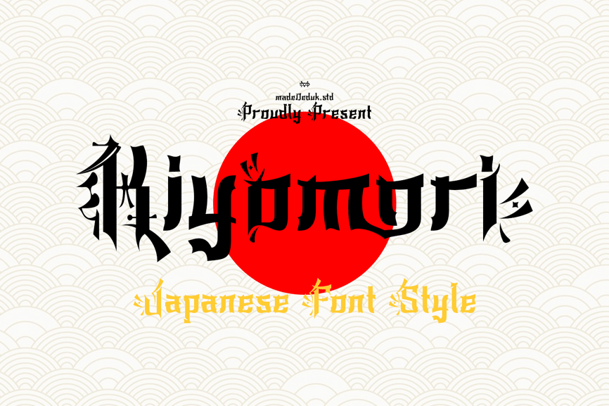
Kiyomori is a standout choice for 2026 because it masterfully blends traditional Japanese calligraphy with a sharp, aggressive "Black Katana" edge. Its high-contrast strokes and modular geometric construction make it ideal for high-impact display work, such as streetwear branding or cinematic posters. By offering extensive ligatures and stylistic alternates, it allows designers to create custom-feeling typography that feels both ancient and futuristic. We’ve included it because it perfectly captures the "Experimental Japan" trend that is currently dominating urban graphic design.
2. Hakio: The Soul of Zen Calligraphy
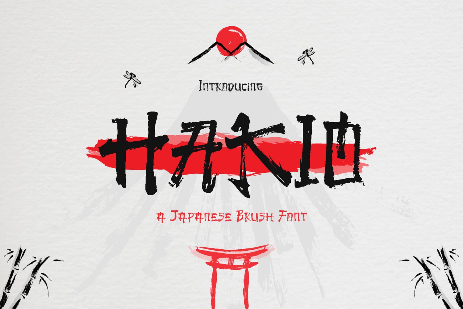
Hakio is an essential addition to any 2026 design toolkit because it perfectly balances the raw, organic energy of traditional Japanese brushwork with a contemporary display structure. Its authentic texture—mimicking the natural fraying of a physical brush—adds an artisanal, "handmade" feel that resonates deeply with the growing trend toward organic branding and sustainable lifestyle products. We’ve included it for its incredible versatility; it feels just as at home on a high-end sushi menu as it does on a streetwear graphic or a travel advertisement. This font is a masterclass in how to inject heritage and movement into a static layout without sacrificing modern readability.
3. Funny Samurai: The Geometric Tech-Retro Fusion
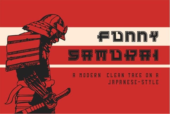
Funny Samurai is a brilliant addition to this list because it reimagines Japanese-inspired letterforms through a playful, geometric lens that feels remarkably current. By stripping away traditional brushwork in favor of blocky, pixel-adjacent structures, it bridges the gap between retro gaming aesthetics and modern tech branding. We’ve included it because its "Regular" and "Outline" styles offer a versatile toolkit for designers working on projects ranging from app interfaces to bold restaurant signage. It is the perfect choice for creators who want to reference Japanese culture with a lighthearted, futuristic, and highly legible twist.
4. Onsen Japan: The Expressive Brush Script
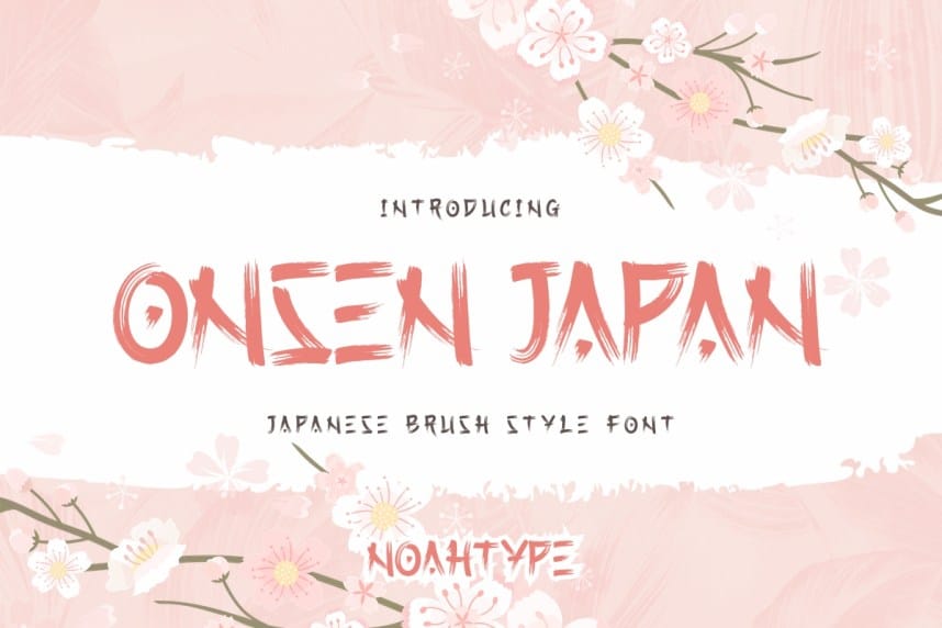
Onsen Japan is a must-have for 2026 projects that require a sense of movement and authentic texture. This font stands out due to its "dry brush" effect, which creates a weathered, high-energy look perfect for book covers, action-oriented apparel, and organic food packaging. We’ve included it because it offers excellent multilingual support and a hand-painted aesthetic that feels deeply personal and artisanal. It is an ideal choice for designers who want to break away from sterile digital lines and embrace a more gritty, character-filled Japanese style.
5. Hakubo: The Friendly Modern Classic
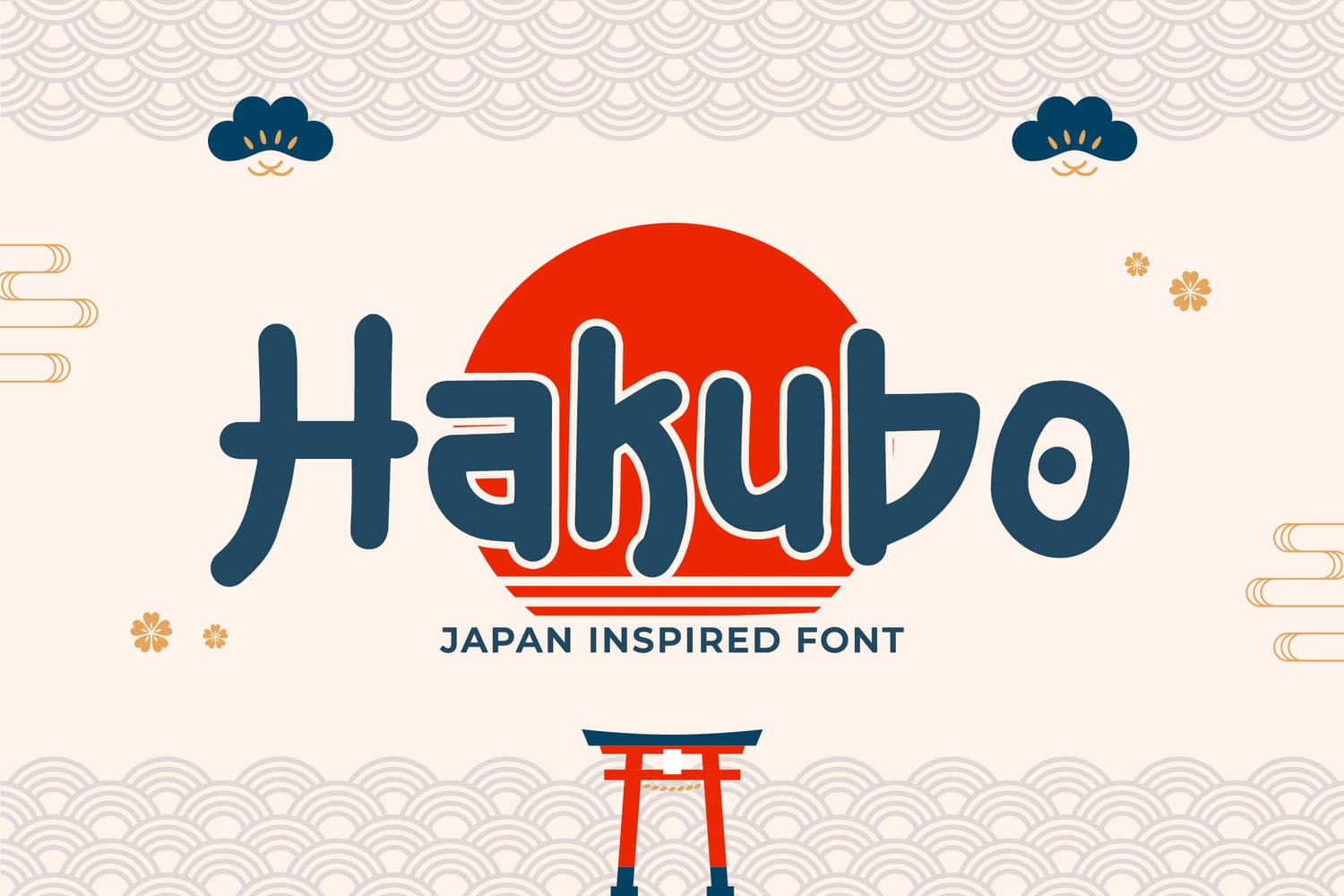
Hakubo is an exceptional choice for 2026 because it brings a soft, approachable geometry to the Japan-inspired aesthetic, moving away from harsh edges toward a more fluid and welcoming form. Its rounded terminals and balanced proportions make it incredibly effective for logo design, community-focused branding, and playful merchandise. We’ve included it because it captures the "Kawaii-Professional" trend, offering a clean and legible structure that maintains a distinct cultural personality without being overwhelming. This font is perfect for designers who need a versatile display face that feels both contemporary and deeply rooted in friendly, modern Japanese visual culture.
6. Renji: The Architectural Powerhouse
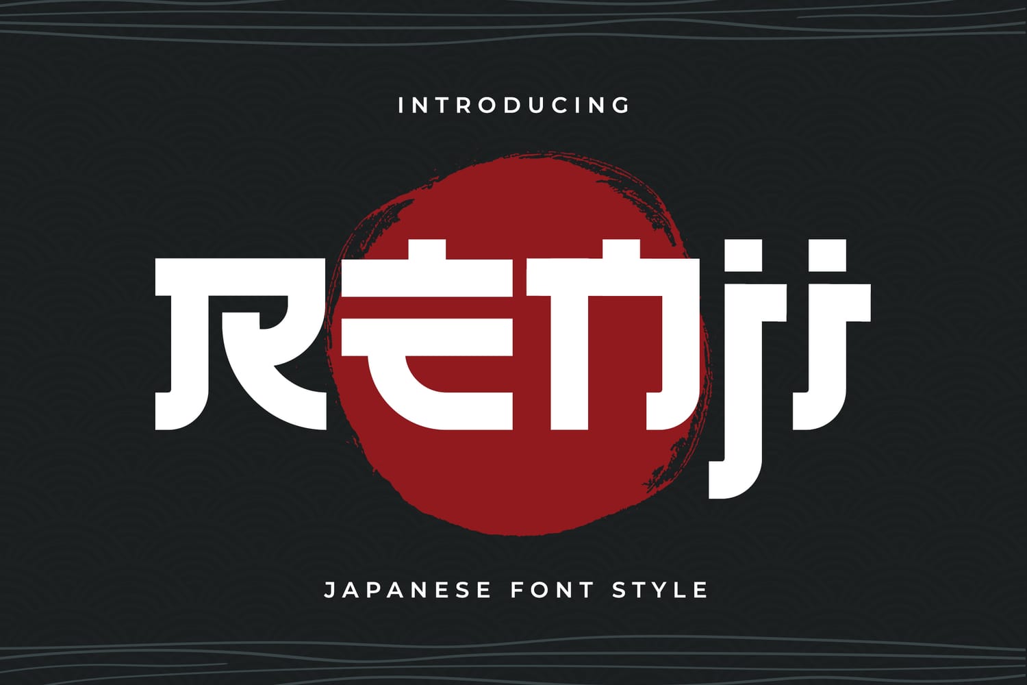
Renji is a standout inclusion for 2026 because it treats typography like modern architecture, using bold, blocky shapes and sharp negative space to create a formidable visual presence. Its all-caps structure is meticulously designed to command attention, making it a premier choice for high-end matcha packaging, luxury travel book covers, and minimalist e-commerce branding. We’ve selected it because it perfectly embodies the "Neo-Gothic" Japanese trend, where traditional character radicals are distilled into clean, ultra-modern geometric forms. For designers aiming to project authority and sleek sophistication, Renji provides a structural backbone that feels both timeless and ahead of its time.
7. Tatsukaze: The Kinetic Urban Display
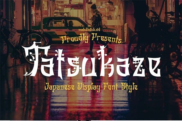
Tatsukaze is a powerhouse inclusion for this list because it perfectly embodies the high-energy, "cyber-street" aesthetic that is trending for 2026. Its letterforms feature sharp, wind-like terminals and aggressive angles that suggest constant motion, making it an ideal choice for urban apparel branding, motion graphics, and nightlife event posters. We’ve included it because of its extensive range of stylistic alternates and ligatures, which allow designers to create highly customized, complex layouts that mimic the vibrant density of a Tokyo neon district. If your project requires a font that feels alive and unapologetically bold, Tatsukaze provides the perfect blend of traditional spirit and futuristic edge.
8. Aokami: The Elegant Spirit of the Brush
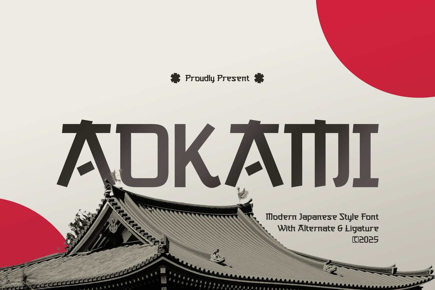
Aokami earns its place on this list for its exceptional ability to translate the fluid, rhythmic grace of authentic Japanese ink painting into a digital format. Its long, sweeping swashes and delicate "bleed" textures give every character a sense of poetic movement, making it a premier choice for luxury editorial layouts, boutique hotel branding, and high-end beauty packaging. We’ve included it because it offers a sophisticated, "quiet luxury" alternative to bolder display faces, providing designers with a tool to create layouts that feel serene yet deeply expressive. Whether used for a minimalist book cover or a refined restaurant menu, Aokami brings a soulful, artisanal touch that is highly coveted in the 2026 design landscape.
9. E.Katakana: The Storyteller’s Choice
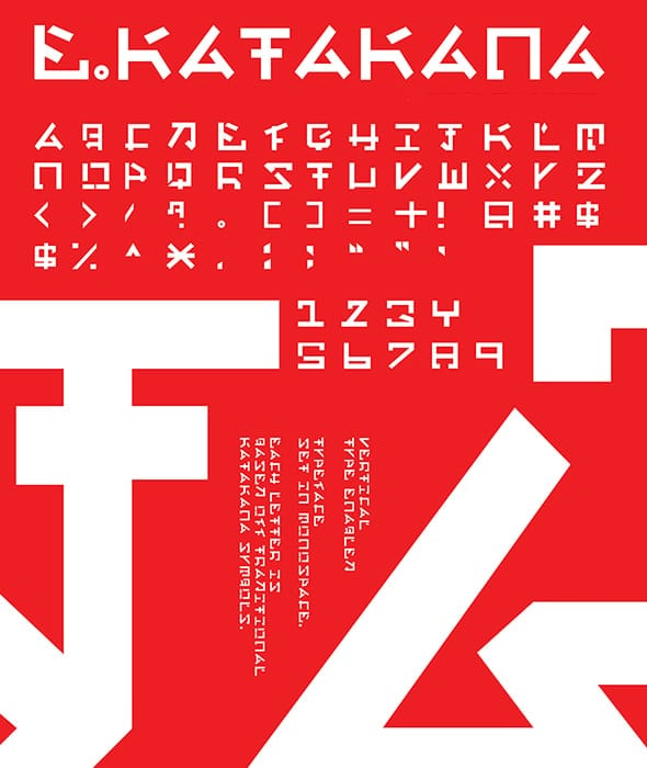
E.Katakana is an essential inclusion for 2026 because it perfectly captures the whimsical yet structured essence of modern anime and manga publishing. Its unique vertical-friendly design and slightly distressed brush edges make it a powerhouse for narrative projects, such as light novel covers or atmospheric book jackets. We’ve included it because it bridges the gap between traditional handwriting and professional editorial type, offering a sense of "fantasy-realism" that is currently trending in international media branding. Whether you're designing for a narrative-driven game or a lifestyle publication, E.Katakana adds an unmistakable layer of charm and cinematic depth.
10. Kabuto: The Heavyweight Heritage Face
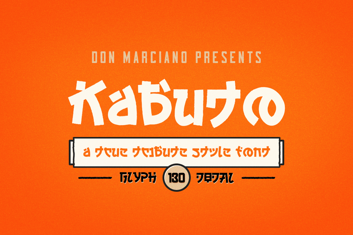
Kabuto is a formidable addition to this list, offering a massive, slab-like presence that draws inspiration from the protective geometry of traditional samurai armor. Its ultra-thick strokes and tight negative spaces make it an ideal "hero" font for bold headlines, impactful packaging, and large-scale environmental graphics. We’ve included it because it exemplifies the 2026 trend of "Maximalist Stability," where heavy, grounded typography is used to anchor vibrant or complex visual backgrounds. For designers looking to project a sense of unbreakable strength and cultural pride, Kabuto provides a powerful, high-contrast solution that demands immediate attention.
11. Fujimaru: The Modern Dragon’s Path
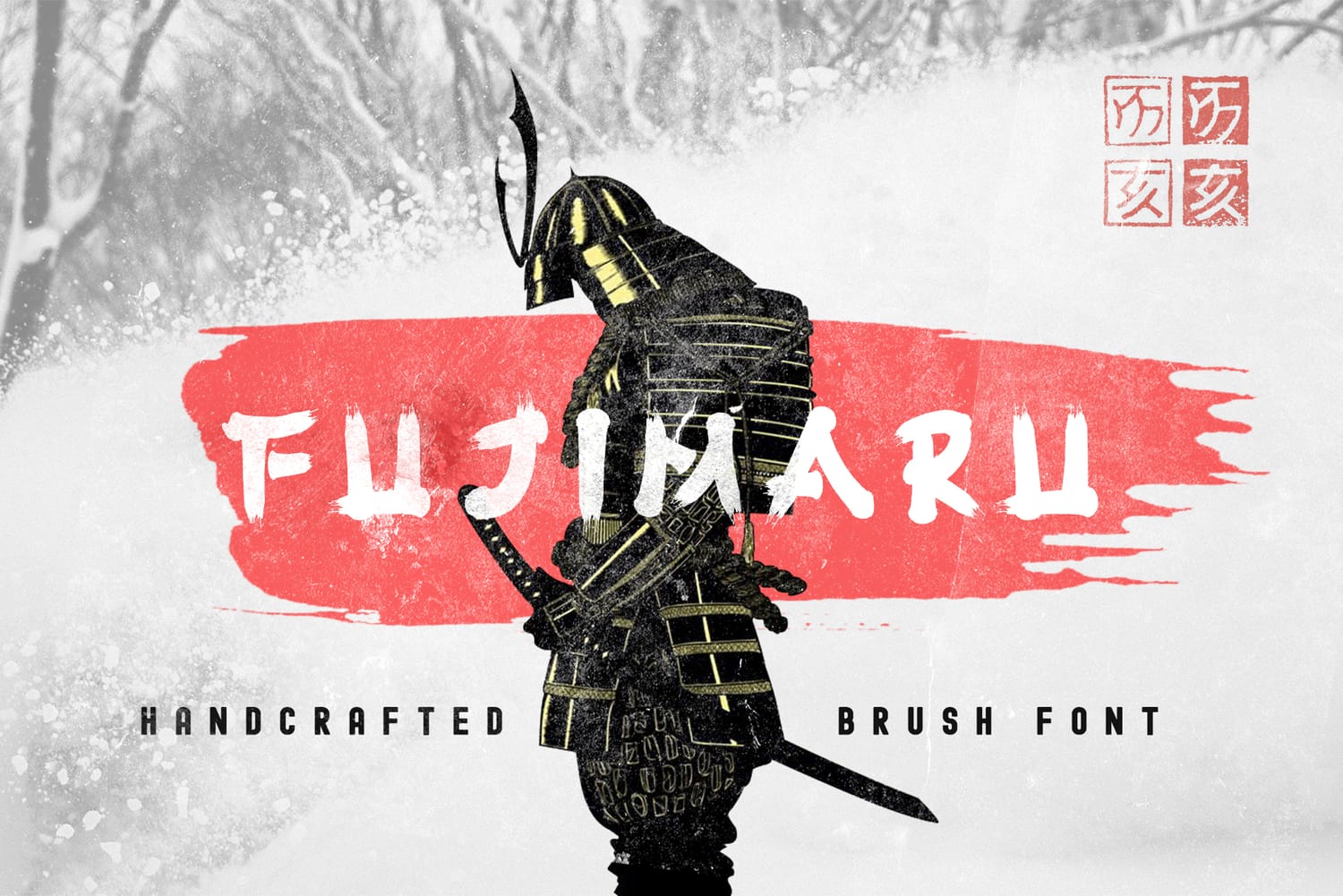
Fujimaru is an outstanding choice for 2026 because it infuses traditional brush calligraphy with a sleek, aerodynamic flow that feels both ancient and contemporary. Its elongated strokes and sharp, tapering terminals mimic the movement of a dragon, making it perfect for high-end spirits packaging, luxury automotive branding, and premium health and wellness products. We’ve included it because it offers a sophisticated balance of "organic speed," providing designers with a display face that communicates prestige and fluid energy. This font is a top-tier option for any project that needs to feel fast, graceful, and deeply rooted in Japanese visual storytelling.
12. The Last Shuriken : The Futuristic Brush Hybrid
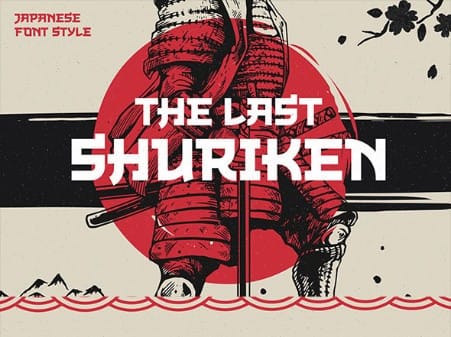
The Last Shuriken is a captivating choice for 2026 because it seamlessly merges the elegance of traditional ink-wash calligraphy with a streamlined, modern structure. Its letterforms feature a unique "tapered" effect that suggests high-speed motion, making it a natural fit for sports branding, automotive graphics, and high-tech lifestyle products. We’ve included it because it offers a clean, professional take on the "speed-brush" aesthetic, allowing designers to convey energy and cultural heritage without sacrificing modern legibility. For projects that require a sophisticated sense of momentum and "East meets West" innovation, Sura is a standout performer.
13. Hotsuka: The Art of Expressive Calligraphy
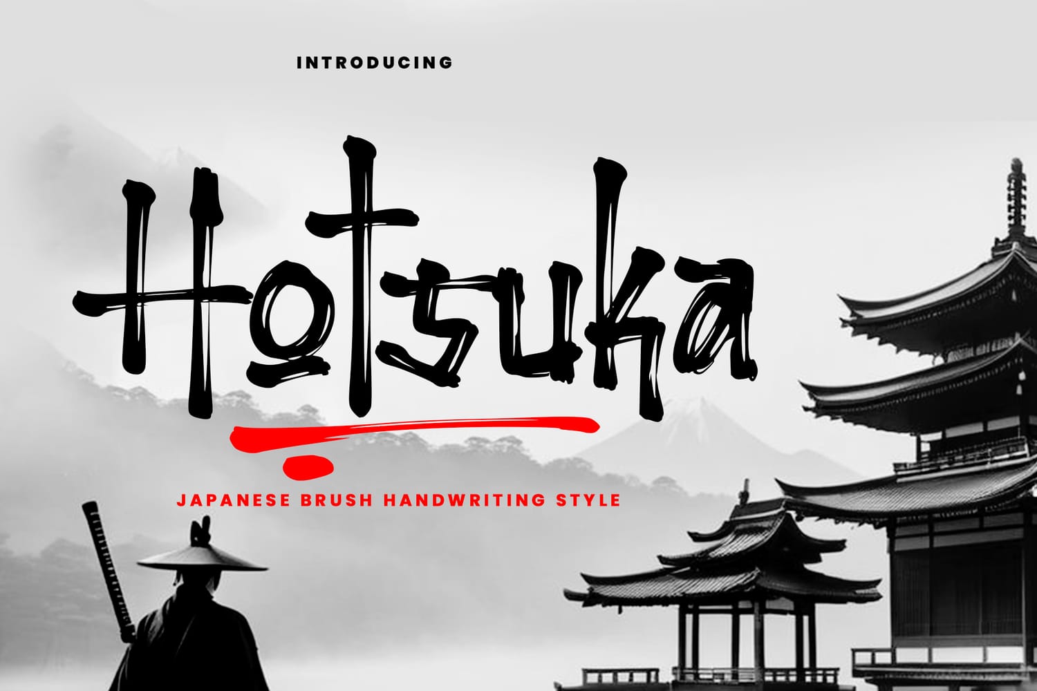
Hotsuka stands out on this list for its exceptional balance between high-artistry traditional calligraphy and modern design utility. Its strokes are imbued with a rhythmic energy that mimics the physical movement of a master’s brush, making it a perfect choice for premium branding, cinematic titles, and artisanal packaging. We’ve included it because it masterfully creates an "unforgettable visual experience," offering a level of organic detail that elevates a simple layout into a piece of digital craftsmanship. If your project needs to convey a message with both elegance and a strong, soulful personality, Hotsuka provides the perfect Japanese-inspired touch.
14. Hirokawa: The Refined Brush Display
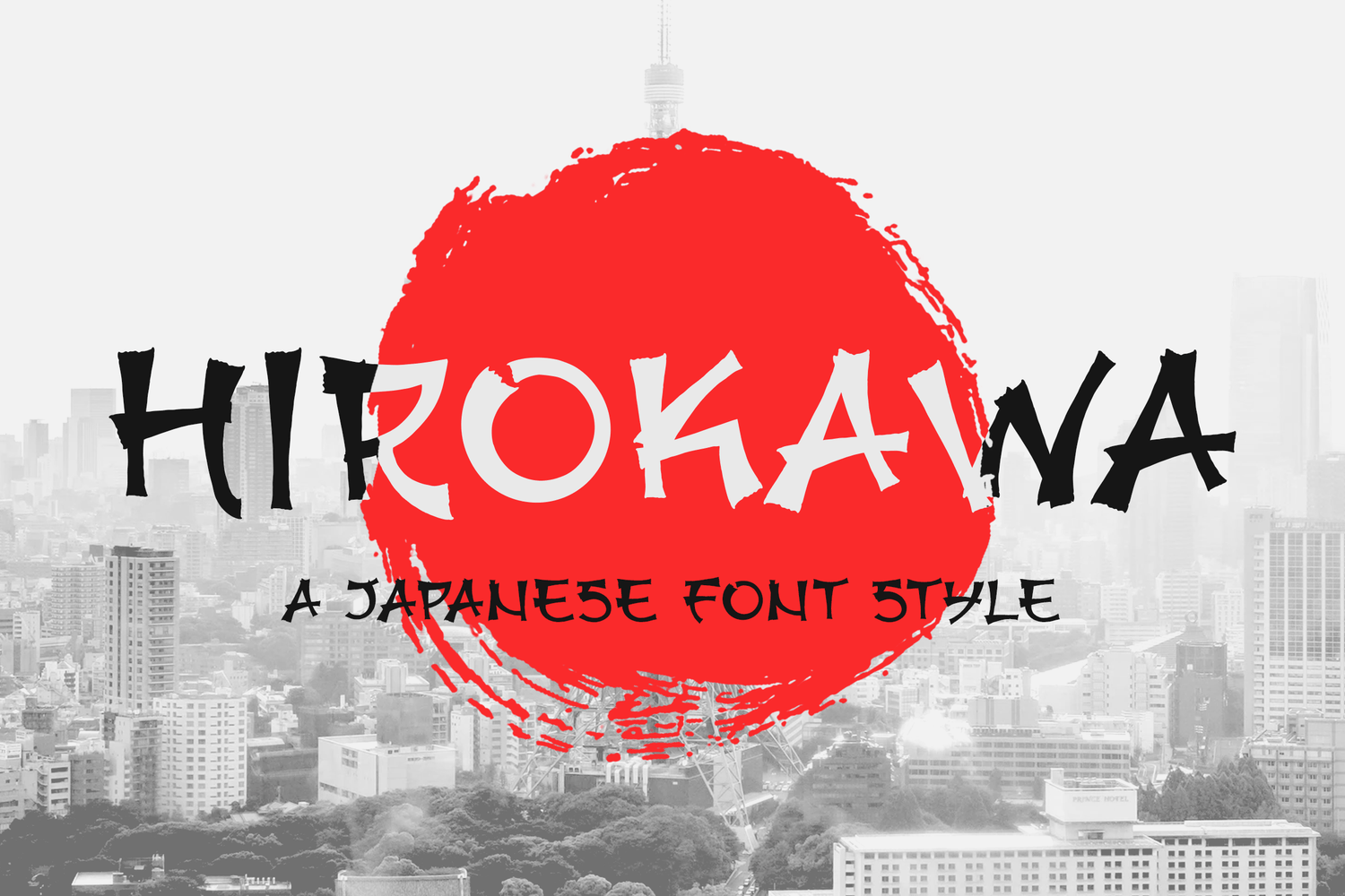
Hirokawa is an essential inclusion for 2026 due to its sophisticated, high-contrast structure that brings a polished editorial feel to the Japanese brush aesthetic. Its elegant ligatures and fluid strokes make it particularly effective for fashion branding, upscale restaurant identities, and high-end lifestyle magazines. We’ve selected it because it offers comprehensive technical compatibility and multilingual support, ensuring a seamless workflow across major design platforms like the Adobe Suite and Keynote. For designers who need a brush face that feels premium, balanced, and ready for professional-grade output, Hirokawa is a top-tier contender.
15. Zenjirou: The Spirit of Sharp Precision
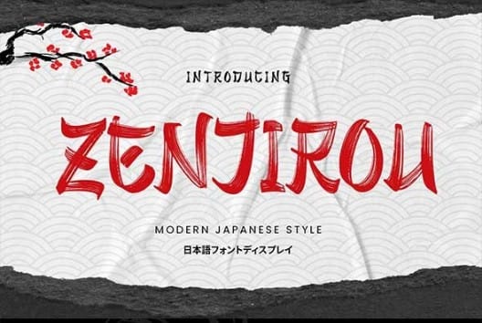
Zenjirou is a definitive choice for 2026 because it captures the lethal elegance of a katana blade within a modern typographic framework. Its letterforms are characterized by razor-sharp terminals and a rhythmic, vertical momentum that makes it exceptionally striking for posters, streetwear, and gaming interfaces. We’ve included it because it masterfully balances traditional "brush-flick" details with a clean, vector-perfect execution that remains legible even in high-density layouts. For designers seeking to project a sense of focused energy and disciplined "Zen" power, Zenjirou offers a visual edge that is both sharp and sophisticated.
Choosing Your Japanese Aesthetic for 2026
The visual landscape of 2026 is all about the intersection of heritage and innovation. Whether it’s the raw, visceral energy of Gojira or the clean, architectural precision of Renji, every font on this list shares a common thread: they don’t just mimic Japanese culture—they recontextualize it for a modern, digital world.
The key takeaway for your next project is that typography is the bridge between story and style. By choosing a font that carries authentic texture and thoughtful geometry, you aren't just making a layout; you're creating an atmosphere. These typefaces suggest a move toward more "human" design—embracing the beautiful imperfections of the brush while maintaining the sharp clarity required for today’s high-resolution screens.
Ready to Level Up Your Design Toolkit?
Don't settle for stock standard when you can access world-class craftsmanship. If you're ready to bring these stunning Japanese aesthetics to your own projects, you can find these fonts and millions of other premium assets through my curated collections.
Explore Unlimited Downloads on Envato Elements – Get everything you need for one monthly price, from professional fonts to high-end mockups.
Grab Exclusive Fonts at Creative Fabrica – Perfect for crafters and commercial designers looking for unique, high-quality typefaces.
Start creating your next masterpiece today!
FAQs
Japanese-style fonts (often called "Japonism" in typography) are Latin-alphabet typefaces inspired by traditional Japanese aesthetics. This includes shodo (calligraphy) with its expressive brush strokes, the geometric minimalism of Japanese architecture, and the bold, blocky forms found in modern urban street culture and manga.
The 2026 trend forecast points toward "Organic Tech." This is a fusion of raw, hand-drawn textures (like dry-brush effects) with sharp, futuristic layouts. We are seeing a shift away from sterile minimalism toward fonts that have "soul" and "movement," particularly those that offer extensive stylistic alternates and ligatures for a custom, bespoke feel.
Most fonts found on professional marketplaces like Envato Elements or Creative Fabrica come with commercial licenses, but it is essential to check the specific "Terms of Use" for each file. For branding and logos, look for "Desktop Licenses" that allow for permanent use in a brand identity.
Most fonts in this specific category are Latin-based display fonts designed to look Japanese. While they are perfect for English-language branding with an Eastern aesthetic, they often do not include a full set of Japanese glyphs. If you need to type in Japanese, look for "Full CJK" (Chinese, Japanese, Korean) font families.
Selection depends on the "energy" of your brand:
For Luxury & Wellness: Choose fluid, elegant brush scripts like Aokami or Hirokawa.
For Streetwear & Gaming: Opt for high-impact, aggressive displays like Gojira or Tatsukaze.
For Modern Tech & Apps: Use geometric, clean hybrids like Funny Samurai or Hakubo.
Typography is the "voice" of your design. Using a culturally inspired font like Zenjirou or Hakid instantly communicates a story of heritage, precision, and craftsmanship without needing a single image. It sets the tone for the entire user experience before the reader even finishes the first sentence.
Disclaimer:
This article is for informational purposes only. Some links may be affiliate links, meaning Advise Graphics may earn a commission at no extra cost to you. We do not guarantee results, and readers should do their own research before making any decisions.
Tags
Subscribe
Join the Advise Graphics community and get exclusive design resources, tips, and updates delivered straight to your inbox.


Ads


Copyright
© 2025 Advise Graphics. All rights reserved.
Cop© 2025 Advise Graphics. All rights reserved.