15 Best Condensed Fonts for Bold, High- Impact Designs

Some links in this post may be affiliate links. See our Affiliate Disclosure for details.
Introduction
Ever tried to fit a long headline onto a poster, a social graphic, or a mobile banner, only to shrink the text until it lost all its punch? Condensed fonts solve that problem. Their narrow, tall letterforms let you fit more words into less horizontal space without sacrificing size or impact.
That's why condensed fonts show up everywhere, from movie posters and magazine covers to product packaging and website hero sections. For graphic designers, marketers, and small business owners, they're one of the most practical tools for creating bold, attention-grabbing layouts in tight spaces.
But not every condensed typeface is created equal. Some are perfect for loud, all-caps headlines, while others bring elegance, retro charm, or a full range of weights to a project.
In this post, we'll share 15 of the best premium condensed fonts and explain what makes each one work, so you can pick the right option for your next project.
Why Are Condensed Fonts Important?
Condensed fonts earn their place in a designer's toolkit for a few practical reasons.
They save space without sacrificing size. When you're working with a narrow column, a mobile screen, or a crowded poster, a condensed typeface lets you keep your text large
and legible instead of shrinking it to fit. That means more words per line and fewer awkward line breaks.
They make a strong visual statement. The tall, slim proportions create a sense of height and energy, which is why they're so common in headlines, sports branding, film posters, and editorial layouts. Pair them with a bold weight and all caps, and you get instant impact.
They work well on small, responsive screens. Headlines on phones have very little horizontal room to play with, and a condensed font can keep a full message on one or two lines.
That said, condensed fonts aren't a fit for everything. Long paragraphs and very small text can feel cramped and tiring to read, so they work best at display sizes. Save them for headlines, titles, and short bursts of text, and let a wider font handle the body copy.
15 Condensed Fonts to Try
1. Boldonse
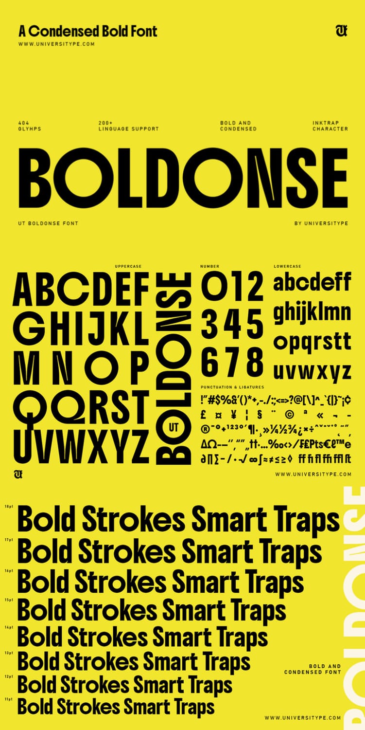
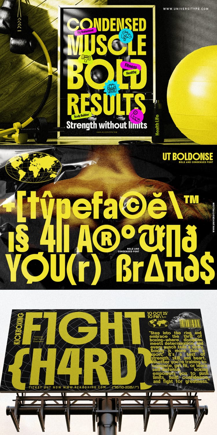
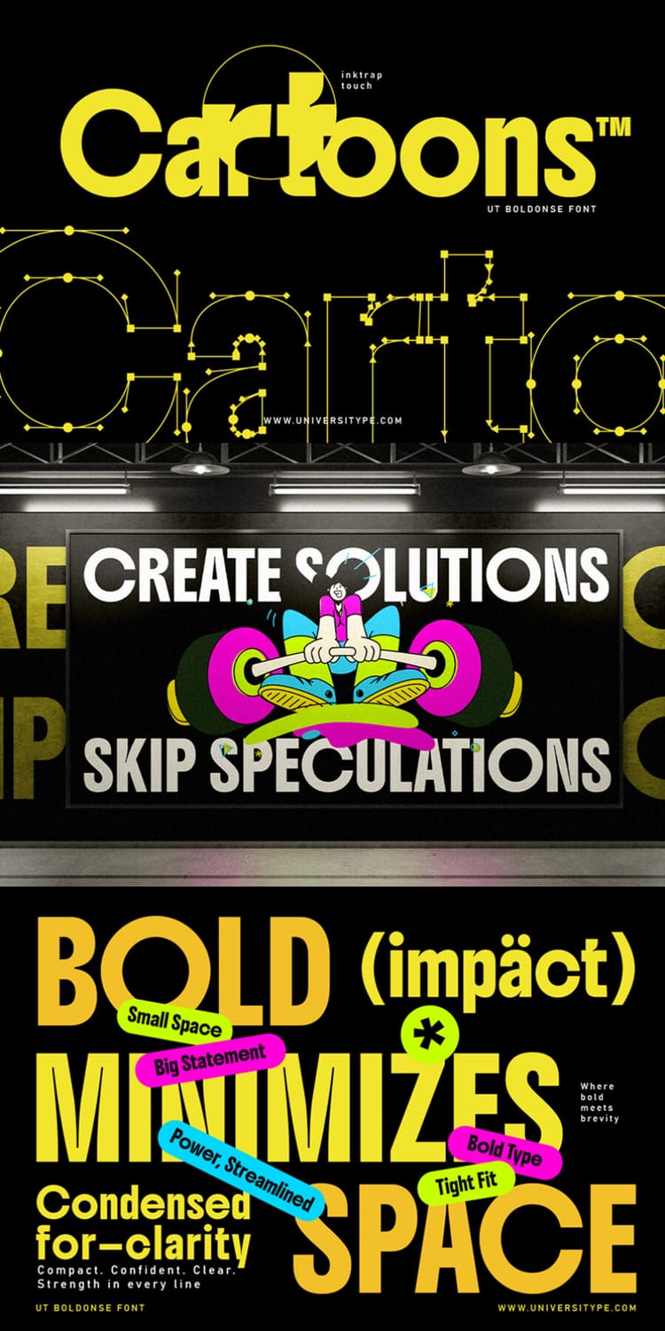
Boldonse is a heavy, condensed sans serif built for making a statement, with playful ink-trap details that give each letter a distinctive, slightly quirky edge. It's designed for large display sizes, which makes it a strong pick for headlines, posters, logos, and branding where you need maximum impact in minimal space. With 404 glyphs and support for over 200 languages, it also works for multilingual projects. Keep it to short bursts of text, since the bold, tight letterforms are best at large sizes.
2. Odrine
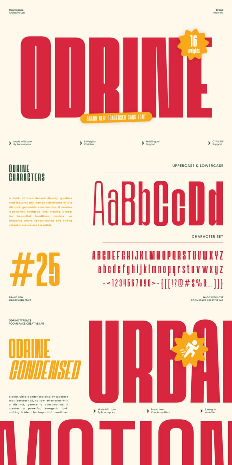
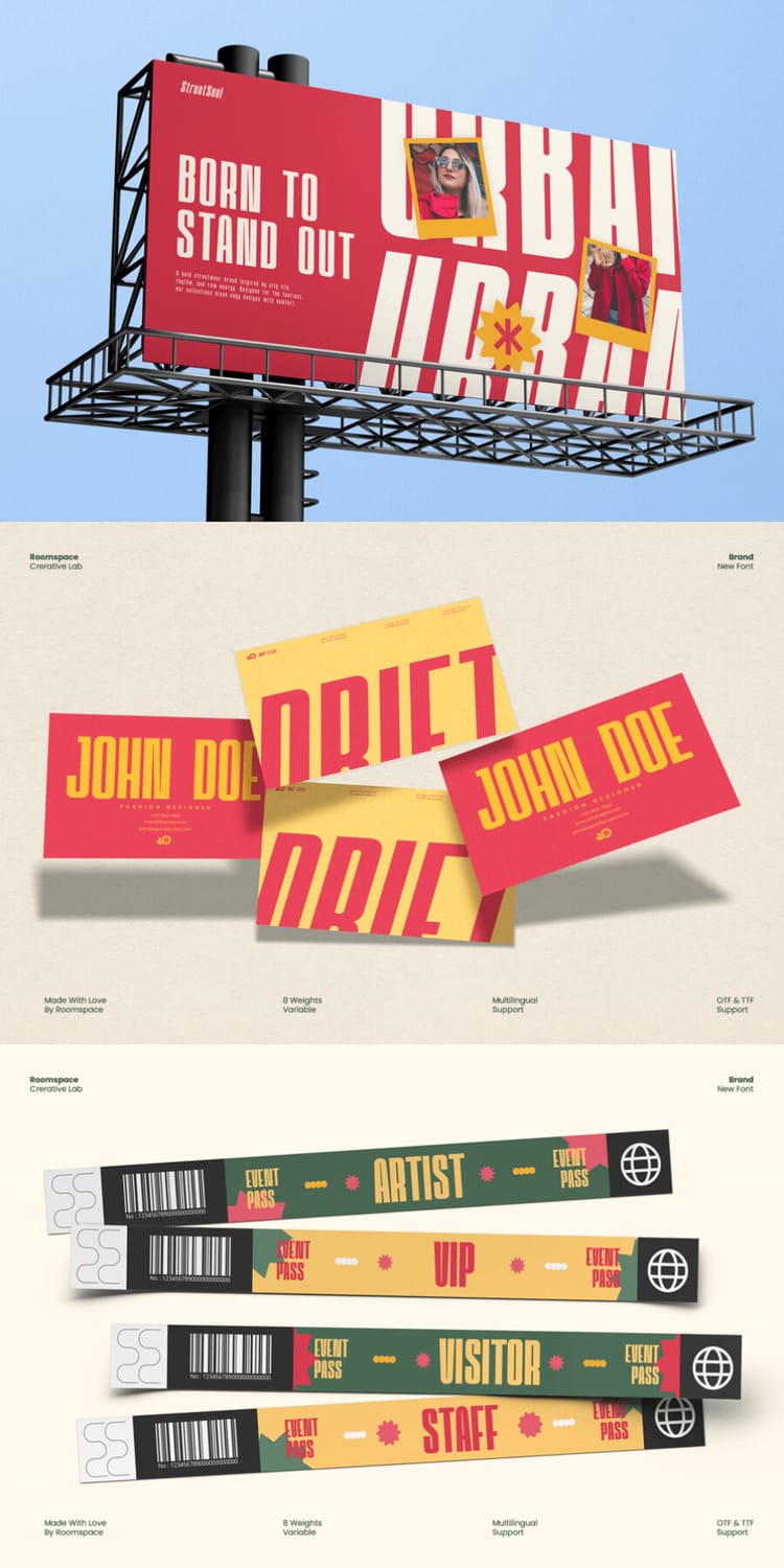
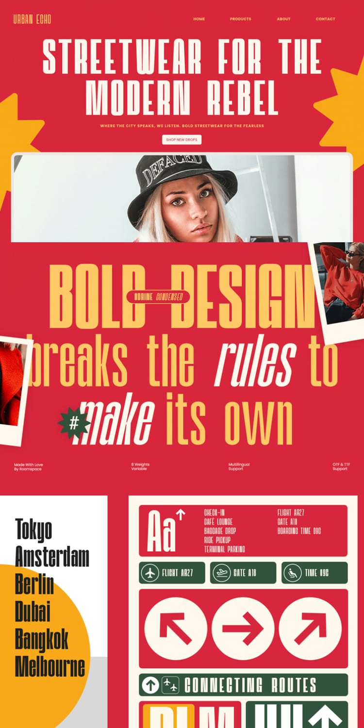
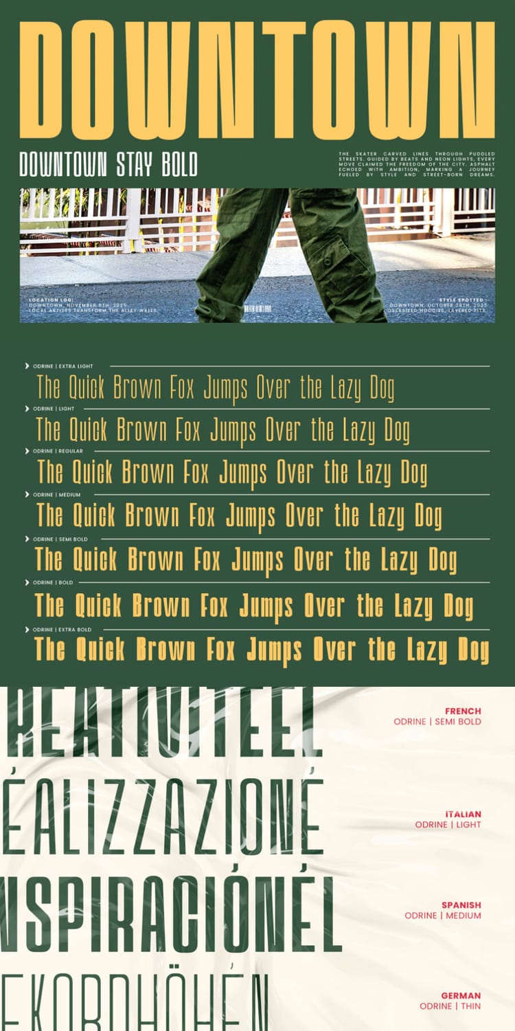
Odrine is a retro-modern condensed sans with tall, tightly spaced letterforms that feel both bold and refined. Its geometric proportions make it a natural fit for logos, posters, ads, and editorial titles, and the mockups show it working just as well on streetwear branding, event passes, and wayfinding signs. The family comes in 16 weights from thin to black, plus a variable version, so you can pair a heavy headline with a lighter subhead without leaving the family. It works at any size, though the tight spacing is best saved for display use.
3. Folime
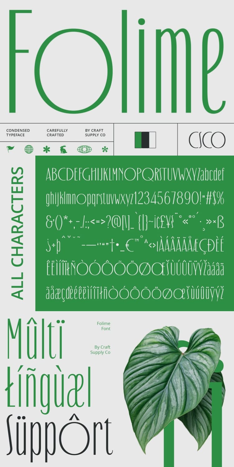
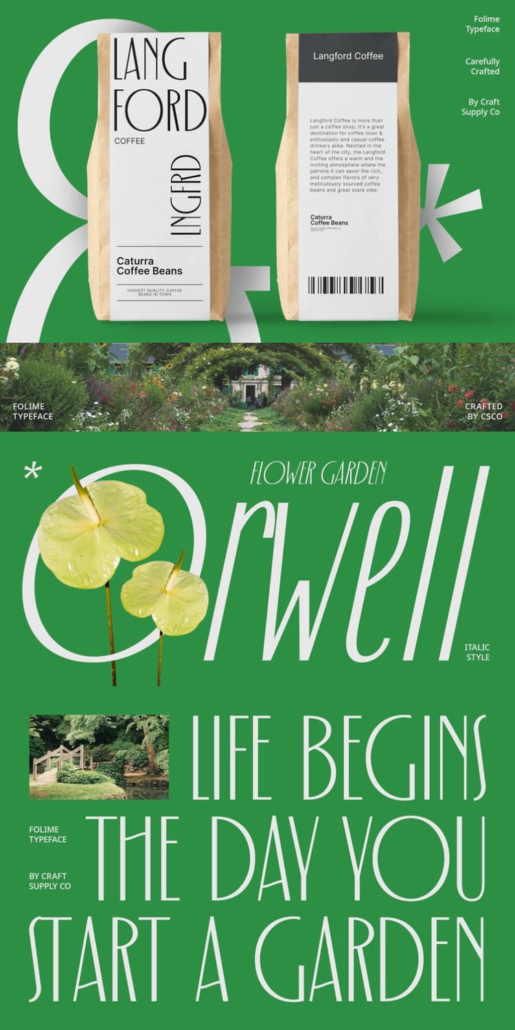
Folime is a slim, elegant condensed sans serif with tall, delicate strokes and a slightly Art Deco feel, which sets it apart from the heavier display fonts on this list. It shines in headlines, banners, and packaging, as the Langford Coffee bags in the mockups show, and it brings a refined, modern look to corporate identities and websites. The family includes a regular and an italic style, so you can add emphasis without switching typefaces. Its thin strokes work best at large sizes, so keep it away from small text.
4. Bixsu Condensed
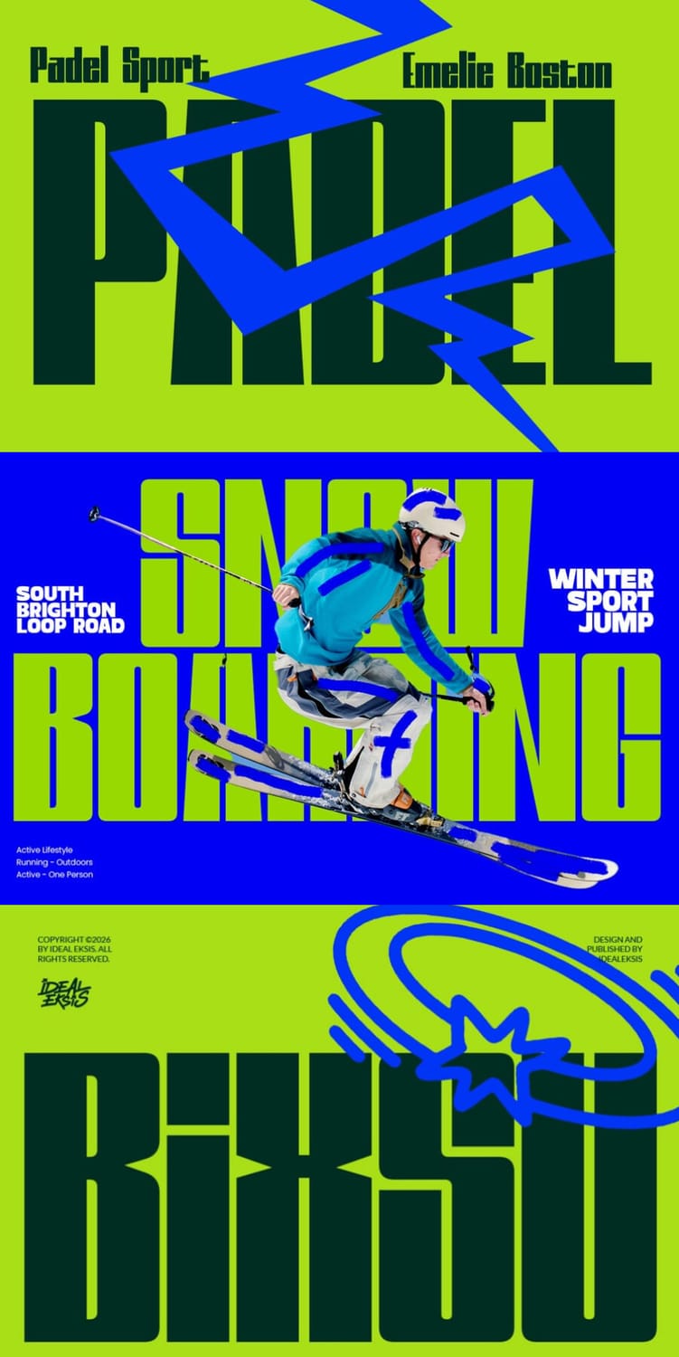
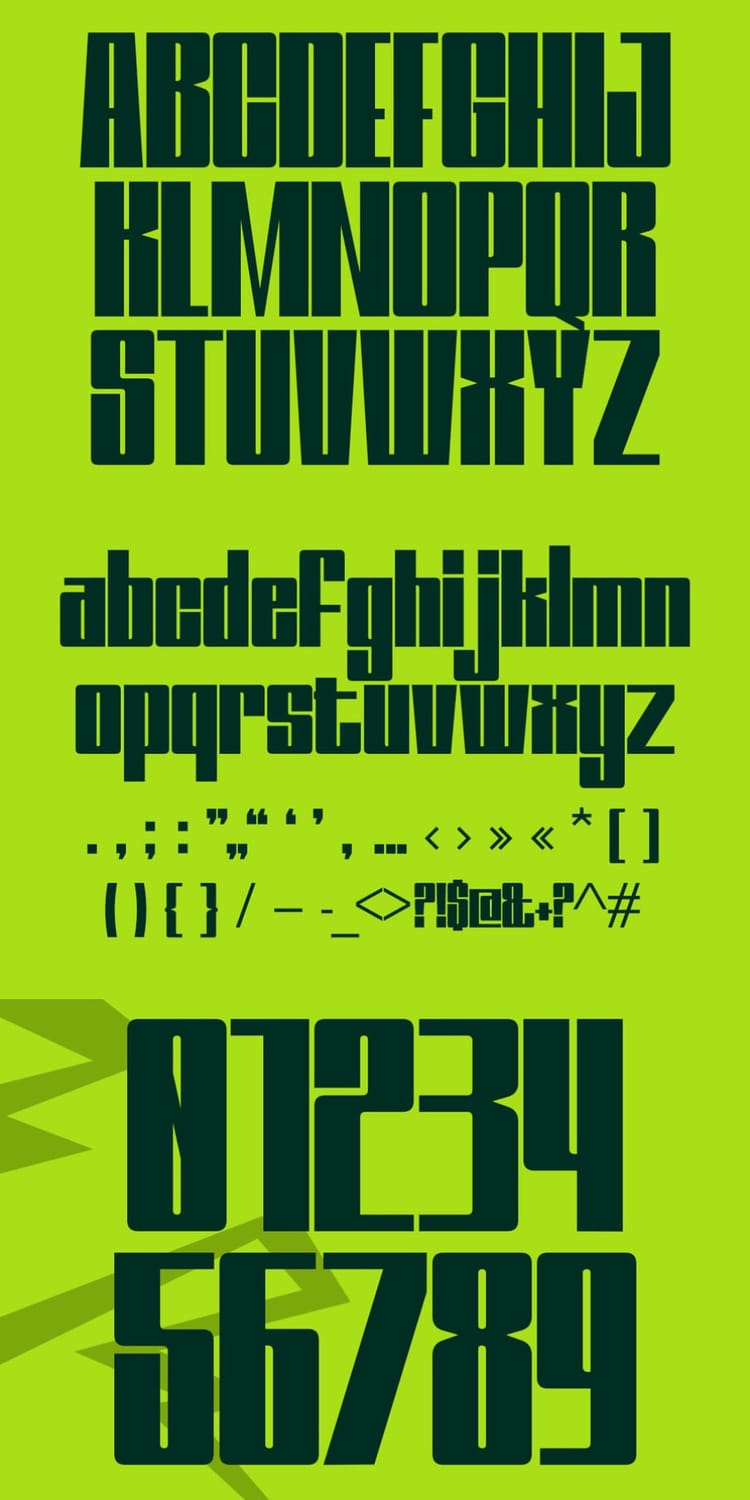
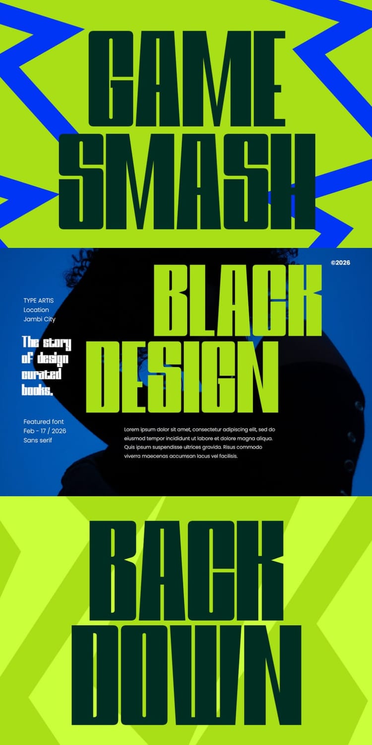
Bixsu Condensed is an ultra-tall, ultra-heavy display font with blocky, squared-off letterforms that pack serious punch into very little width. It's built for sports and esports branding, and the specimen shows it on a snowboarding poster, a padel campaign, and bold slogans. It also suits speed-themed headlines, product branding, social media graphics, and even food flyers. The tight, chunky shapes are made for large display sizes, so use it for short, high-impact lines rather than anything you want people to read at length.
5. Kravon Condensed
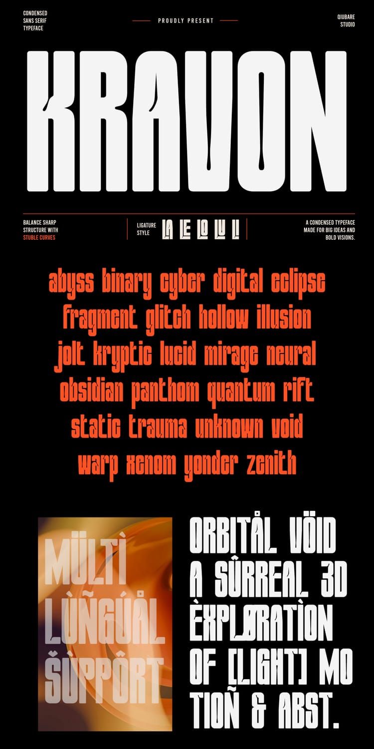
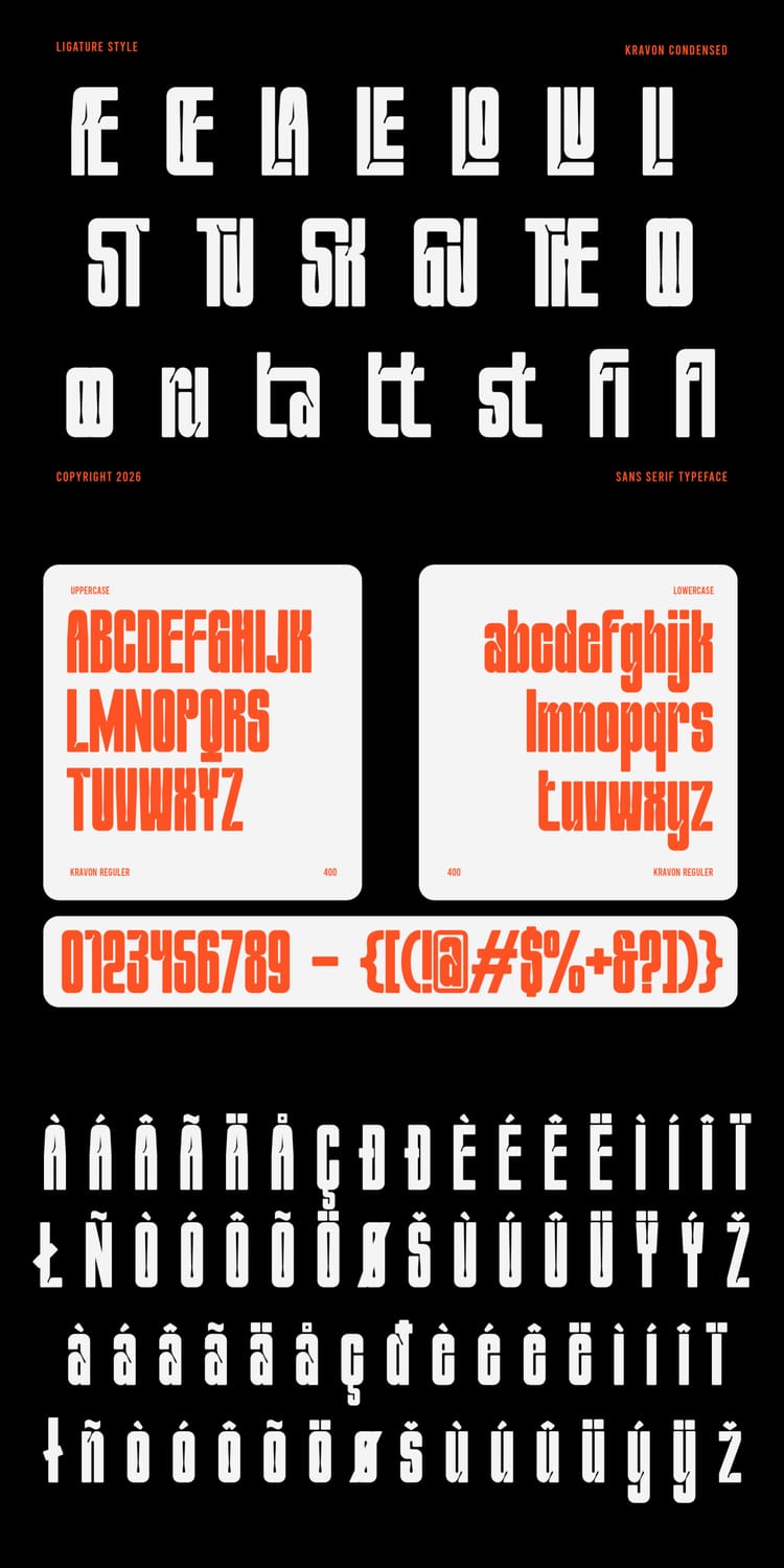
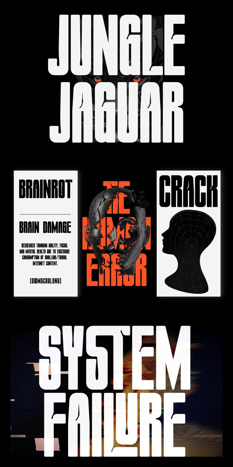
Kravon Condensed is a bold, tall display sans serif that mixes clean geometry with sharp, distinctive details, giving headlines a confident and slightly edgy presence. The specimen shows it on everything from magazine-style layouts to glitchy, tech-inspired posters, and the listing recommends it for editorial headlines, advertising, packaging, logos, and fashion branding. It also includes unique ligatures, such as the stylized letter pairs in the specimen, plus multilingual support. Its tight, heavy forms are made for headlines and short bursts of text, so avoid using it for long copy.
6. Wishdorm
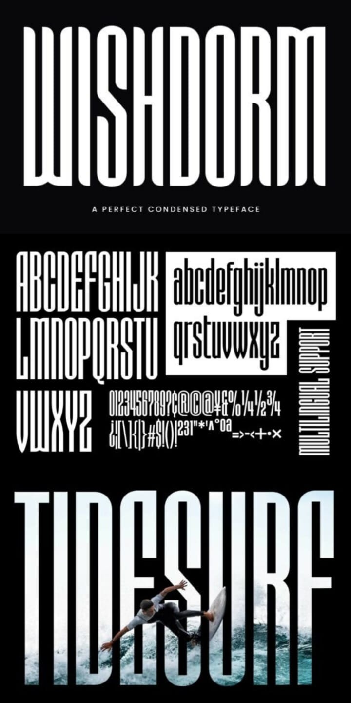
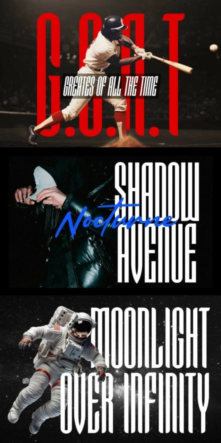
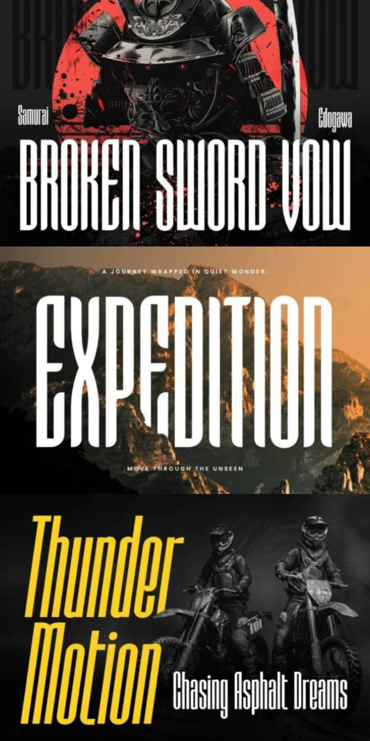
Wishdorm is an ultra-condensed display font with tall, confident letterforms and a sporty, futuristic edge. It comes in three styles (Normal, Curvy, and Slanted), so you can switch between a clean look, softer curves, or a more dynamic, forward-leaning feel without leaving the family. The specimen shows it on everything from surf and baseball graphics to sci-fi and samurai-themed posters, and the listing also suggests masking it with images or using it as a typographic background. It includes ligatures, stylistic alternates, and multilingual support, though its extreme narrowness is best saved for large headlines.
7. Nugotha
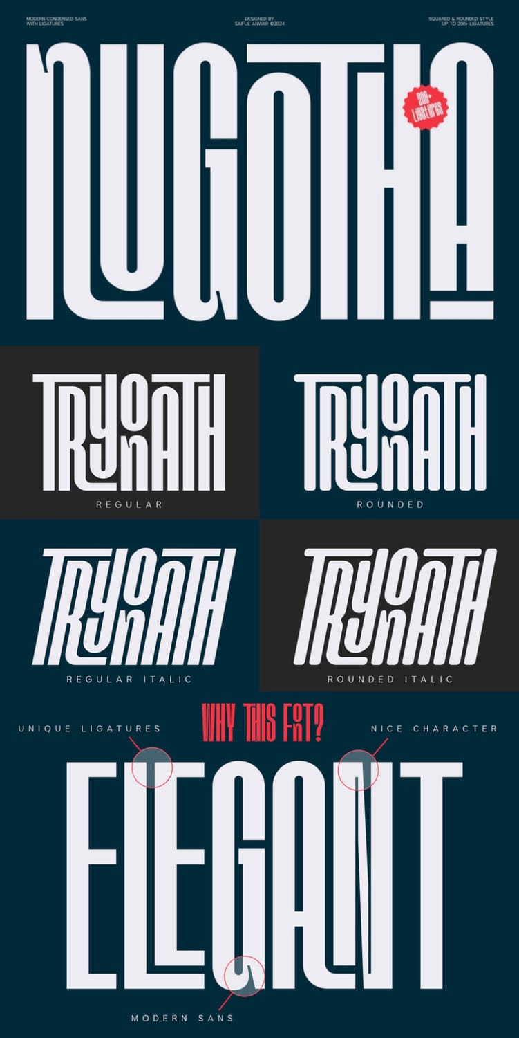
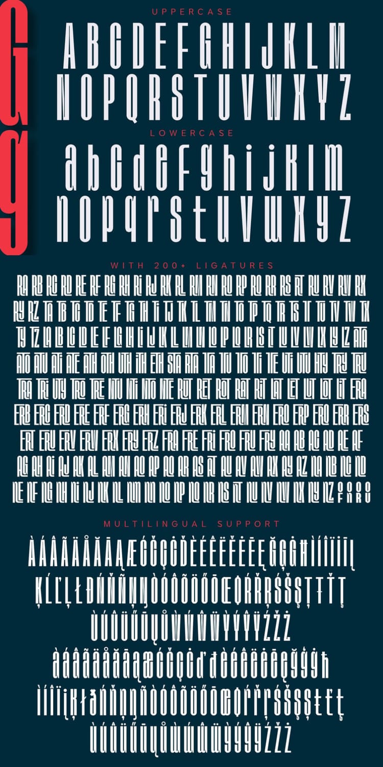
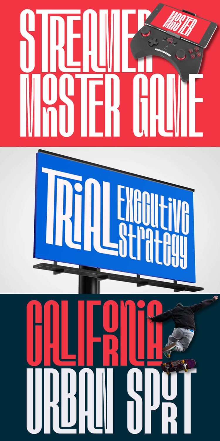
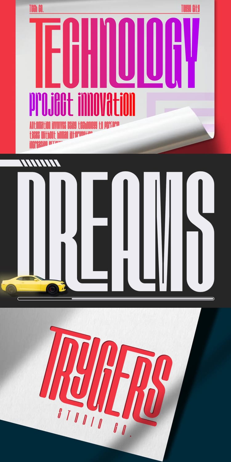
Nugotha is a modern condensed sans with tall, narrow letterforms and a sleek, slightly avant-garde character. Its standout feature is a collection of 200+ ligatures that connect letters into fluid, interlocking shapes, which gives headlines and logos a distinctive, artistic look. The specimen shows it in regular, rounded, and italic variations, on everything from sports and gaming graphics to billboards and packaging. It suits headlines, branding, advertising, and editorial layouts best, so save it for display sizes where the ligatures have room to stand out.
8. Homura
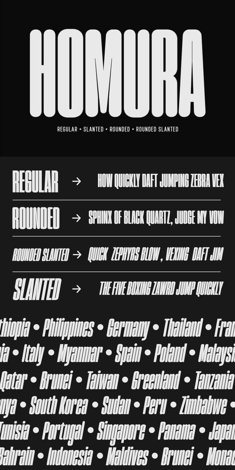
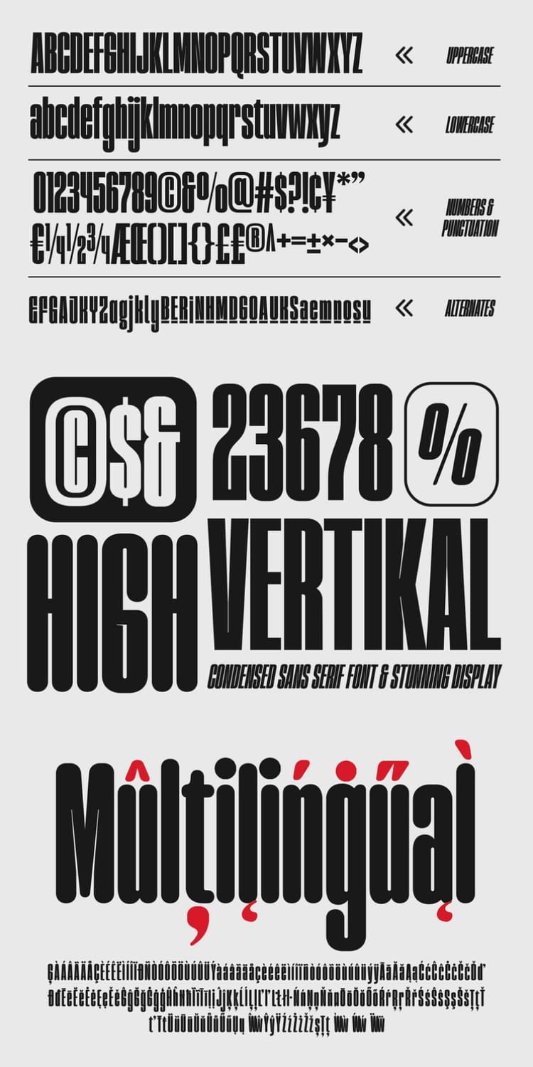
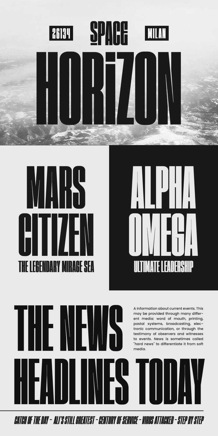
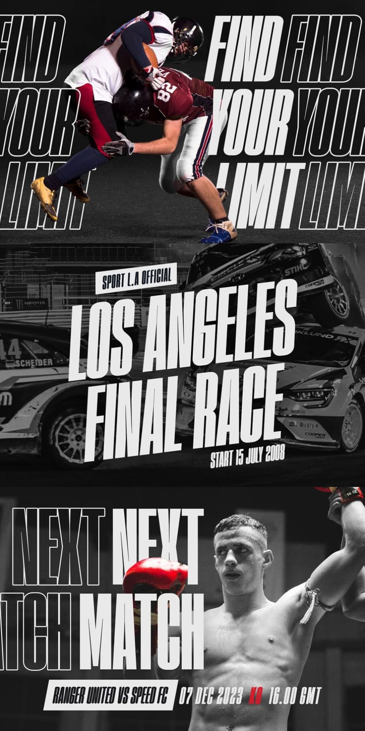
Homura is a bold, condensed sans serif inspired by newspaper headlines and modern typography, with a tight build and small ink-traps in the sharp corners that add a fun, slightly fancy touch. It comes in four styles (Regular, Rounded, Slanted, and Rounded Slanted), so you can pick a crisp, softened, or more dynamic look without leaving the family. The specimen shows it on news layouts, sports posters, and quote graphics, and the listing recommends it for logos, short quotes, stickers, labels, and posters. It's made for large displays and headlines, so save it for short, high-impact lines.
9. Zentaro
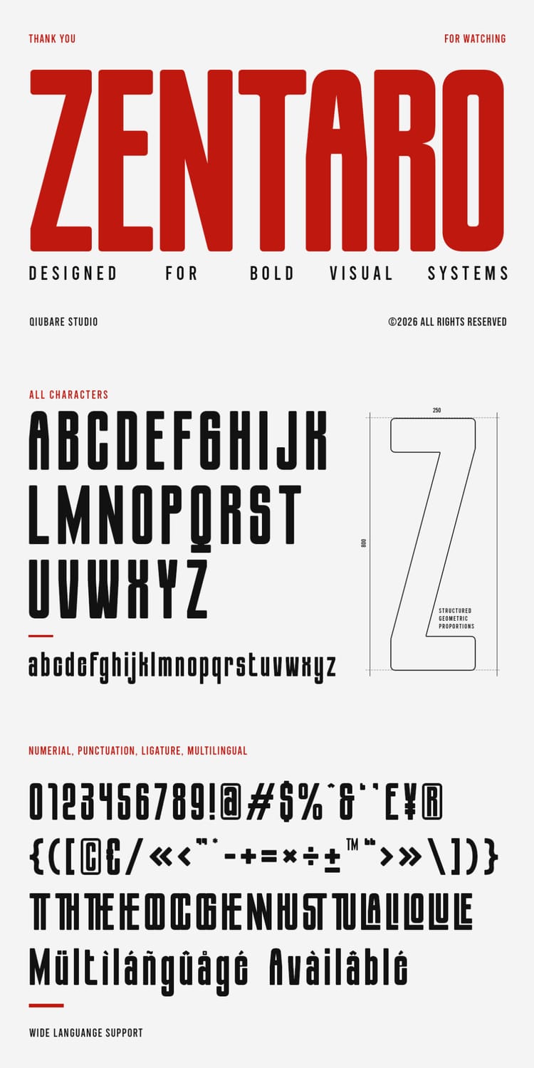
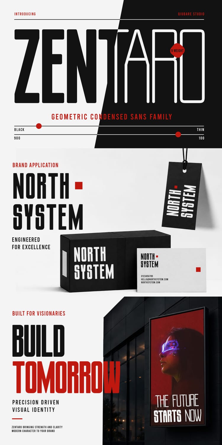
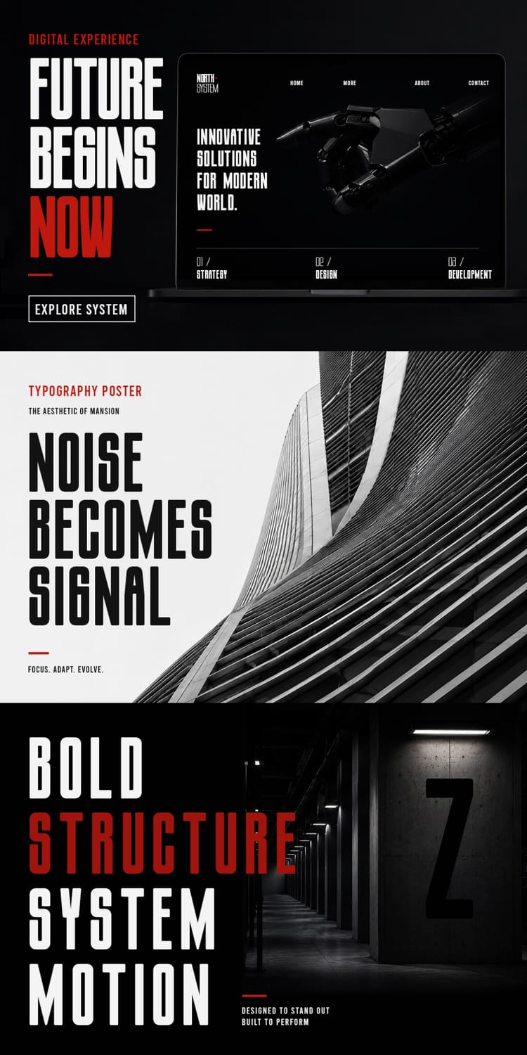
Zentaro is a geometric condensed sans family with clean, structured letterforms that feel precise, modern, and quietly powerful. It comes in nine weights from Thin to Black, so you can build an entire hierarchy, from a delicate subhead to a heavy headline, without leaving the family. The specimen shows it on brand identities, packaging, a website mockup, and typographic posters, and the listing recommends it for branding, editorial layouts, web and UI design, and tech or startup projects. It also includes ligatures and multilingual support, though it performs best at display sizes rather than in long passages of text.
10. Bindoran
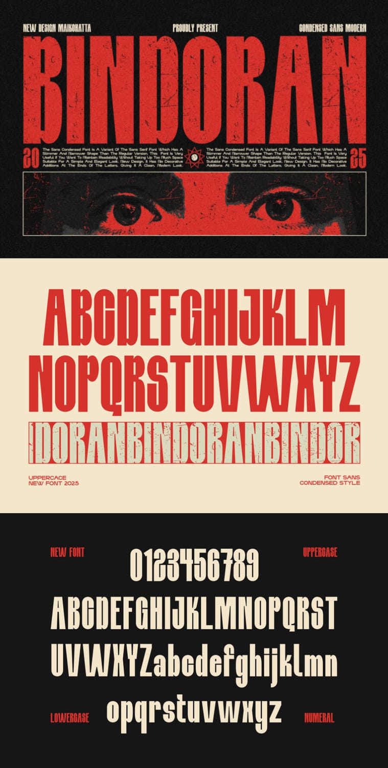
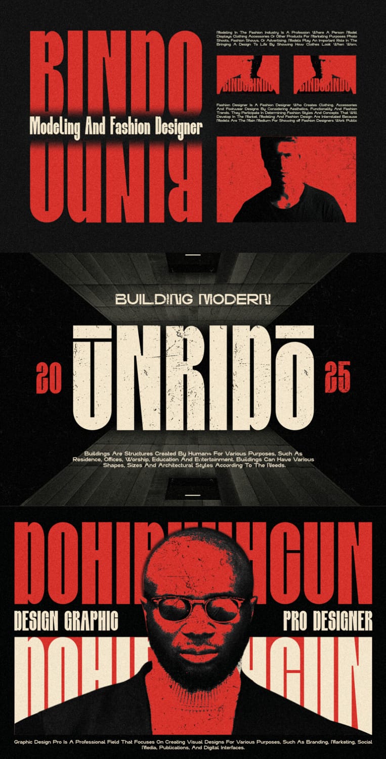
Bindoran is a condensed sans with a retro-modern, poster-ready look: tall, narrow letterforms with chunky details, a slightly quirky personality, and a vintage print feel in the specimen. The listing highlights its slim shapes and tags it for posters, covers, branding, events, and merchandise, and the mockups show it on fashion, architecture, and editorial-style layouts. It includes ligatures, alternates, and multilingual support, which gives you extra room to customize headlines. Its tight proportions are best used for short, bold lines rather than long passages.
11. Merchandes
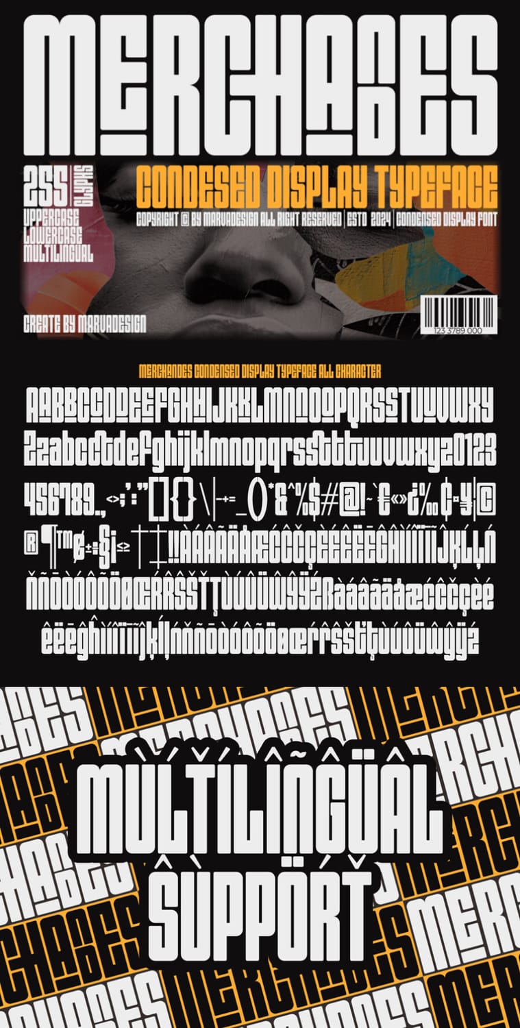
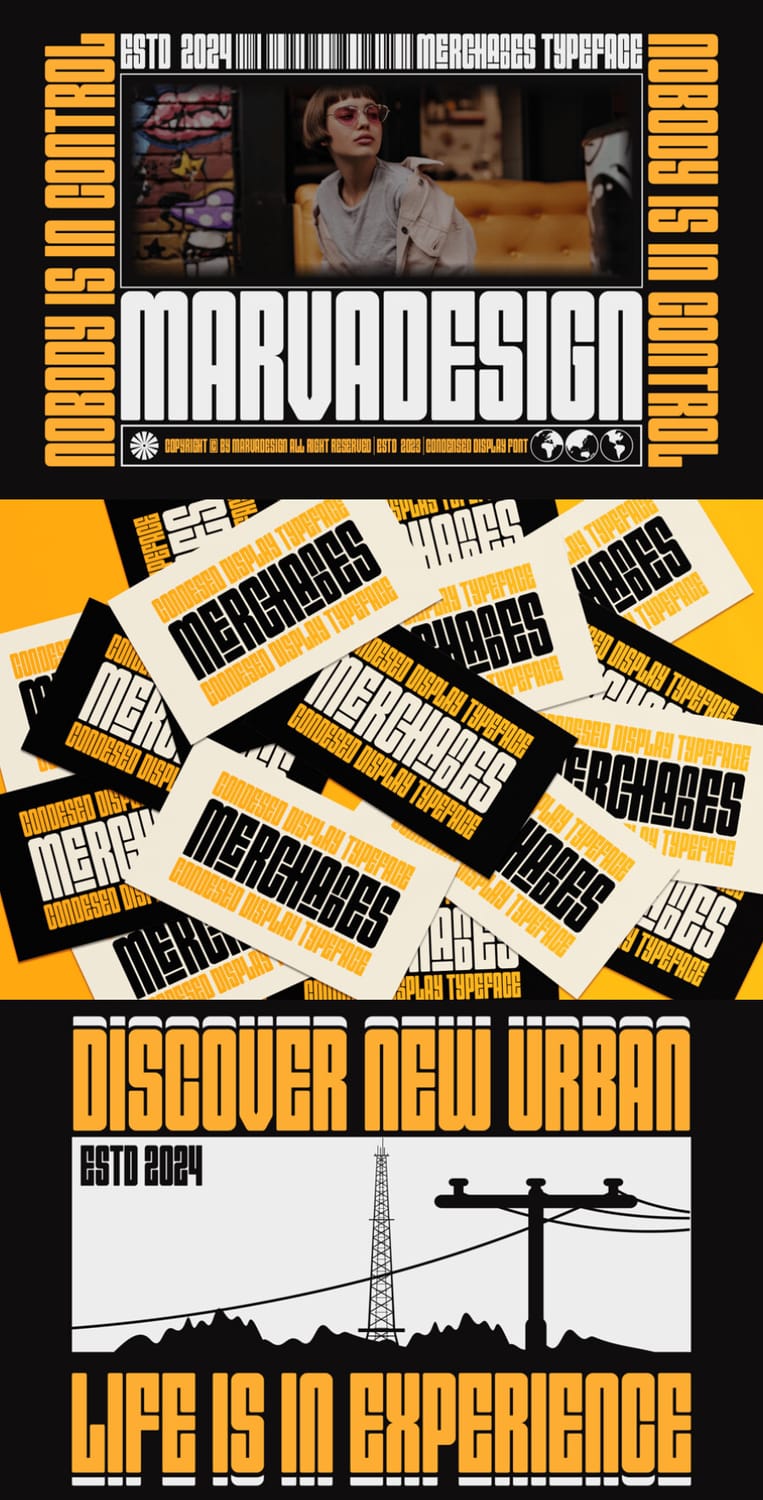
Merchandes is a chunky condensed display font with tall, blocky letterforms and quirky details, such as tucked-in letters and small cut-outs, that give it a retro, poster-style personality. The listing describes it as a display font for branding projects like logos, template design, and products, and tags it for magazines, posters, titles, and headings. The specimen shows it on business cards, urban-themed graphics, and bold slogans. It includes 255 glyphs, ligatures, and multilingual support. Its dense, heavy shapes are best used for short headlines, not long copy.
12. GC Grind
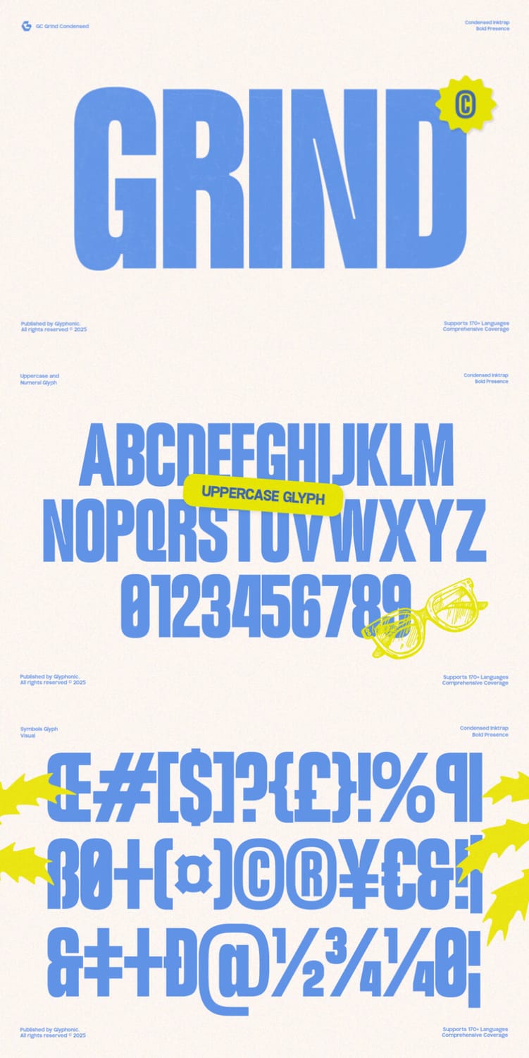
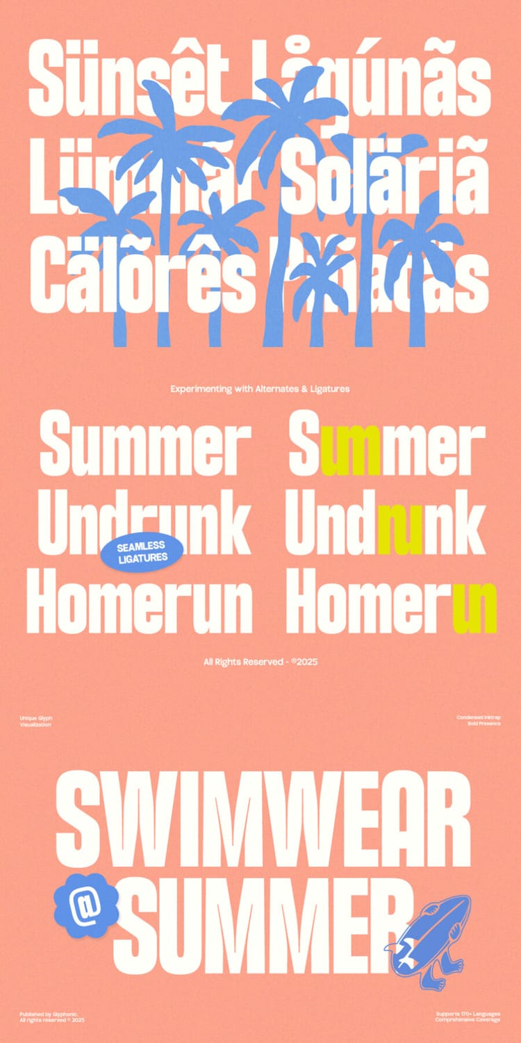
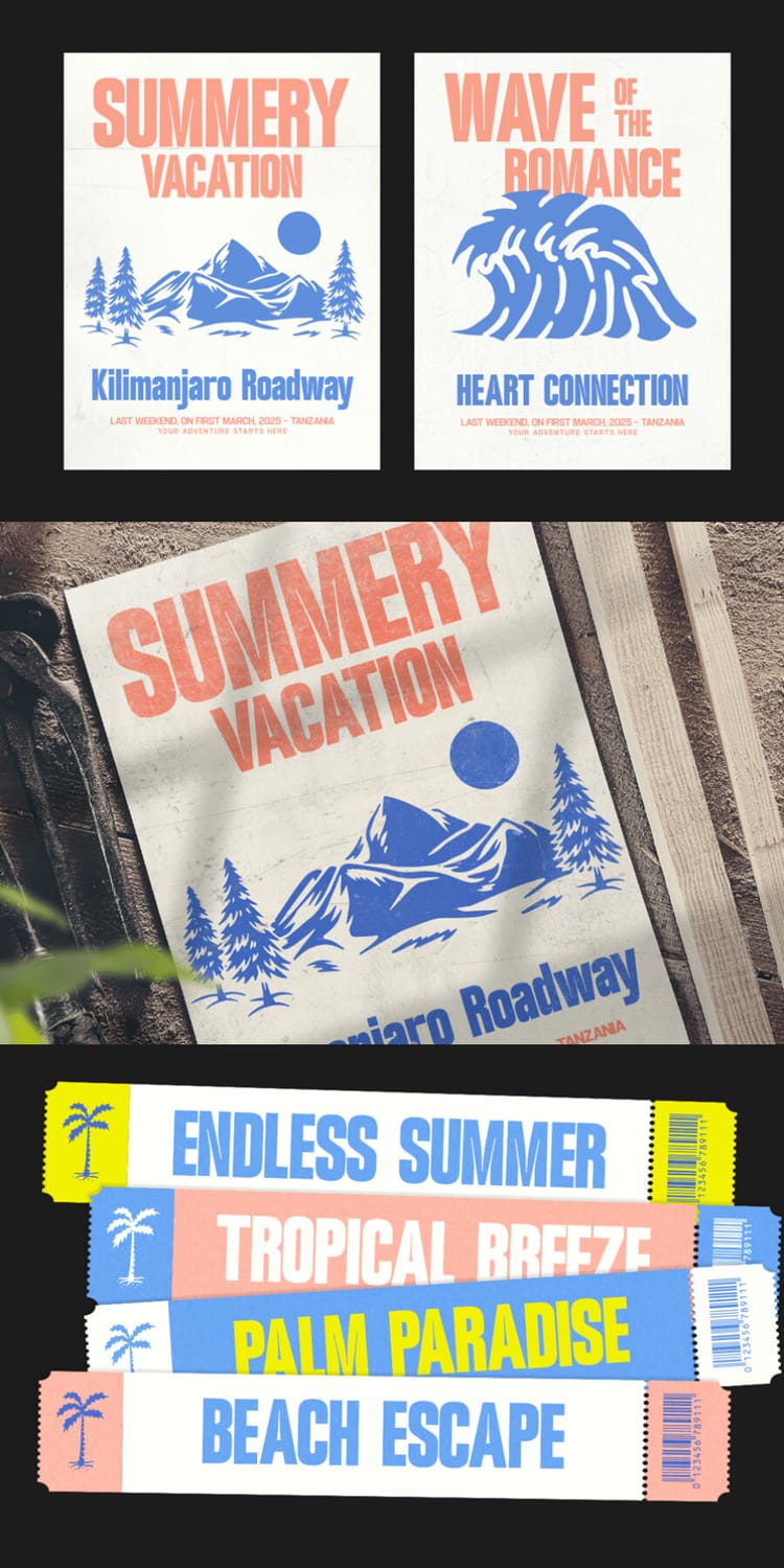
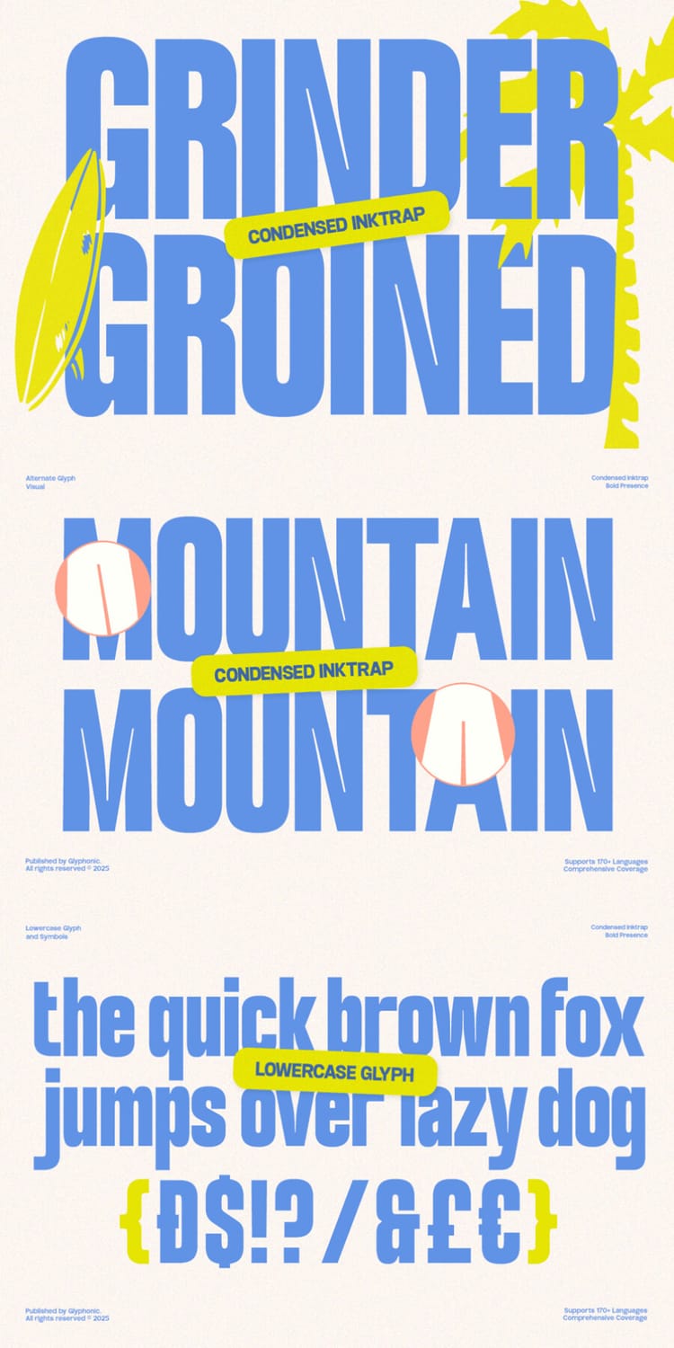
GC Grind is a bold condensed sans with tall, tightly spaced letterforms, sharp edges, and small ink-trap details that give it a punchy, slightly gritty presence. The listing recommends it for posters, headlines, branding, packaging, and sports or urban-inspired designs, and the specimen shows it on summer-themed posters, event tickets, and surf and beach graphics. It supports more than 170 languages and includes seamless ligatures and alternates, so it works for international projects too. The heavy, compact shapes are made for headlines and short lines of text rather than long passages.
13. CS Edmund
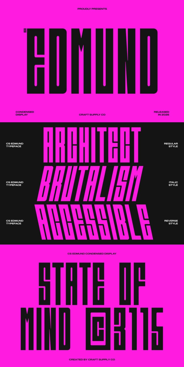
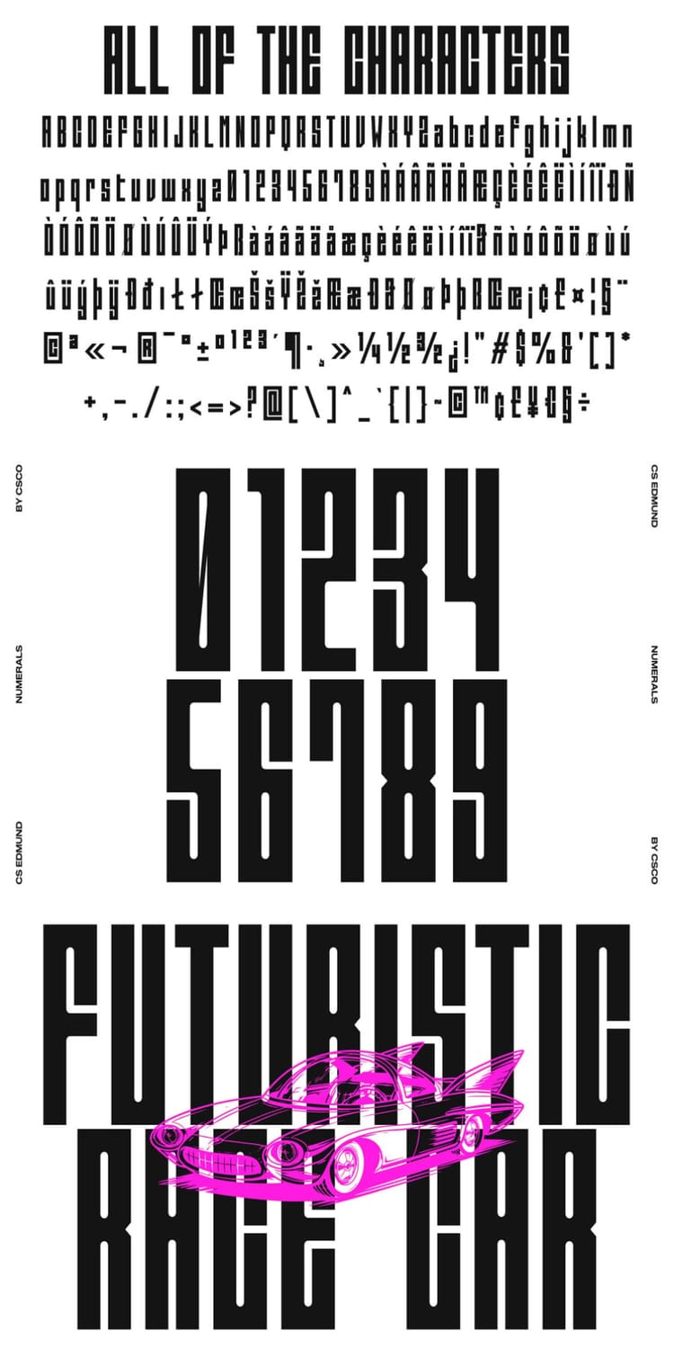
CS Edmund is a condensed display font with tall, blocky letterforms and an industrial, almost architectural feel, built from firm shapes and clean geometry. It comes in three styles (Regular, Italic, and Reverse Italic), so you can add motion and variety to a layout without leaving the family. The listing recommends it for posters, industrial branding, editorial titles, packaging, and digital graphics, and the specimen shows it on automotive and futuristic themes. It also includes multilingual support. Its compact, heavy build is best saved for bold headlines rather than long passages.
14. Nexora
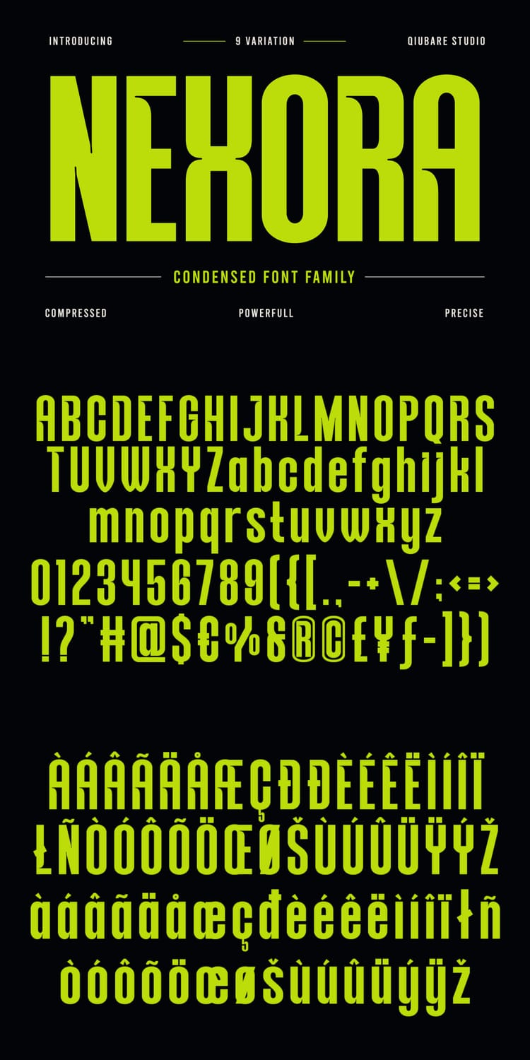
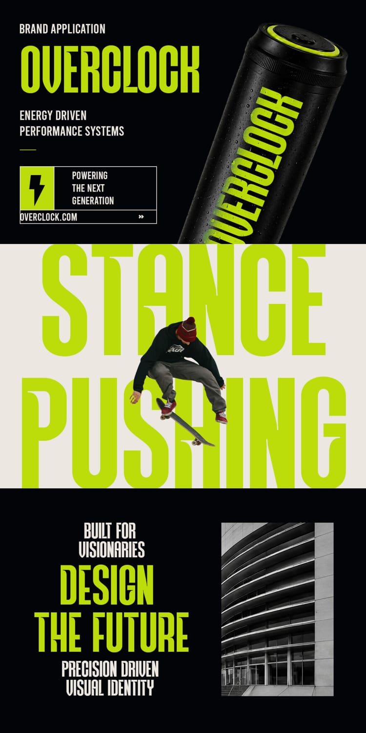
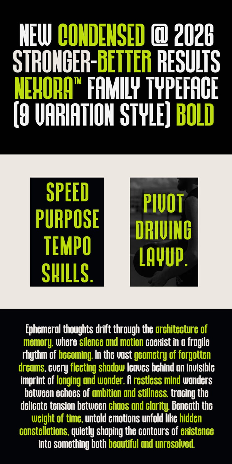
Nexora is a modern condensed display family with a bold geometric structure and a sharp vertical rhythm. Its standout feature is nine width variations, running from Ultra Expanded to Ultra Condensed, so you can build a whole typographic system, from wide, airy subheads to tight, tall headlines, without leaving the family. The listing recommends it for branding, posters, editorial headlines, sports and streetwear graphics, packaging, and UI work, and the specimen shows it on an energy drink can, skateboarding visuals, and futuristic layouts. It also includes multilingual support and symbols, but the condensed cuts are best saved for headlines and short lines.
15. Wakatobi
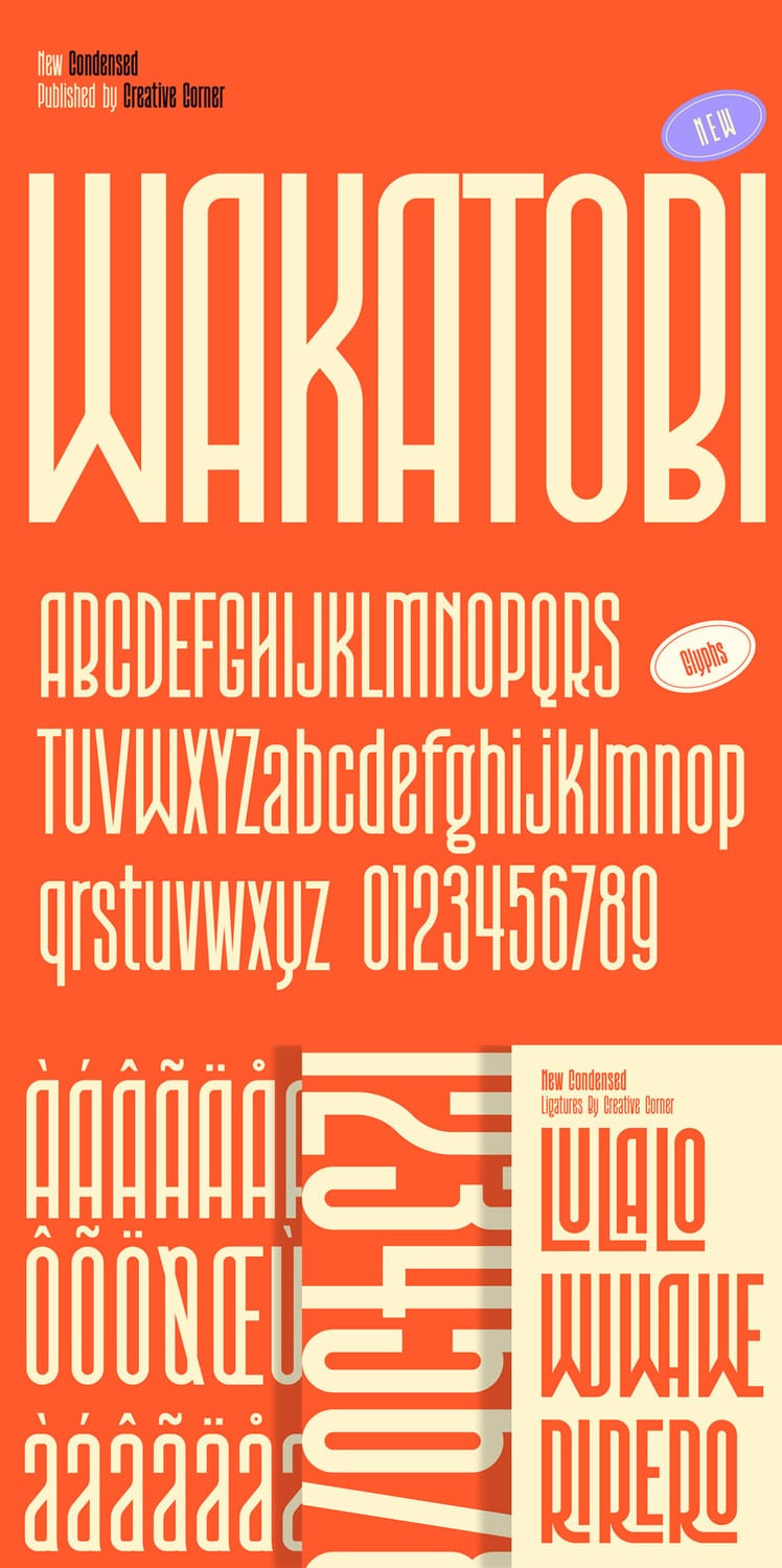
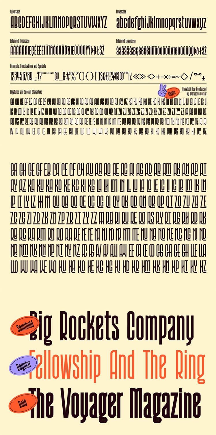
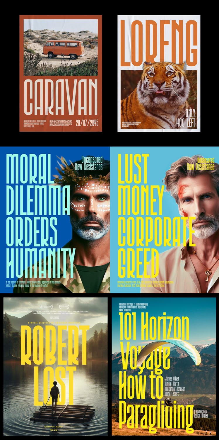
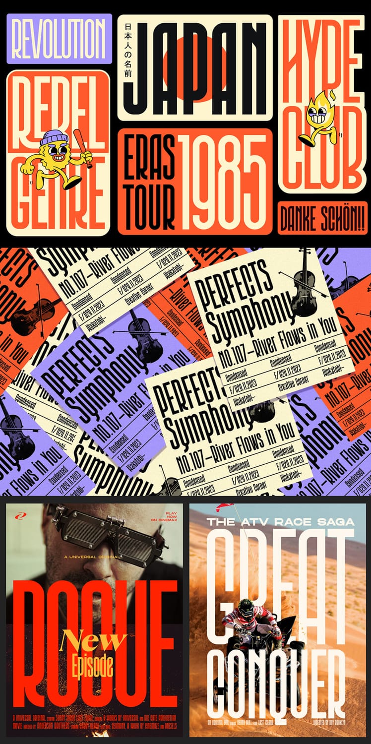
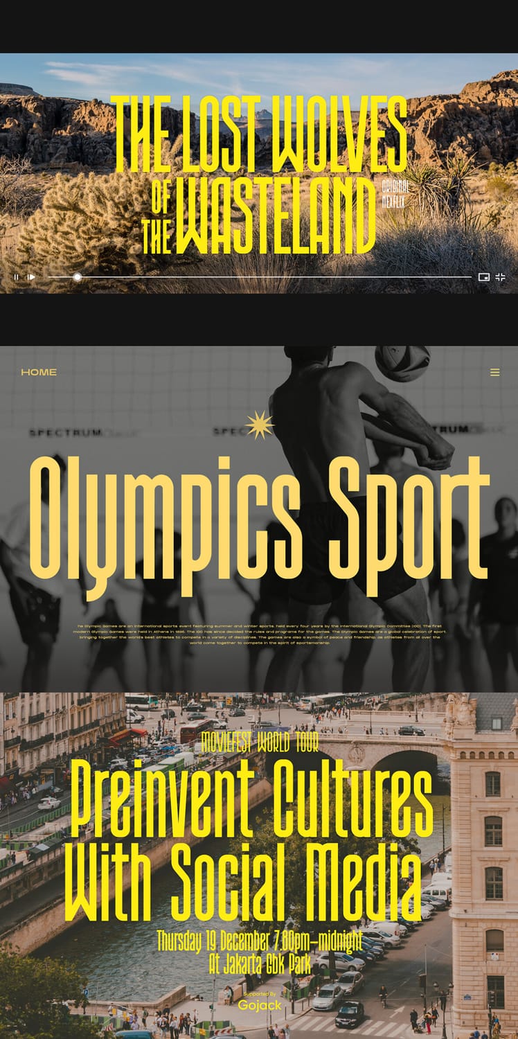
Wakatobi is an ultra-condensed sans serif with tall, narrow letterforms that give headlines a commanding, elegant presence. It comes in three weights (Regular, Semibold, and Bold), so you can build hierarchy without leaving the family. The listing recommends it for magazine spreads, covers, and large-format posters, and the specimen shows it on film-style titles, event posters, and editorial layouts. It also includes stylistic alternates, ligatures, and multilingual support. Its extreme narrowness works best at large sizes, so save it for titles and short, high-impact lines.
Closing
Condensed fonts prove that you don't need more space to make a bigger statement. Whether you're designing a poster, a logo, a social graphic, or a website headline, the right narrow typeface lets you say more, keep your text large, and still leave room for the rest of your layout to breathe.
What the fonts on this list have in common is strong vertical emphasis and a real talent for display sizes. Some, like Boldonse and Bixsu Condensed, bring loud, poster-ready impact. Others, like Folime and Zentaro, offer a more refined, versatile look, with elegant strokes or a full range of weights. And families like Odrine and Nexora give you enough variety to build an entire typographic system. The best choice depends on your project, your audience, and the personality you want your brand to project.
One last tip: pair your condensed headline font with a wider, simpler typeface for body text. The contrast keeps your design balanced and easy to read, and it lets each font do what it does best.
Disclaimer:
This article is for informational purposes only. Some links may be affiliate links, meaning Advise Graphics may earn a commission at no extra cost to you. We do not guarantee results, and readers should do their own research before making any decisions.
Tags
Copyright
© 2025 Advise Graphics. All rights reserved.
Cop© 2025 Advise Graphics. All rights reserved.