

Retro Revival: Best 70s-Inspired Serif Fonts for Bold Packaging

Some links in this post may be affiliate links. See our Affiliate Disclosure for details.
Walk down any supermarket aisle or browse a curated retail boutique today, and you’ll notice a seismic shift on the shelves. The cold, sterile, geometric minimalism that dominated the 2010s—often dubbed "bland-branding"—is officially losing its grip. In its place, a warm wave of nostalgia is washing over consumer goods. Brands are yearning for personality, soul, and a tactile sense of human craft.
Enter the 1970s typographic revival.
The 1970s was an era defined by tactile, expressive, and unapologetically bold design. At the heart of this aesthetic are plump, heavy display serifs. These aren't the rigid, academic serifs of the century before; 70s serifs are liquid and organic, boasting tight letter-spacing, generous curves, dramatic swashes, and heavy, bottom-weighted anatomy.
When applied to modern packaging, these typefaces do something magical: they instantly command attention, evoke a deep-seated sense of comfort, and make a product feel premium yet highly approachable. Whether you are designing for a craft beverage, a natural skincare line, or a funky snack brand, embracing the groovy, high-contrast curves of the seventies is the ultimate way to make your product pop on a crowded shelf.
Why 70s Typography is Dominating Modern Packaging Design
Design has always functioned like a pendulum, swinging between strict utility and expressive ornament. Right now, we are witnessing a massive, reactionary swing. After more than a decade of clean, geometric sans-serifs dominating our screens and shelves, consumers are experiencing sensory fatigue.
The psychological pull of retro design isn't just about looking backward; it is about seeking warmth, comfort, and tangible humanity in an increasingly digital, automated world. In times of uncertainty, the soft, curved, and organic shapes of the 1970s offer a comforting, familiar visual hug that modern consumers are actively craving.
The Pivot Away from Minimalist Sans-Serifs
For years, corporate branding abided by a strict rulebook: strip away the clutter, flatten the logos, and use clean, geometric sans-serifs. This movement—often termed "bland-branding" or "blanding"—was driven by the rise of mobile screens, where ultra-simple, high-contrast fonts performed best.
While this clean aesthetic offered great legibility, it came at a steep cost: personality. Brands across every industry, from luxury fashion houses to direct-to-consumer mattress startups, began to look identical.
On physical retail shelves, this sterile minimalism translates as cold, clinical, and mass-produced. Consumers began to tune it out. 70s-inspired serifs have emerged as the perfect antidote. By rejecting the rigid grids of the 2010s, these expressive, heavy-weighted letterforms demand that you look at them. They break through the quiet, white-space-heavy noise of modern packaging, signaling to the shopper that the product inside is crafted, unique, and full of character.
The Best 70s-Inspired Serif Fonts for High-Impact Packaging
Choosing the perfect typeface is where strategy transforms into tangible design. In packaging design, your choice of display font acts as the "hero" of the shelf. It sets the tone, communicates the product’s price point, and establishes an instant emotional connection with the consumer before they ever read a single ingredient.
To pull off a successful vintage packaging design, you need typefaces that don't just mimic the past, but recontextualize it for today's market.
Below is a highly curated list of elite, time-tested classics and stunning modern revivals. Each typeface has been selected for its unique personality, complete with technical styling tips, ideal target industries, and where you can license them to level up your next physical product project.
1. Bright (The Poetic & Playful Modern Revival)
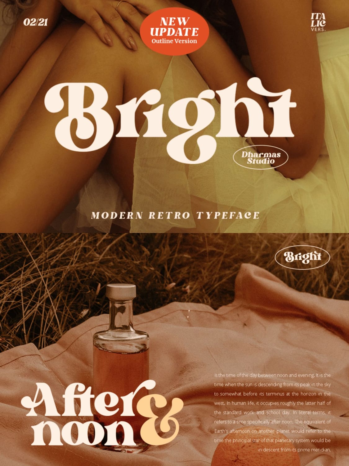
Bright is a gorgeous modern-retro display serif designed by Dharmas Studio. It perfectly bridges the gap between mid-century editorial poise and late-70s flower-power playfulness.
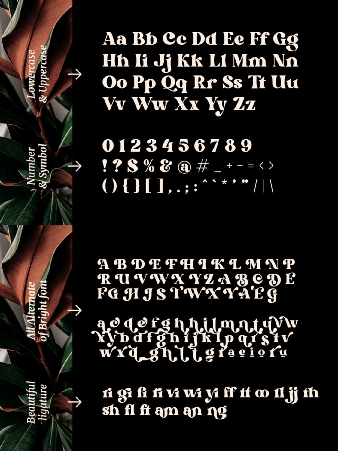
Key Characteristics: It features a striking contrast between heavy, voluptuous stems and delicate, razor-thin brackets. The defining charm of Bright lies in its generous, sweeping swashes and fluid, looping ligatures—particularly visible in characters like the lowercase 'g', 'h', and the expansive '&'.
Best Packaging Industries: Artisan spirits (liquors, vermouths), specialty sodas, gourmet oils, botanical skincare, and luxury candle boxes.
Pairing Recommendation: Pair it with an ultra-clean, light geometric sans-serif for modern product descriptions, or let it share space with a minimal, elegant monospace font to keep the focus on the packaging's tactile qualities.
Technical Design Tip: Take full advantage of Bright's 50+ stylistic alternates and ligatures. When typesetting words with repeating letters (like "noon"), use alternative glyphs to ensure the characters interlock beautifully without looking repetitive.
Where to Get It: Available directly through Dharmas Foundry, envato element, or Creative Fabrica.
2. Paradixe (The Gritty, Sun-Drenched Outdoor Classic)
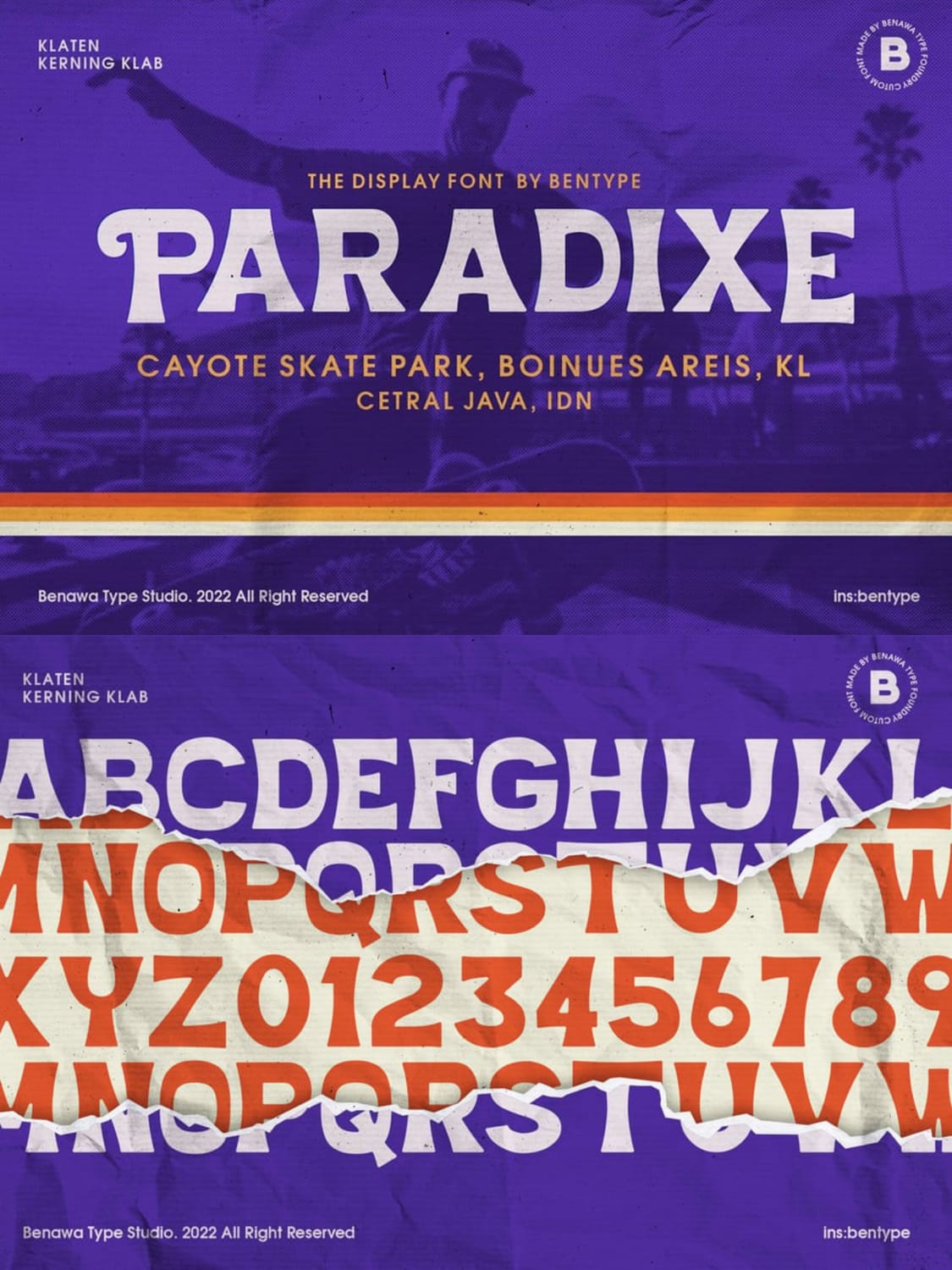
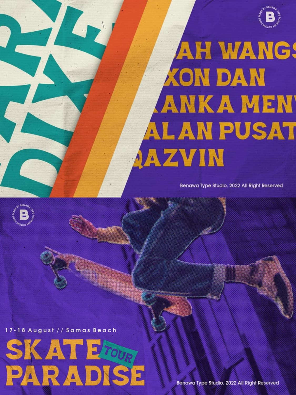
Paradixe is a highly characterful, hand-drawn display serif designed by Benawa Type Studio (formerly bentype). Taking its visual cues from mid-century surf culture, dusty California skate parks, and retro summer beach clubs, this typeface brings a raw, rugged authenticity to physical products.
Key Characteristics: Paradixe is built on bold, chunky letterforms that feature a slightly irregular, hand-cut edge. It is famously distributed in multiple distress styles—including Paradixe Rough and Paradixe Stamp—which mimic a worn, weathered screen-print with subtle ink bleeds and texture craters right out of the box.
Best Packaging Industries: Craft beer cans, street-apparel boxes, surf-wax wrappers, artisan hot sauce bottles, and organic, small-batch coffee bags.
Pairing Recommendation: Keep it rugged and outdoorsy by pairing it with a high-contrast, distressed monoline stamp script, or contrast its heavy, textured weight with a ultra-simple, modern sans-serif.
Technical Design Tip: To truly lean into the screen-printed, sun-faded aesthetic of the 70s, layer Paradixe with a subtle halftone pattern in your vector editor. If your packaging design uses a dark background, use the "Stamp" version with slightly transparent ink colors to let the mock texture bleed beautifully.
Where to Get It: Available directly through Creative Fabrica or Envato Element
3. Moontail (The Retro Varsity & Vinyl Record Hybrid)
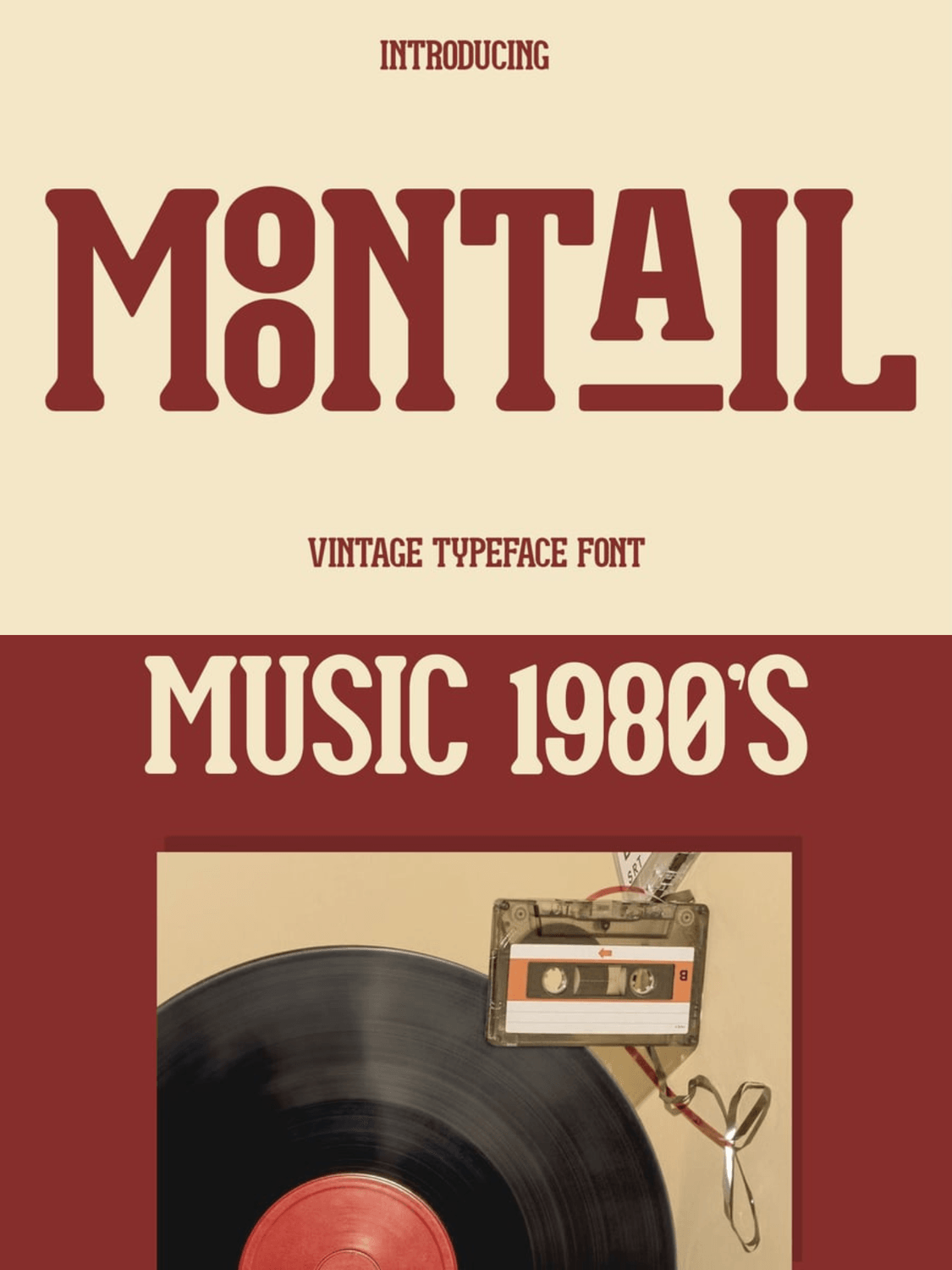
Moontail is a bold, high-contrast vintage typeface designed by Dharmas Studio. It sits at the fascinating intersection of late-70s academic athletic apparel and the classic, groove-carved cardboard sleeves of the early-80s vinyl record era.
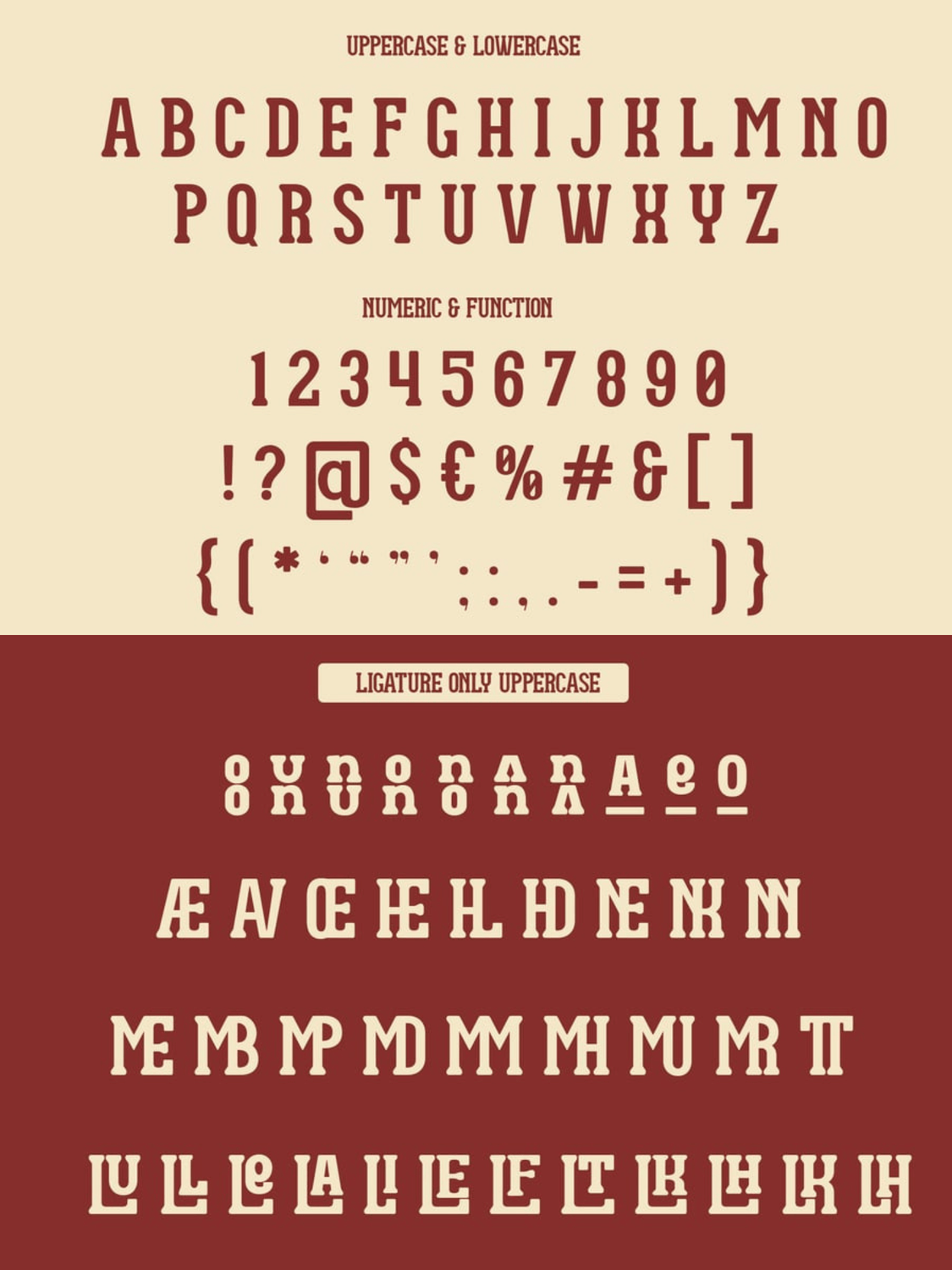
Key Characteristics: Moontail is defined by its tall, blocky proportions and heavy, bracketed slab serifs. Its true genius lies in its extensive, ligature-only uppercase set. By utilizing special stacked alternates (like the stacked 'O' over 'O' in the image) and underlined horizontal structures (seen on the 'A'), it allows you to build highly dynamic, puzzle-like typographic hierarchies inside a single word.
Best Packaging Industries: Retro record sleeves and merchandise, premium canned coffees, vintage sports-themed apparel boxes, and craft snack bags.
Pairing Recommendation: Pair it with a classic, clean geometric sans-serif to keep your secondary copy legible, or lean fully into the vintage vibe with a mid-weight, soft-edged editorial serif for body copy.
Technical Design Tip: This font is built to be stacked. Try using the ligature-only uppercase options to interlock letters horizontally and vertically, creating a custom, badge-like logo lockup for your packaging's main face.
Where to Get It: Available directly on Dharmas Foundry or Envato Element.
4. Wimp Stars (The Sharp & Nostalgic Psychedelic Serif)
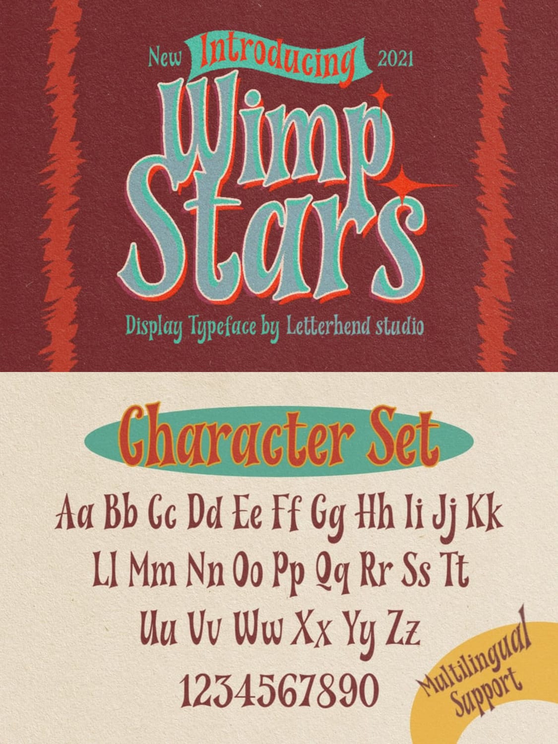
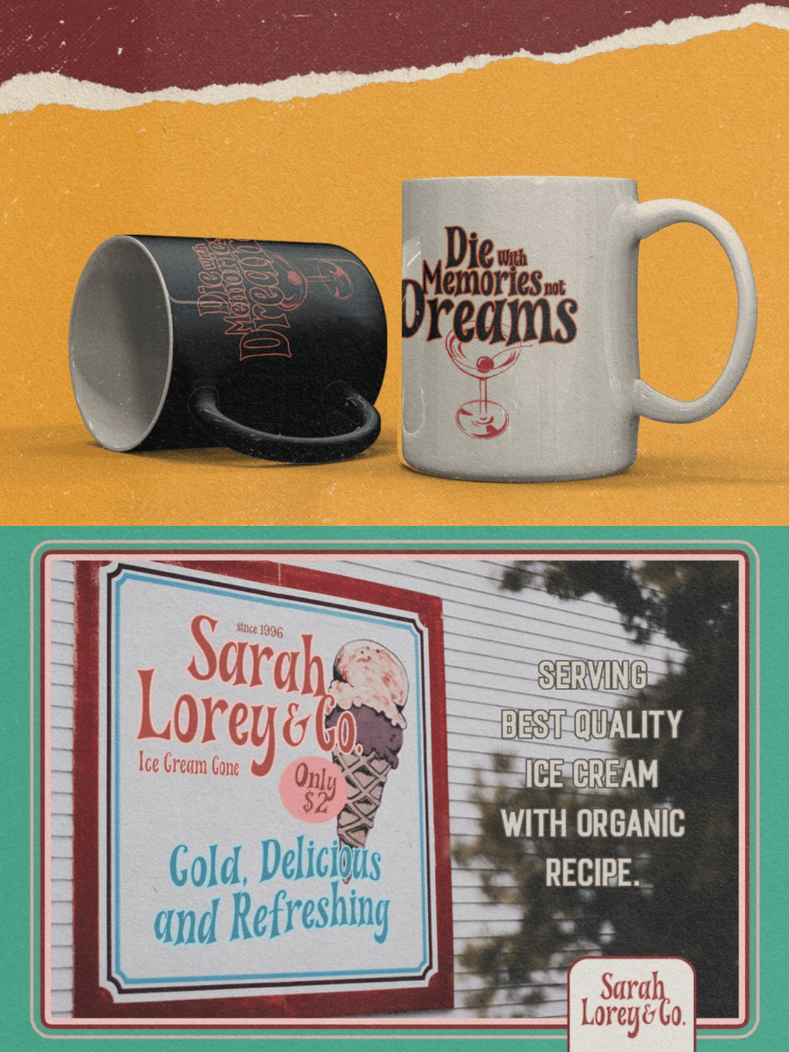
Wimp Stars is a standout nostalgic display typeface designed by Letterhend Studio in 2021. It captures the fluid, slightly wavy, and psychedelic energy of 70s sign painting and diner typography, bringing a highly specific retro flair to modern packaging.
Key Characteristics: As beautifully showcased in the primary graphic, Wimp Stars features distinctive sharp edges combined with wavy, organic stems. The full character set highlights its dynamic, bouncy baseline and slightly irregular letterforms that feel entirely hand-painted.
Best Packaging Industries: It shines in casual, joyful applications like retro ice cream tubs and dairy shop signage, printed merchandise and novelty mugs, and nostalgic candy bar wrappers.
Pairing Recommendation: Pair it with a condensed, slightly distressed vintage sans-serif to ground the design and allow Wimp Stars to act as the primary visual hook.
Technical Design Tip: Because the letterforms have such high personality and sharp, undulating outlines, use this font strictly for large, high-impact titles like logos or headlines. Avoid using it for any secondary text or ingredient lists, as the wavy baseline can become difficult to read at smaller point sizes.
Where to Get It: Available through Envato Element, Graphic River or Creative Fabrica.
5. Losta Masta (The Groovy & Elegant Art Nouveau Serif)
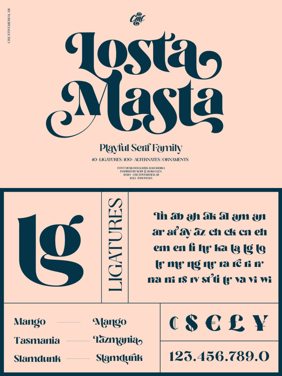
Losta Masta is a deeply expressive, playful serif family designed by Kadek Mahardika of Creativemedialab in 2020. Inspired by classic retro aesthetics, it seamlessly blends the organic, flowing curves of the Art Nouveau movement with the bold, groovy swashes of 1970s typography.
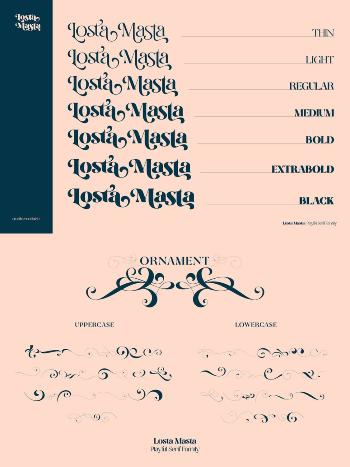
Key Characteristics: The font stands out for its high contrast, heavy voluptuous curves, and sharp terminal points. It is an incredibly versatile family that includes 7 distinct weights—ranging from a delicate Thin to an ultra-chunky Black—alongside over 40 ligatures, 100 alternates, and custom decorative ornaments.
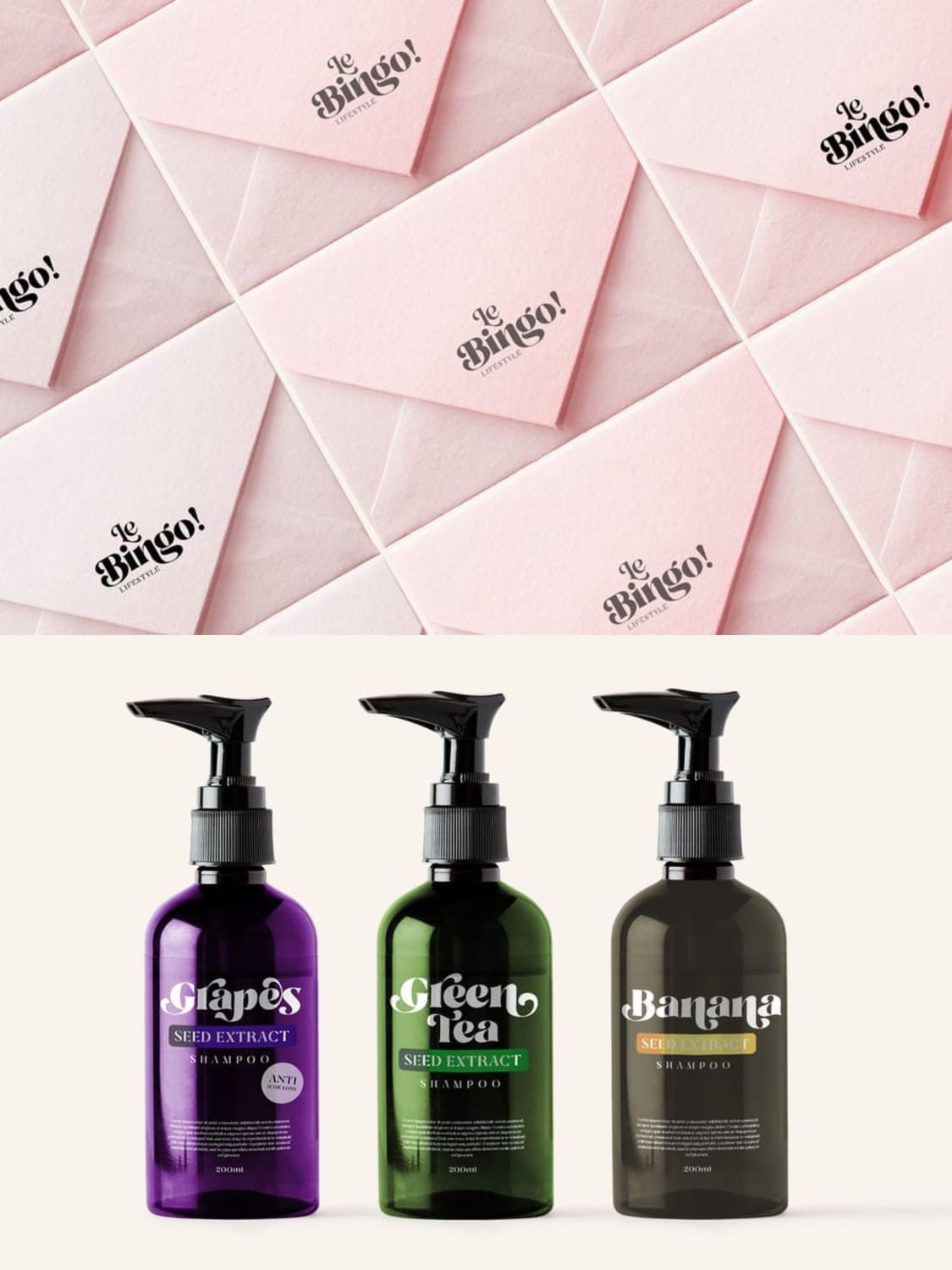
Best Packaging Industries: Its inherent elegance and organic flow make it a perfect match for modern cosmetics, organic shampoos, and botanical hair care lines (as beautifully showcased on the seed extract pump bottles). It also works wonderfully for boutique lifestyle brands, specialized stationery, upscale confectionery, and organic food packaging.
Pairing Recommendation: When using its heavier weights (like Bold or Black) for your main title, pair it with a clean, low-contrast geometric sans-serif for secondary details to keep the overall look balanced and grounded.
Technical Design Tip: To fully elevate a packaging layout, don't just type out the standard characters. Dive into your design software's glyphs panel to tap into the 100+ unique alternates and ligatures (such as the flowing lg, ng, or ck combinations). Interlocking these characters allows you to create a completely bespoke, custom-lettered logo layout that naturally draws the eye.
Where to Get It: Available directly on Graphic River, or Envato Elements.
6. Black Magic (The Bold Retro Vintage Cinematic Serif)
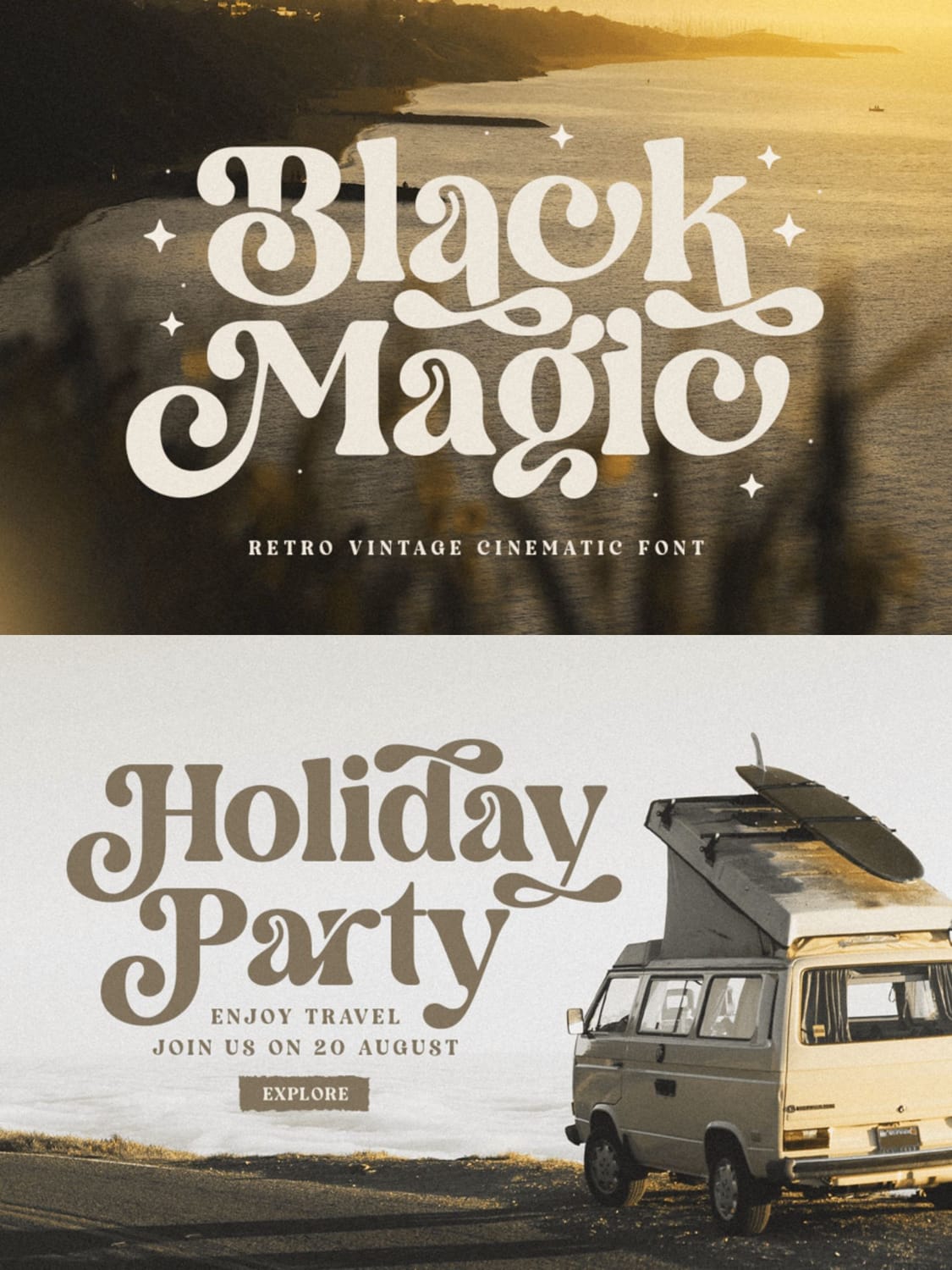
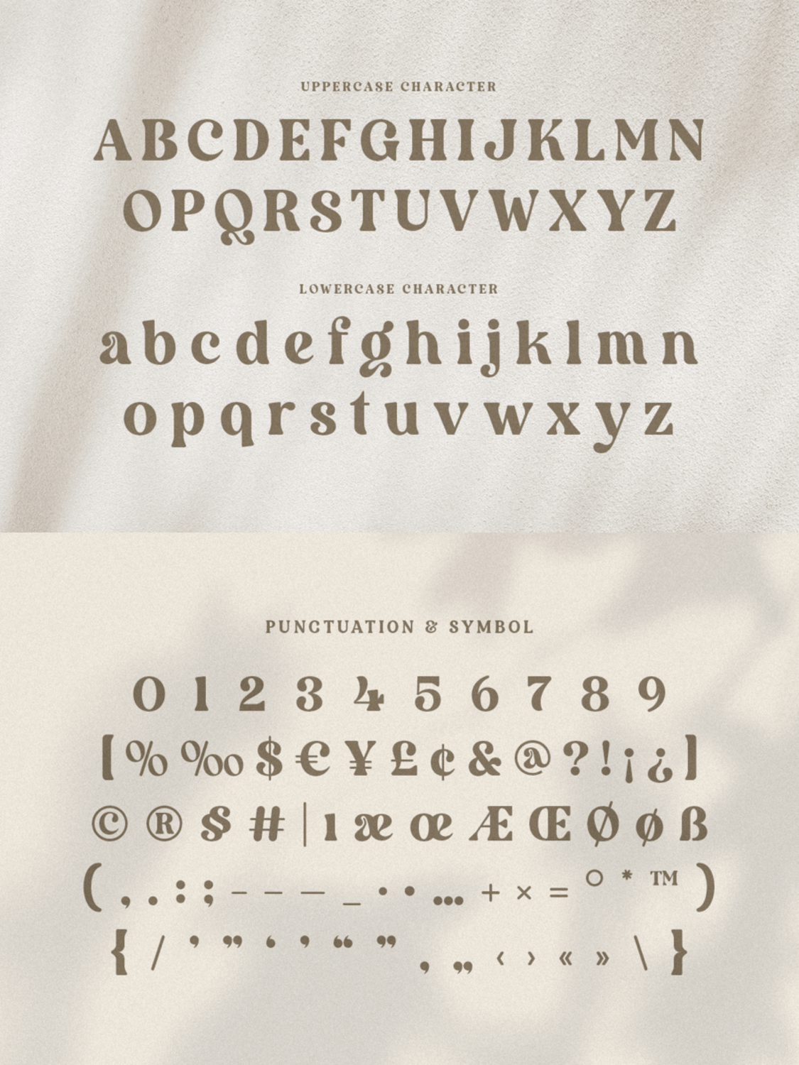
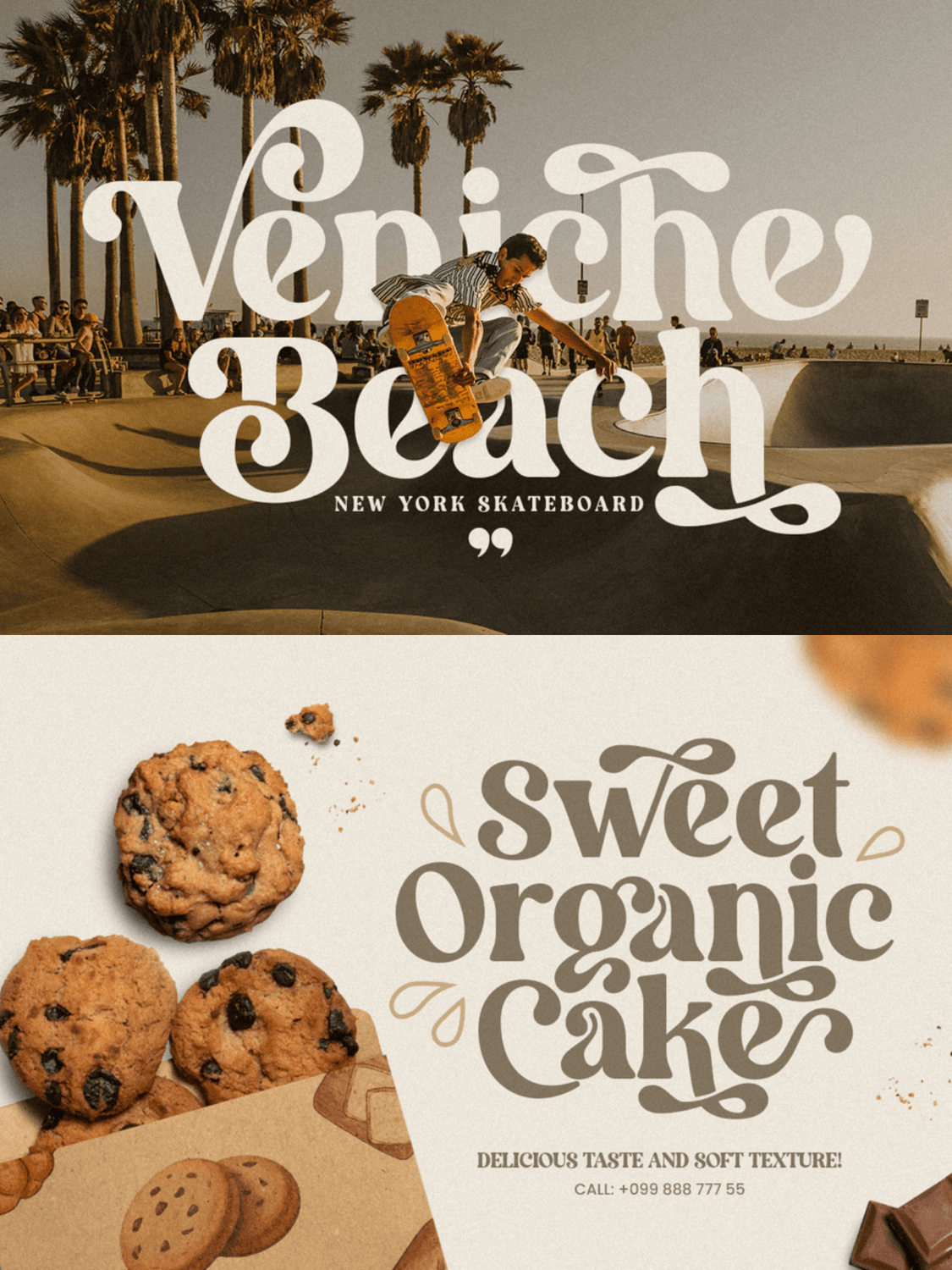
Black Magic is a bold, high-impact display serif designed by HamzStudio. Unapologetically dramatic and expressive, it draws heavy inspiration from mid-20th-century cinema, retro music posters, and classic 1970s typography.
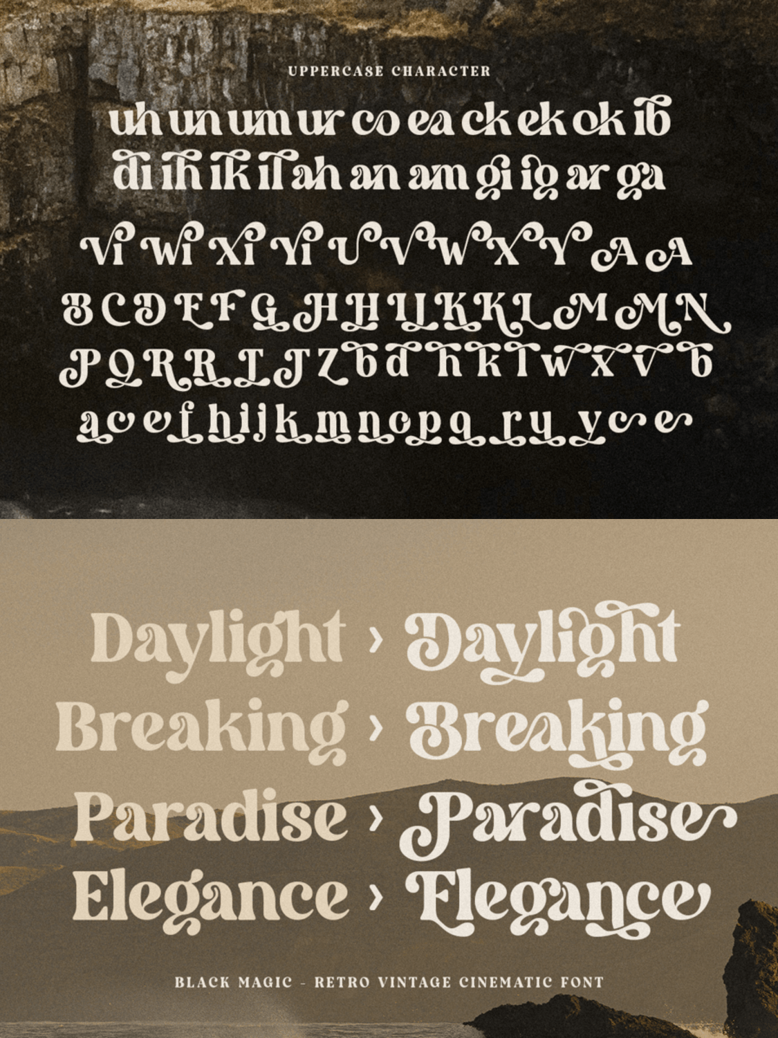
Key Characteristics: The font features exceptionally thick, chunky letterforms balanced by sharp, elegant serifs and whimsical, sweeping terminal loops. It is highly customizable, packed with beautifully integrated Opentype features, including custom ligatures (like the interlocking ck, ea, and un combinations) and expressive alternate characters that add a fluid, hand-drawn vibe.
Best Packaging & Branding Industries: True to its name, Black Magic is excellent for designs that need to feel nostalgic yet powerful. It’s a stellar fit for artisanal food packaging, bakeries and confectionery (like the "Sweet Organic Cake" mockup), craft breweries, retro-themed beauty lines, and editorial headers that demand immediate attention.
Pairing Recommendation: Because its heavy weights and flowing alternates command so much visual space, pair it with a clean, understated, high-legibility geometric sans-serif or a simple, light monoline sans for any secondary body copy or ingredient lists. This allows the display title to shine without making the layout feel cluttered.
Technical Design Tip: Take advantage of the dual personalities built into the font. As shown in the character maps, you can dial down the retro drama by utilizing its clean, standard uppercase and lowercase sets for a more classic, high-contrast serif look. Then, selectively swap in the decorative swooping alternates on first or last letters to frame your brand name perfectly.
Where to Get It: Available on Envato Elements and other major digital font marketplaces.
7. Chinook (The Fluffy, Heavy Retro Display Font)
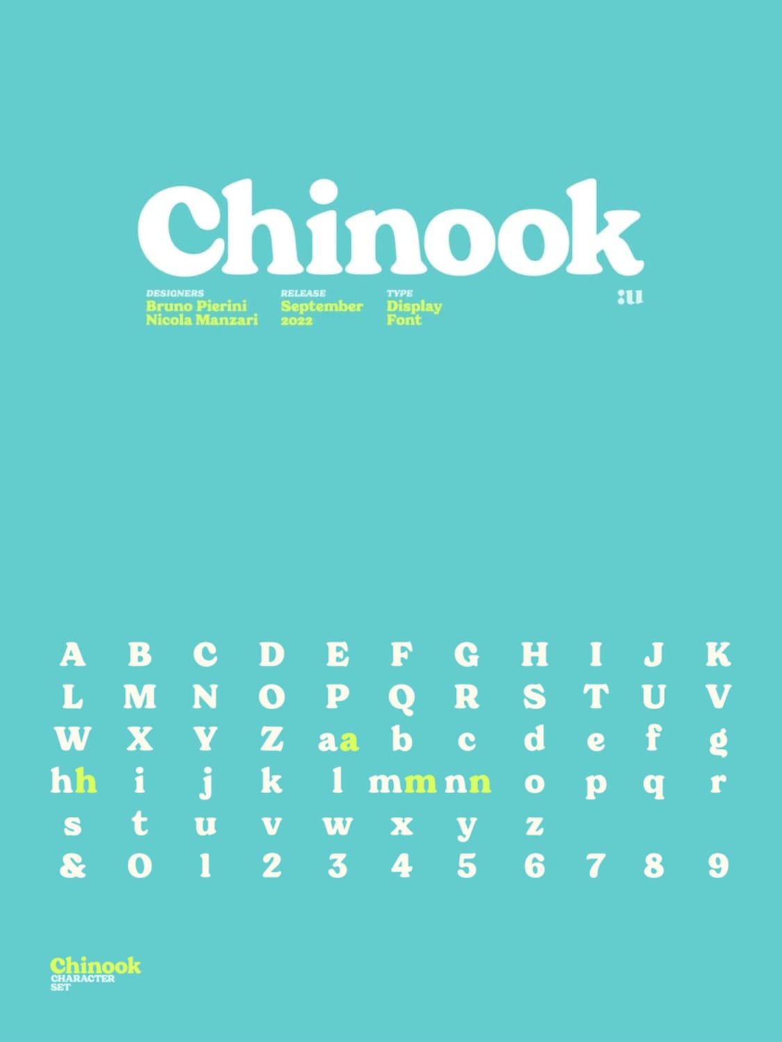
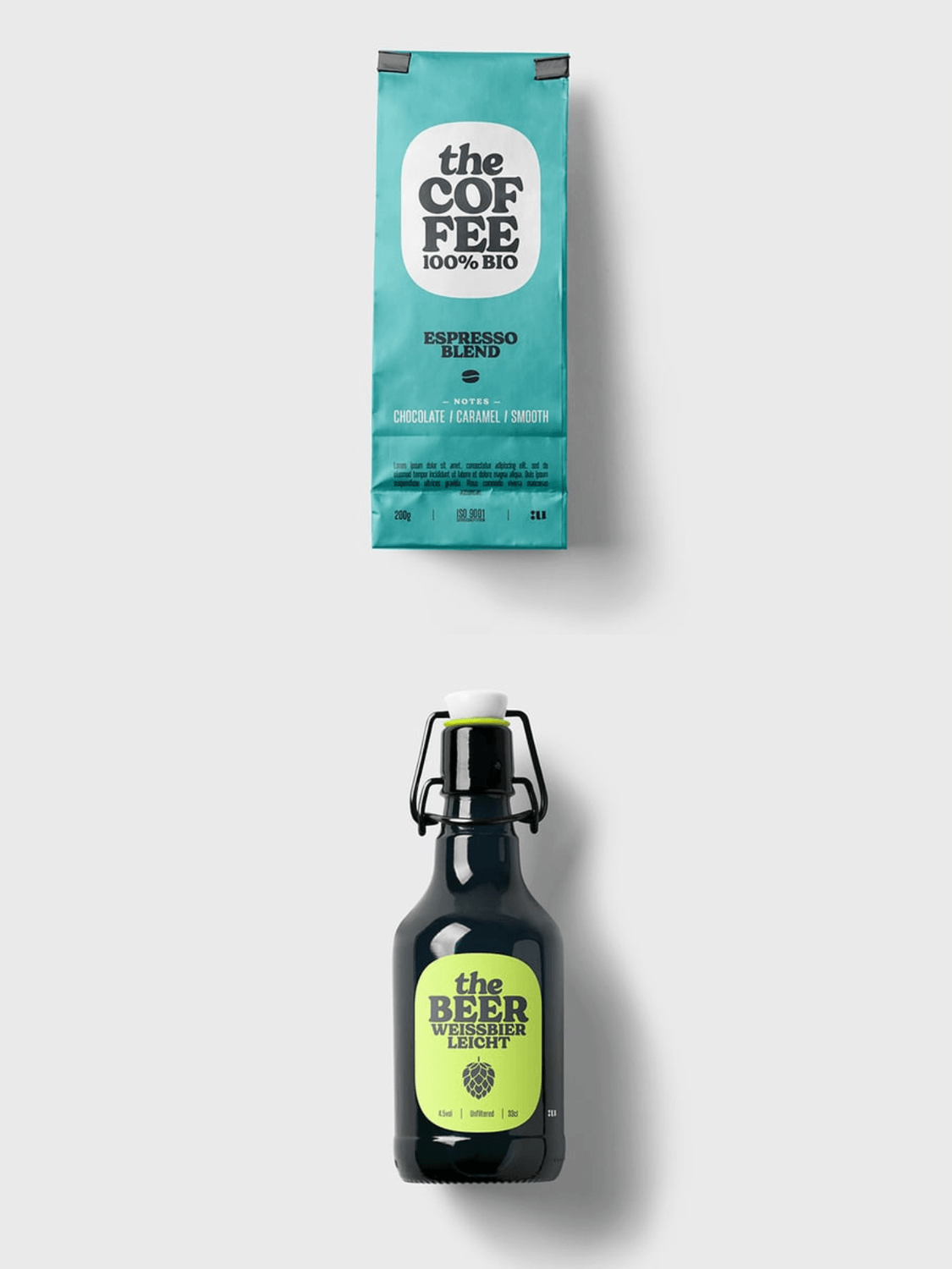
Chinook is a soft, ultra-chunky display typeface designed by Bruno Pierini and Nicola Manzari, released under the foundry Unio Creative Solutions in September 2022. It serves as a beautiful contemporary homage to the heavy, iconic movie titling aesthetics popular in Italian cinema during the 1970s and 1980s.
Key Characteristics: Strongly influenced by timeless classics like Cooper Black, Chinook subverts the traditional heavy serif mold by introducing highly modernized, rounded letterforms and a distinctively cozy, "fluffy" appearance. It packs a punchy, high-contrast weight profile paired with soft terminal curves.
Best Packaging & Branding Industries: Due to its sturdy, friendly, and highly appetizing look, Chinook thrives on modern artisanal goods. It is highly effective for premium organic coffee bags (as shown in the "the COFFEE" mockup), craft microbreweries, natural juice/soda labels, and contemporary book cover publishing.
Pairing Recommendation: Since the font is exceptionally heavy and dense, it functions best as a central logotype or short headline. For supporting packaging information, pair it with a highly legible, condensed sans-serif or a crisp, lightweight grotesque typeface to maintain perfect hierarchy.
Technical Design Tip: The font includes a rich set of built-in OpenType features. When typing out words that begin or end with expressive letters like W or s, activate its custom Swashes and Stylistic Alternates to inject flowing, elongated terminal curves that elevate standard text into custom lettering.
Where to Get It: Creative Fabrica, or Envato Element
8. Bahlie (The Groovy Bold Display Serif)
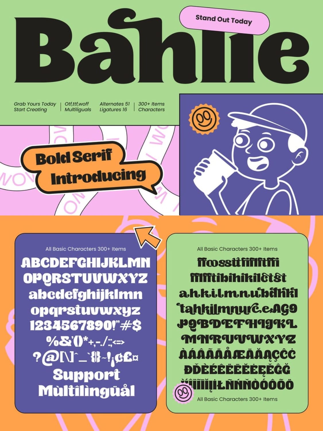
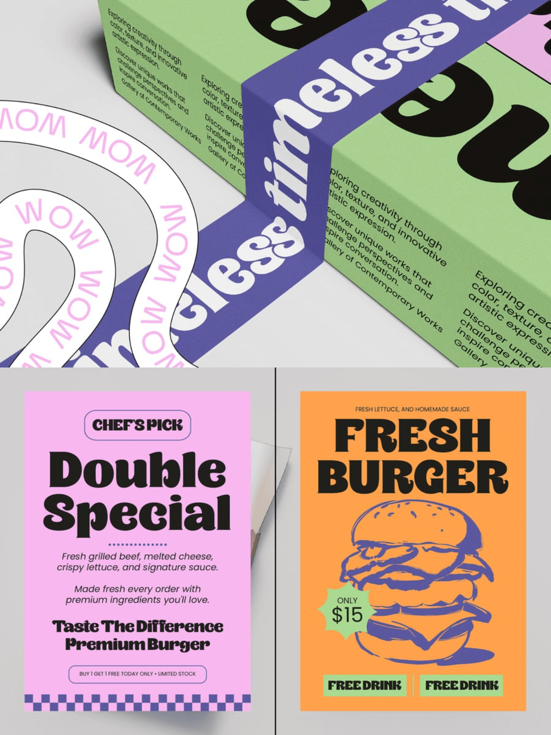
Bahlie is a highly expressive, high-contrast display serif designed by TimelessType, released in July 2026. Seamlessly blending nostalgic 1970s vibes with contemporary typographic refinement, this font commands attention through its playful yet authoritative weight distribution.
Key Characteristics: The typeface features ultra-chunky, fluid letterforms juxtaposed with razor-sharp, bracketed serifs. It is engineered with over 300 characters, including 51 expressive alternates and 16 unique ligatures that introduce a dynamic, wave-like visual rhythm to headlines.
Best Packaging & Branding Industries: Thanks to its high-energy, friendly, and somewhat cartoonish visual weight, Bahlie is an exceptional fit for casual dining, fast-casual food packaging (such as the "Fresh Burger" and "Double Special" promo flyers), beverage brands, custom apparel, and playful retro-themed merchandise.
Pairing Recommendation: Since Bahlie is incredibly dense and expressive, it should be paired with a clean, highly legible, medium-weight geometric sans-serif (like Montserrat or Futura) for secondary information, body text, or product descriptions. This guarantees the layout remains readable and structurally balanced.
Technical Design Tip: To give your packaging layouts a hand-lettered, bespoke feel, do not rely strictly on the default characters. Tap into the 51 built-in alternates using your design software's OpenType panels to access the loops and teardrop terminal extensions on lowercase letters like a, h, k, and r, instantly elevating a standard wordmark into a custom logo.
Where to Get It: Available directly through TimelessType, Envato Element and Font Bundles.
9. Tipo de la Manda (The Lovable 1970s Bookman-Inspired Serif)
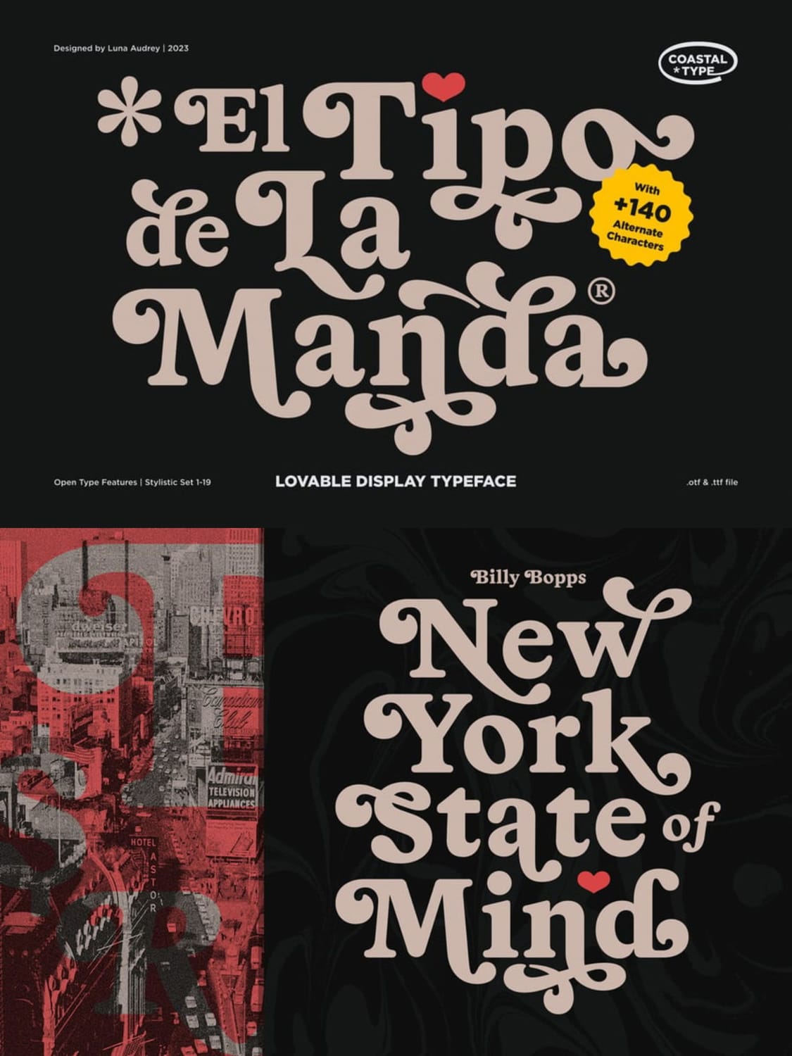
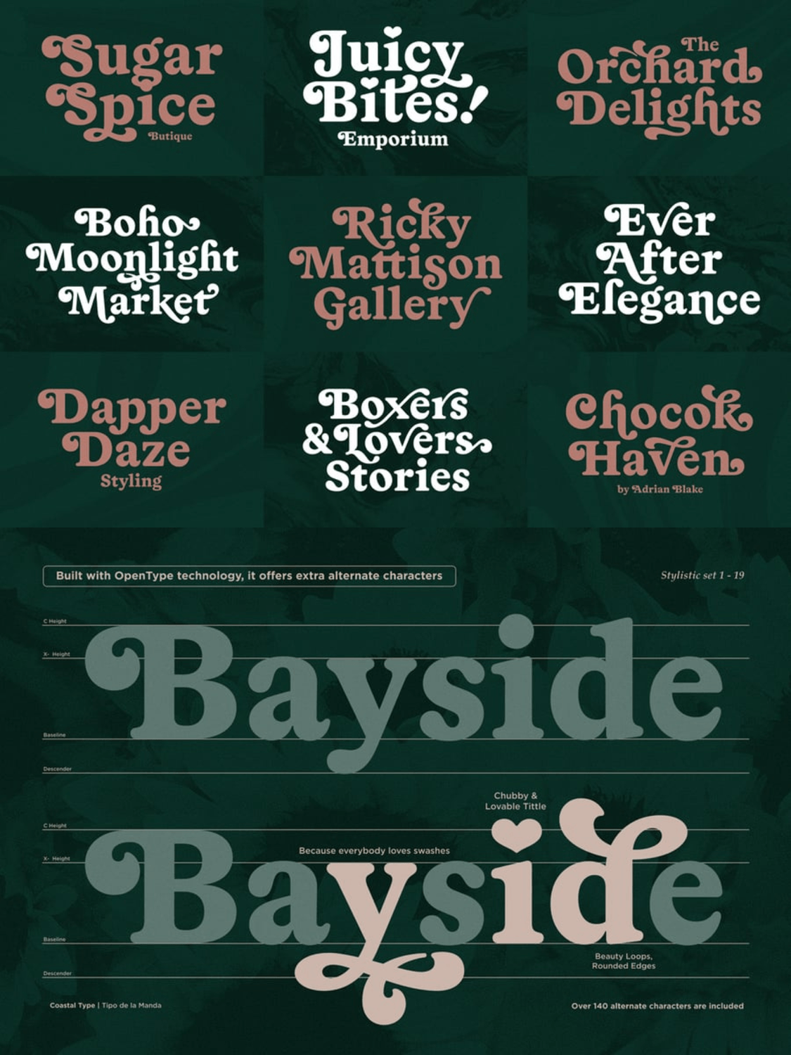
Tipo de la Manda is a highly expressive, bold display typeface with rounded edges designed by Luna Audrey under the foundry Coastal Type in 2023. It is heavily inspired by the historic warmth of Bookman Swash and the legendary, tight-fitting letterforms pioneered by Herb Lubalin.
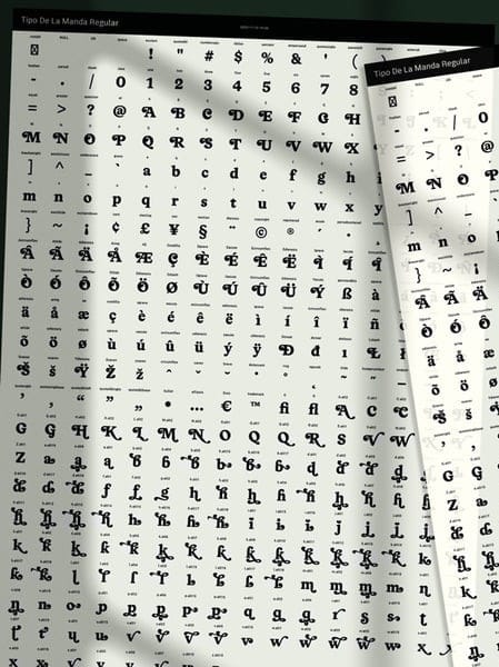
Key Characteristics: The font beautifully captures the essence of 1970s typography. It features chunky, voluptuous characters with soft, rounded edges, deep teardrop terminals, and highly expressive swashes. It contains over 140 alternate characters (such as the charming, heart-shaped tittle/dot on the lowercase i and loop-de-loop swashes on the lowercase y).
Best Packaging & Branding Industries: It is an incredibly "lovable" font that works wonders for organic product packaging, eco-friendly tote bags (as showcased on the "Quick Brown Fox" mockup), botanical beauty branding, boutique cosmetic lines, artisanal tea/coffee labels, and retro-themed editorial layouts.
Pairing Recommendation: Since Tipo de la Manda is rich with personality and curved details, pair it with a clean, low-contrast, lightweight sans-serif (such as Satoshi or Inter) or a simple, geometric linear sans to keep your secondary copy highly legible and visually balanced.
Technical Design Tip: To fully harness the vintage spirit of this typeface, make sure to explore its 19 distinct Stylistic Sets. Swapping standard letterforms for the swashed alternates (especially on letters with descenders or ascenders like y, g, b, and d) allows you to build custom, interlocking layouts that mimic high-end, hand-drawn vintage lettering.
Where to Get It: Available directly on Envato Elements.
10. Micklé (The Soft Retro-Modern Display Serif)
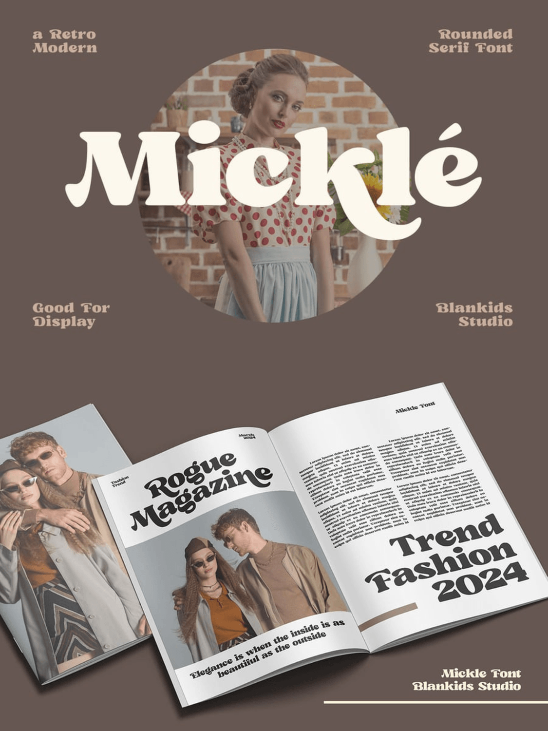
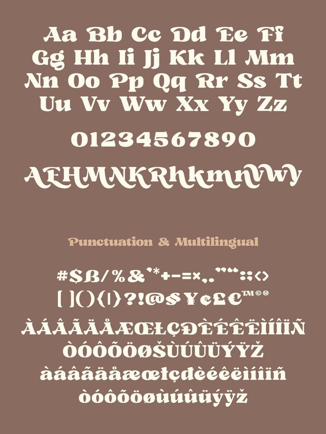
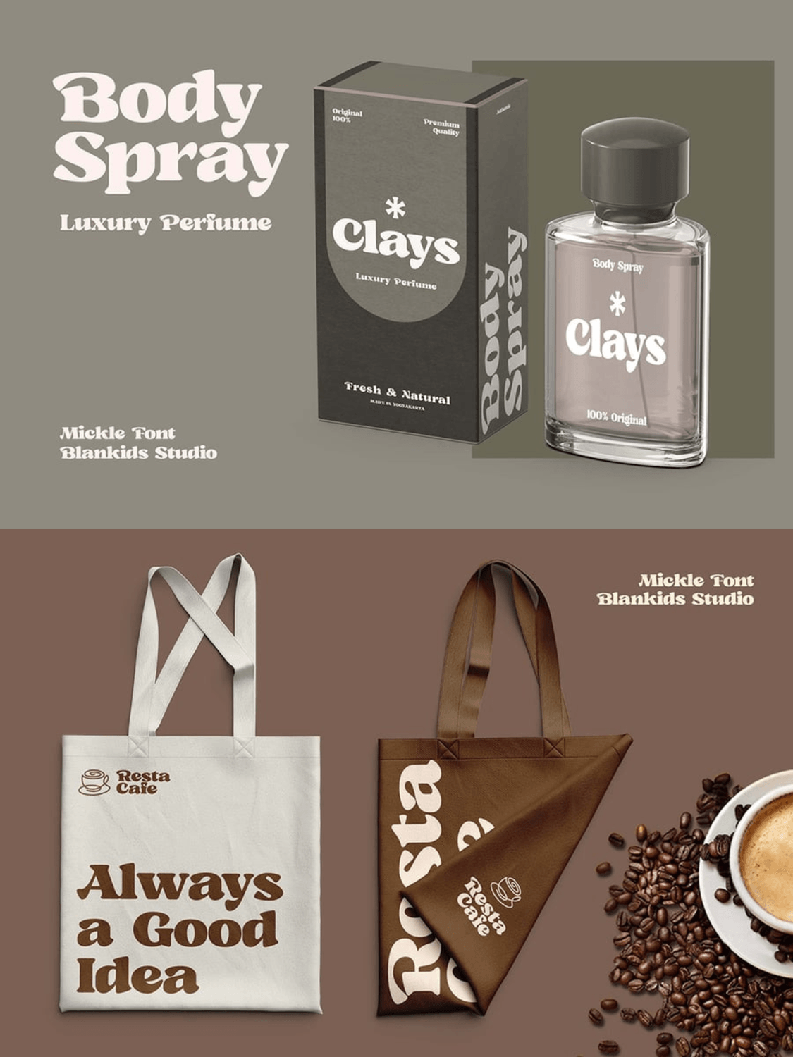
Micklé is a captivating, high-contrast display serif designed by Blankids Studio, released in May 2024. Perfectly walking the tightrope between nostalgia and clean-cut modernism, this typeface brings a cozy, sophisticated energy to contemporary layout design.
Key Characteristics: The typeface is defined by its incredibly smooth, rounded serifs and voluptuous, teardrop-adjacent curves. While it retains the heavy baseline structure of classic 70s display faces, its sleek, high-contrast stems and refined terminals lean heavily into a minimalist, luxurious aesthetic.
Best Packaging & Branding Industries: Micklé feels right at home in boutique fashion editorials (as seen in the "Rogue Magazine" layout), high-end cosmetic or personal care packaging (like the "Clays Body Spray" mockups), and trendy lifestyle brands. It's also an excellent choice for artisanal coffee shops, organic cafes, and bespoke tote bag designs.
Pairing Recommendation: Pair this expressive display face with an ultra-clean, neutral geometric sans-serif (such as Inter, Satoshi, or Plus Jakarta Sans) in light or medium weights. This allows Micklé to dominate headlines while secondary body copy remains sharp and legible.
Technical Design Tip: Take advantage of the font's beautiful ligatures and alternate characters (especially the stylized ascenders and descenders on lowercase letters like k, h, and y) to create naturally interlocking text hierarchies. The flowing, wave-like connections on these letters can easily turn a simple wordmark into a custom-looking, hand-crafted logo.
Where to Get It: Available directly on the Blankids Fonts website, Creative Fabrica, and Envato Elements.
3 Rules for Designing 70s Typography on Packaging
Simply downloading a vintage-inspired typeface isn't enough to capture the genuine magic of the era. The seventies had a specific design ethos—a tactile, hand-crafted philosophy that dictated how letters sat next to each other, interacted, and lived on a physical canvas.
To make your packaging look like an authentic retro relic rather than a modern imitation, follow these three essential design rules:
1. Keep the Kerning Tight (Tight-But-Not-Touching)
Modern digital design tends to favor airy letter-spacing (tracking) for readability. The seventies did the exact opposite. Type layouts in this era were incredibly compact, with letters practically hugging.
When setting your display type, manually adjust your kerning so the characters sit tightly together without fully overlapping. This "tight-but-not-touching" rule causes the negative space between letters to shrink, turning your brand name or product title into a singular, cohesive visual shape that commands high impact on a shelf.
2. Lean into Warm, Earthy Palettes
Color and typography are deeply linked. A groovy 70s serif set in high-contrast neon blue or sterile, digital pure-white will immediately lose its vintage charm.
To ground your packaging in the decade, lean heavily into a warm, analog color palette. Think rich chocolate brown, mustard yellow, burnt orange, avocado green, and soft, warm cream instead of stark white. These earthy, slightly muted tones evoke a sense of physical print, sun-faded paper, and retro organic goods.
3. Utilize Custom Swashes & Alternates
The best 70s typography feels hand-drawn, fluid, and custom-fit. Most modern revival fonts come packed with OpenType (OTF) features like ligatures, decorative swashes, and stylistic alternates.
Don't just use the default character set. Take the time to explore these hidden glyphs. Swap out standard 'R's, 'Y's, or 'g's for versions with dramatic, sweeping tails or overlapping loops. Weave the letters together like a jigsaw puzzle so the brand name flows organically across your packaging.
Conclusion: Bring Retro Warmth to the Modern Shelf
In a digital landscape crowded with hyper-polished, sterile visuals, nostalgia is one of the most powerful marketing tools a packaging designer has. It doesn't just sell a product; it evokes an emotional response—a longing for simplicity, tactile warmth, and genuine human craft.
Choosing a 70s-inspired serif is more than a trendy stylistic choice. It is an invitation to step away from the rigid grids of modern "bland-branding" and inject personality, soul, and playfulness back into your product design. By embracing these bold, voluptuous curves, you ensure your brand doesn’t just sit on a shelf—it connects.
What’s Your Go-To Retro Font?
We want to hear from you! Are you team Cooper Black, or do you prefer the modern, flowing swashes of Musaic? Drop your favorite 70s-inspired serifs in the comments below.
Want to stay ahead of the latest branding and typography movements? Subscribe to our newsletter to get curated font lists, design tutorials, and creative inspiration delivered straight to your inbox!
Disclaimer:
This article is for informational purposes only. Some links may be affiliate links, meaning Advise Graphics may earn a commission at no extra cost to you. We do not guarantee results, and readers should do their own research before making any decisions.
Tags
Popular articles
Copyright
© 2025 Advise Graphics. All rights reserved.
Cop© 2025 Advise Graphics. All rights reserved.